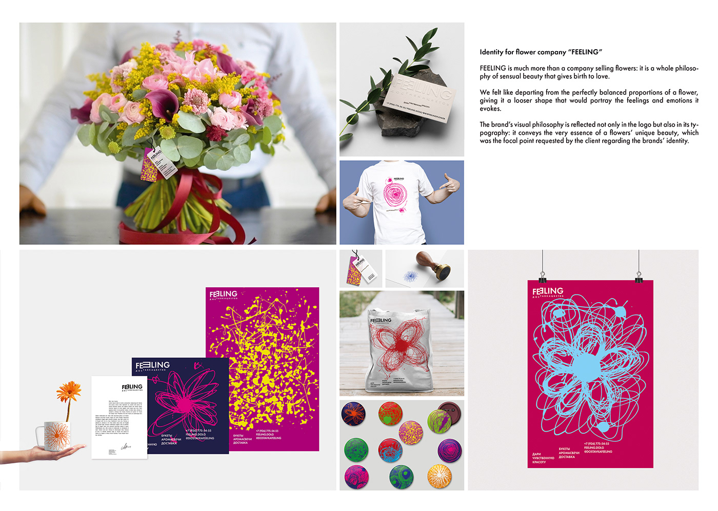
Identity for flower company “FEELING”
‘Feeling’ is much more than a company selling flowers: it is a whole philosophy of sensual beauty that gives birth to love.
We felt like departing from the perfectly balanced proportions of a flower, giving it a looser shape that would portray the feelings and emotions it evokes. The brand’s visual philosophy is reflected not only in the logo but also in its typography: it conveys
the very essence of a flowers’ unique beauty, which was the focal point requested by the client regarding the brands’ identity.
The name feeling is the main semantic loadin a visual brand and carries a deep meaning in the activities of a company that gives sensual beauty to people.
Feeling - это не просто цветочная компания, а целая философия чувственной красоты и созидания, порождающих любовь! Захотелось уйти от идеальных пропорций цветка, придать ему свободную форму и в эту форму вложить эмоции и чувства, которые он вызывает. Визуальная философия бренда заложена не только в логотип, но и в типографику:
их сочетание передает красоту и неповторимость цветка, которые были так важны клиенту при разработке айдентики.
Название feeling является основной смысловой нагрузкой в визуальном бренде и несет глубинный смысл
в деятельности компании, которая дарит чувственную красоту людям.