
UI/UX - Facebook Messenger for Business Case Study
Overview:
- The Client
Facebook Messenger (App) - 70% of people in Vietnam use Messenger for business. This increased 23% during the last 3 years. However, both the customers and the business owners face several challenges to use a social networking app for business purposes.
- The Challenge
Look through the process of communication between businesses and customers via Messenger and help Messenger identify a solution that can make this process easier and more convenient for the customers.
- Outcome
Create new design and add more functions to messenger app to resolve the solution.
- Length of Project
5 weeks (Case study project)
- Role
Student (research, interaction design, visual design)
Research:
Facebook Messenger App the the most common using app that I’ve usually used everyday and I really like it. It help me keep contacting with my friends, family and colleages very well.
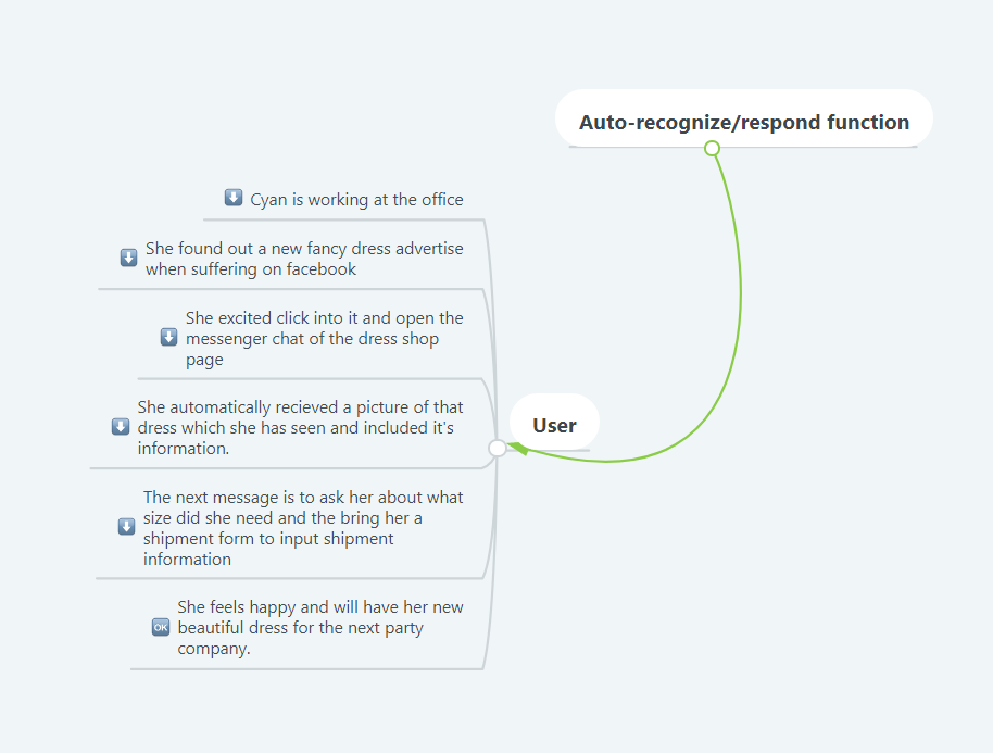
During my personal design sprint, I’ve research, learn about my users 's pain points and due to this, auto-recognize/respond function is what I’m going to focus on my project.
User Understanding - Who are they?
- Age: 20 - 50,
- Income: 6,000,000đ - 20,000,000đ
- Location: Most in HCM, some live abroad
- Income: 6,000,000đ - 20,000,000đ
- Location: Most in HCM, some live abroad
- Group familiar to use techonologies and active social media
User Understanding - User persona
- Cyan (34 years old) lives in Ho Chi Minh City
- She is a general services Manager at Bayer Vietnam Ltd, which company about pharmaceutical.
- She likes travel, shopping online, gym, yoga and love to making new friends.
- She is active, talkative, humor and confident.
- She uses mobile app for everyday activities (Go to places by Grab, Order food via Now.vn, Exchange Grab Rewards for coupons)
User Understanding - User's pain points?
- Become unpleasant when receiving the message about asking general questions
- Don’t have image about the product have been seen
- Don’t have a form or poll for customers to input the amount of product and add contact shipment right away to save time
- Feeling annoying have to wait for the respond and low feeling want to buy
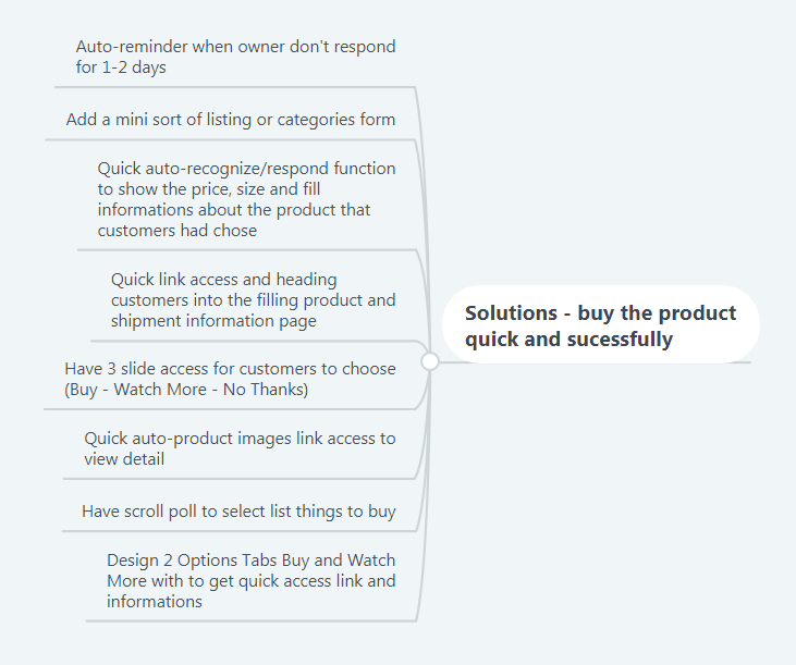
Product Goal:
To buy the product quick and sucessfully which time for customers to accomplish the journey will be faster, there will be more new businesses setup such as have another way to access to buying form, payment and shipping form.
After research and found the goal. I begin the map of user flow to define solutions, then I picked 1 solution to go on.

Map the Challenge - User Flow
How Might We Notes Organized - Define Solutions
Pick a Target
Then I began to create some ideas and drawn it down to papers.

Crazy 8s

Paper wireframe
I created a UI requirements document to outline all of the features and elements I wanted to incorporate into the design. Once this was complete, I started creating digital wireframes for the main screens in InVision Studio.

Wireframes: Mid-Fidelity
I asked for participants to test out the prototype's usability. And have an Five-Act Interview with Mrs Tuyen
Findings:
At the beginning of the interview, Tuyen said that she is troubles with how to get a quick buy online on facebook and have to get long respond from the shop owner when contact to buy things. But then when she get along with my solution, there are two points that makes she confused. She said “I was confusing with the payment access because the steps by steps was proceed further and further, it’s difficult to get back in case I would like to buy more” and “there’s no page for transaction from the bank”.
On the other hand, she thought that It would be more convenience if the payment has “the confirmation page” to make sure that user really don’t change about their decision or they will make another choice, and come along with the “Back button” must appear more in credit and paypal payment steps. Furthermore, she thought it’s good to be have a “transaction page or pin code page” from the bank to get more secured when shopping online.

User Interviews
Recommendations:
- need page for transaction
- need pin code page
- need back buttons
So the potential change of the prototype that will be applied is make some more payment pages and add some back buttons.
After updating my wireframes to incorporate the recommendations, I moved on to visual design. Up until this point, my prototype lacked a color scheme, typography, and a brand identity. I looked for inspiration for the mobile app on Pinterest, Medium...and other sources on the internet.
Visual Design (User Interface):
Typography: I've picked clean and simple font that goes well with the simple color and icon within app.


Please view the final prototype below.
Thanks for taking time and watching my project. If time permits, I would like to work more for this app to make it even improve better.


