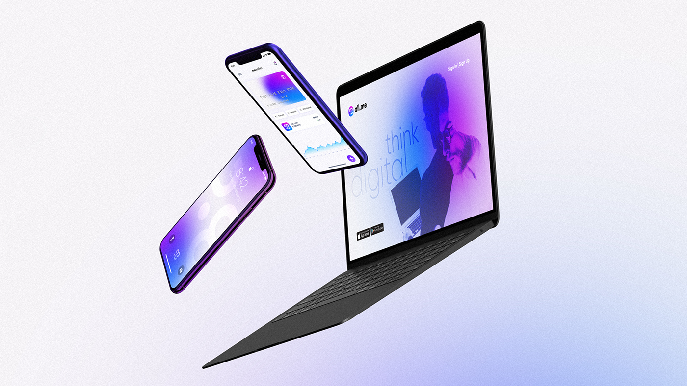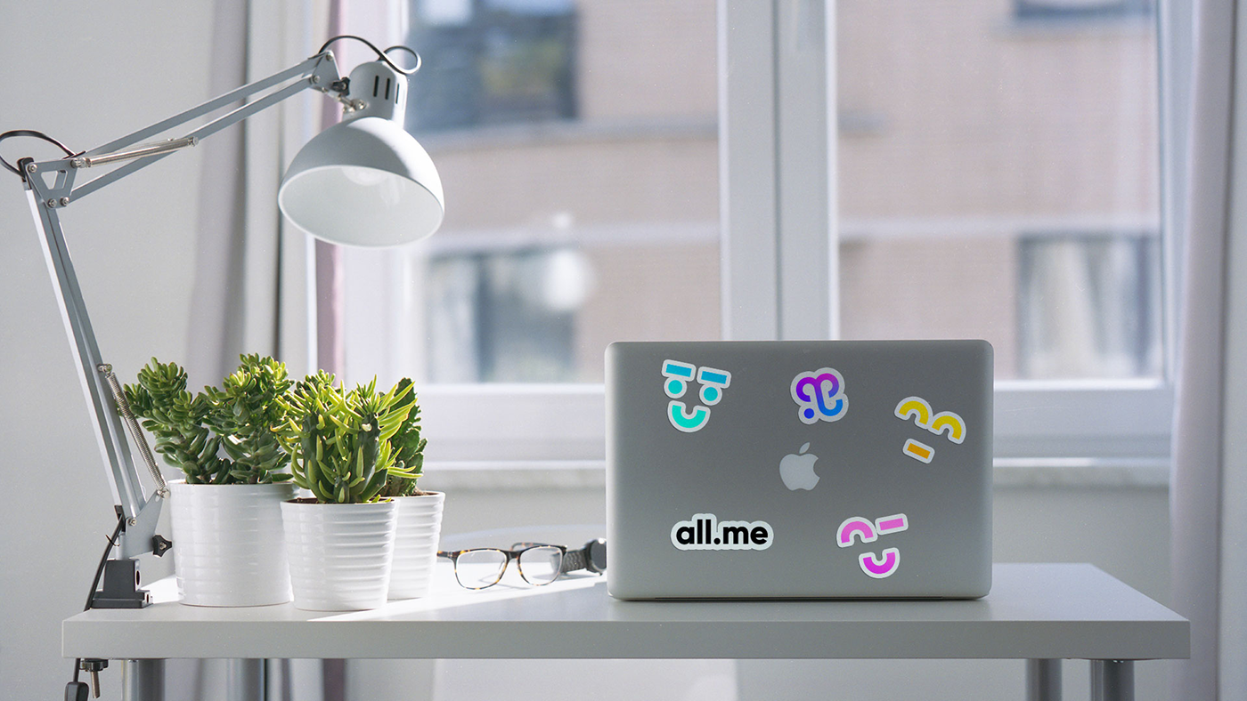

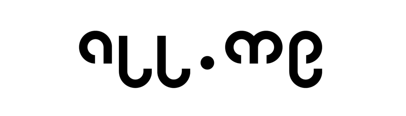
all.me is a new eco-system rooted in blockchain technology.
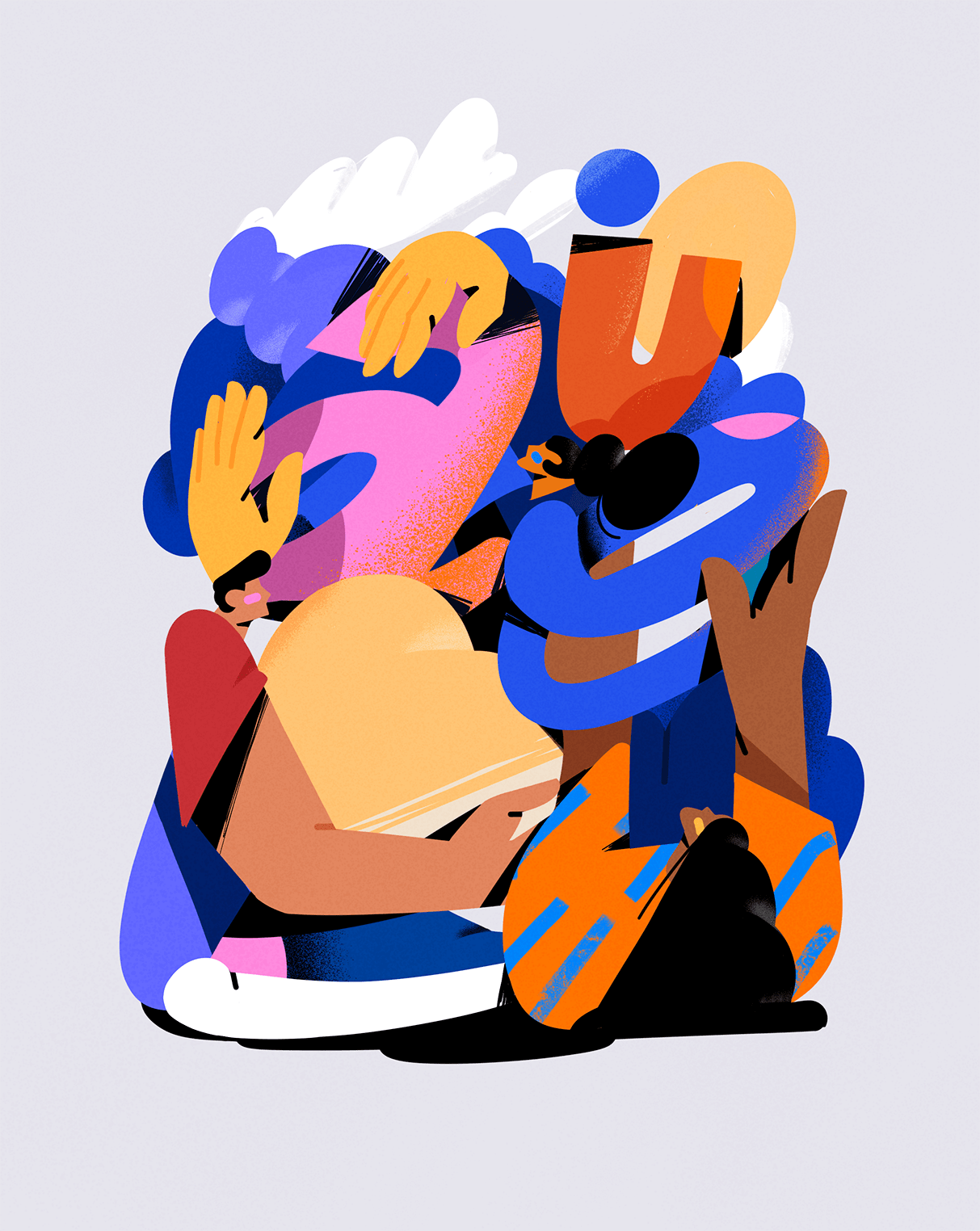
It simplifies the way users share content, shop online and advertise. By bringing these facets together in one platform users can freely publish engaging content, chat with friends, enjoy trading and shopping using a single digital asset and even earn on advertising!
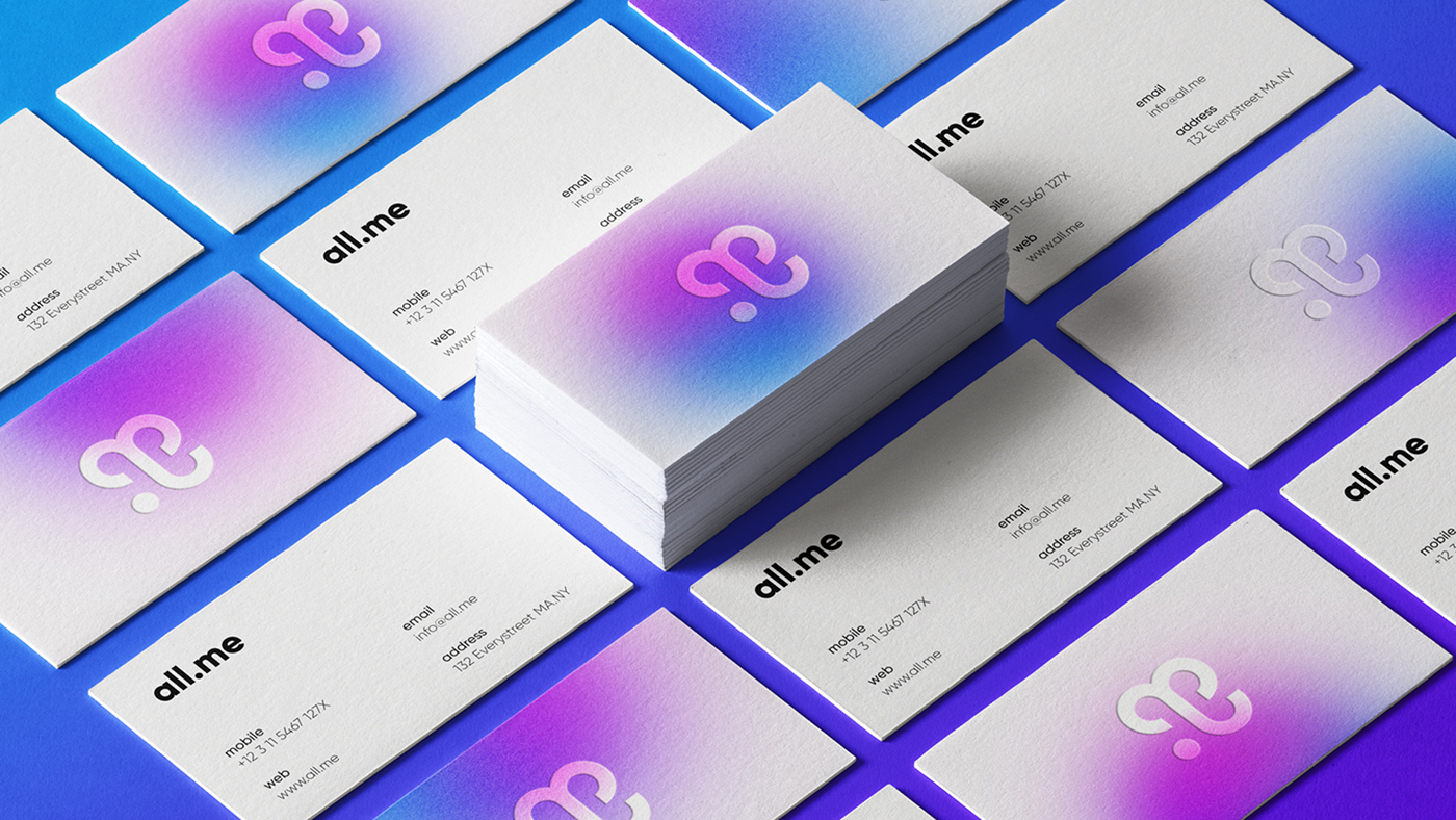
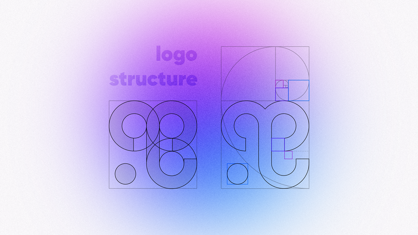
The challenge was to create a logo and brand identity and it was about being unique, memorable, trendy, clean and simple.
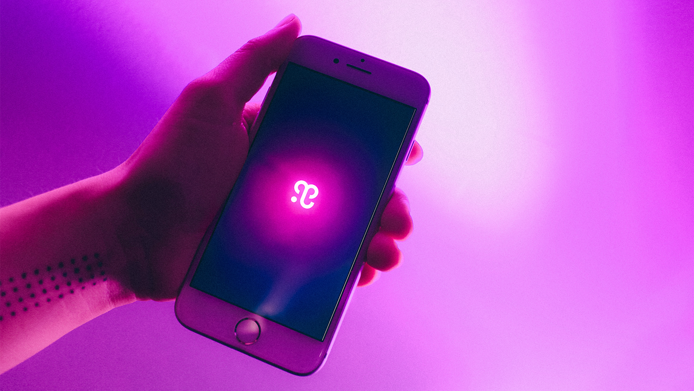
The given solution is following the path of modernism. It is an icon, which contains all the letters of a brand name and looks pretty simple and memorable. The logo is a combination mark. Combination mark is a logo comprised of a combined wordmark and a pictorial mark or symbol. The symbol and text can be laid out side-by-side or stacked on top of each other.
The construction of icon is based on Golden Ratio proportions to keep the harmony of sizes.
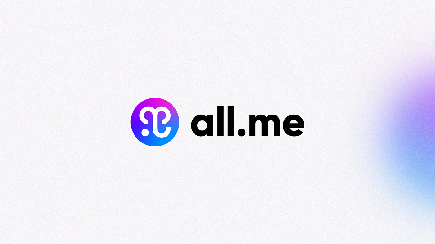
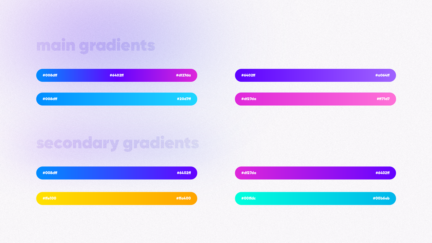
As all.me is a union of 3 platforms (menetwork, mepay, memarket) each of them has it color and can be used as a separate sub-logo.

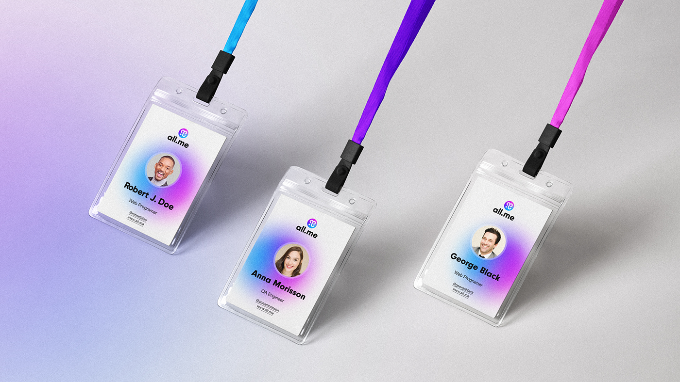
The symbol gradient has three color. Each of them represents one platform of all.me. Blue is for social network, purple is for crypto paying, pink is for market.
The chosen color combination is called “analogue harmony” in color theory. It’s about the arrangement of the colors in design in the most attractive and effective way for user’s perception.
Besides those three main colors, I used more colors and more gradients in case of necessity.