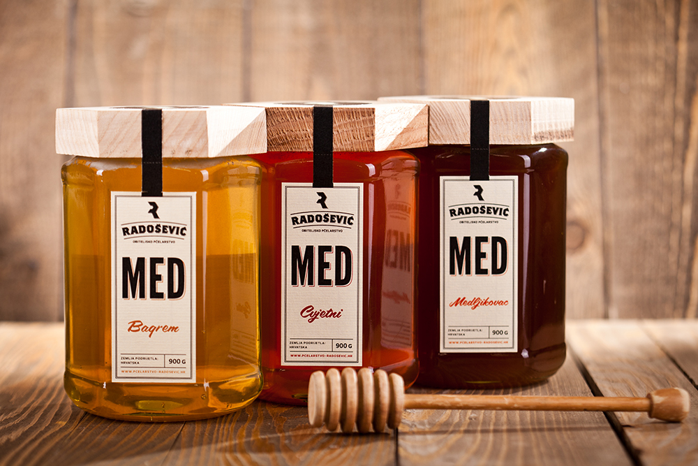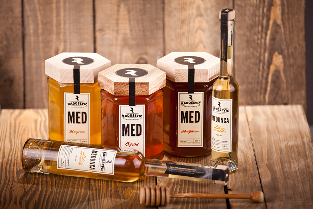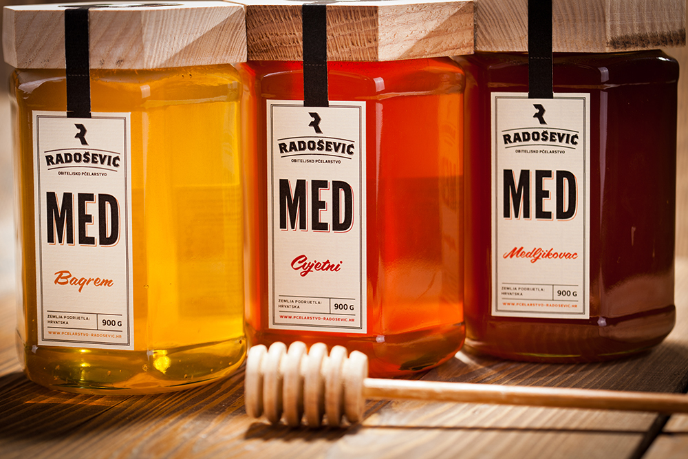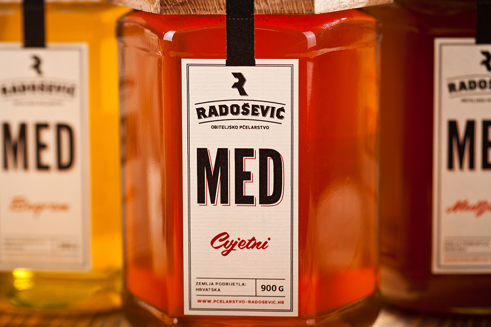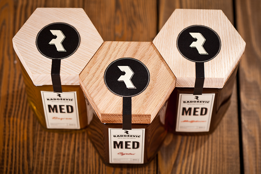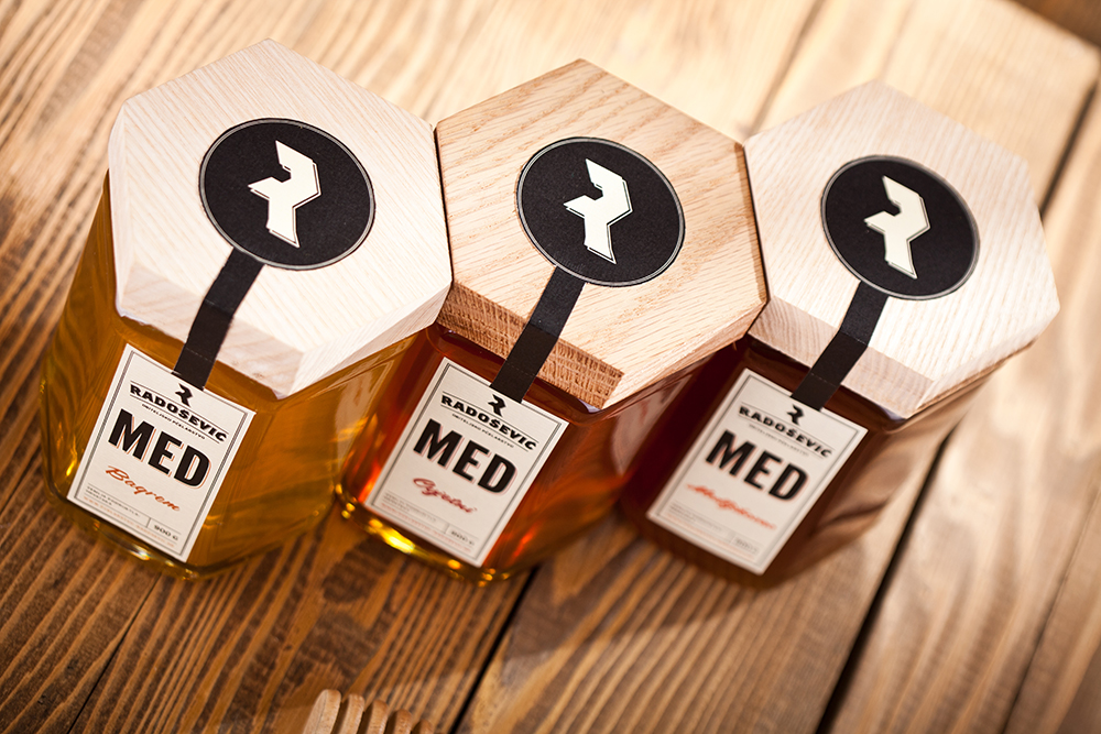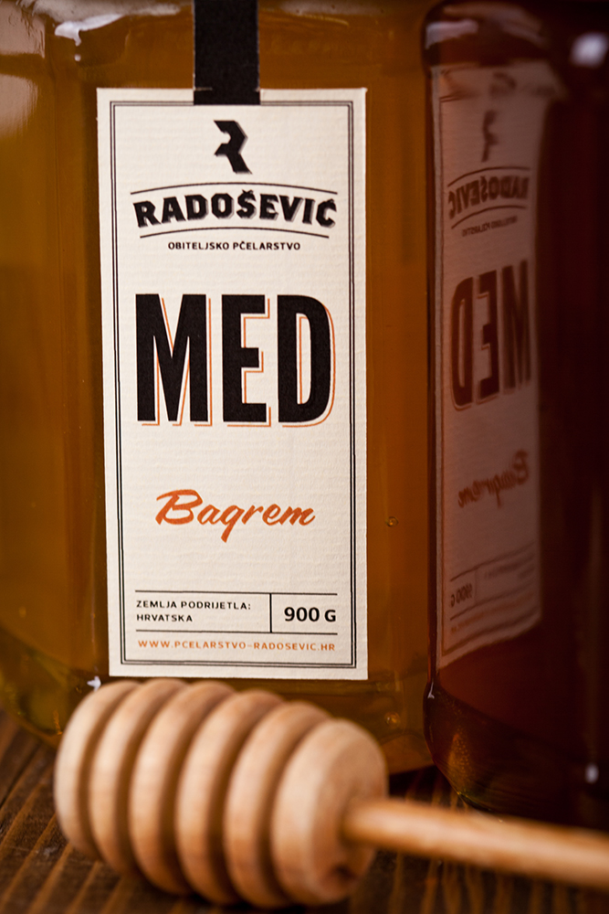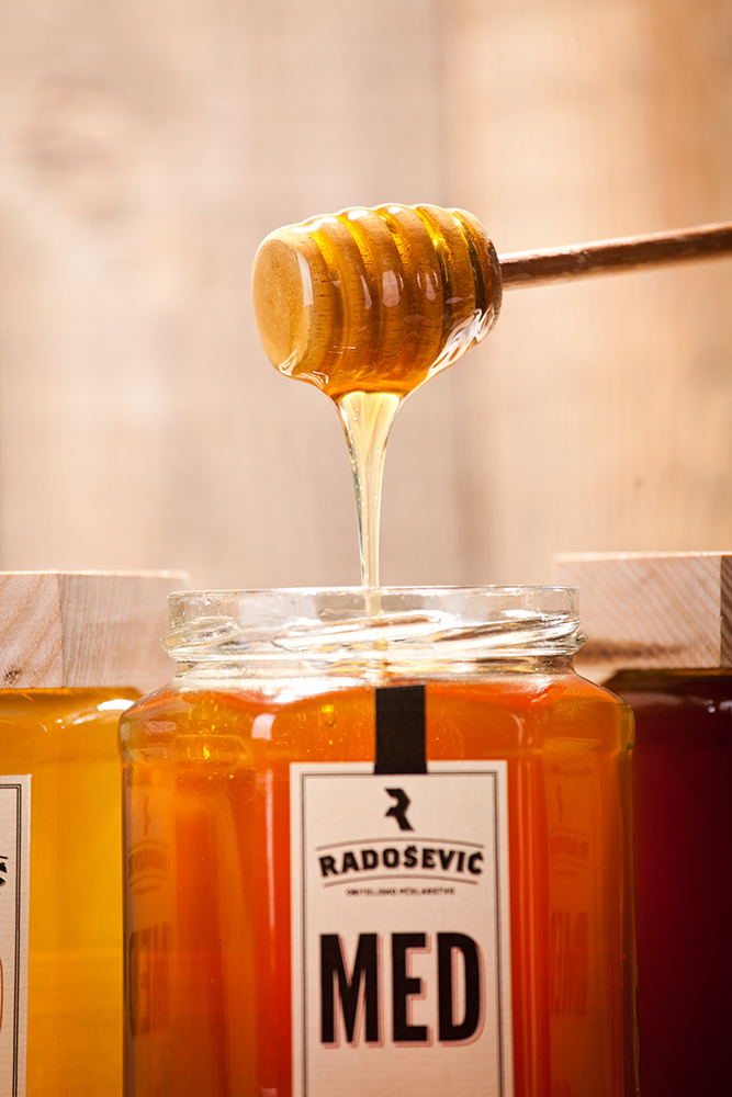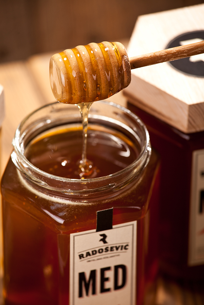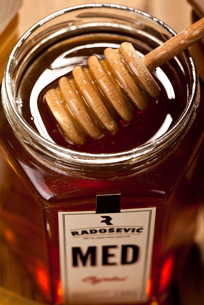

The modern customer values high quality and is increasingly conscious about the benefits of traditional and homemade products; our concept is based around this idea of natural and preventative medicine. We designed the packaging to evoke a sense of traditional old-style pharmacy production by using wooden lids, warm colors and a retro label design. For the honey jars, the hexagonal shape reinforces the origin of the product and allows for the unique opportunity to stack the jars in a honeycomb shape, bringing the entire visual identity into the physical space. All the packages in this range share this same visual identity to maintain brand image on the store shelves. All these elements come together to express a value of healthy, traditional, immunity boosting, naturally produced honey products.
Agency: Mit Design Studio
Client: Obiteljsko Pcelarstvo Radosevic
Design: Leo Vinkovic
Art Direction: Leo Vinkovic
Photography: Vedran Marjanovic Wekster