


Project
We’ve been reached by a ukrainian natural honey producer with a task to develop a positioning strategy for their brand. Honey in Ukraine is a super affordable product with over 20 trademarks present on the market. The only option to stand out in the category was to create a vibrant and recognizable brand.
For our mission we chose to switch the perception of honey in general: from underrated product to a delicacy. From first visual contact to every consumer case – this new honey brand has to give new emotions and experience.
Naming
Ironic, playful and flirty naming. Say “Zhü”: your lips are folding like during a kiss. Zhü is the quintessence of youth, when everything is possible and you eagerly taste life.Thanks to light french fleur the name gives feeling of joy and carelessness.
The short word looks great in minimalist style or lettering.
The short word looks great in minimalist style or lettering.


Brand face
Young woman aged 27-32, looks after herself, is fond of sports, art and healthy food. She’s an aesthete, surrounds herself with beautiful things and her taste is hedonystic.
She’s a connoisseur of natural beauty, practically doesn’t use makeup but if she does – it’s probably a lipstick. Not a careerist, but self-sufficient. She is able to make hard decisions, but at the same time remain feminine. And, of course, she loves sweets.
As our heroine says: “Sweets should be not many, but such, that you won’t feel sorry to spoil lipstick on”.
The brand voice is the voice of a girl who does not scatter words: she sounds calm, slightly mysterious, her words always arouse interest of the listener.

Legend and Message
Imagine: everything you tried before was a preparation. You practiced your taste: went to exhibitions, and over time, you began to distinguish between the directions of painting, you made gastronomic discoveries and found that it is not just “tasty”, but also “interesting.” Understanding comes with time. And now, having all this baggage of impressions, you can look at the essence of things, see their potential. Zhü provides not just sweet and healthy qualities of honey. It offers a new interaction experience, new flavor combinations, new tactile and visual impressions.


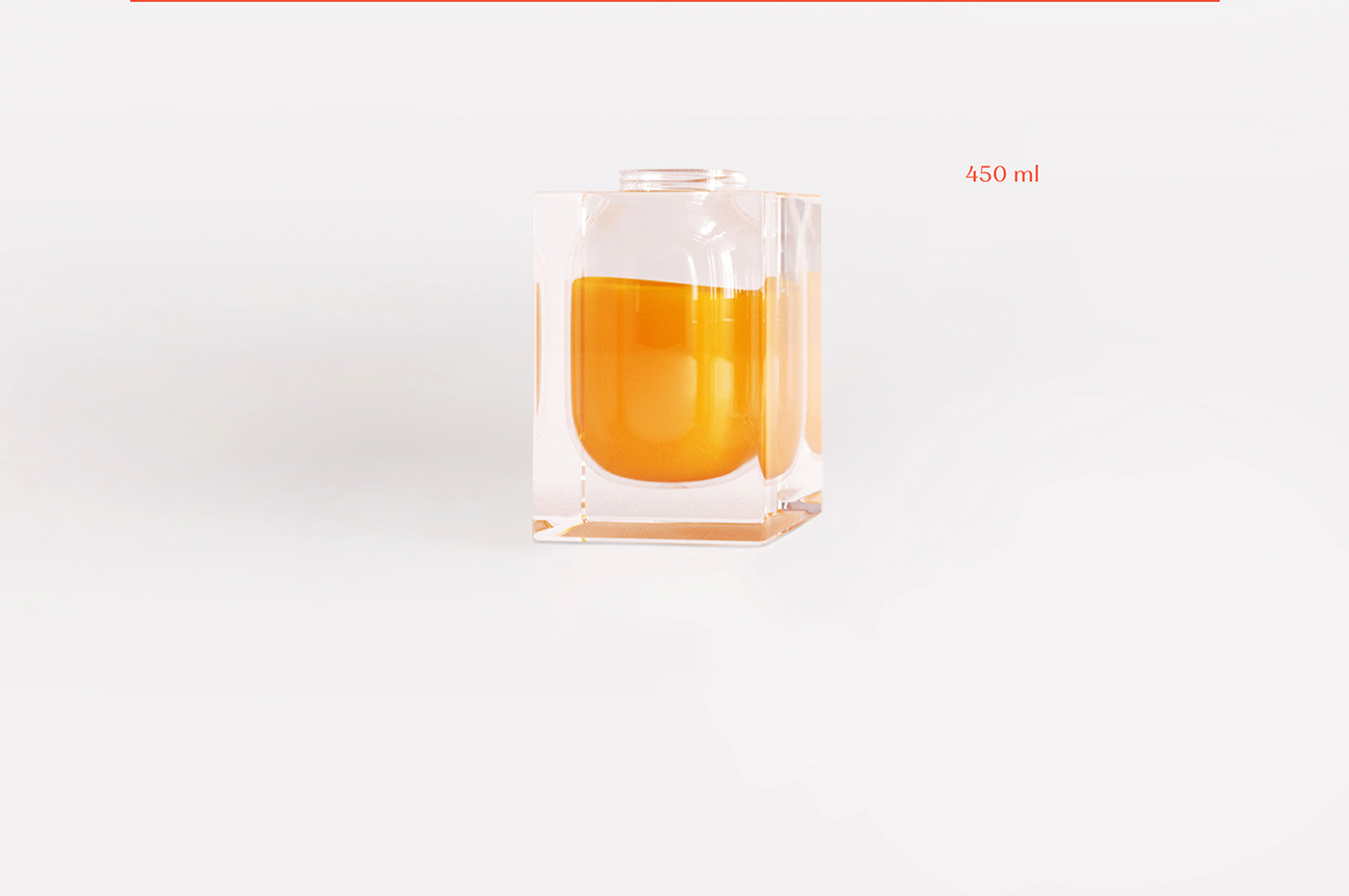
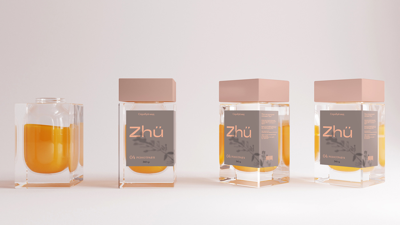
Can idea
Glass 3 liter jar is a traditional symbol of honey-as-a-gift "from relatives". We put the jar in a new context: “adde-up” to its space and turned the packaging into an art object. Such a form will make Zhü stand out from its competitiors on the shelf.
Jar shape, size and interaction with packaging designed to bring maximum fun and keep user from inconvenience
usage and storage, unaesthetic honey drips that can ruin the moment of product enjoyment.
usage and storage, unaesthetic honey drips that can ruin the moment of product enjoyment.

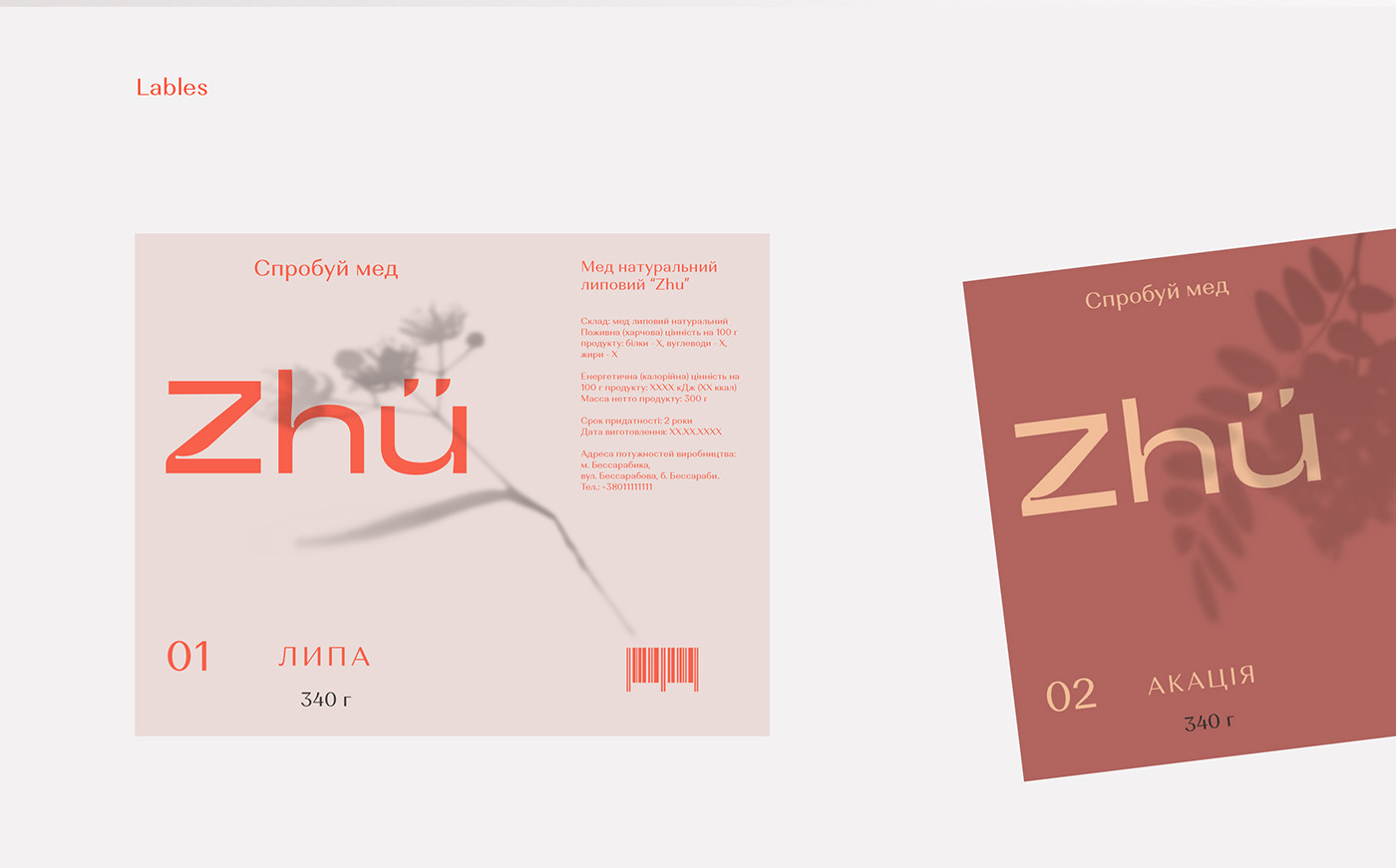
Shadow
Plant shade is the main brand identity method. They stimulate the perception of naturalness of the product, convey the atmosphere of south, summer and sunny day. Also the shadow is used for additional indication of the honey variety.


Team:
Angelina Andreeva
Creative copywriter. Naming / Legend / Tagline / Brand face
Andrew Hurmanchuk
Art director, designer. Logotype / Identity / Can / Brand face
Art director, designer. Logotype / Identity / Can / Brand face
George Deev
Naming
Roman Slipchenko
Project manager
Project manager
Anastasia Kolodub
Project manager
Oleksandr Kolisnyk
Market analysis / product research / positioning strategy
Project manager
Oleksandr Kolisnyk
Market analysis / product research / positioning strategy
Mykola Kutola
Market analysis / product research / positioning strategy.
Thanks
Market analysis / product research / positioning strategy.
Thanks


