Ribaasu Typeface: A multi-script reverse-contrast typeface
Design Concept
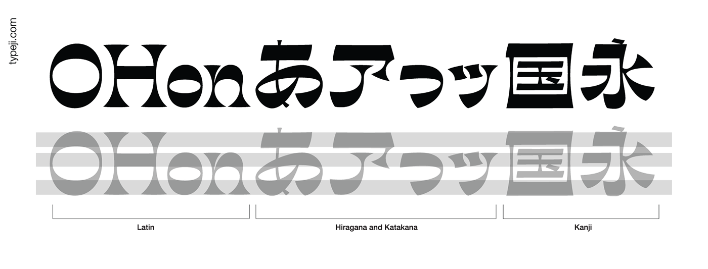
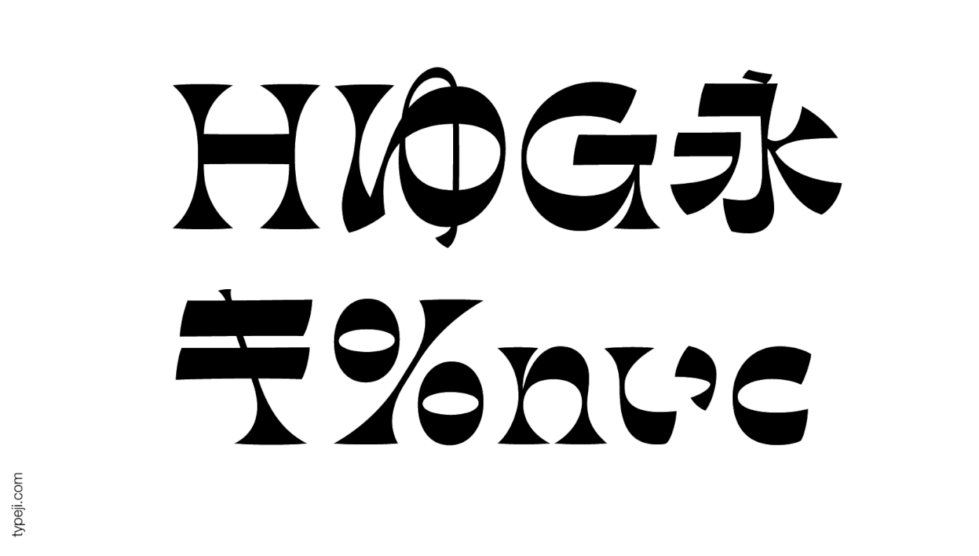
In a reverse-contrast typeface, the normal weight distribution is reversed. The result is that the weight becomes concentrated along the cap-height, x-height, and baseline, creating a strong horizontal visual connection.
Unlike the Latin alphabet, the weight distribution in Kanji and Kana is much more complex, and the weight is not just on the verticals. Many strokes are diagonal or curved, so the weight distribution varies on different strokes. Simply reversing the weight distribution may not create the same visual result as in the Latin one. Instead of reversing the weight literally, my approach is to create a typeface that captures the visual essence of the Latin reverse-contrast. That essence is the quirky personality and strong horizontal connection; thus, both can work together in a visually compatible way.
Ribaasu字體的設計概念
逆反差字體(Reverse Contrast) 最早可以追溯到19世紀,主要的用途是利用逆反差效果所造成的奇異性格 (quirky personality) 來引起注意力。它的特色是有著強烈的橫向連結感及一致性,筆畫的重量也恆定地分佈在上中下三區。
逆反差字體在漢字或假名設計中本來不存在,它是拉丁文字特有的結構所延伸出來的一種設計規則。拉丁文字大致上粗細分佈保持一致:橫細豎粗。除了弧形筆畫,很少有粗細變化極端的單一筆畫。在這樣單純的結構中,把原先粗筆畫逆反成細;細筆畫逆反成粗,就成為逆反差字體。
漢字或假名的設計與歐文不同,他們的粗細分佈是根據書法傳統而來。文字本身的結構變化複雜,如果直接以「逆反差」字面本身的意思來繪製漢字,反而難以達到逆反差字體獨有的特色。既然逆反差字體是拉丁文字設計所延伸出來的概念, 設計對應的漢字或假名時,或許可從歐文逆反差字體的視覺結果來做分析,抓住逆反差字體給觀者的視覺感受與特色:1.強烈的橫向連結、2. 恆定的重量分佈,以及 3.逆反差所造成的奇異性格 。而Ribaasu是以前述三項要點為前提,所提出的一種字體設計方案。
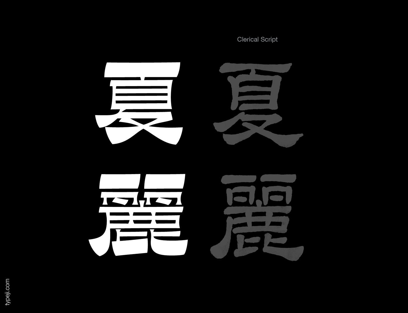
Clerical Script (Li-shu/Reishotai)
The Kanji Structure and the weight distribution is influence by the Clerical Script, which was dominant in Han dynasty (202 BC–220AD).
隸書筆法與結構
漢字的設計參考了隸書的筆法、結構與粗細分佈。向右傾斜的起筆與收筆、近乎水平垂直的線條以及均勻的負空間。


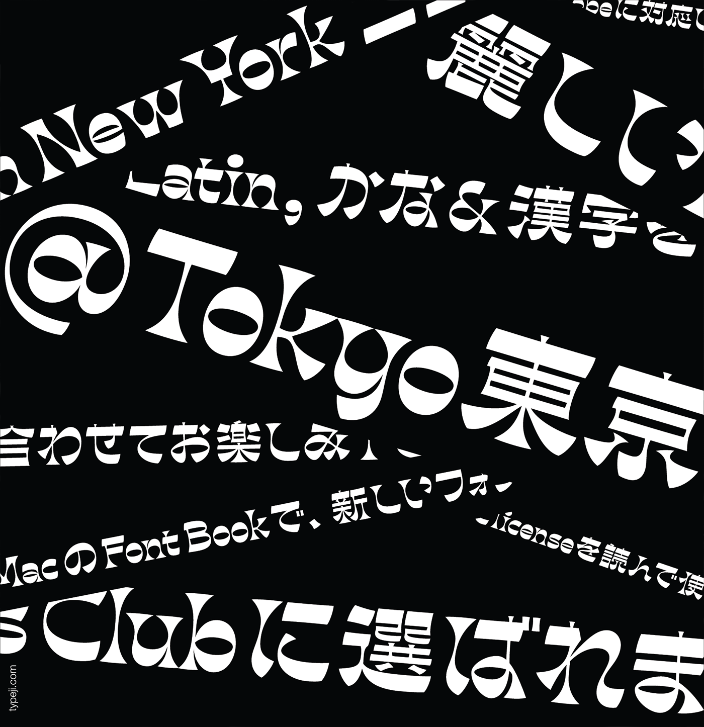
Ribaasu typeface has been recognized by the
Type Directors Club (Typeface Design Competition, Judge's Choice)
Morisawa Type Design Competition (2019, Bronze)
Art Directors Club (Annual Award, Gold)
Tokyo TDC (Excellent work, 2020)
Ribaasu字體獲得
紐約字體指導俱樂部評審特選獎
日本森澤字體競賽銅賞
紐約藝術指導協會金獎
及入選東京TDC
To see more work in progress, please follow:

