Pau Capitale humaine
Territorial brand identity for Pau conurbation
Territorial brand identity for Pau conurbation
Graphéine supported the Pau conurbation in the creation of its territorial brand and the harmonisation of its brand architecture. Pau, a town in the southwest of France, is a city with a rich heritage.
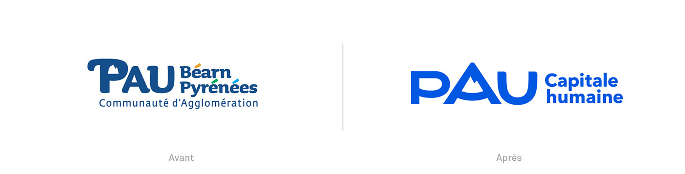
Several identities have followed one another since 1971. The last one was signed "Pau Porte des Pyrénées" and was designed in 2011 by Dragon Rouge agency. With the creation of the Pau Béarn Pyrénées conurbation in 2017, a project to harmonize brand architecture was initiated. The objective was to create the territorial brand "Pau Capitale Humaine" and to rationalize all the city's brands. It was also a question of designing an editorial charter adapted to all sectoral public policies: supply of services, equipment... in order to allow identification and readability of all the city's communications.
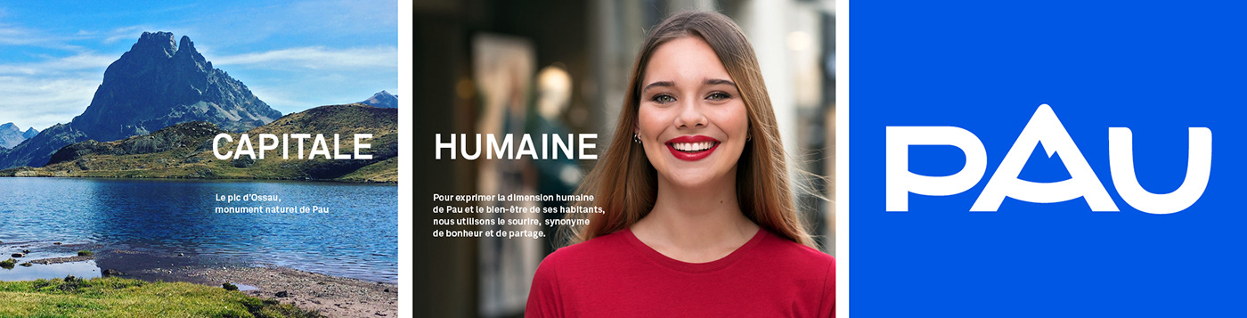
At the root of this demand: the evolution of the old "PPP" logomark in order to create the main brand "Pau capitale humaine". This territorial brand emphasizes the territory's quality of life: its human size, its cultural dynamism, its economic attractiveness. A territory that has the same assets as Paris, but that is 1h30 from the ocean, the first slopes of the Pyrenees and Spain.


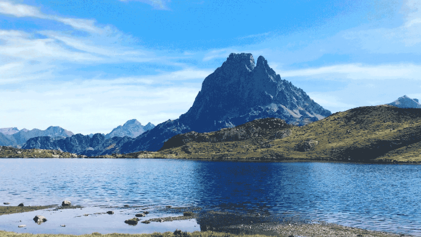
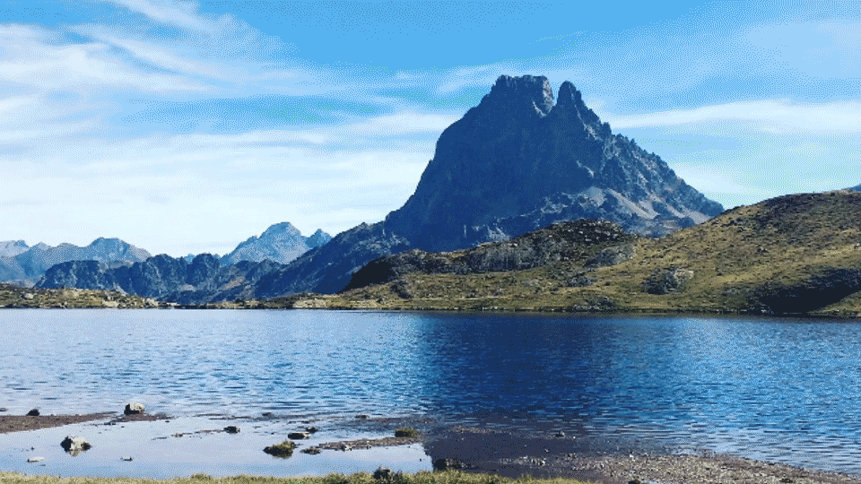
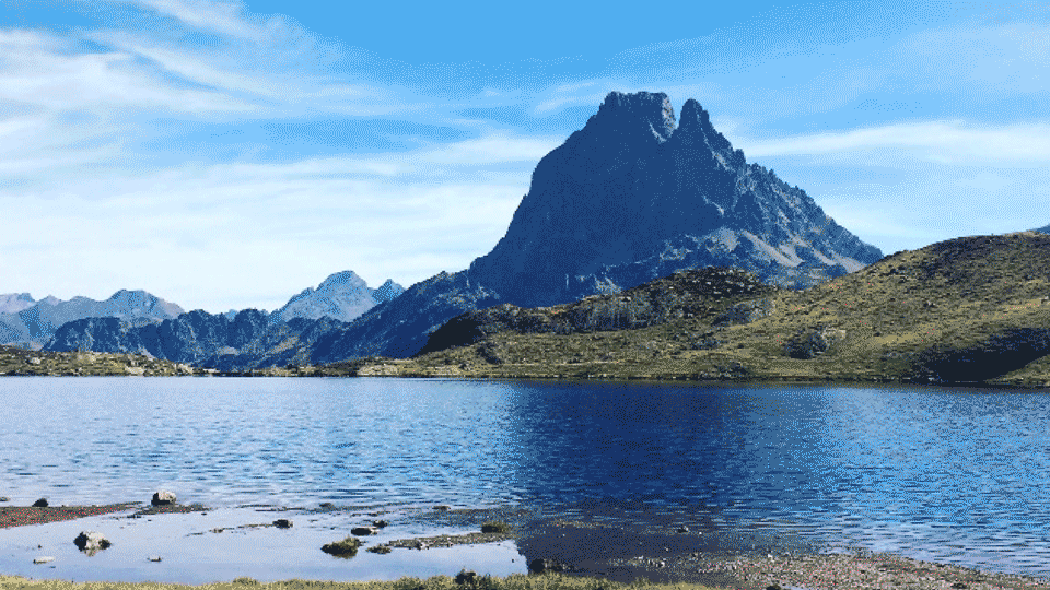
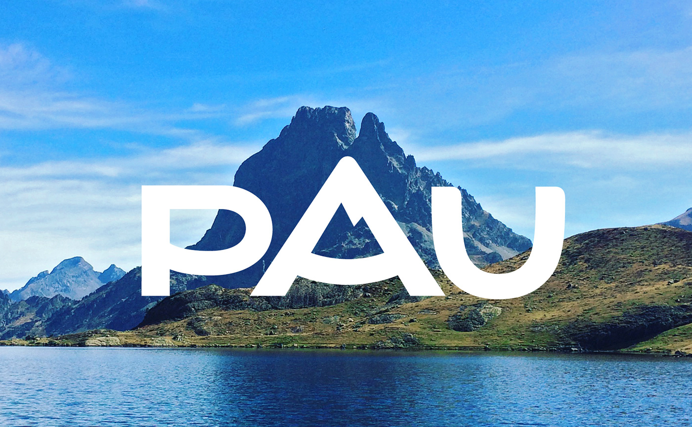
Ossau peak, the Mona Lisa of Pyrenees mountains
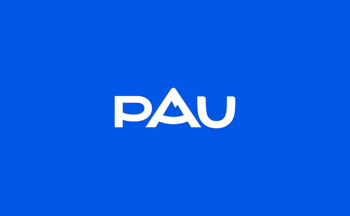
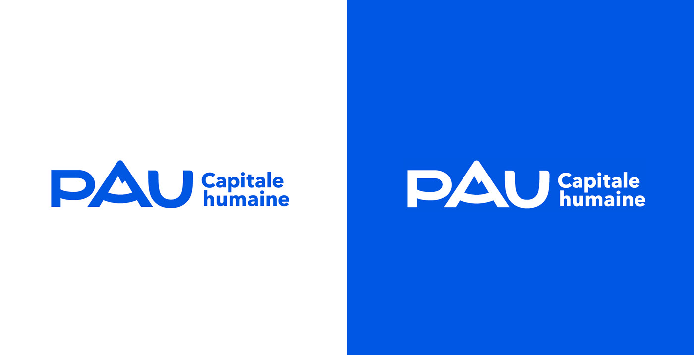
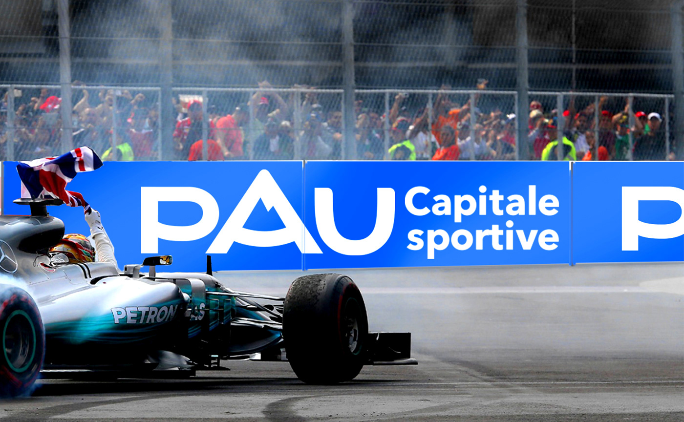
The combination of roundness and typographic redesign for the facelift of this worrmark fulfils two objectives: capitalizing on the very human character of the city - with a smiling typography - and institutionalizing the territorial brand. Our facelift of the urban area's visual identity has made it possible to create the PAU wordmark common to all identities.
Each capital has its own totem, Pau has its Pyrenees mountain. The integration of the peak icon was previously within the letter P. We decided to move the counter-form to the letter "A". This transformation allows a rebalancing of the typogram and gives Pau a greater harmony around a pyramidal construction.
By removing overly decorative finishes, all attention is focused on the "capital A" and its Ossau Peak. Blue colour directly evokes the Pyrenean environment. We kept the blue of the logo and brightened it to give Pau a unique "Nousté Blu" colour ["Our blue" in Béarnais, the local dialect].


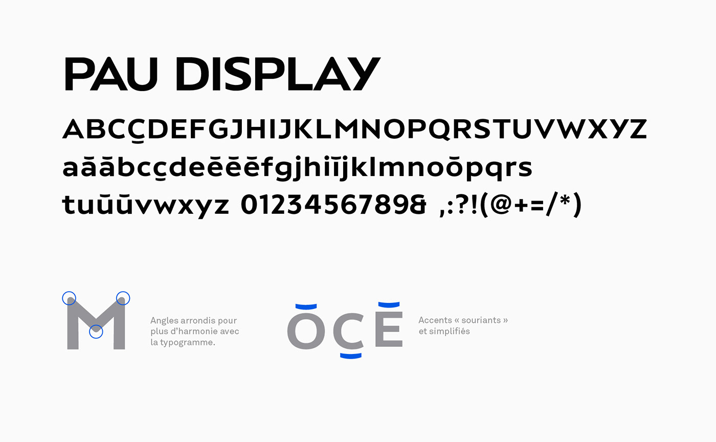
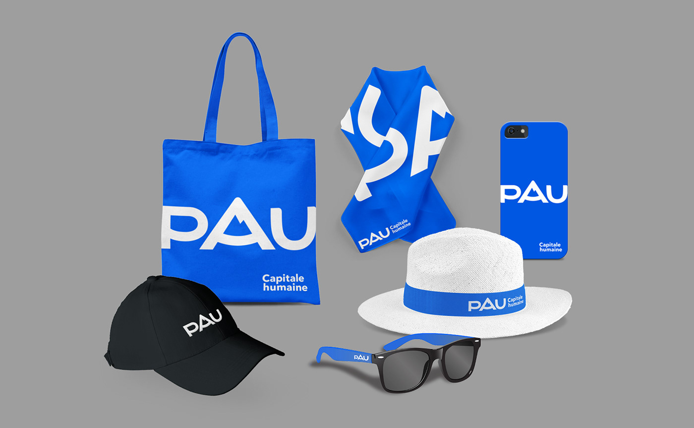
A custom typography, the Pau Display typeface
From this tailor made wordmark was born the dedicated Pau Display typeface. This typography used for the whole communication is an inhouse font creation. The exclusive Pau Display typography extends the wordmark identity with capital letters and lowercase letters inspired by Art Deco, smiling and generous. This dedicated typography, which is used across all communication media, completes and widely disseminates the visual identity.
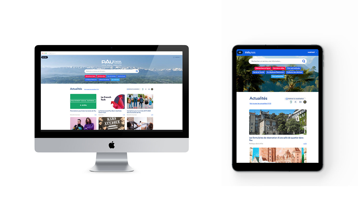
The creation of PAU logotype allows the construction of a strong and memorable brand platform. The wordmark principle is integrated into all the subbrands: Ville de Pau, Pau Béarn Pyrénées Communauté d'Agglomération, Pau Mobilités and Pau Béarn Pyrénées Tourisme. It's also used for all the city's sectoral public policies, events and infrastructures.
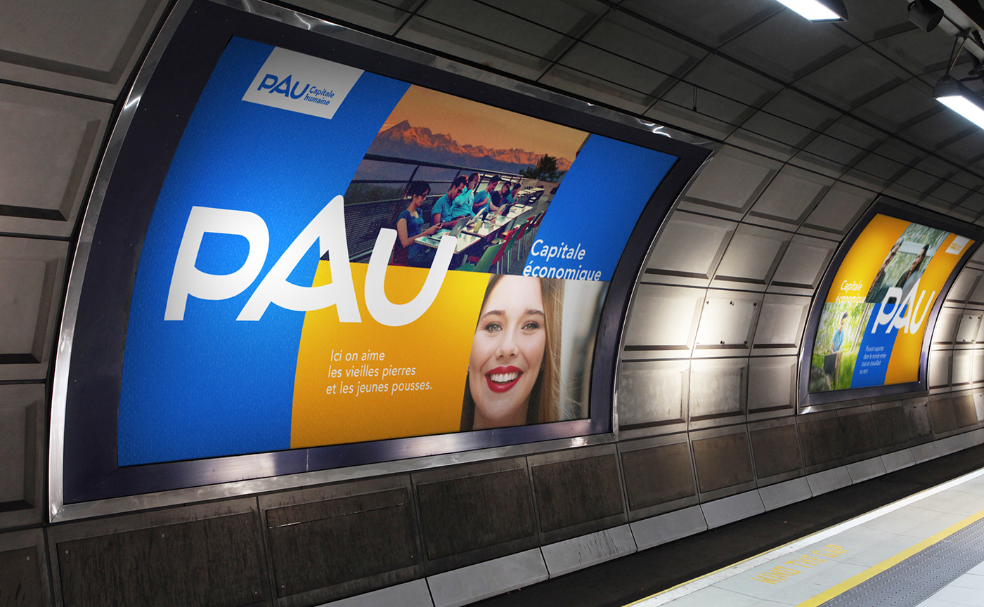
The anaphor of the word "capital" reinforces territorial communication and makes it possible to clearly identify the sectoral policies carried out in the idea of a label that marks out communication campaigns: Pau Economic Capital, Pau Green Capital, Pau Cultural Capital... The identity of the city is articulated around a brand architecture which is spred to all its services and policies thus allowing an excellent identification.
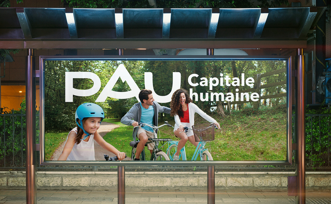
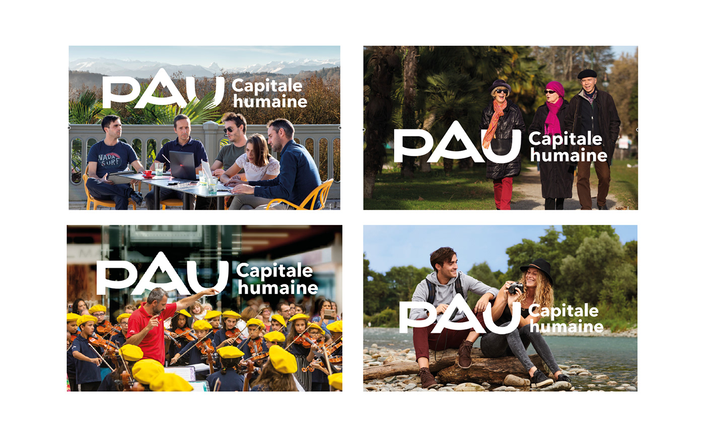

Pau Capitale Humaine communication campaign
The composition principles play on reconciliation of antagonisms and in particular call for smiles and good living in an urban environment.
For the launch of the territorial brand, a poster campaign unveiling the Pau Capitale Humaine logo, combining an iconography that shows the good life of the territory, was distributed throughout the city. Graphéine was in charge of the artistic direction, casting and shooting of these photographs taken directly in Pau.
For the launch of the territorial brand, a poster campaign unveiling the Pau Capitale Humaine logo, combining an iconography that shows the good life of the territory, was distributed throughout the city. Graphéine was in charge of the artistic direction, casting and shooting of these photographs taken directly in Pau.
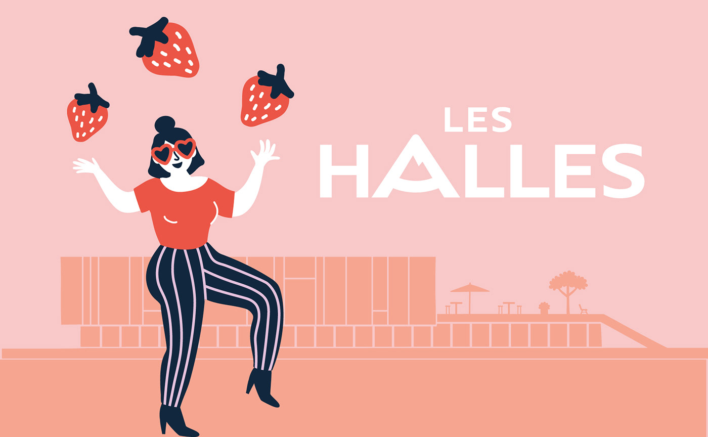
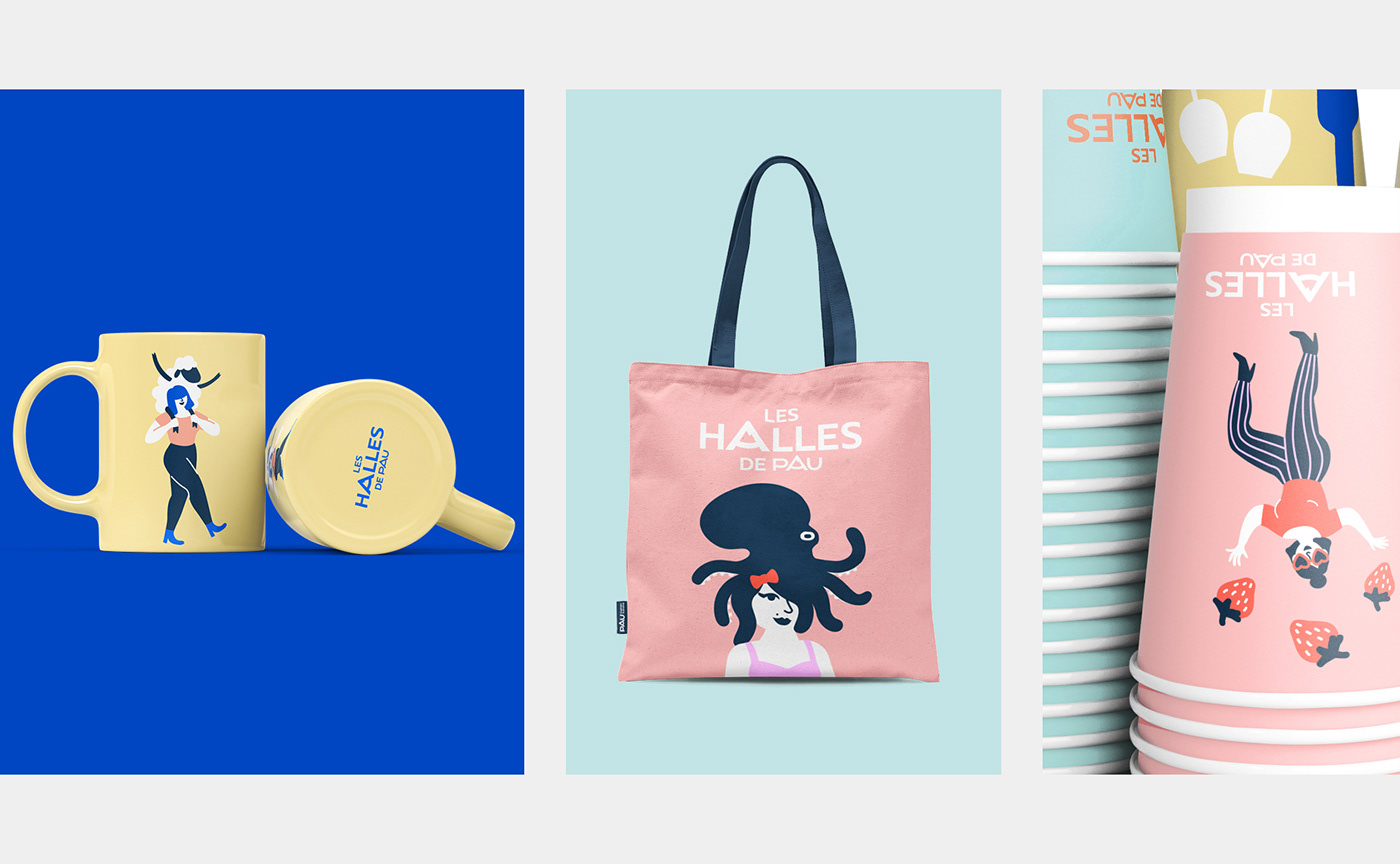
The local producer market
The city's covered local market have been undergoing renovation since 2017. For the reopening of the area dedicated to retailers and restaurants, our agency also supported the SPL des Halles for the creation of its own brand identity. The city's wordmark has been adapted for the local market and is accompanied by a festive and colourful communication. A series of illustrations integrating characters, animals, fruits, vegetables... at the heart of humorous and offbeat scenes sets the tone. These illustrations work in series; they are adorned and evolve over the course of the various festivities.


Learn more about this project:
[FR] https://www.grapheine.com/portfolio/pau-capitale-humaine-identite-visuelle
[EN] https://www.grapheine.com/en/portfolio/pau-capitale-humaine-brand-identity
[FR] https://www.grapheine.com/portfolio/pau-capitale-humaine-identite-visuelle
[EN] https://www.grapheine.com/en/portfolio/pau-capitale-humaine-brand-identity
Credits:
Creative direction: Jérémie Fesson
Art direction: Maxime Saint-Etienne, Ajitesh Lokhande, Manon Moreau
Project management: Leslie Darné
Type design: Graphéine / Elliott Amblard
Creative direction: Jérémie Fesson
Art direction: Maxime Saint-Etienne, Ajitesh Lokhande, Manon Moreau
Project management: Leslie Darné
Type design: Graphéine / Elliott Amblard
Illustrations: Manon Moreau
Motion Design: Cowbell Studio
Models: Sindy Bop
Photography: Julien Dominguez
Make-up: Emily Fontaine
Motion Design: Cowbell Studio
Models: Sindy Bop
Photography: Julien Dominguez
Make-up: Emily Fontaine


