


Prior to APEX, the themes of Burnaby North yearbooks have typically followed light and whimsical colour schemes. Taking inspiration from Swiss design and minimalist trends, our intention when designing this publication was to deviate from the norm and surprise students with dark colours, modernist elements, and an asymmetrical layout.
The concept of APEX is meant to demonstrate that while each student at Burnaby North has undergone a different journey, they each strive to achieve their full potential. As our school is situated on top of a hill, we felt that it would be appropriate to focus our theme around "the path to the top." This ties into the theme of APEX through several elements, including section names and focal images.

The cover showcases several repeating elements found in the theme, such as the folio, section shapes, and the asymmetry. The main element on the front cover folds over the spine, inviting viewers to see the book as a whole.

The colour scheme used across sections of the yearbook.

The opening page of the yearbook. The image features a student with a viking helmet looking up towards a large statue of the Burnaby North mascot; a viking. The image is overlaid with geometric details created in Adobe Illustrator.

Each divider pages features a horizontal bar with information denoting the prescribed colour and shape for that section.

Following the asymmetrical theme, the page number can be found in the right side margin of each spread, two-thirds of the way down the page.

Each spread of APEX is built on an 8-column layout. In the bottom left corner of each spread, the shape rotates depending on the page number.
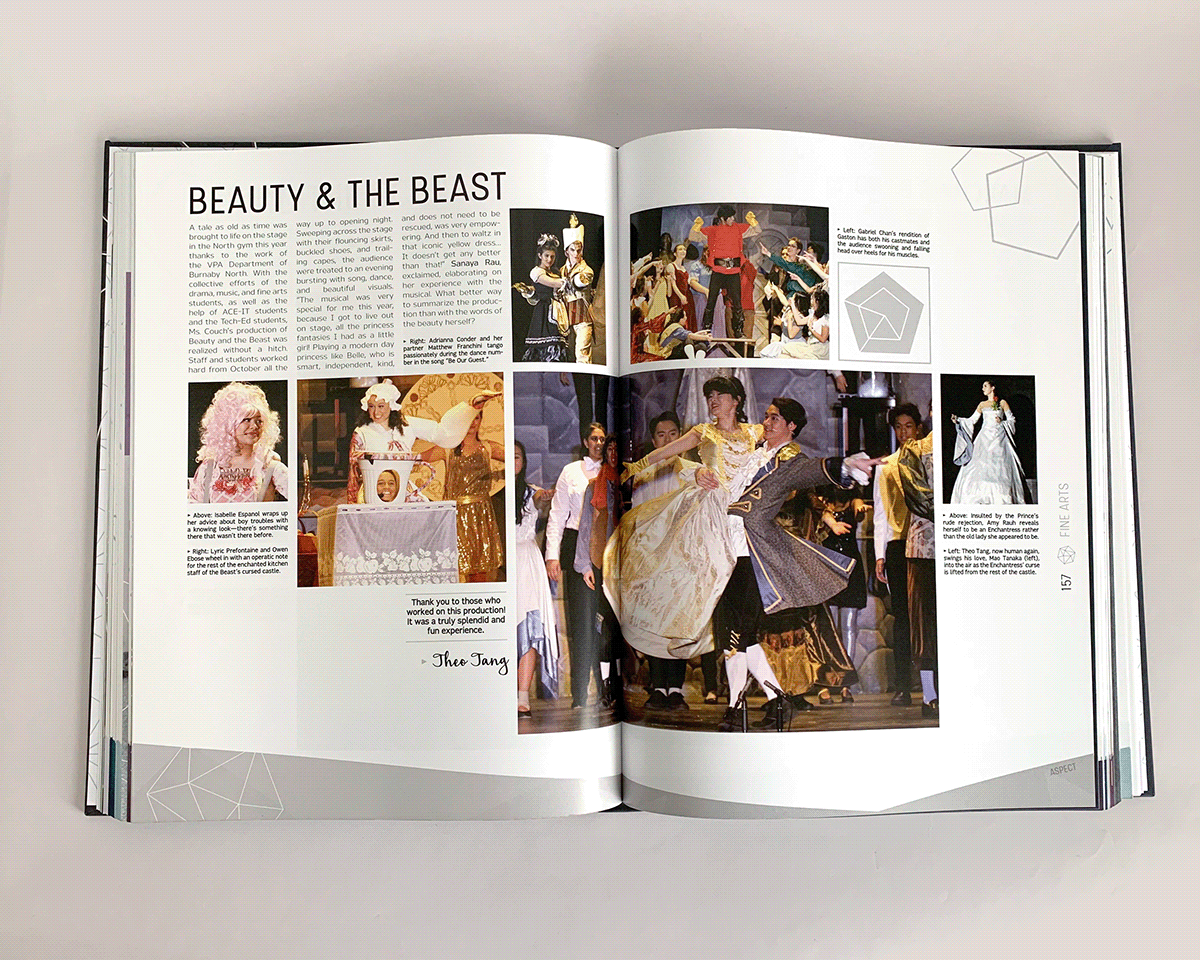
A second layout, this one done on the annual musical.

The index section of the yearbook. Every single number was indexed manually.


