


D’Carts and Baskets Shopping Mart
Overview
D'Carts and Baskets Shopping Mart is a local, family-owned grocery store in the Philippines that caters to a small community and sells local food goods, pantry staples, household supplies, and other daily essentials.
What We Did
Logo Design
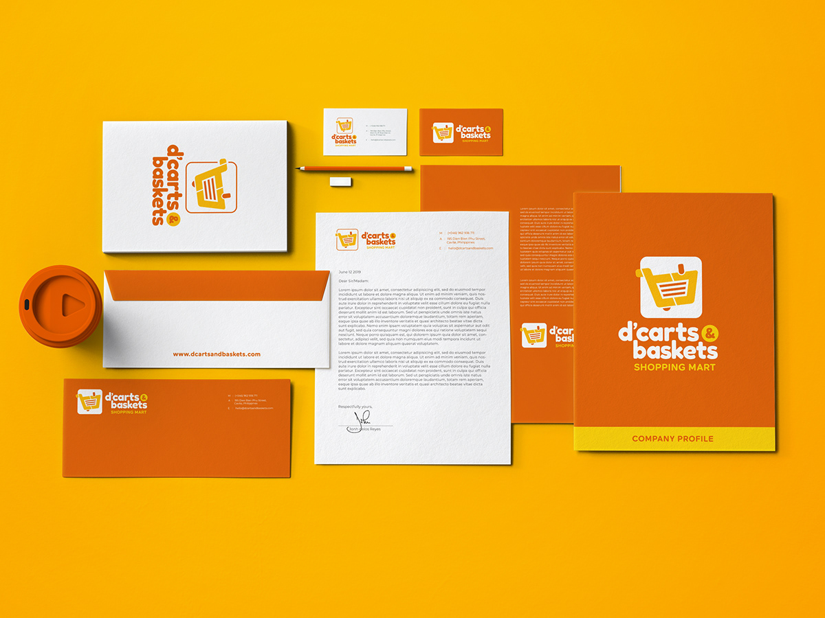
Brand Identity

The Challenge
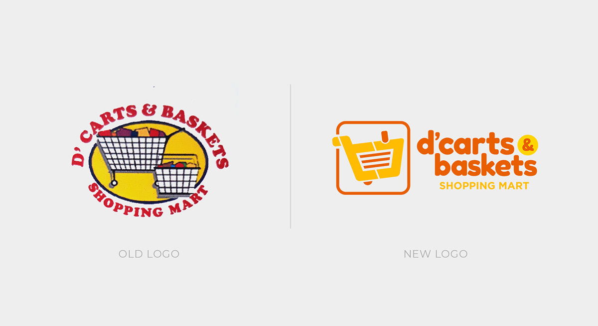
D’Carts and Baskets Shopping Mart has been in the business for more than a decade now. Over the years, they have already established trust and built confidence with their customers. But in order to stay contemporary and fresh, and therefore keep up with market changes, they decided to evolve their corporate identity.
The new identity has to reflect the brand’s personality, and tell the company’s story in a way that creates excitement and loyalty.
The Solution
Before we began crafting the brand identity, we first tried to identify D’Carts and Baskets' business goals, target market, and their positioning. We then used these information to craft a brand experience that visually communicates the brand's personality in a way that resonates with their intended audience.

THE LOGO
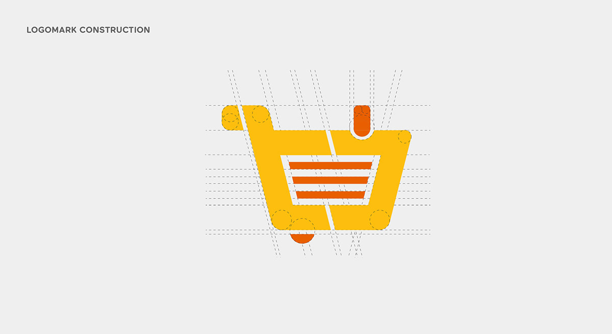
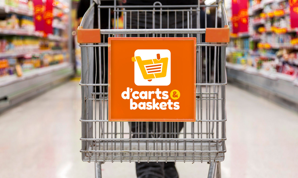
We explored different approaches to the logomark, including abstract/symbolic ones that communicate the brand’s values and inner workings of the company. But in the end, we opted to go literal because we think it’s the right direction for the client and their needs.

We also tilted the logomark slightly upward to convey movement and forward direction, and somehow give it a feel of being active.
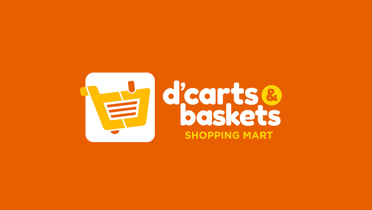

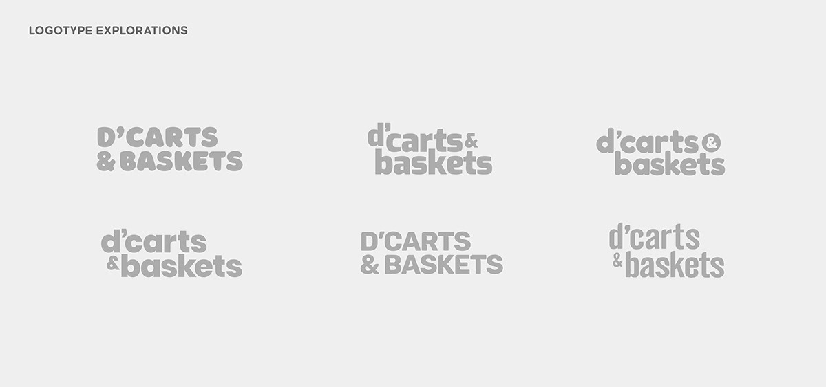
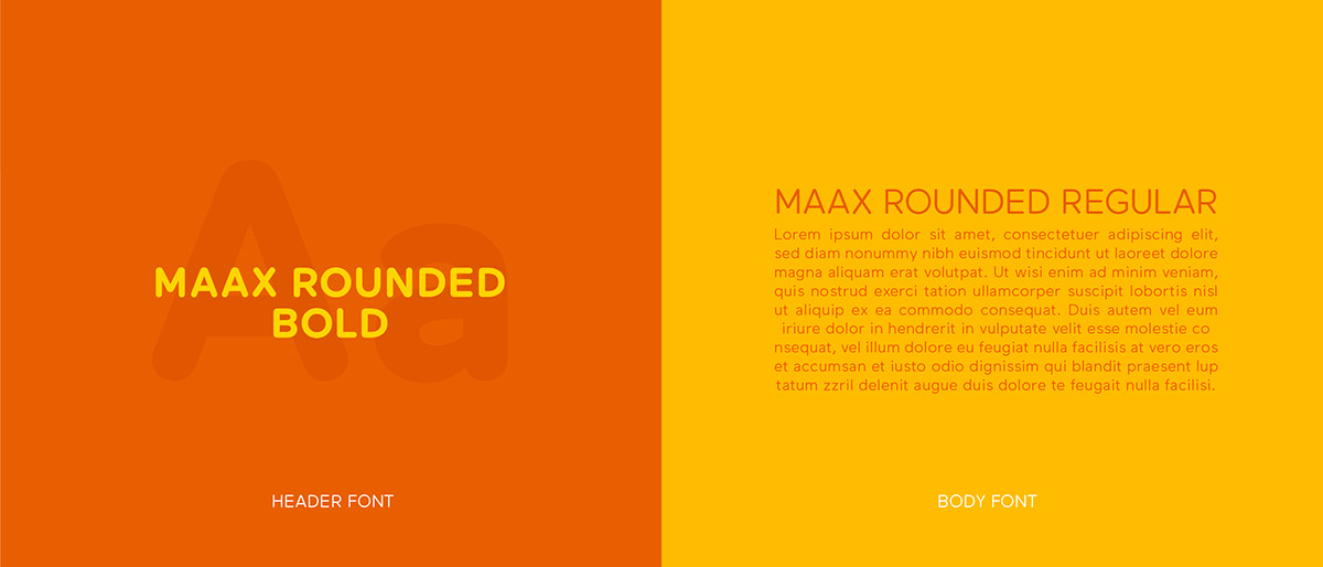
We experimented with different typefaces for the logotype, but we decided to go for a modified Fredoka One Regular. This bold and rounded typeface imbues the logo with an approachable, casual, and inviting vibe. We also think that the use of lowercase letters helps reinforce that message.
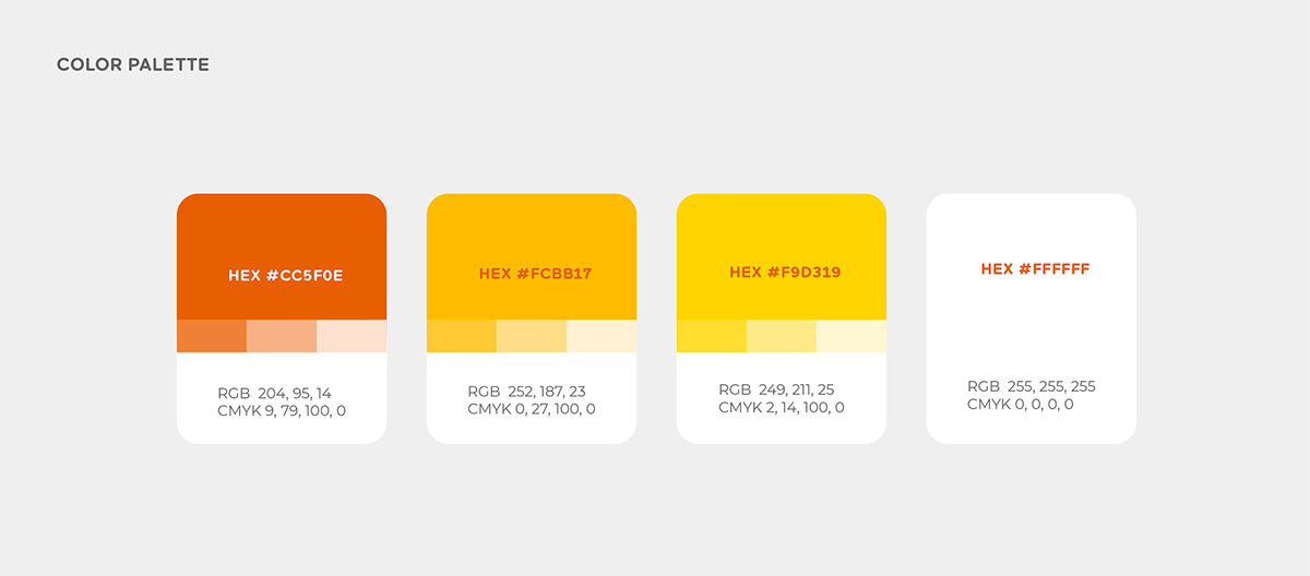
We decided to use orange as the brand’s primary color as it is associated with good value, and communicates a message of affordability yet of reasonable quality. It also reflects sociability and warmth, which suits the brand’s goal to express friendliness as well as outstanding customer service. Also, we think this color differentiates the brand from its competitors which use red, blue, and green for their visual identities.


Ready to freshen up your brand?
Reach us at hi@kintalcreativestudio.com or visit us at www.kintalcreativestudio.com


