
Interstate began as a personal challenge to build a typeface from the unlikely source of highway signs. By any traditional measure, the design is full of shapes that are “wrong” but are still essential to its personality. I redesigned every original shape and extrapolated missing characters such as reference marks, currency symbols, and foreign accents, using a light touch to preserve the durability and stumbling, dissonant charm. (Designed 1993–1999)
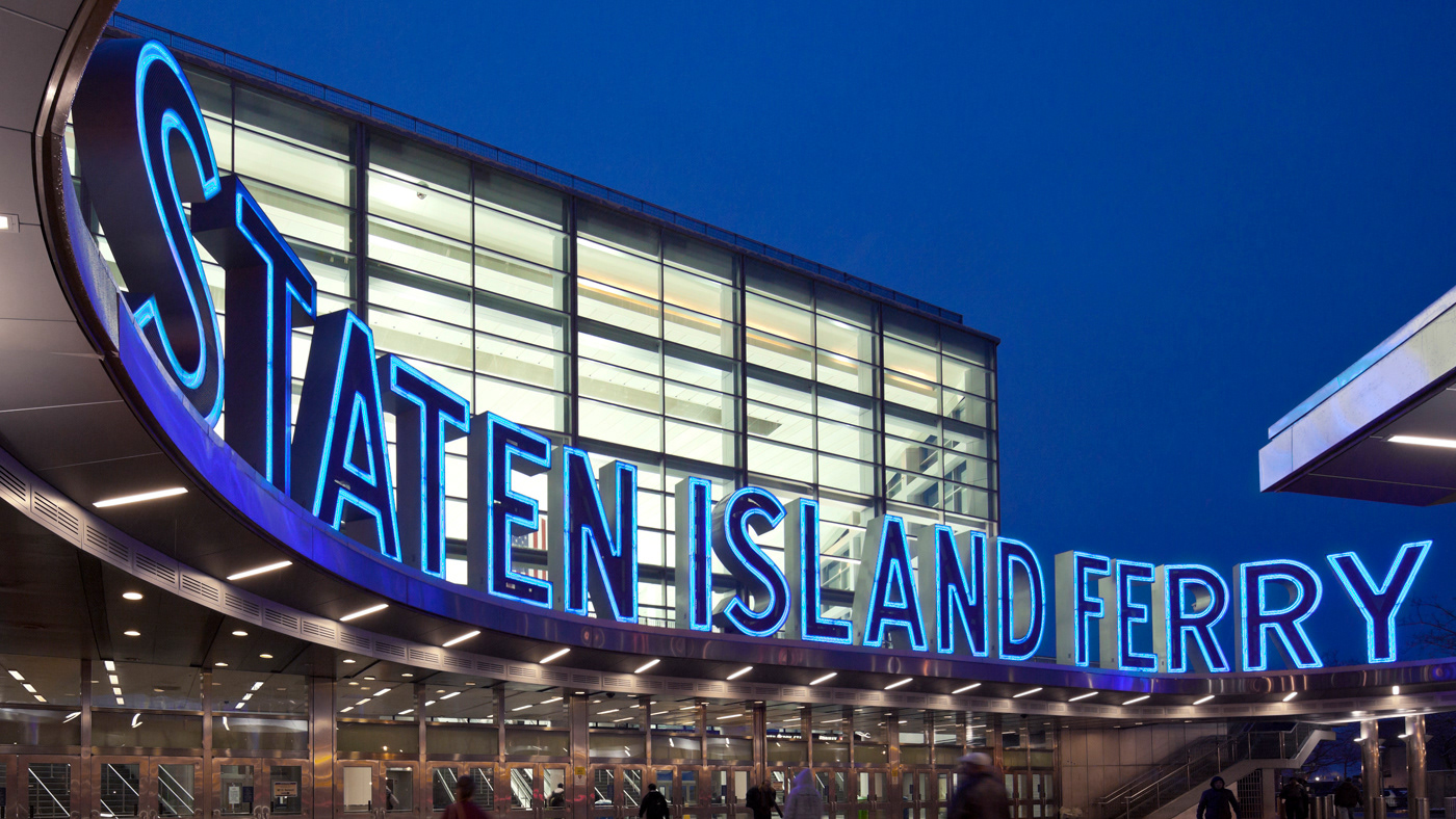
Interstate in use: Staten Island Ferry signage, Alexander Isley
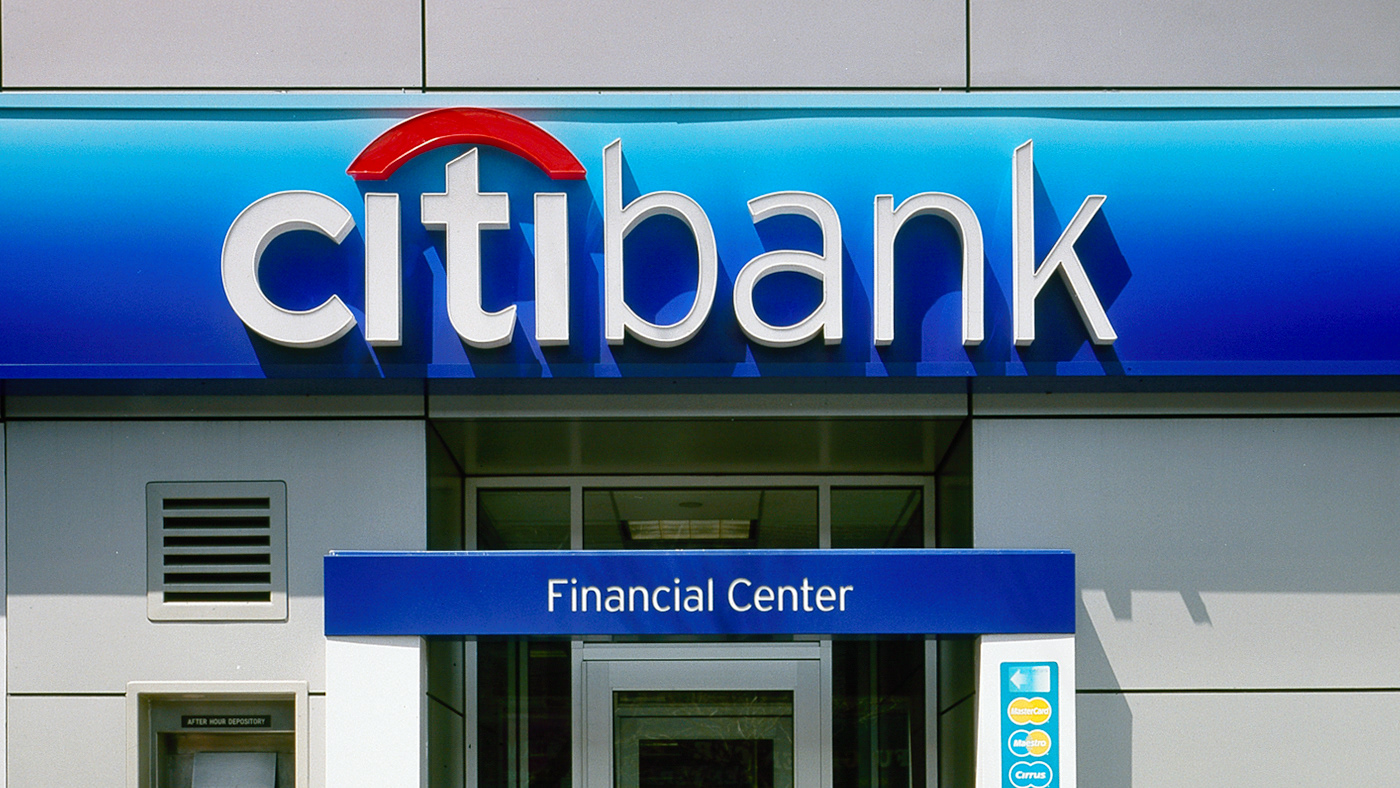
Interstate in use: Citibank identity system, Paula Scher/Pentagram
