Magna & York
-
We own and lease multi-family buildings in Manhattan and we also own land and develop it as multifamily buildings in Manhattan.
We run our business with the highest degree of honesty, integrity and efficiency.
I like to compare our business to a "Patek Philippe" watch. It is seamless, elegant and will stand the test of time and you can always rely on us - whether you are a market player or participant or a tenant.
Our Word is our Bond.
I like to compare our business to a "Patek Philippe" watch. It is seamless, elegant and will stand the test of time and you can always rely on us - whether you are a market player or participant or a tenant.
Our Word is our Bond.
-
Client / Magna & York
Services / Brand Identity, Print Design
Year / 2018
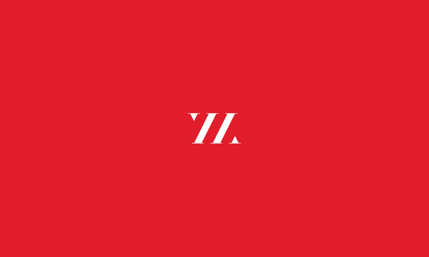
Logo
-
Request
-
The logo needs to be clean and elegant. No bells and whistles, nothing cheesy and tacky. Please also no buildings in the logo since that is what everyone does in real estate in New York.
Solution
-
In this historical moment in which the graphic trend is the use of sans serif fonts, I decided to use a serif font to build a logo that went against the schemes dictated by fashion. It is with this objective that the current logo for Magna & York was born.
-
The logo needs to be clean and elegant. No bells and whistles, nothing cheesy and tacky. Please also no buildings in the logo since that is what everyone does in real estate in New York.
Solution
-
In this historical moment in which the graphic trend is the use of sans serif fonts, I decided to use a serif font to build a logo that went against the schemes dictated by fashion. It is with this objective that the current logo for Magna & York was born.


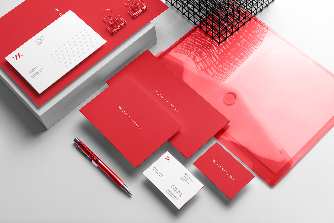
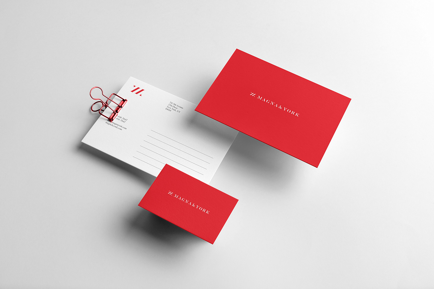
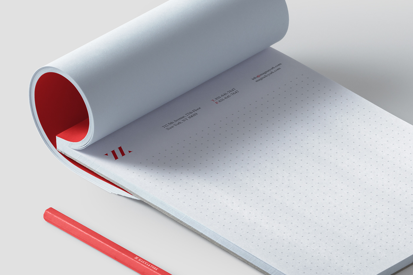
Stationery
-
"Our Word is our Bond"
I wanted to respect this quote, so I decided to create an extremely minimal stationery.
The only thing that matters is the name of the company and its contacts.