VIMO is a Cryptocurrency exchange.
The most interesting aspect of this project was that I get to know and research a completely new domain for me (trading) in order to deliver a good interface to our users.

Product Design
Benchmark
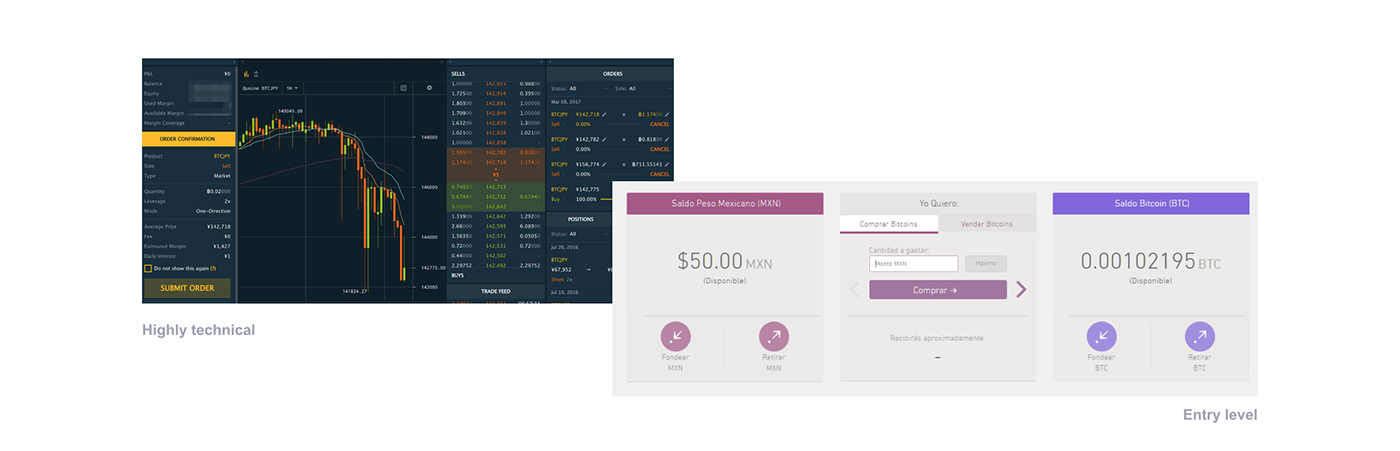
Analyzing our competitors, we realized that there were two types of cryptocurrency exchanges in the market:
• Entry level exchanges. You buy and sell, but without any analytical tools
• Pro level exchanges. Fully featured set of tools to trade
Since in Mexico cryptocurrencies were not new but also not highly adopted, we decided to be appealing to a set of people that already know crypto, but is not a pro trader.
The issue with pro level exchanges is that they're somewhat intimidating at the beginning and we wanted to remove this barrier.
Discovery stage
As a team we knew very few about asset trading, so aside from consulting our client and domain experts we did some real life Cryptocurrency Trading to gain knowledge about the needs of a platform like this.
At the same time we started making sense of the app creating an Information Architecture.


The discovery research and Information Architecture was one of the first cross-functional team efforts in which I have participated. The visual design was also the result of the work we've done here. I want to thank my developer teammates: Zura Guerra, Wendy Fabela, Alejandro Cuenca, Arturo Vergara, and José Nieto, as well as the captain of this project David Noriega, to show me the good way and helped this project with their effort and excellent input.
Findings
As we watched people trading and did some trading on our own, we learned that an informed trade is a better trade, and two pain points started to stand out:
⚠️ Critical data was not at hand
While trading, there are mainly two charts you want to check: Order book and Trading history. With this two you can analyze trends and check if your order fits the market or if there are orders that clearly will block yours, etcetera.
In some of the trading platforms we watched and used, this data is not always at hand, and sometimes we had to open two or three different windows to check everything at once. This is a flaw in the overall trading experience, more if you are not a professional day trader and don't have 3 displays, or a huge screen at your disposal.
⚠️ When critical data was there, it wasn't easy to consume
Some of the pro exchanges we checked display this information but in a format that is not scannable. In our experience as casual day traders, we learned that you really need to be able to check information fast.
Proposed Solution
After some brainstorming and sketching I came up with a wireframe that tried to solve this two issues: Have all the information at hand, and make that information easy to read, also letting you make a trade in place.


First wireframe after sketching and discussing solutions with the team
Visual Design
Since VIMO is a heavy data application, we wanted to be nice to the eye and make it dark mode by default. Besides from that, the color scheme represents very well the voice of the brand so for me it was a win win decision.
Brand
This was of course a very small exercise of branding since all my design efforts were focused on the product, but it was also an opportunity to give a voice and personality VIMO.
The concept came from putting together the trading bars and the letter V. The idea for the name came from Wendy Fabela in a brainstorming session by putting together the words Virtual Money.
Talking about typography, I used Avenir because of it sober personality and also because it's numbers work very nice; their width is so homogeneous that is closer to a monospaced font.

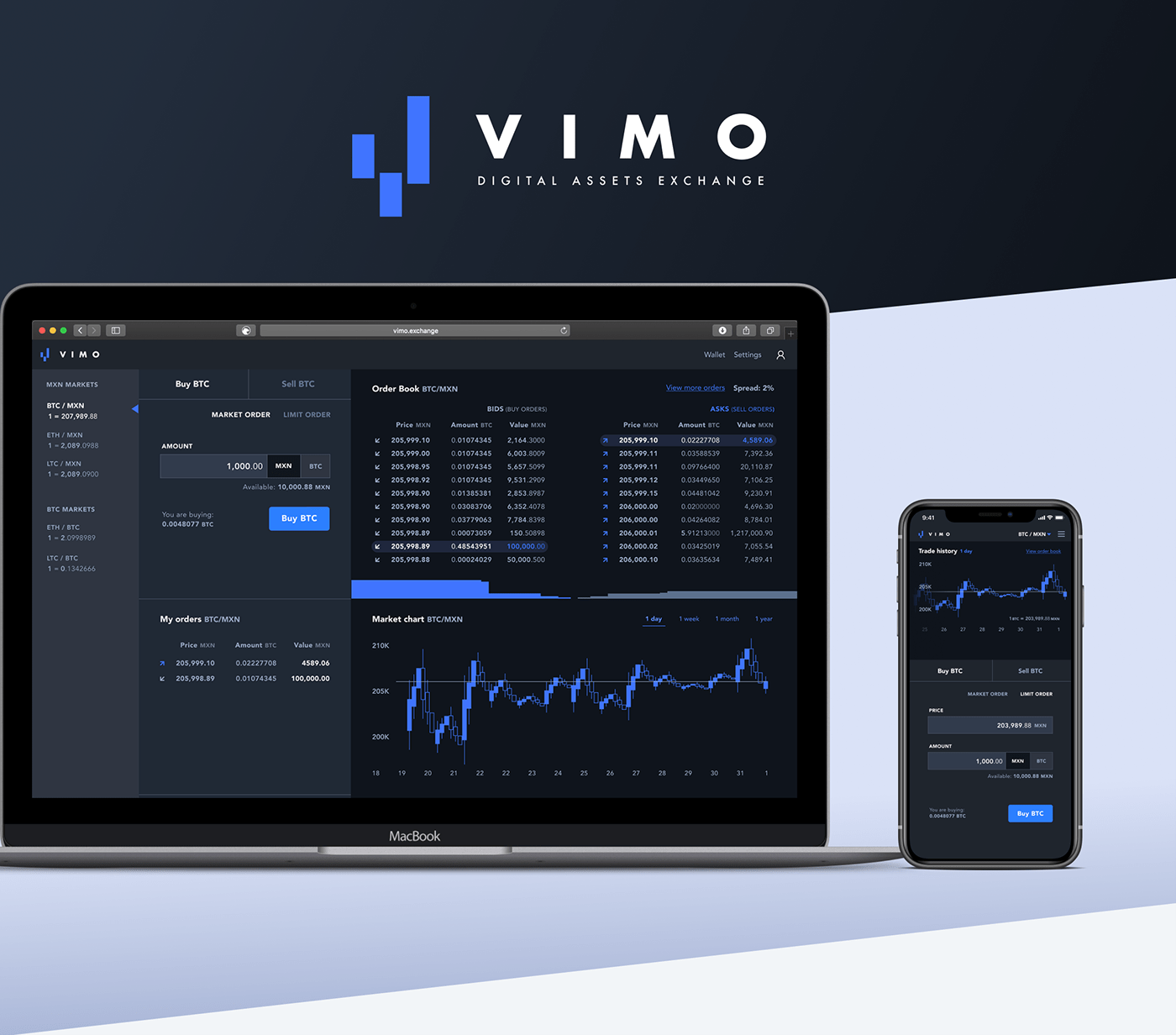
UI Design
Trade Component
This component is the core of the platform if we think about it from the point of view of buying and selling digital assets. I designed this component thinking in clarity and compactness in order to have more screen real estate to display the order book and trade history, which have been proven to be critical according to our discovery research.
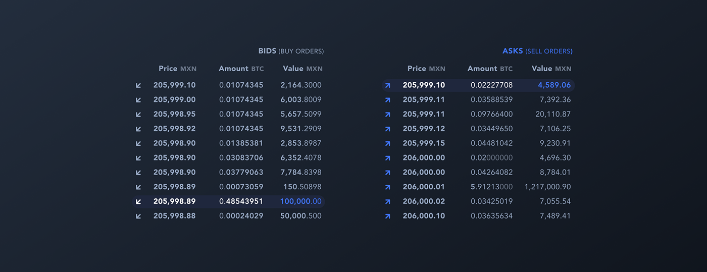
Order book
The main goals we look to perform at an order book are:
- Look at the highest bid versus the lower ask
- Have a clear vision of your order against the orders from other users. (is it blocked?, are you being outbided?)
Those task made clear that it would be easier to read if we had bids and asks side by side and not in a big column as in many trading platforms.
Trading History
The goal here trying to look at trading patterns or trends. The component is standard and straightforward, with customizable time frames. My contribution was to design this screen in order to make this component visible without needing to scroll and not to say, go to a different page to look at this type of information.

The end
I share here with you the main final screens (remember you can click to see them in full res).
It was a very ambitious project in which I learned a lot, and somehow kept me in the fintech sector : )


