

About
—
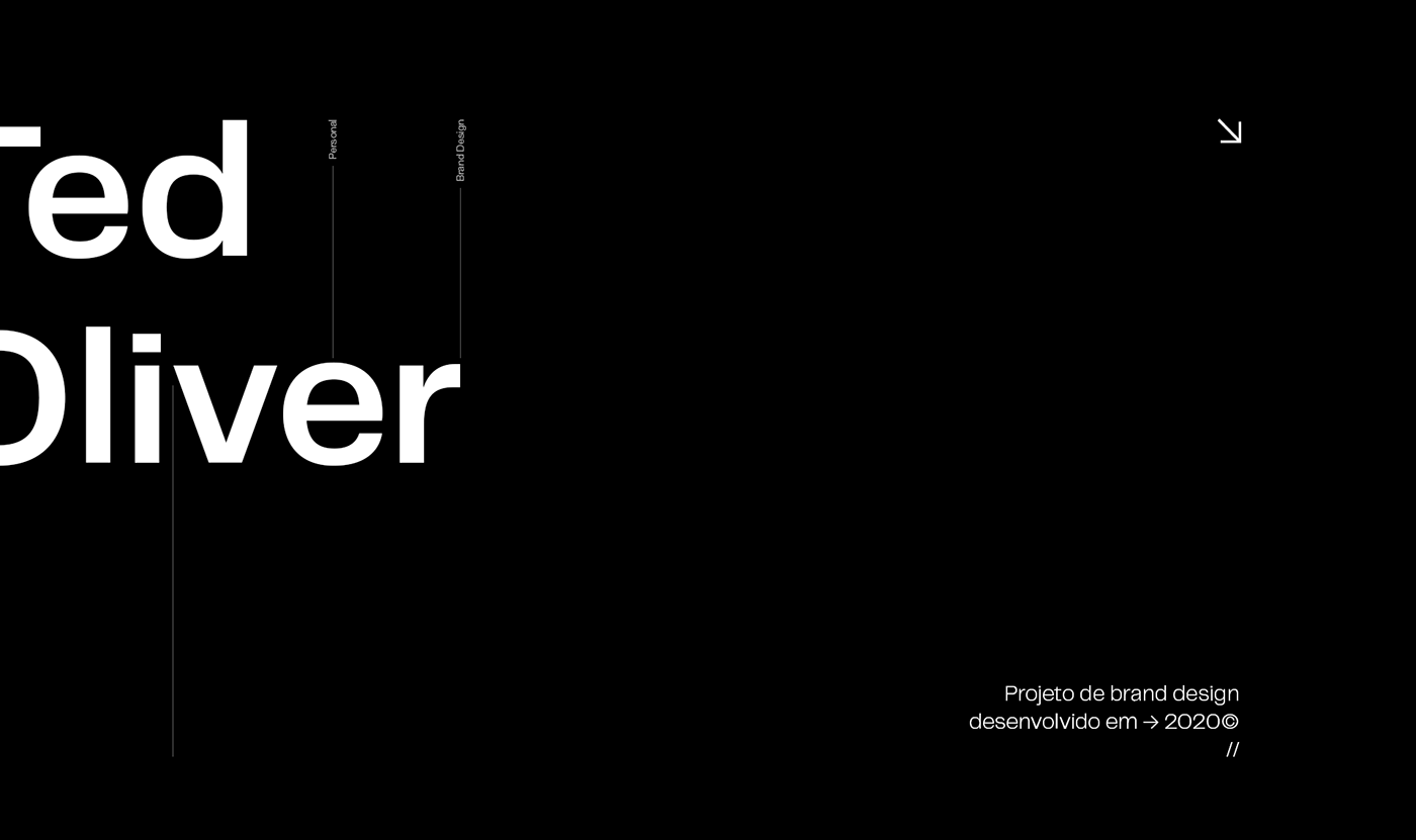
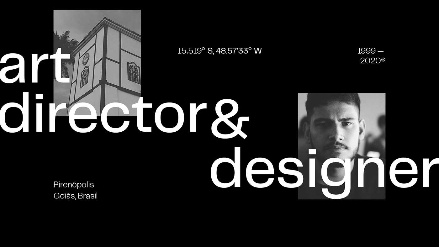
Ted Oliver, stage name of Tiago Souza Oliveira (20 years old), born in Pirenópolis — small town in the heart of the interior of Goiás, Brazil — Brazilian art director, and designer with more than 5 international and national design awards.
Project
—
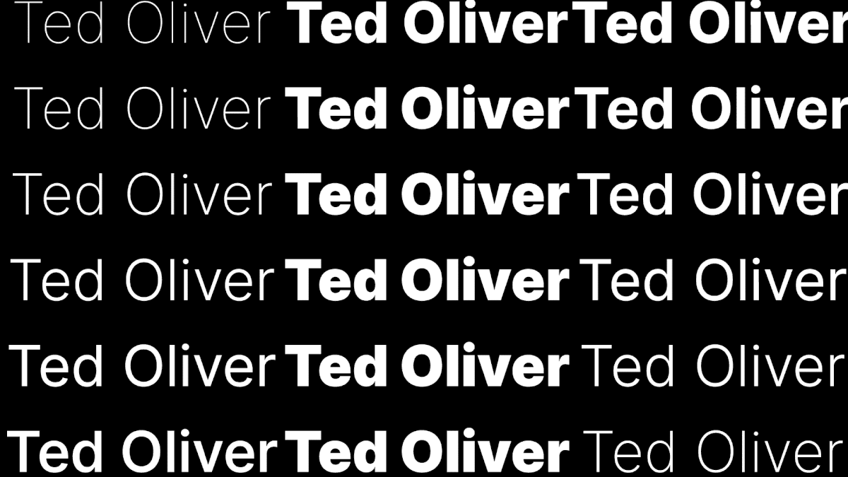
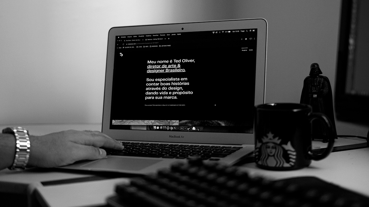
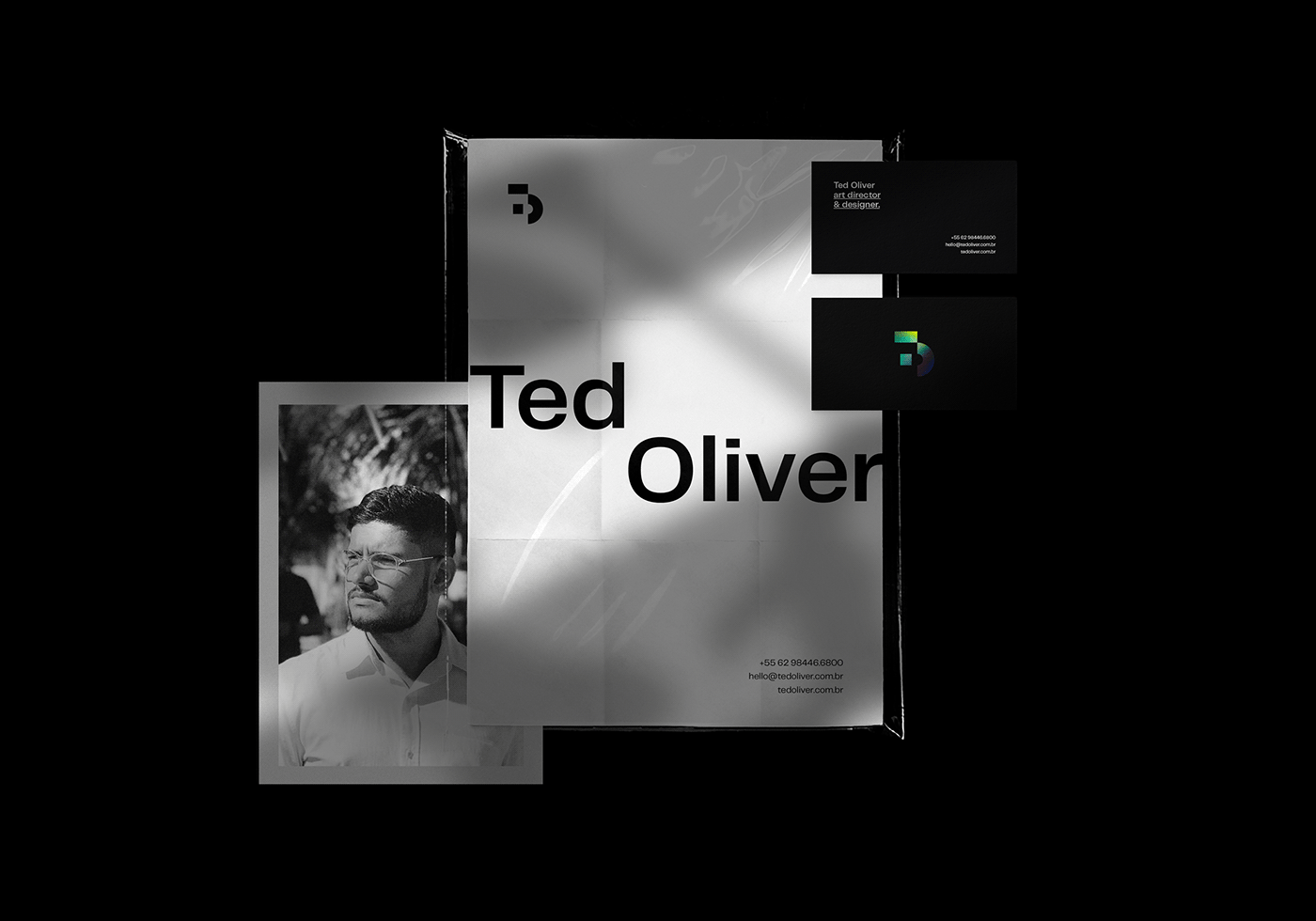
After positioning myself professionally as an art director, the need arose to create an identity for my personal brand and improve my online presence. A logo, brand guidelines, animated identity, business cards, institutional materials and a portfolio website were developed, thus becoming a complete visual identity with easy identification and memorization.
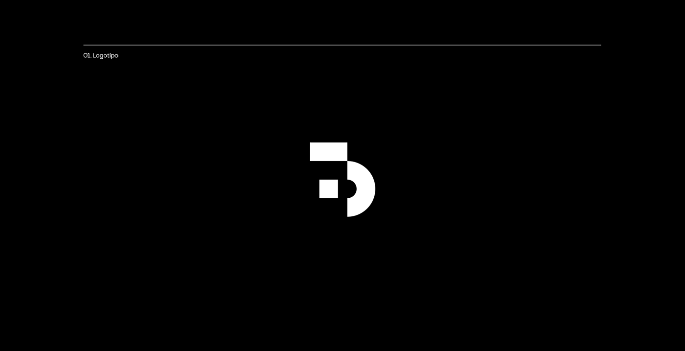
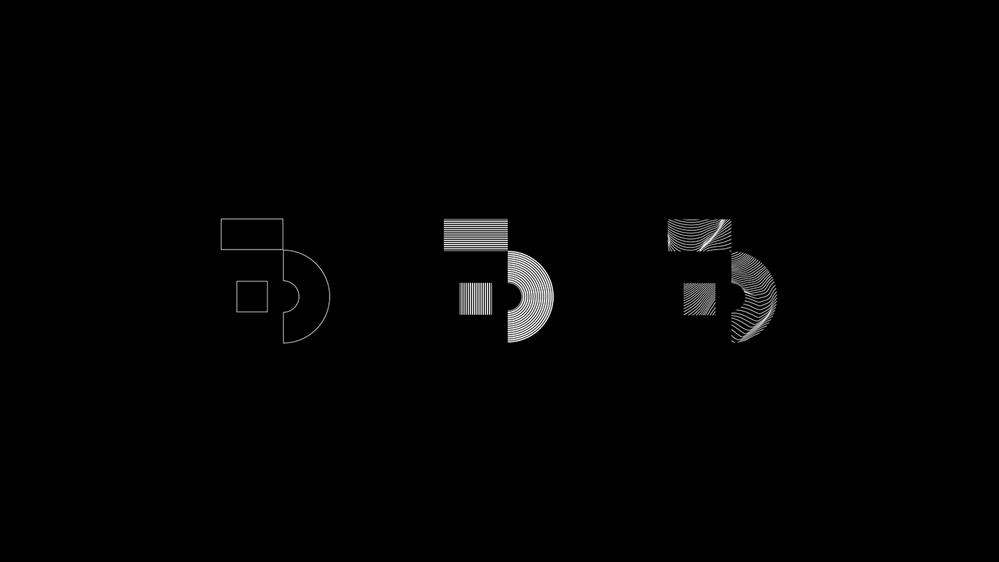
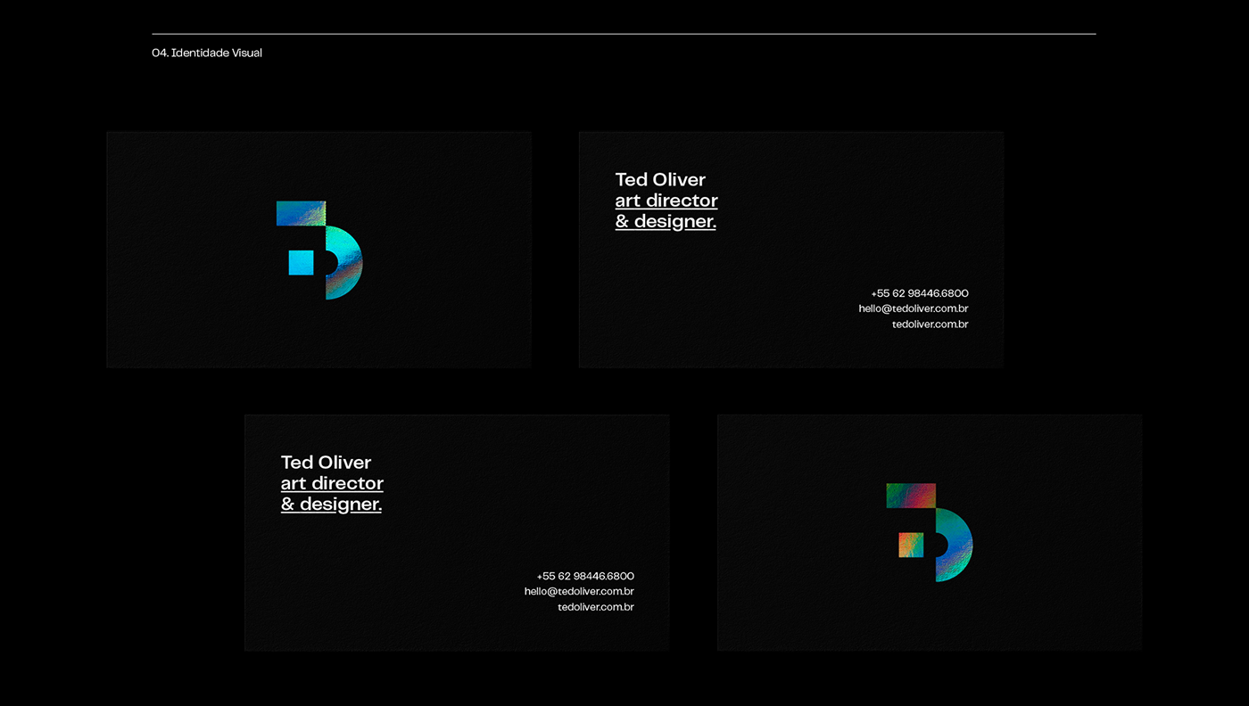
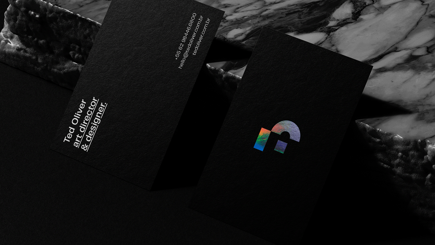
The initial letters of Ted Oliver, "T" and "O", were used in the logo monogram with disruptive geometric shapes, giving the slight sensation of dynamism and movement - with a strong influence on Hans Richter's aesthetics.
↓
Sobre
—
Ted Oliver, nome artístico de Tiago Souza Oliveira (20 anos de idade), nascido em Pirenópolis, pequena cidade no coração do interior de Goiás, Brasil. — É um diretor de arte, designer gráfico e motion designer brasileiro com mais de 5 premiações de design internacionais e nacionais.
Projeto
—
Após me posicionar profissionalmente como um diretor de arte, surgiu a necessidade de criar uma identidade para minha marca pessoal e melhorar minha presença on-line. Foi desenvolvido logotipo, diretrizes da marca, identidade animada, cartões de visita, materiais institucionais e um site de portfólio, tornando-se, então, uma identidade visual completa com fácil identificação e pregnância.
No logotipo foram utilizadas as letras iniciais de Ted Oliver, "T" e "O" como um monograma com formas geométricas disruptivas, dando a leve sensação de dinamismo e movimento - com forte influência na estética do Hans Richter.


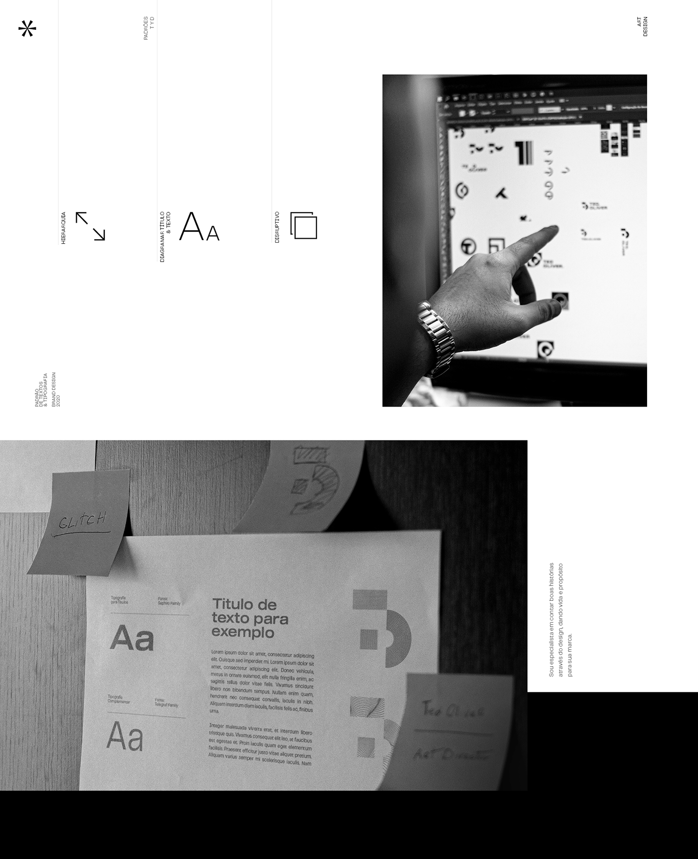
Hierarchy
—
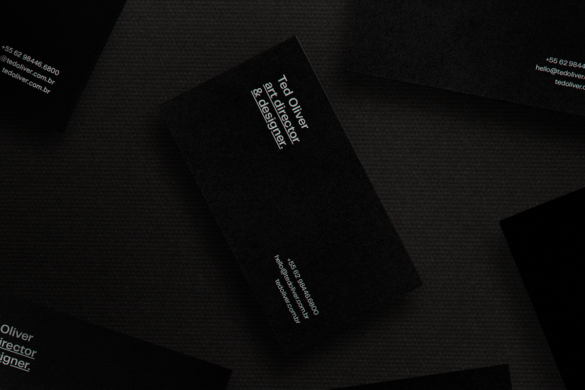
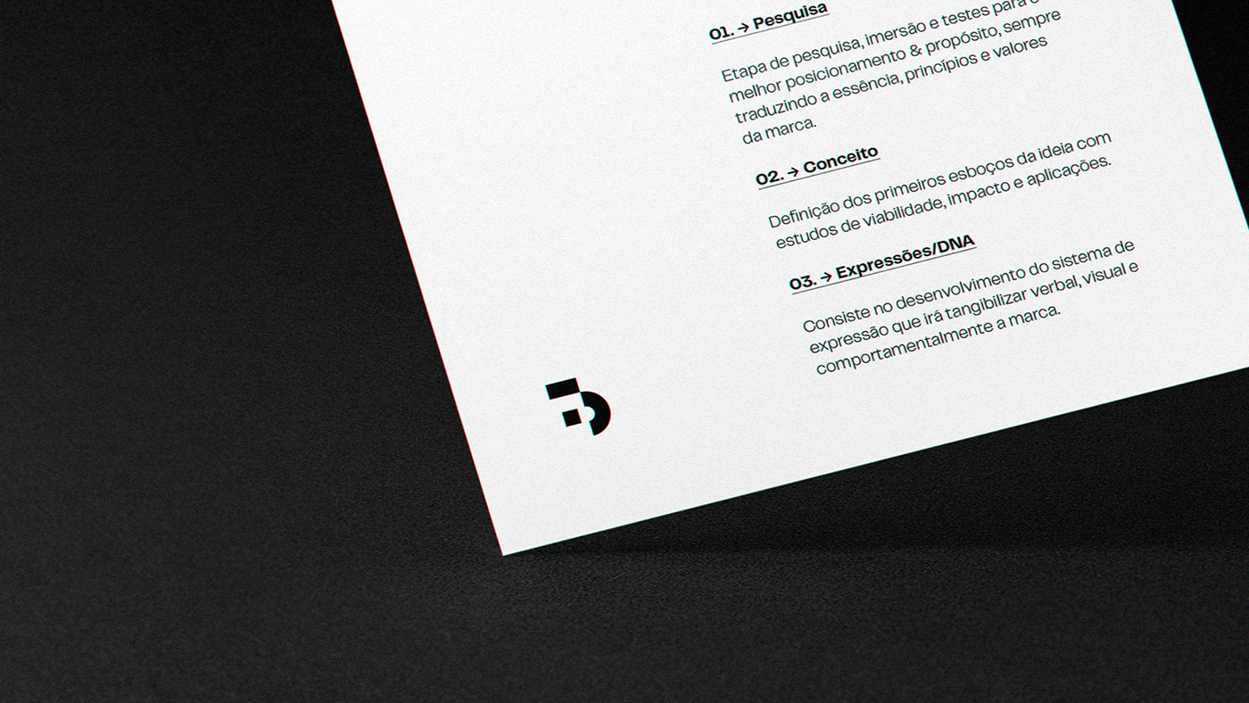
Considering the importance of brand consistency, the use of a disruptive hierarchy for main titles and texts was considered. - always keeping the title on the upper left side and the supporting text in the lower right corner, giving the idea of "zoom in" or modifying tool of the scale shape in manipulation / editing softwares.
——
Hierarquia
Considerando a importância da consistência da marca, foi pensado o uso de uma hierarquia disruptiva para títulos e textos principais. - sempre mantendo o título do lado superior esquerdo e o texto de apoio no canto canto inferior direito, passando a ideia de "zoom in" ou a ferramenta de modificação da escala de uma forma em softwares de manipulação/edição.


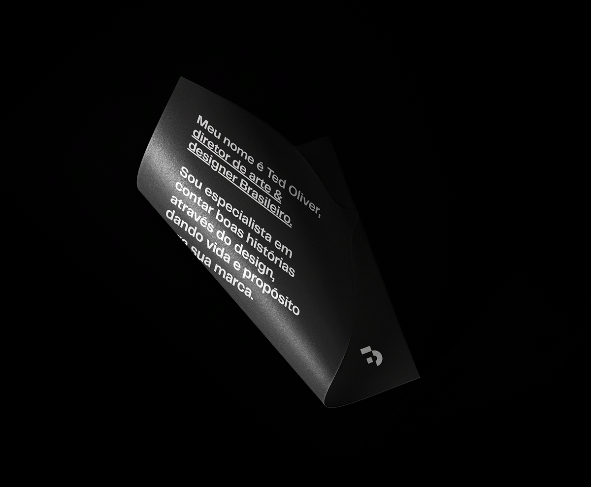
Colors
—
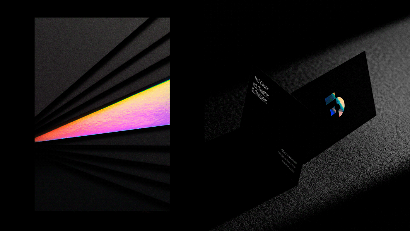
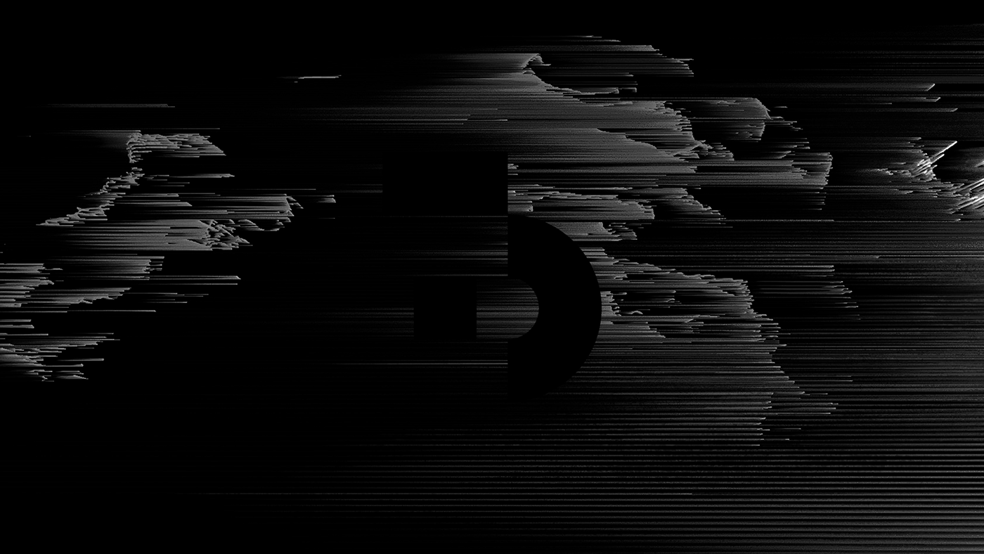
The holographic Hot Stamping was chosen to convey the feeling of "movement" / infinite colors and possibilities that design can provide.
——
Cores
O Hot Stamping holográfico foi escolhido para passar a sensação de "movimento" / infinitas cores e
possibilidades que o design pode proporcionar.


Creation Director: Ted Oliver
Photography: Pedro Morais
Video/Motion: Ted Oliver
Video/Motion: Ted Oliver
Translation: Clarice Carvalho
→ Featured on: Abduzeedo.com
—
Follow me:
© 2020 TED OLIVER → All Rights Reserved.