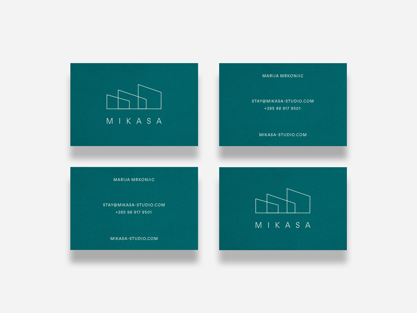
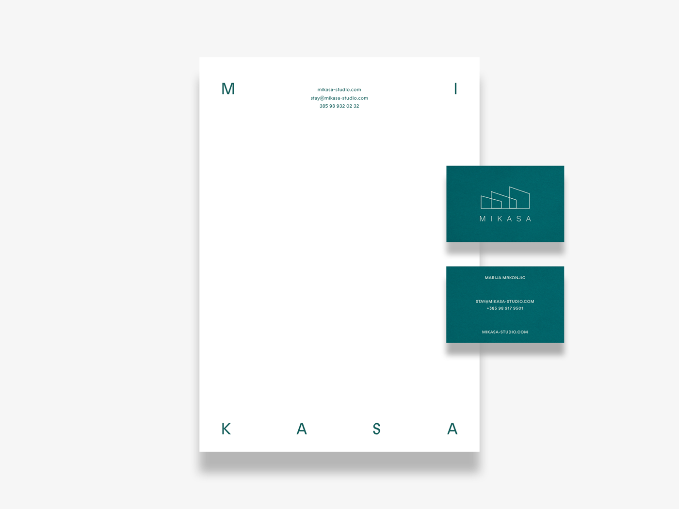
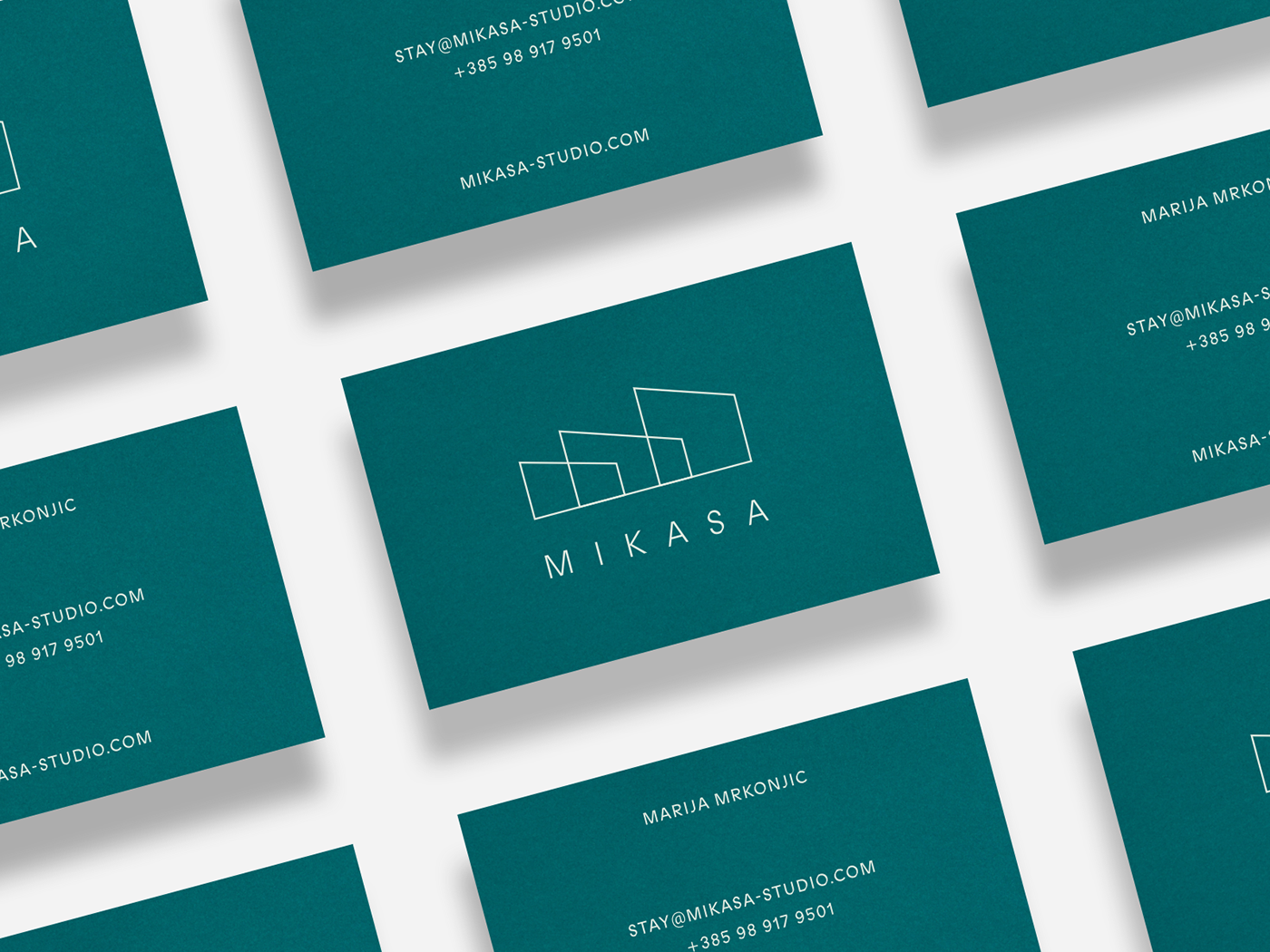
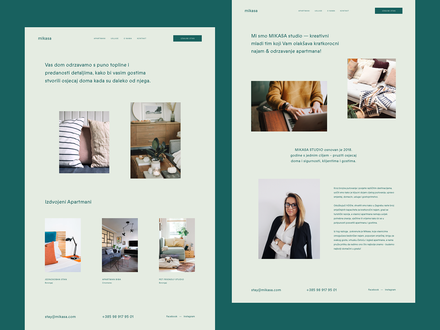
Mikasa
Brand identity, website design
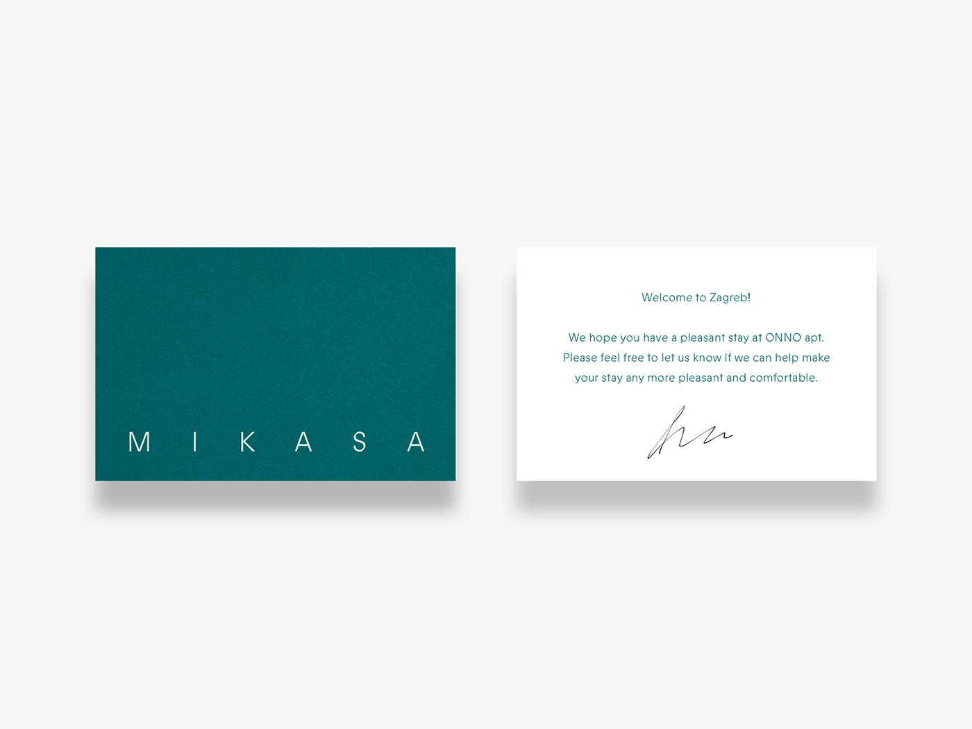
Mikasa is a young company that needed a strong identity to position themselves as a team that’s serious about their business — offering reliable services with high attention to details, creative and fun ideas for the homeowners and great care for both homes and clients they work with.
The logo was inspired by three main structures that were directly connected to their business and name: shape of the house; apartment buildings and letter M. Combining those objects and their shared forms, the final mark became a simple shape with a hidden, but clever twist on the brand’s name and the pun behind it.