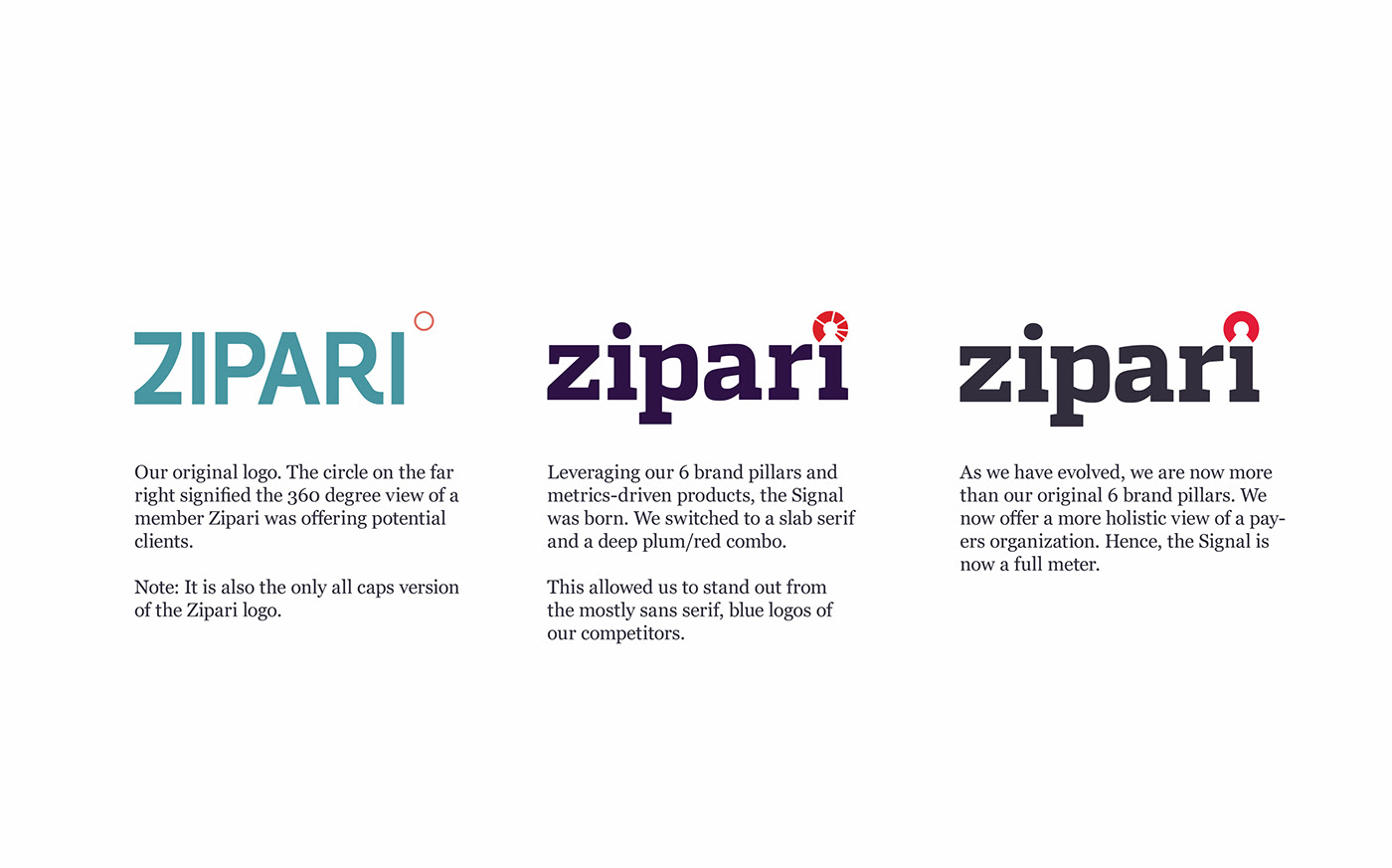
When Zipari launched in 2014, we needed to stand out in the health insurance tech crowd. We leaned into a heavy slab serif to connote our bold approach to the industry. We aim to help payers understand their membership at every touchpoint. Surely a tall order and one that our brand needed to embody. I developed a brand mark (The Signal) to represent our commitment to understanding how people navigated the health insurance industry. Whether it's a member or Broker purchasing insurance, or a Service Representative handling a complaint, Zipari and its suite of technology are there to increase ease-of-use and reduce confusion. We made the brand model that sentiment.

Over the years, we accumulated design debt that I needed to pay off. One big piece was the creation of a brand style guide. I took stock of our past decisions and did an audit of our existing brand. I needed to make sure our strategy was still aligned with the goals we set for the company. Some bits (i.e. The Signal & brand typography) had to change while others (i.e. our color decisions and base visual system) remained consistent.


Internally, we strive to build a strong, fun, productive culture and use the Guiding Principles as the foundation for how we run the company. We printed up some posters to hang in the office as a reference guide to what makes the company special and how each person can contribute to Zipari's success.


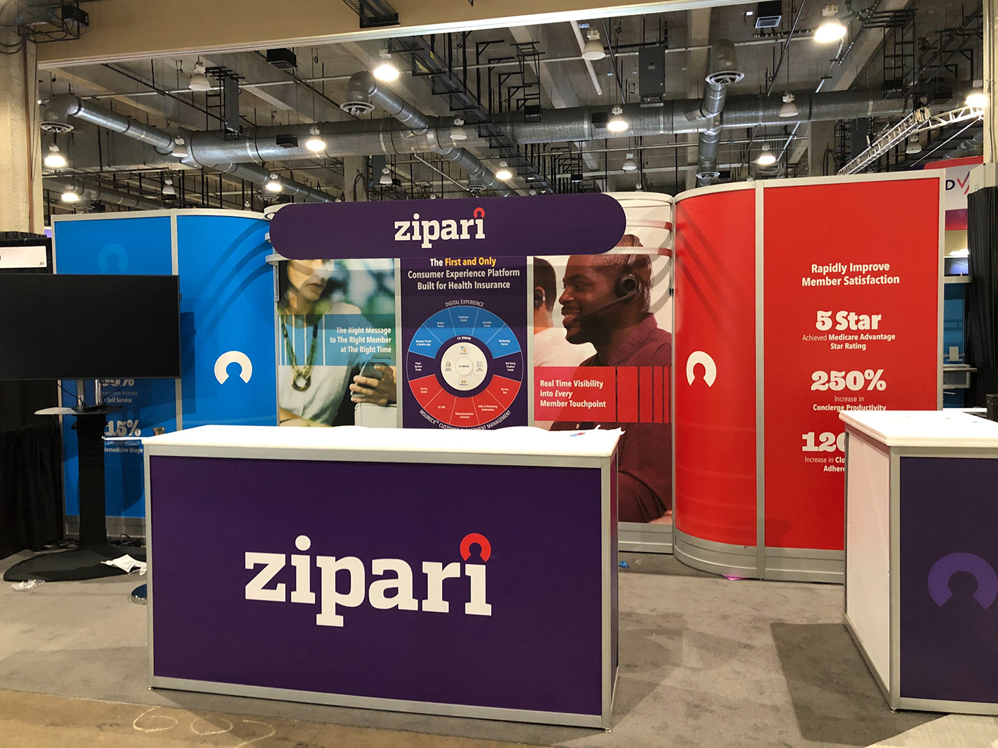
Here we apply the new styles to a Trade Booth. We tell a story of how our products serve the health insurance community; from the payer to the member.