
Project Brief:
This is a assigned project from the Communication Design 4 class taught in Art Center College of Design. The goal is to redesign the entire visual system of an existing brand, ensuring the identity to match closer with its core values; while establishing a more flexible logo mark for future application. For symantec, a already well known cyber security company, I am looking for design executions that can bring a rather refreshing element into the culture, expanding the range of target customers as well as ensuring the quality of symantec.
Concept:
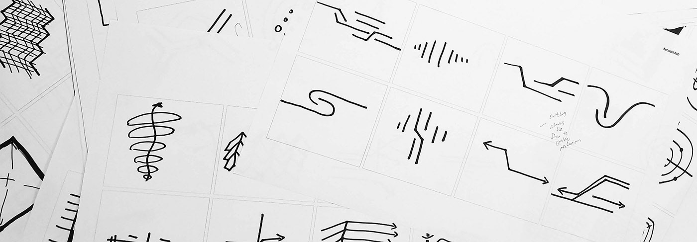
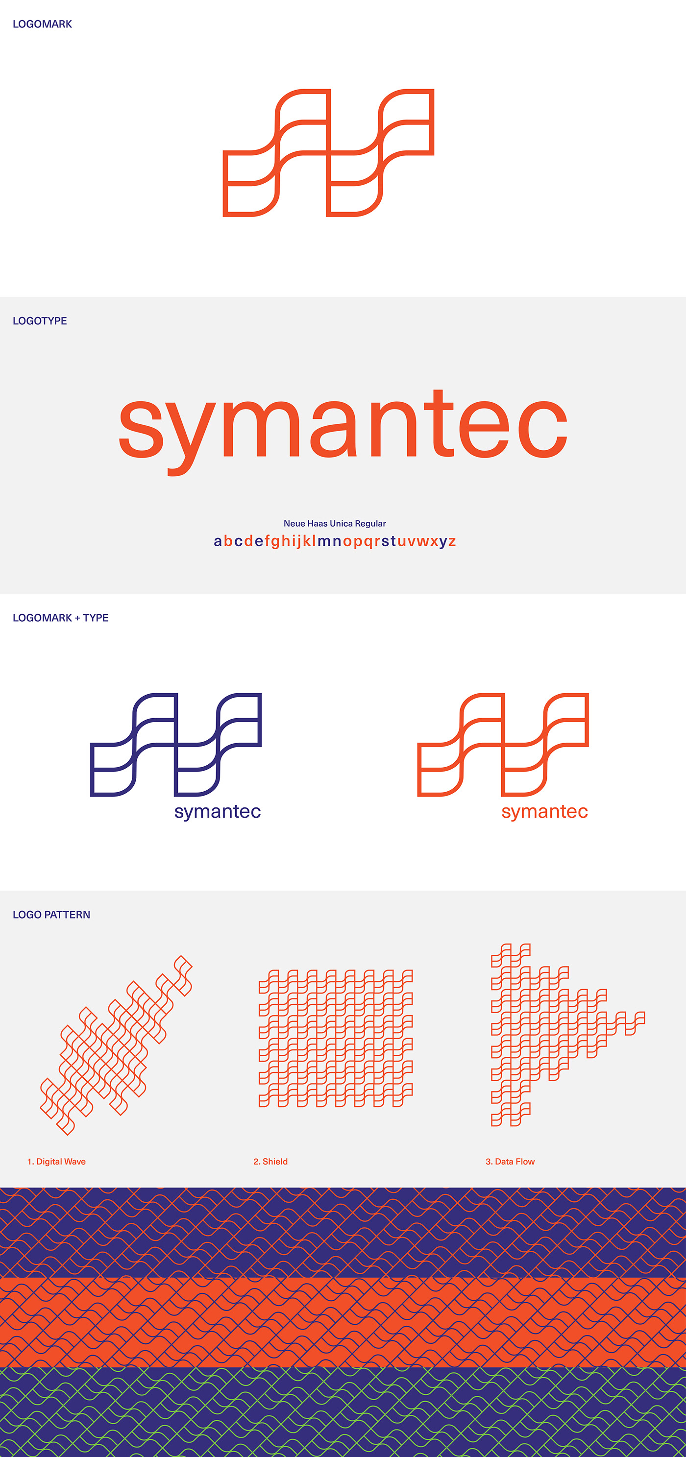
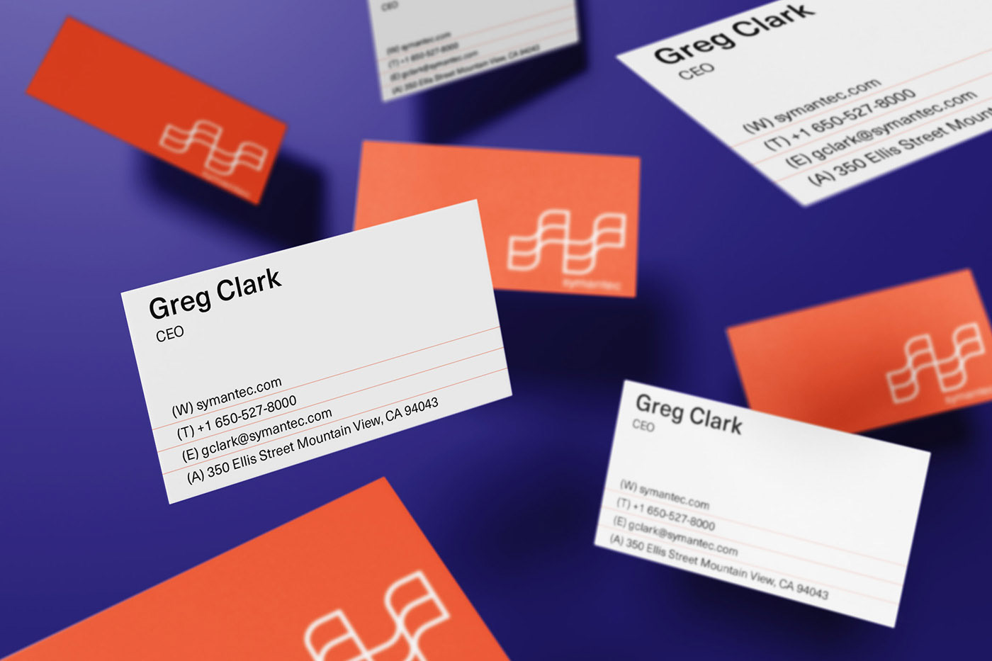
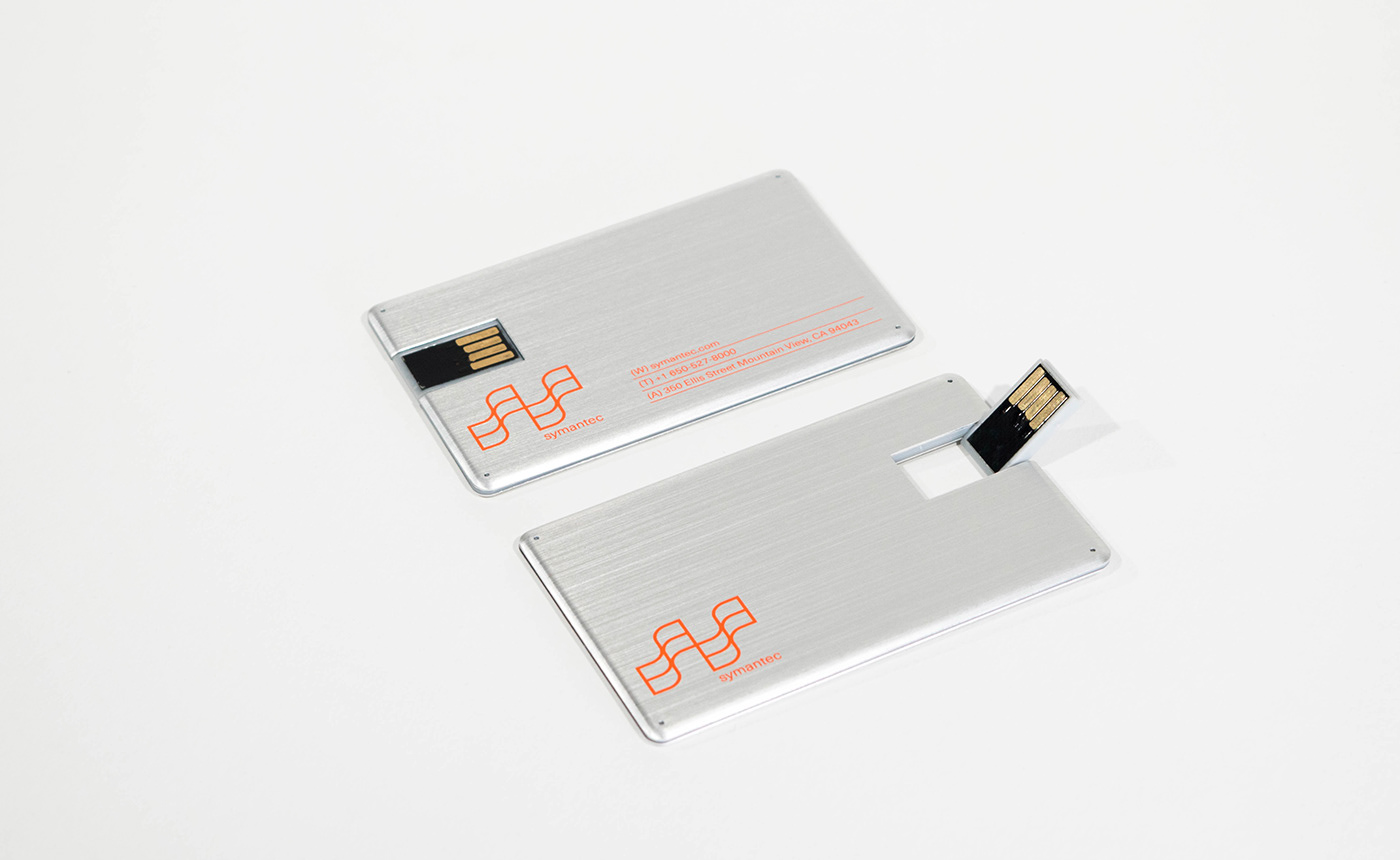
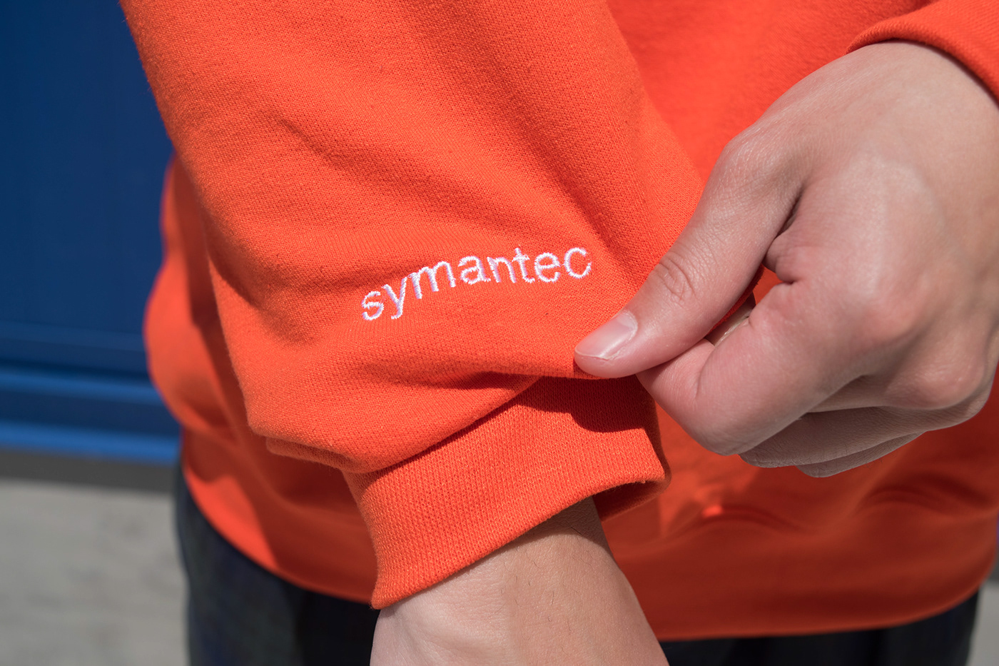
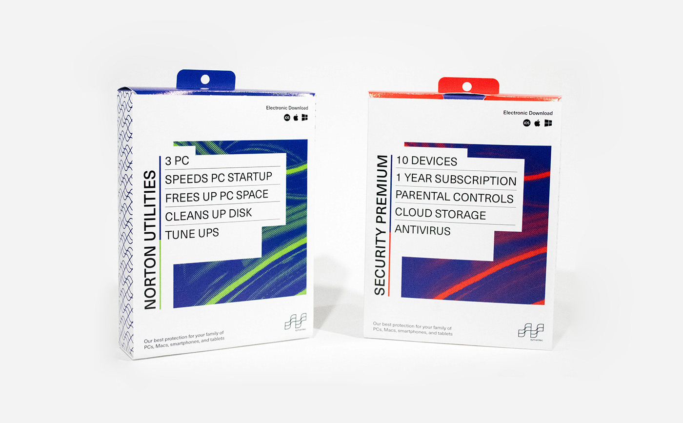
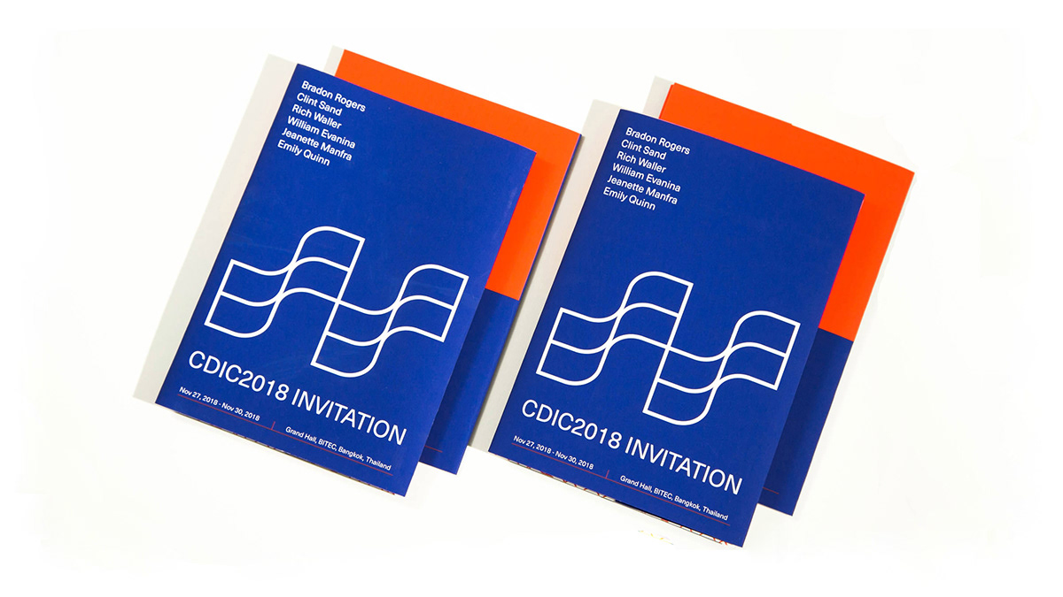
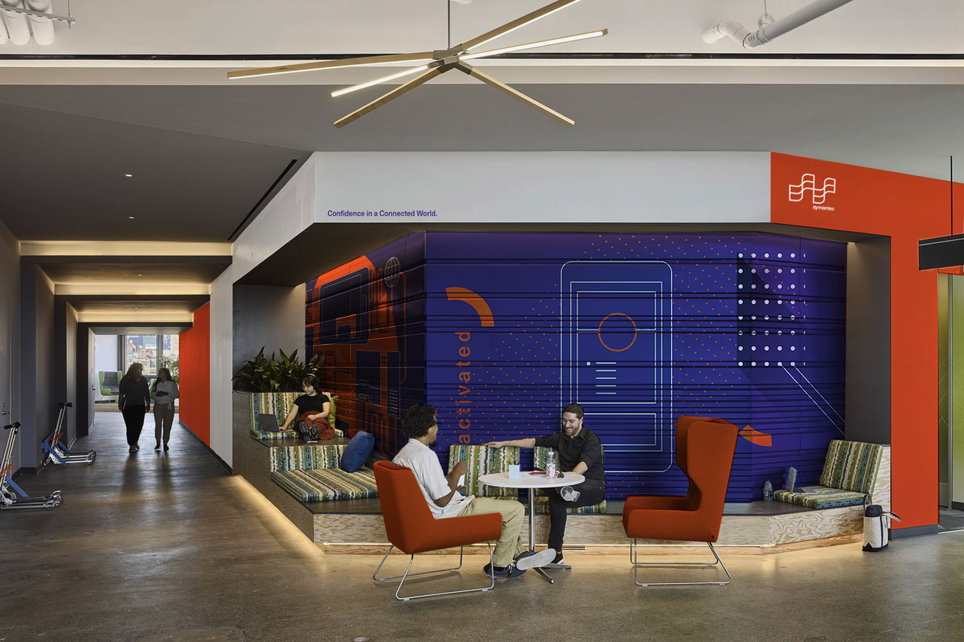
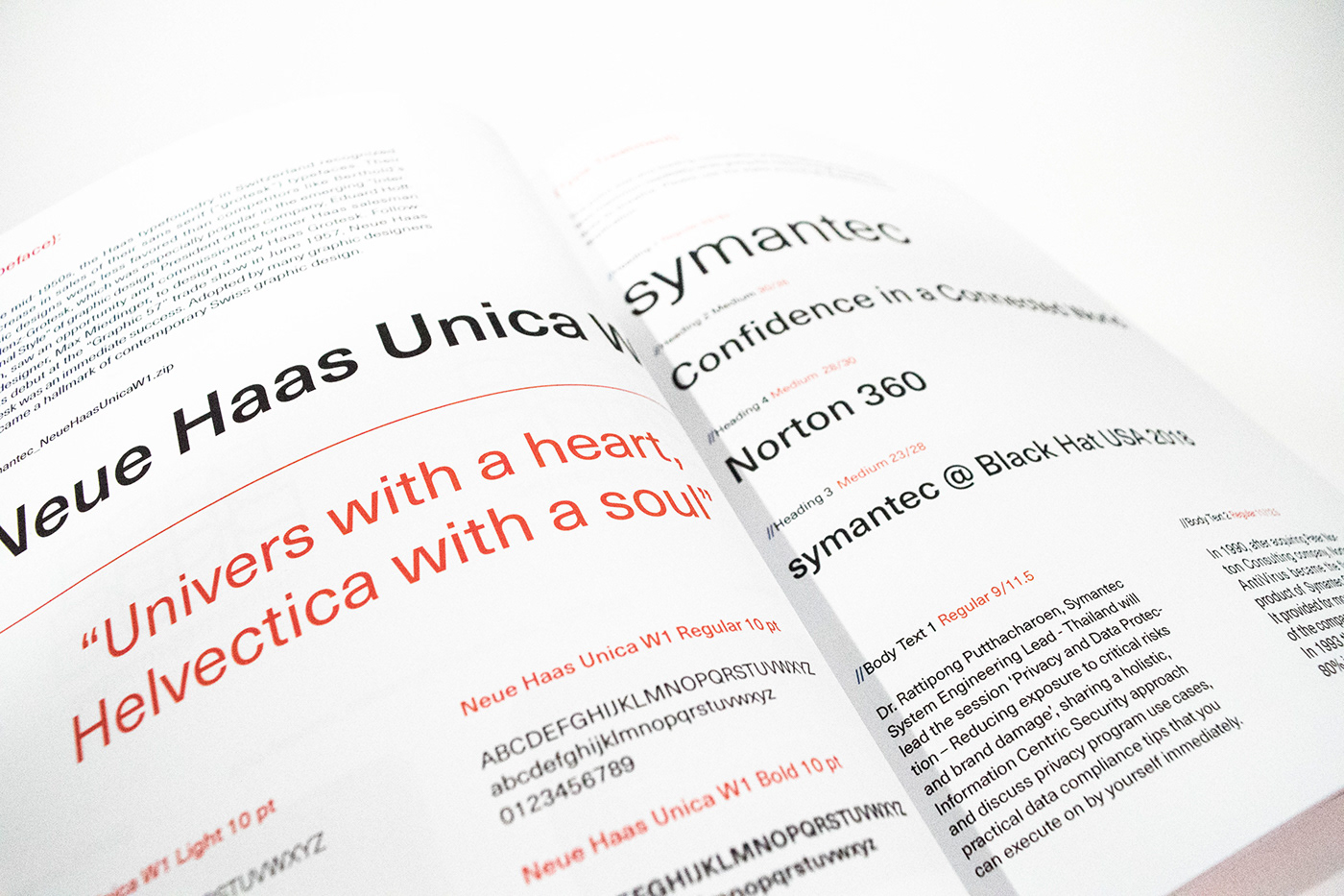
This new logo identity revolves around the idea of data flow while emphasizing on the system it forms when joining together. It is a flexible design that can be used both individually or as a logo pattern onto the various product lines provided by symantec. The two connected s represents the tag line of the company, “Confidence in a Connected World”. Meanwhile, the subtleness of it represents its low profile nature considered how ubiquitous their service is every users’ daily lives: It is reliable and responsible. Also, the strokes show velocity and directions, just like how data bits are being transferred from one point to another. The window formed within serves as a shield-like structure that can protect both the users from getting attacked by the virus and the virus from getting pass the defense software. With this new identity system, symantec is ready to present itself to a wider customer group with more refreshing visual language as well as a more confident cooperate image.
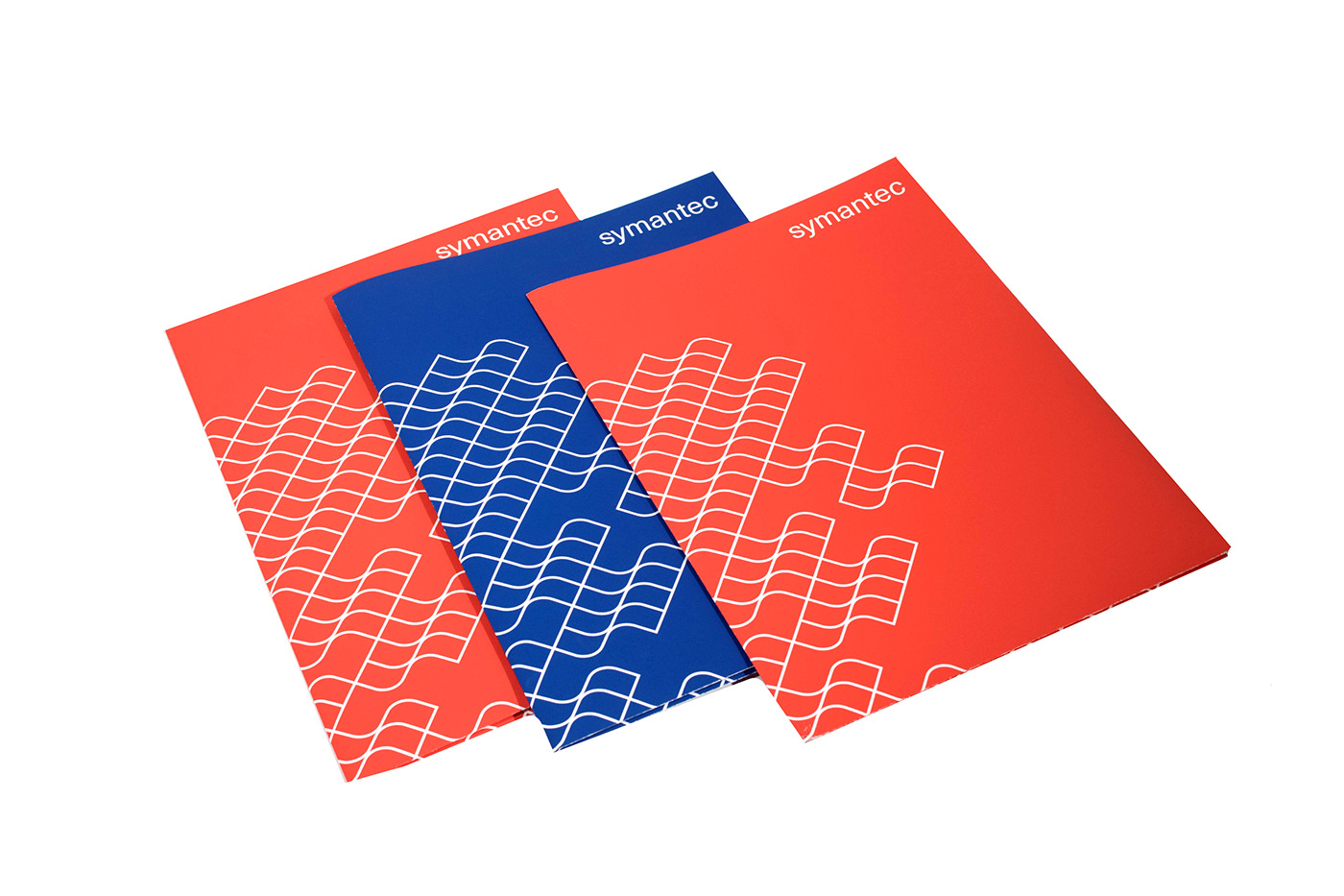
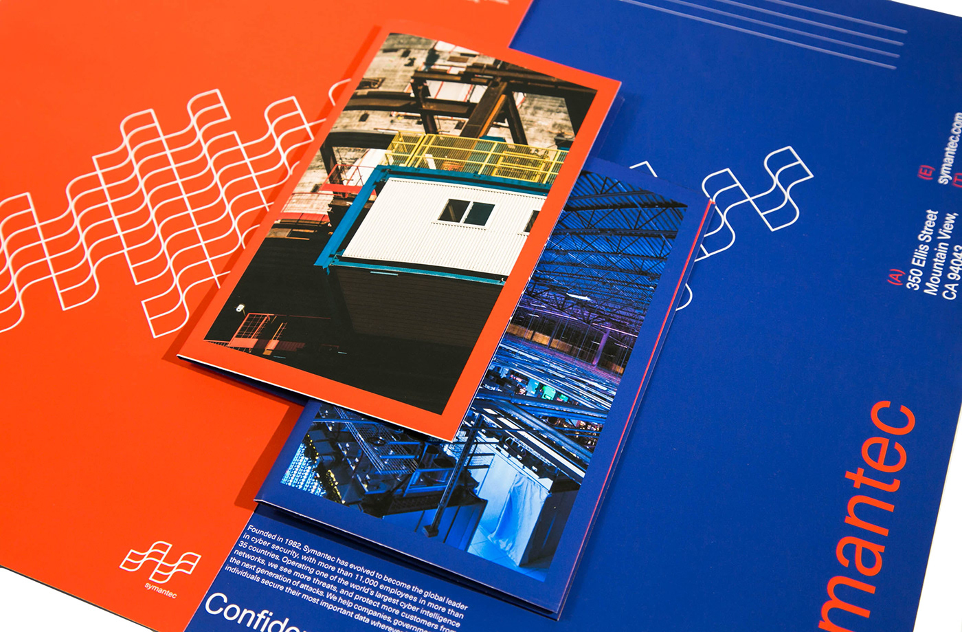
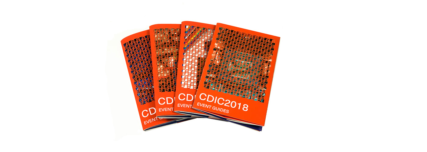
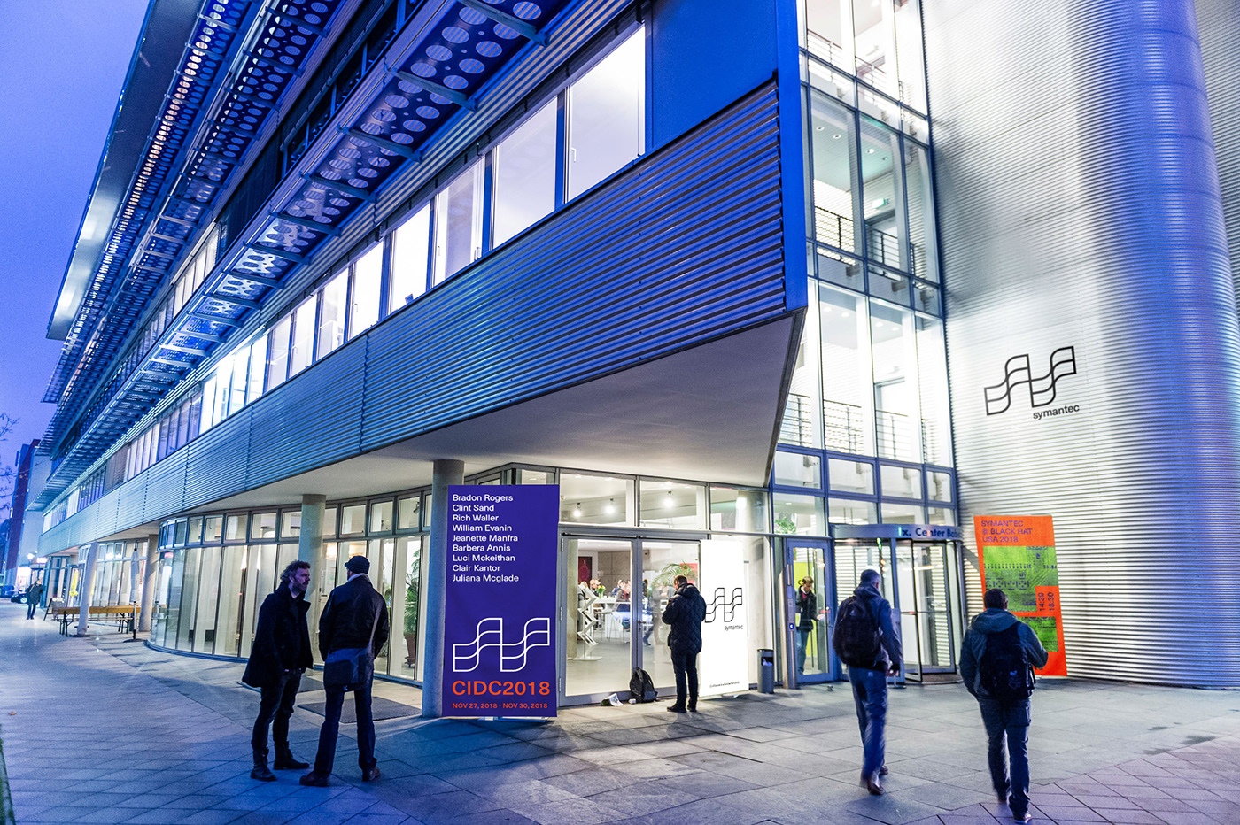
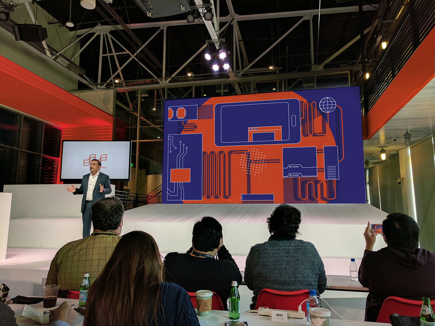
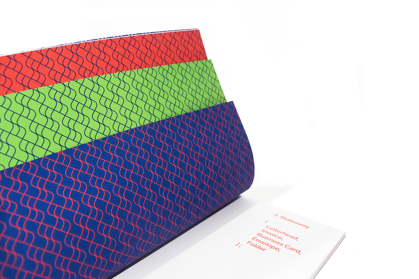
The project comes with a brand manual consisted of four chapters, explaining in details of how each concept was formed during the process; while showcasing how such design would look like in real life settings and spatial installations. Each chapter is divided by a layer of pattern, representing the cyber defense walls provided by symantec.
Approach:
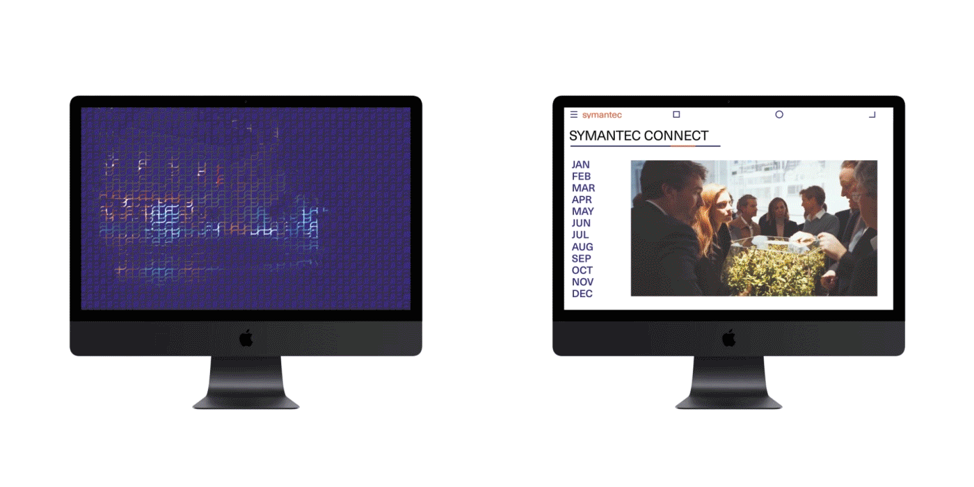
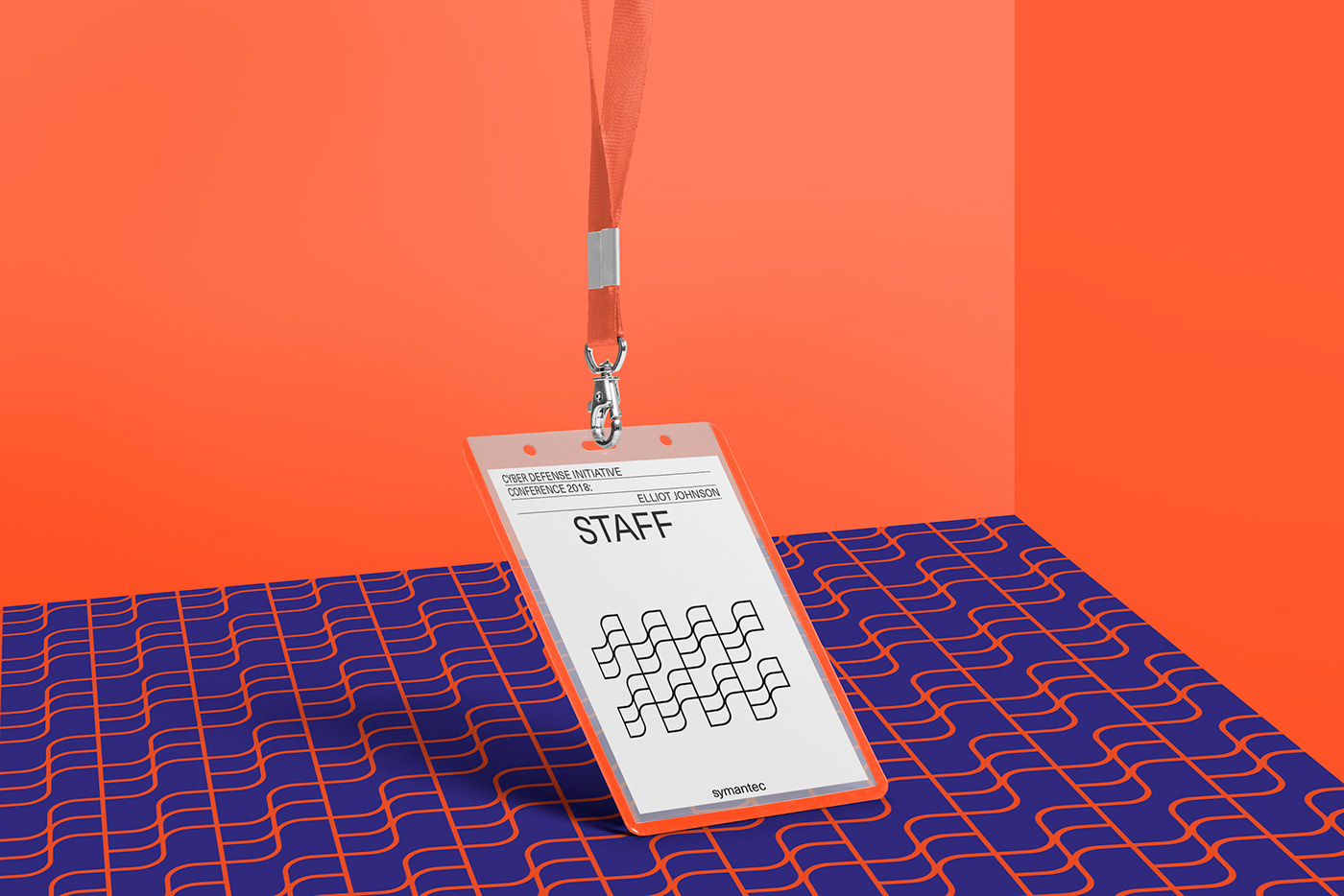
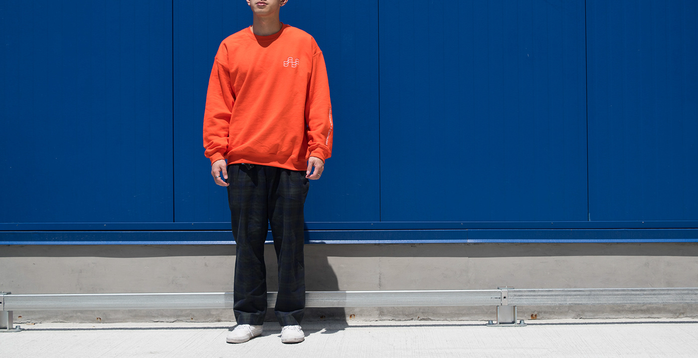
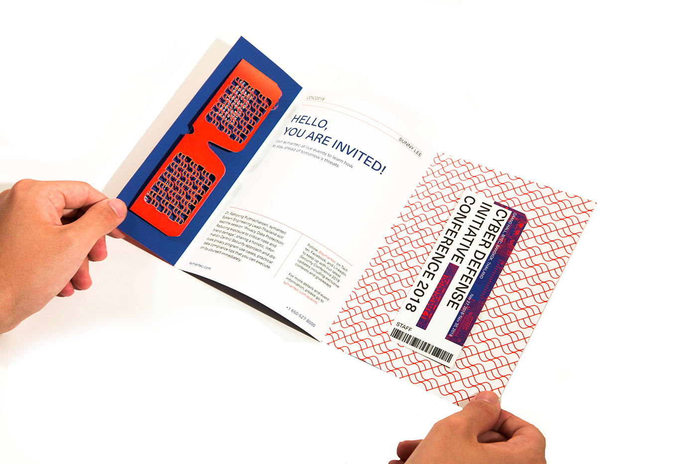
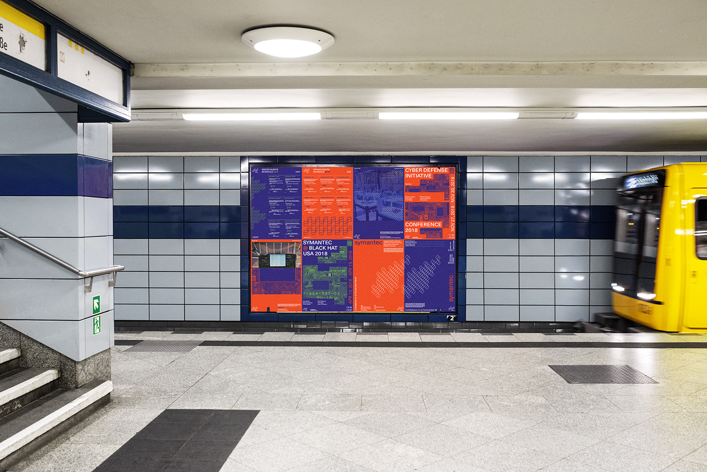
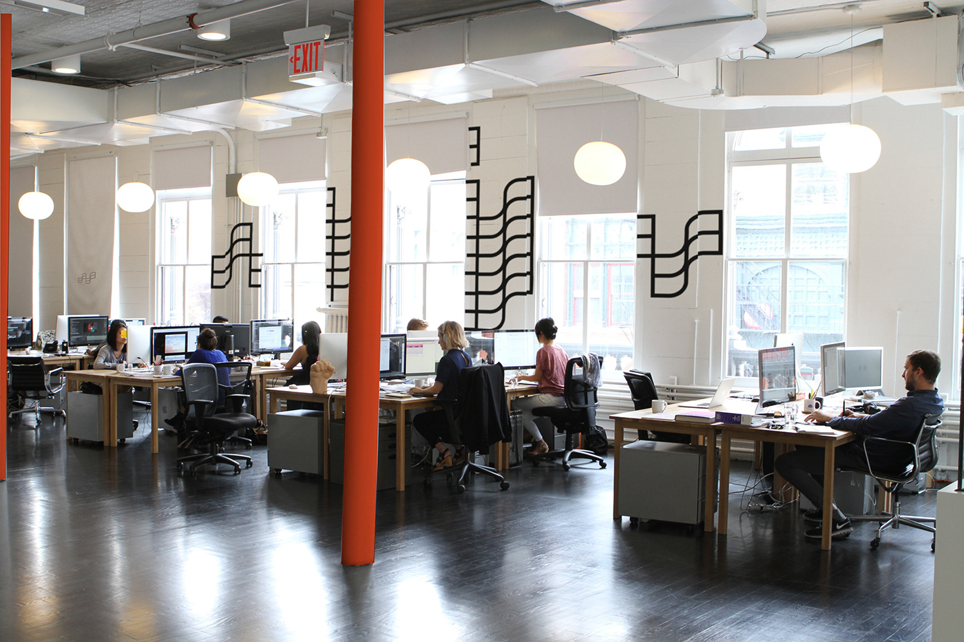
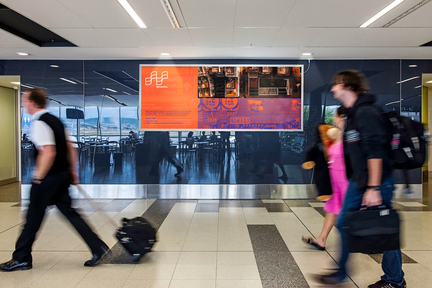
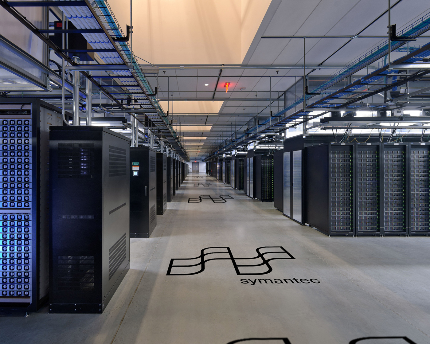
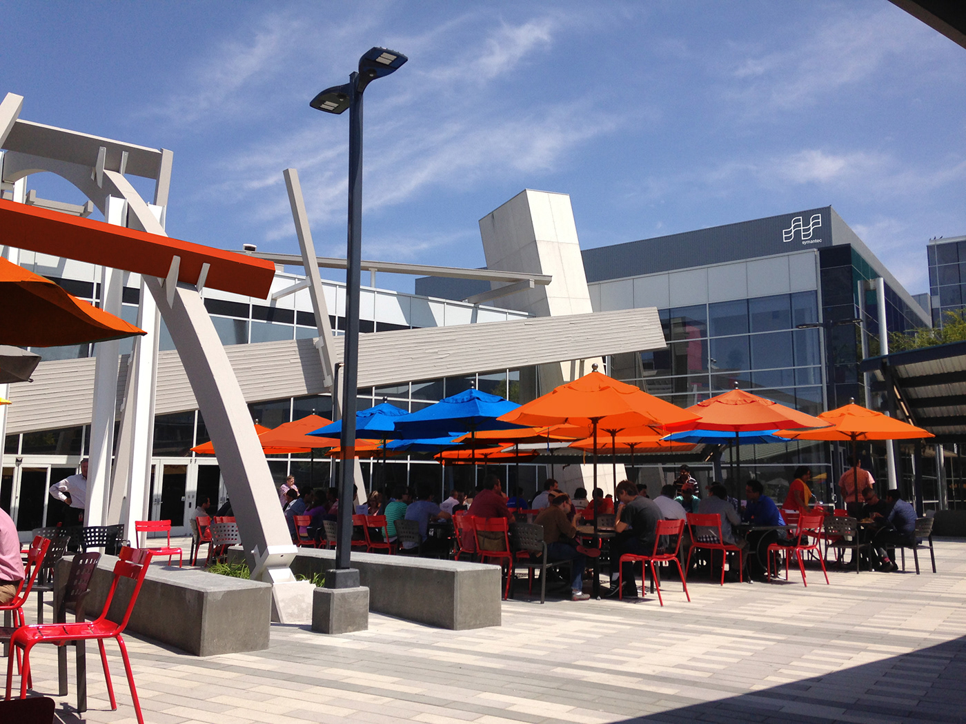
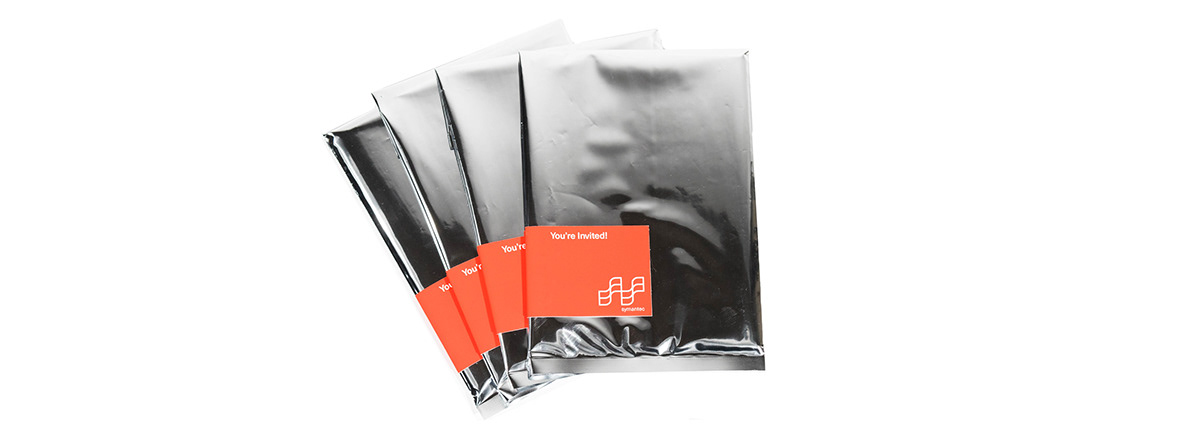
This identity system is created to help solving the problem of one of symantec’s issues, which is unorganized system throughout its products and acquired companies. Many of the past users have expressed confusions towards the unsystematic sorting of its visual language, and logo pattern. The primary mark and logo pattern should be used in symantec’s product lines from now on to ensure everything have a consistent look, being differentiated only by the color and structure of the pattern. They will be used throughout their apps, posters, spatial installations and much more. Also, I have reestablished a complete system for event organization considered how often these are held annually by cyber security companies. A series of event posters, brochures and invitation pamphlets will be included in a package along with a badge and ticket. Ensuring the participants to have the most premium experience possible. It will be the first step to re-introduce symantec to the world, and I want to make sure that the designs are intuitive enough for everyone to grasp.
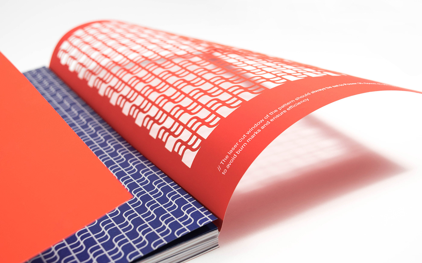
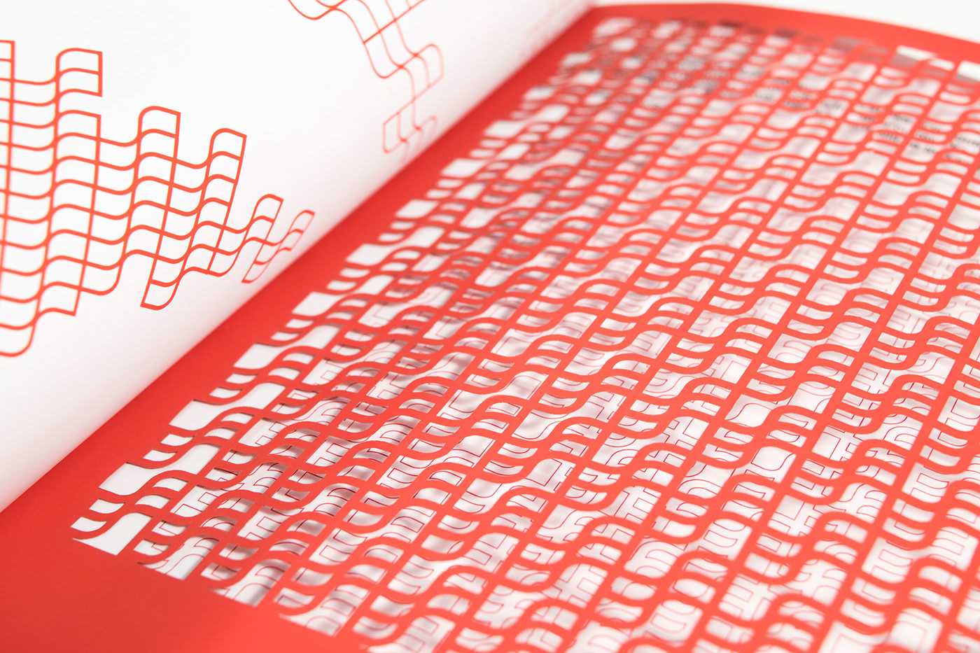
Laser cut treatment are relied strongly throughout this project, to cut out the window shaped patterns from editorial pieces such as event brochures, glasses and posters. It provides a more tangible interaction for people to understand the concept of “ Keeping virus outside and securing users inside” It is a two-way system which allows the participants to interpret freely.