CenterCal is a national builder and developer of high-end outdoor shopping centers. Their primary goal is to design gathering places that will strengthen the social fabric of the neighborhoods, ultimately creating prosperity, happiness and a stronger sense of community.

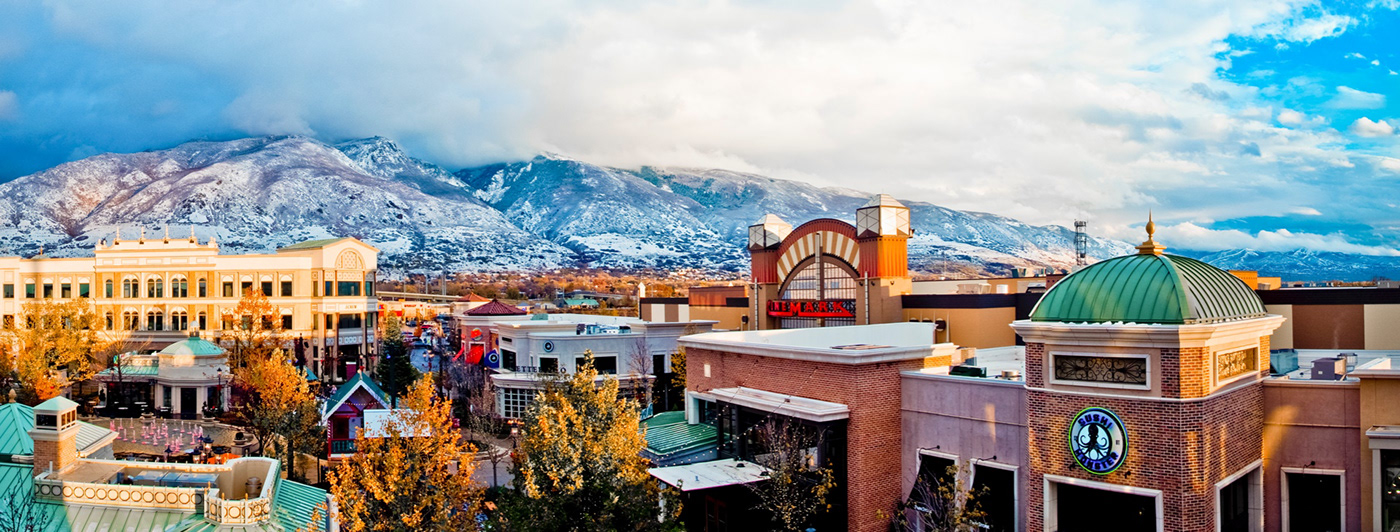
Located near Boise, The Village at Meridian is Idaho’s premier dining, shopping and entertainment destination. The center includes a growing roster of sit-down restaurants with abundant patio seating, bars and entertainment venues.
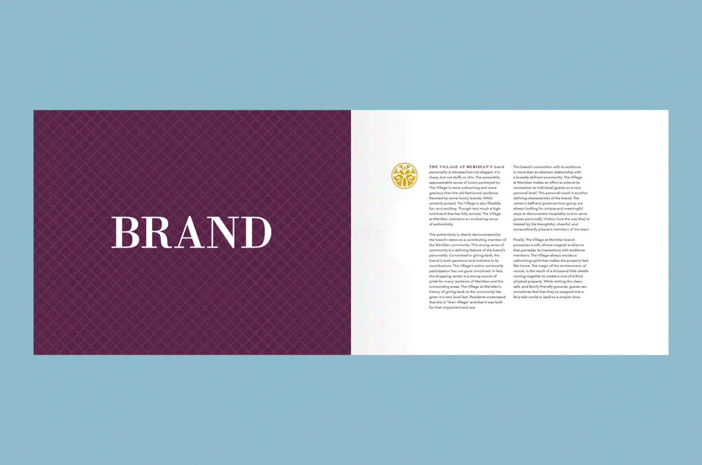
When we first began working with CenterCal properties, The Village at Meridian already had a barebones kit of visual elements: a logo, typefaces, colors, and property photography. Jibe was tasked with further defining and developing the brand so that the property would be set up in the future to produce work that was consistent, high quality, and spoke the correct message to its audience. We worked on everything from the visual identity (logo, colors, typography, etc.) to other non-physical aspects of the brand (brand voice, key differentiators, performance drivers, etc.).

There was enough brand equity that existed with the logo to deter any drastic logo updates. We took a closer look at the color palette and simplified the logo from three colors to two. We also chose a brighter, more fitting gold. A comprehensive brand book outlined all aspects of the newly redefined visual identity. While still maintaining flexibility, this brand book sets the stage for successful design work.

All of the CenterCal properties are very active in hosting community-based programs, announcing new store and restaurant openings, and putting on a wide array of family events, especially during the holidays. Some of these events are fashion-centric brand campaigns that use photography from a photoshoot we art directed. Other events are more fun and colorful—family- or kid-focused programs—that require custom illustrations.


The Station Park shopping center is located in Farmington, Utah, near the Lagoon Amusement Park and a busy FrontRunner station. Like The Village at Meridian, Station Park's logo had already been in use for several years around the property so a complete logo redesign wasn't necessary or advisable. We did, however, identity certain weaknesses in the overall design of the logo. We updated the proportions and shape of the logo in order to improve readability across applications without harming the recognizability.


Station Park and The Village at Meridian share a similar audience: young, aspirational families; adult outing crowds; and local office clientele. Station Park's on-property events cater to these crowds and Jibe is responsible for the design and advertising for these events.


Billed as the first food hall in Ventura County, The Annex is a small marketplace located within a larger shopping center in Oxnard, California. The marketplace serves as a melting pot for small eateries and shops, owned and managed by mom-and-pop proprietors. Each small business brings a unique flavor to the shared space, which combines bar-front eating with common-area seating. The small shopping spaces, along with the distinct cultures of each participating business, blend together to form a unique environment and a distinct vibe. That vibe is creative and artistic, as demonstrated by the eclectic collection of distressed materials, natural textures, and recycled objects found throughout the space.
The Annex exists within a larger shopping center (The Collection) but has its own identity. The Collection sought our help with defining the brand of The Annex before they opened. The existing logo was fine, but needed some finesse. We adjusting the kerning of the letters, thickened up the hairline stroke, and got rid of the "Locally Grown" tagline (a point of pride for The Annex).


Because The Annex was a brand new entity (unlike Station Park and The Village at Meridian), we had more opportunity to get creative and robust with the visual identity. Along with the logo adjustments, we designed three secondary marks (each derived from the original logo), a new Americana-inspired palette, and a rich graphic and pattern system.


