For our HMI group project, Team #2 considered a list of digital products that had specific relevance to each of us individually within our team. During our conversation, we decided that we wanted to challenge ourselves to select a product that was universally known for a brand that people are opinionated about, had a wide-reaching cultural relevance, and could serve as an impressive portfolio enhancer by highlighting our knowledge of UX and HMI principles to potential employers. With these parameters in mind, our team selected the Facebook Messenger App to analyze and improve toward a more empathic solution.
“We must design for the way people behave, not for how we would wish them to behave”
—Don A. Norman, Living with Complexity
“Technology creates a context in which we can and must think more compassionately.”
—Jason Lanier, VR and the Problem of How We Talk about Tech
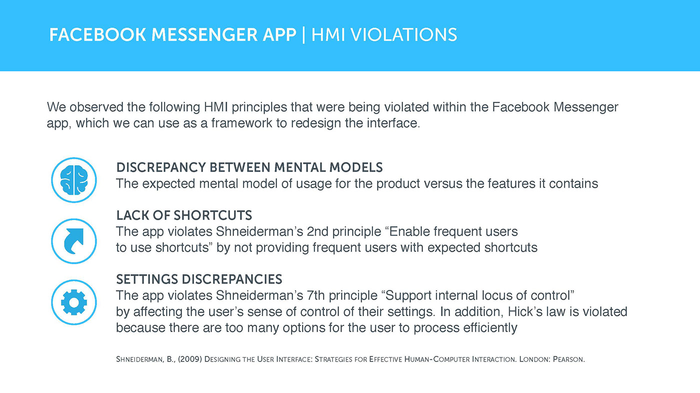
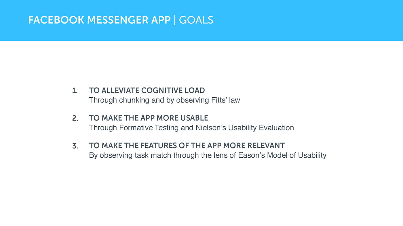
Through the lenses of Norman and Lanier we can see that Facebook has touched upon fundamental human desire to connect with each other. However, we believe Facebook could strengthen their interface into a more democratic social tool, augmenting accessibility, and reducing corporate clutter. We observed the following HMI principles that were being violated within the Facebook Messenger app, which we can use as a framework to redesign the interface.
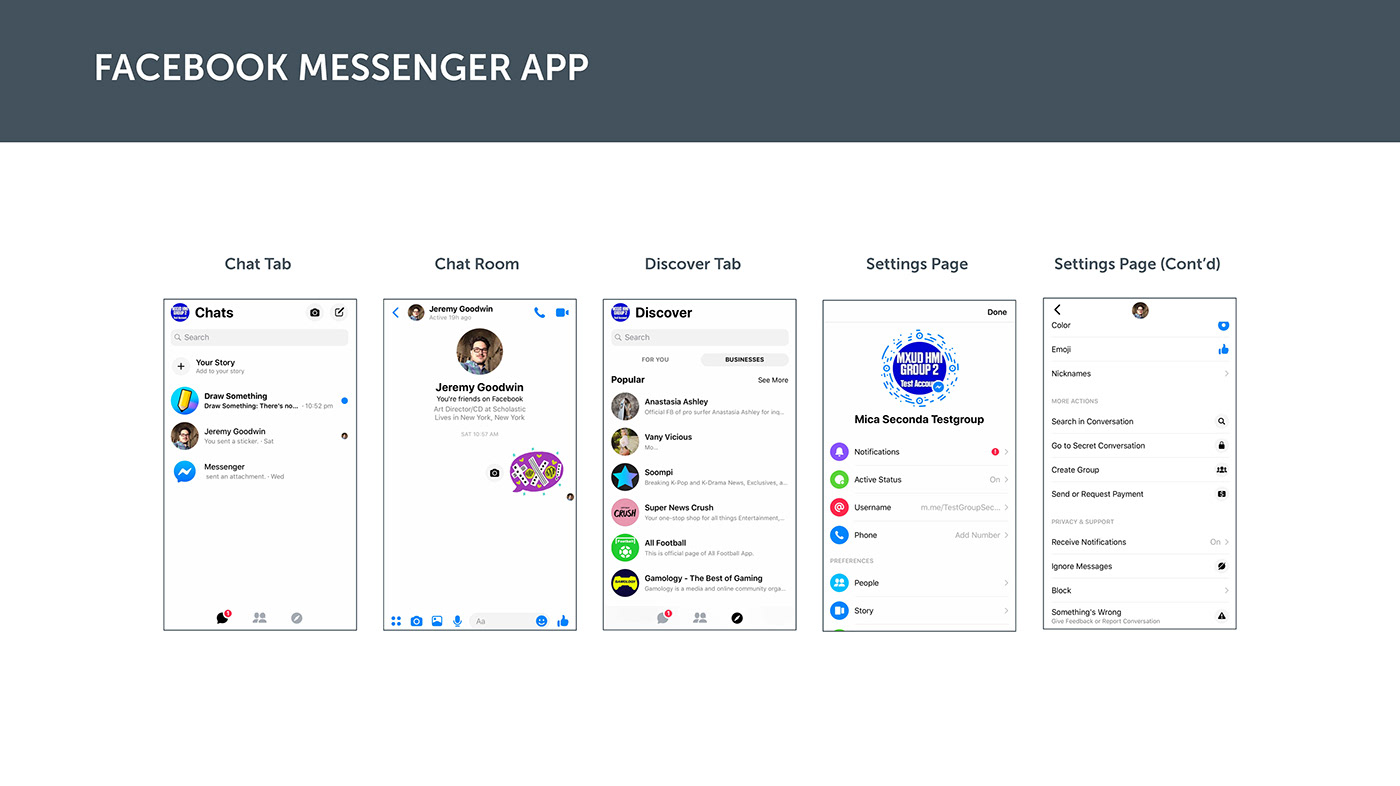
First of all, we noticed a discrepancy between the expected mental model of usage for the product versus the features it contains. The app is called Facebook Messenger, however, a number of the features are unrelated to the chatting or calling functions, such as games, advertisements, and the myStory function from facebook. We perceived this as duplicative because Facebook is including features from the main Facebook app and therefore it distracts from the primary goals of using the ‘Messenger’ app. This relates to Shneiderman’s 8th principle to reduce short-term memory load.
The second point that we found pertains to an issue with Shneiderman’s 2nd principle of providing frequent users with shortcuts. The app is currently doing a good job of giving quicker access to contacting your Facebook friends; Although, because the interface looks very similar to other peer-2-peer messaging apps it unintentionally makes the environment ambiguous and therefore more confusing. Unnecessary time is spent trying to figure out where messages and phone calls are coming from. In addition to this, because of the non-descript, neutral application of color, generic font selections, and standardized grid layout, the user potentially have less awareness of the product that could lead to disorientation.
Thirdly, we noticed that the user’s sense of control is negatively affected because of the absence of a clear settings button. Not unfamiliar to Facebook, this omission could present a privacy and security concern. By default, when people connect to each other, they automatically have the ability to call each other at will. Ideally, to support the internal locus of control, there should be a way to easily adjust the settings to prevent undesired contact. Because the settings are obscured, it diminishes the user's sense of safety within the environment.
We see these points as a general launching point for us to explore a redesign of the Messenger app.