


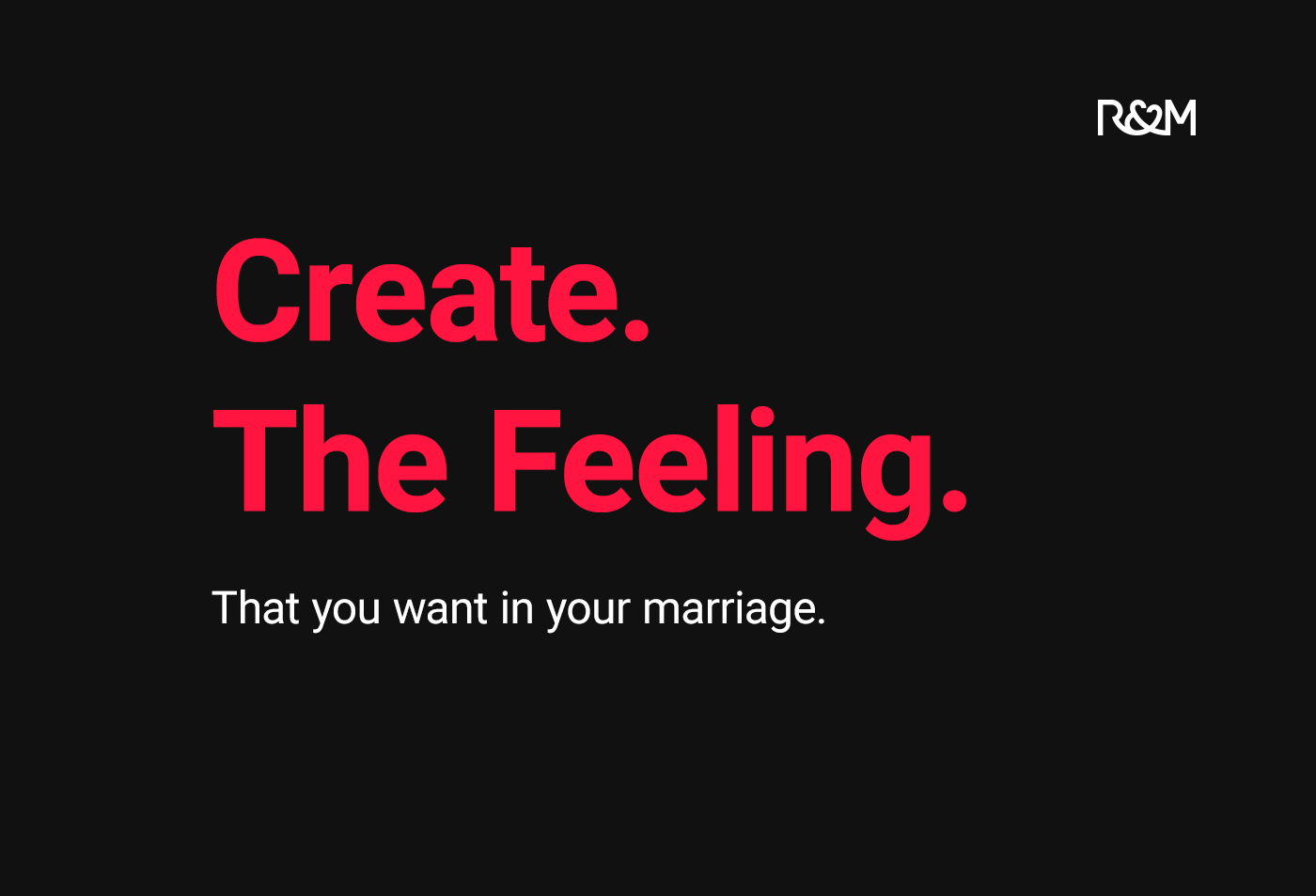
Love. Commitment. Continuity.
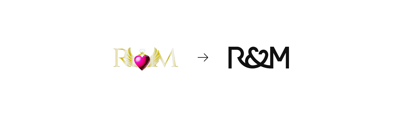
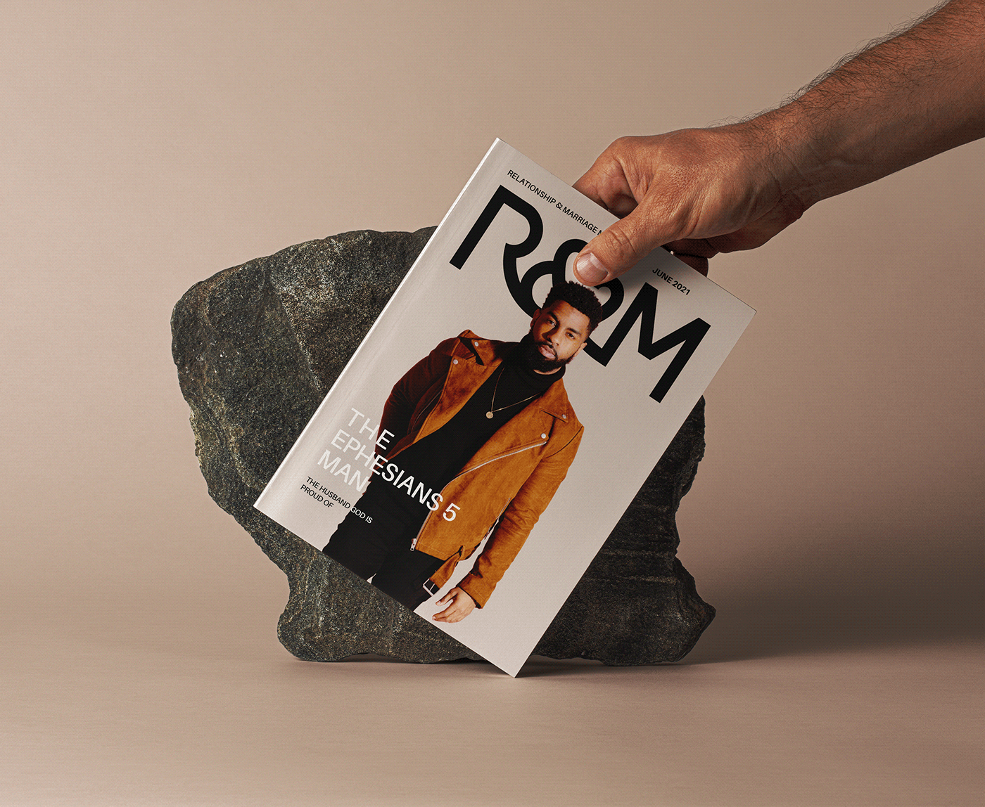
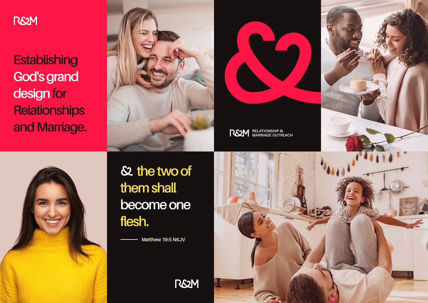
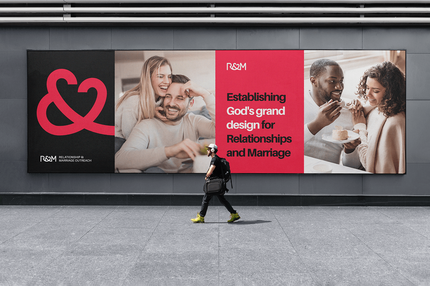
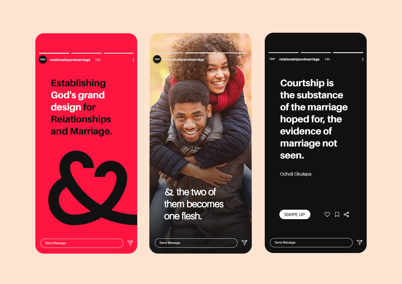
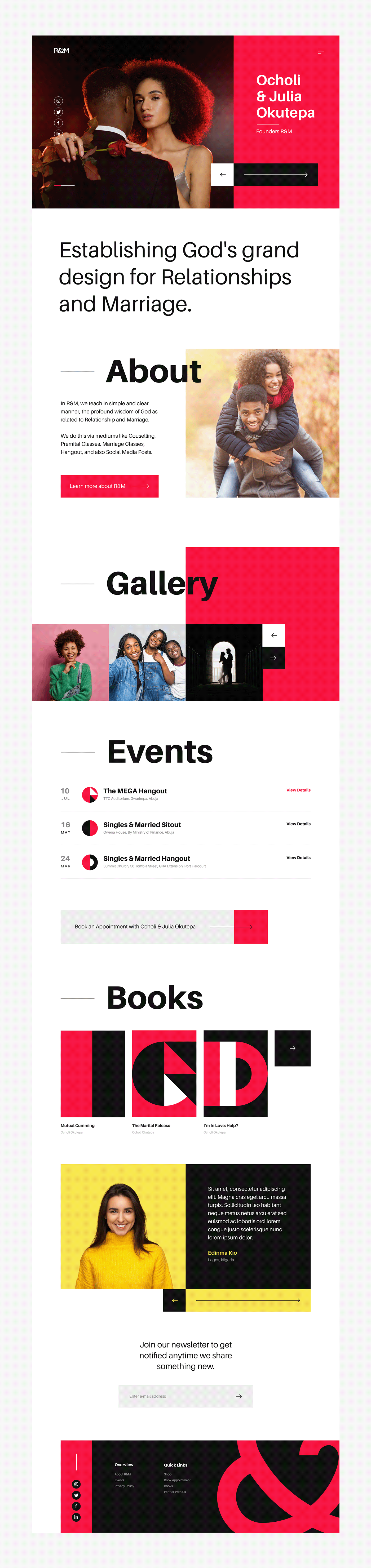
Relationship & Marriage Outreach also known as R&M, focuses on establishing God's grand design for Relationships and Marriage. They teach in simple and clear manner, the profound wisdom of God. After 6 years of operation, since it’s inception in 2015, R&M need a new identity to reflect what it stands for.
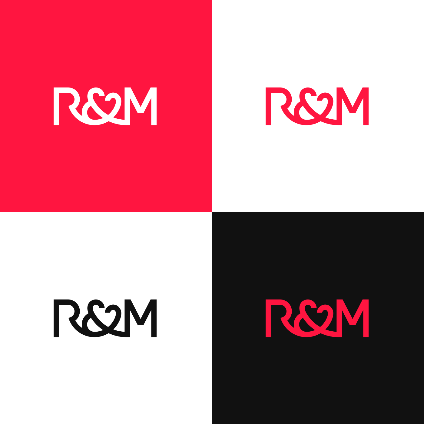
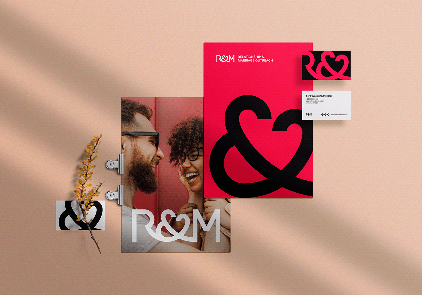
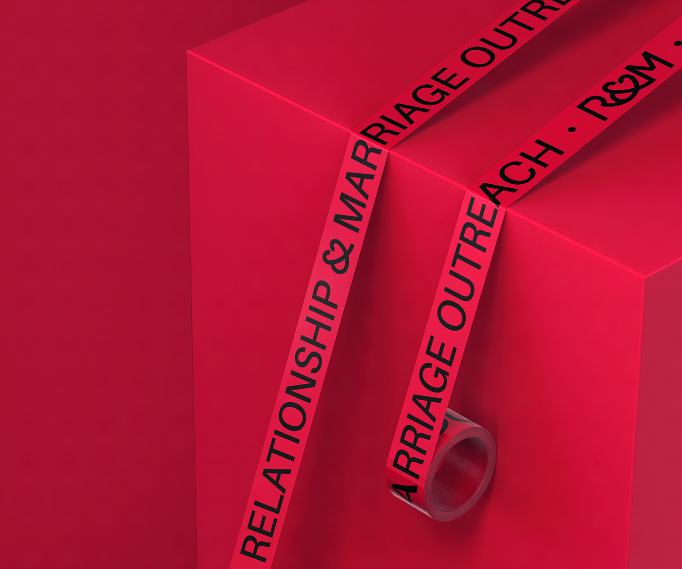
We built an identity around letters R, and M connected together by the ampersand symbol.
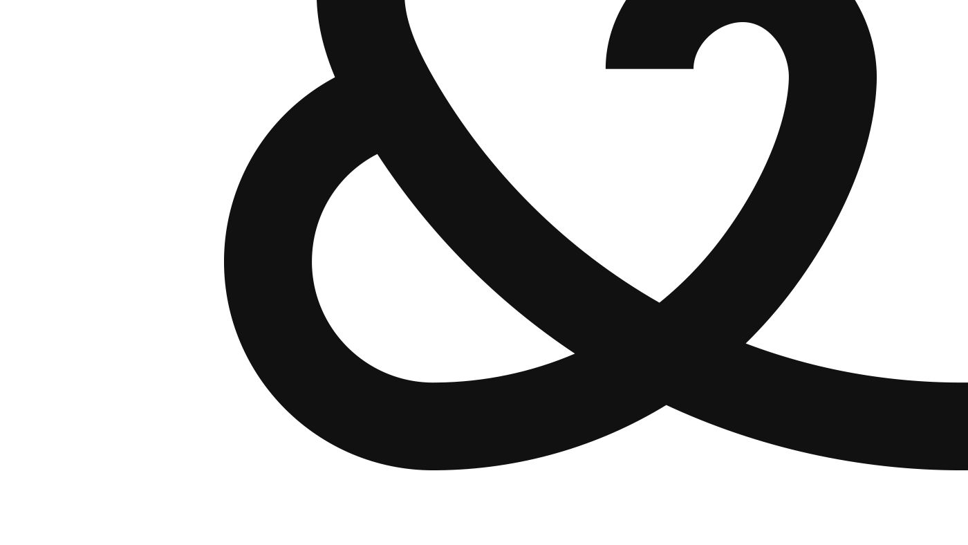
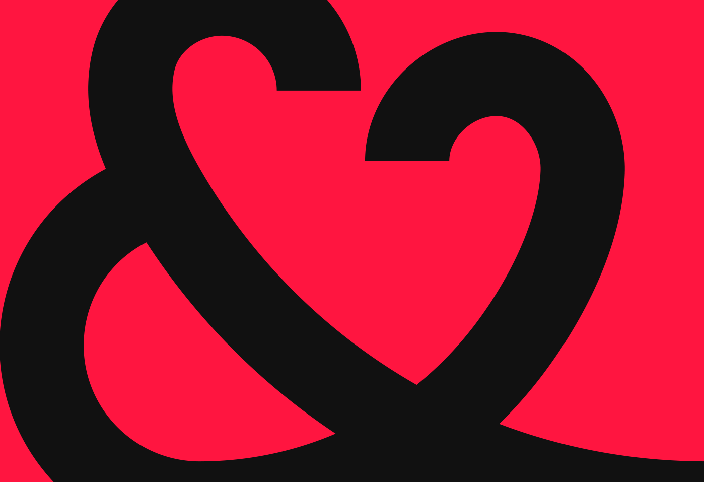
The ampersand (&) is creatively crafted to incorporate a love symbol in it and also doubles as a unique icon for the Relationship & Marriage brand. It subtly reflects a “Man” and a “Woman” connected and forming a love arc (See Img. 1 and Img. 2). The arcs flow into each other forming a single symbol, reflect commitment and oneness, giving a nod to the scripture “The two shall become one flesh”. The tail end of the symbol is an extension reflecting continuity.
Keywords: Love, Oneness, Commitment, Continuity, Connection, Family, Joy


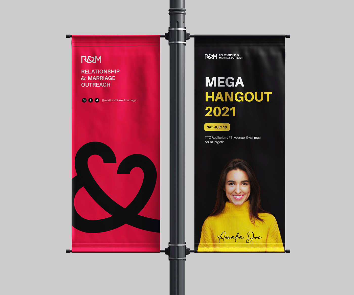

The Mega Hangout 2021 Event
Saturday, July 10 2021

R&M Live on IG @relationshipandmarriage
Thanks for Viewing.
Appreciate if you like it. Follow for more work in the future. See you soon.


