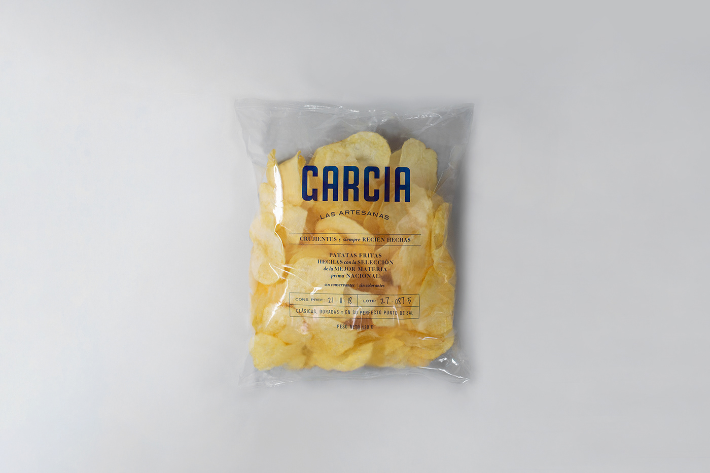
Redesign of J.García chips, a classic from the province of Castellón, Spain, a small charming and very close city as the company is.
The first thing was to simplify the name to Garcia and create a new modern and balanced logo. To represent simplicity and the artisanal production of the brand, it is used only a typographic composition with a more deep corporate blue color and gave a lot of visibility to the product with a completely transparent bag. The result is a simple but elegant packaging, which elevates the product and communicates quality and tradition.


Before & After
MA in Packaging Design | ELISAVA | Barcelona, Spain | Oct.- Dec. 2018
Tutorized by Eva Minguella.
Tutorized by Eva Minguella.
Featured on: Packaging of the world


