

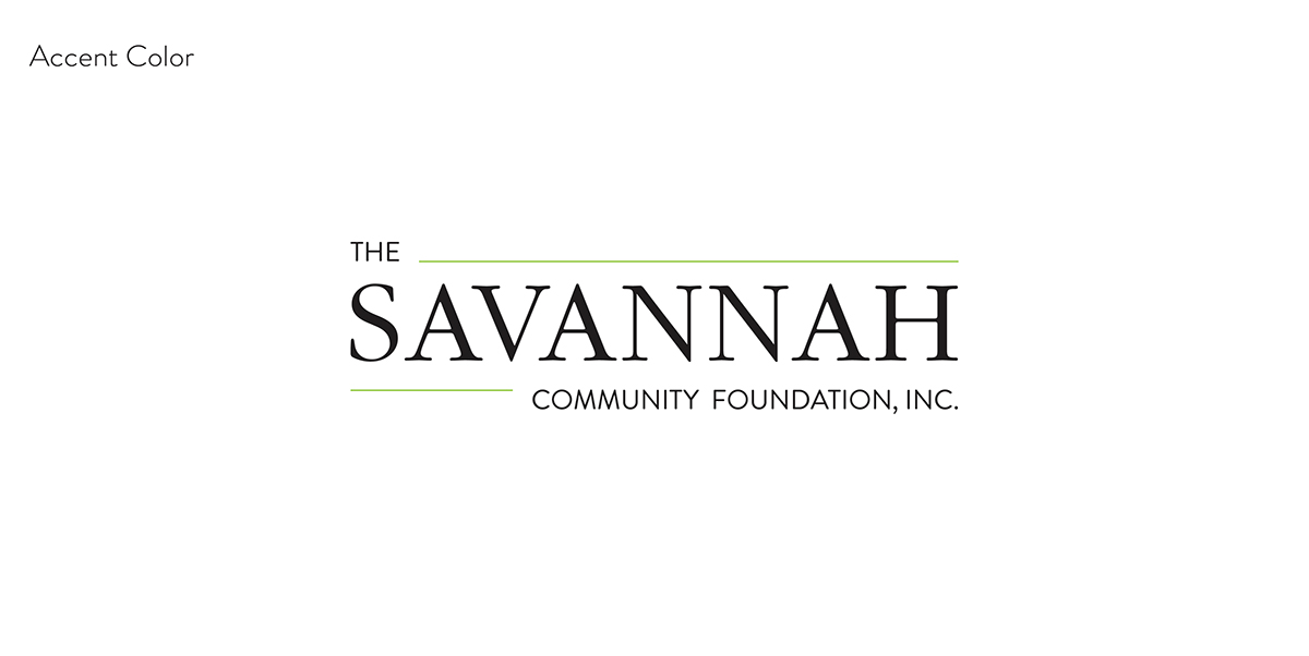
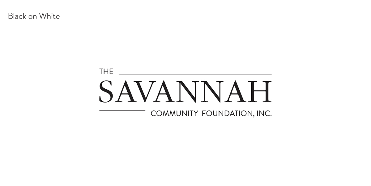
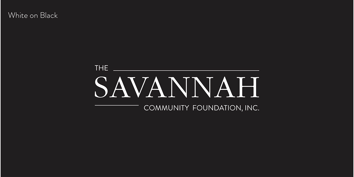
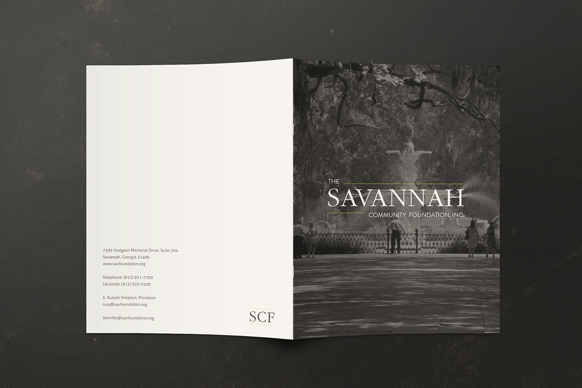
The Savannah Community Foundation
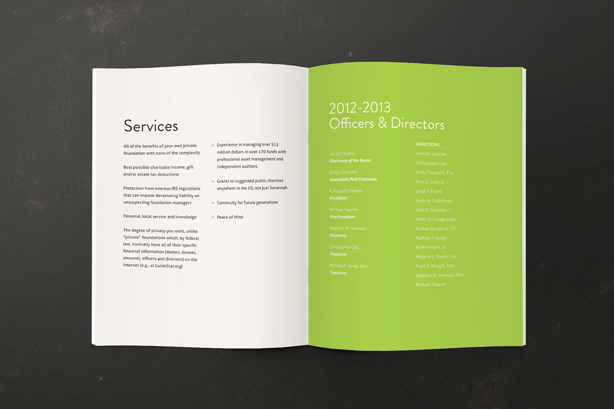
Recently, I worked with The Savannah Community Foundation, creating a logotype and a brochure for their reputable local charity organization.
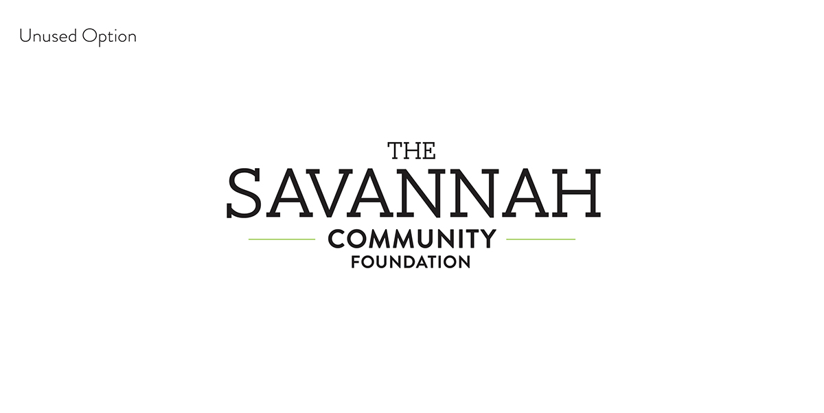
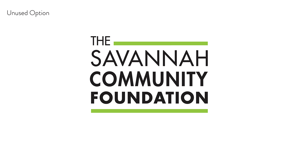
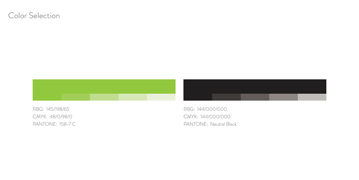
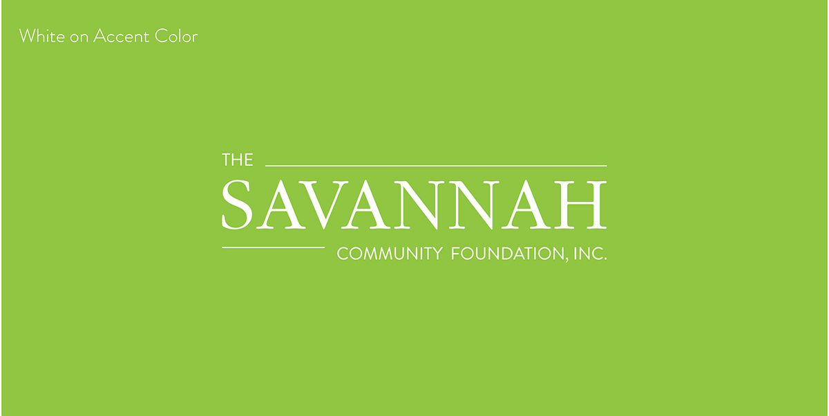
For the logotype for The Savannah Community Foundation, Inc., I designed a logotype that addresses both the rich historic past of the city and the promising future.
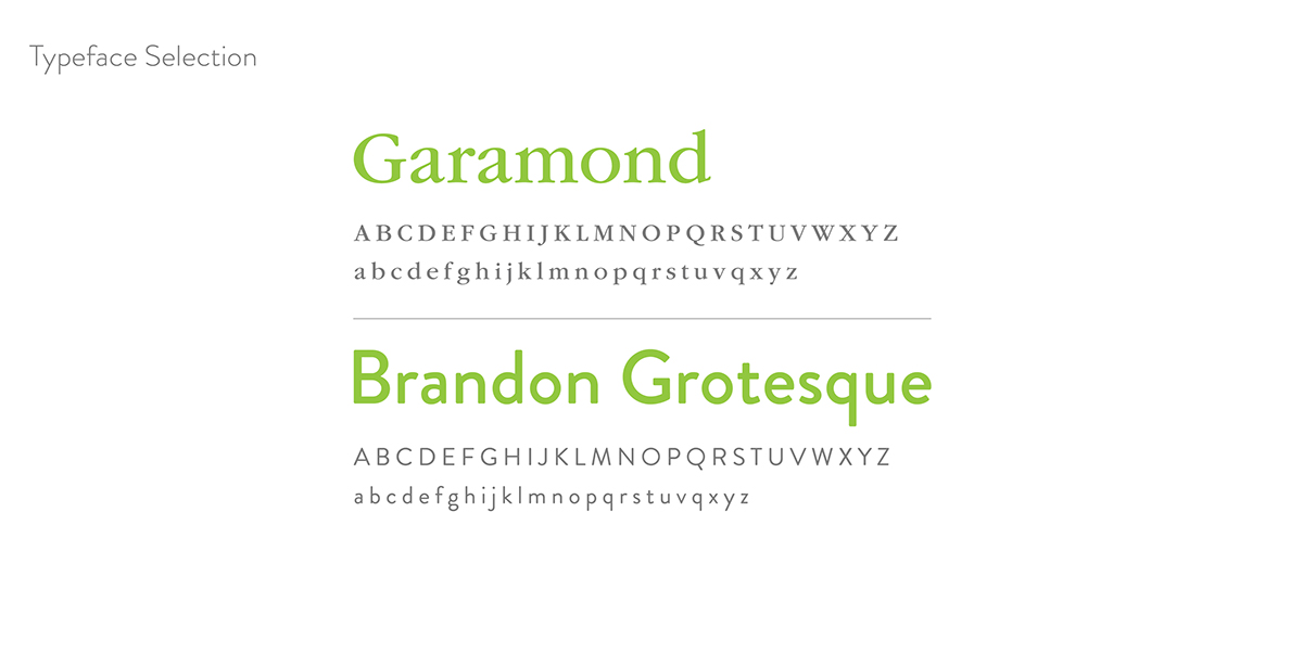
To embody these ideas, I chose two contrasting typefaces, Garamond and Brandon Grotesque, supported by two rules to give the feeling of stability.
Garamond is an Old Style serif typeface, and is one of the most legible and readable typefaces for print. I chose Garamond to represent the historic past of Savannah Georgia, and to instill feelings of trust and permanence. The slightly open tracked wordform of “Savannah” lends itself to a sense of nobility and professionalism.
For the “The Community Foundation” wordforms, I decided upon Brandon Grotesque, a geometric sans-serif typeface that embodies the future of the city of Savannah.

Moodboard
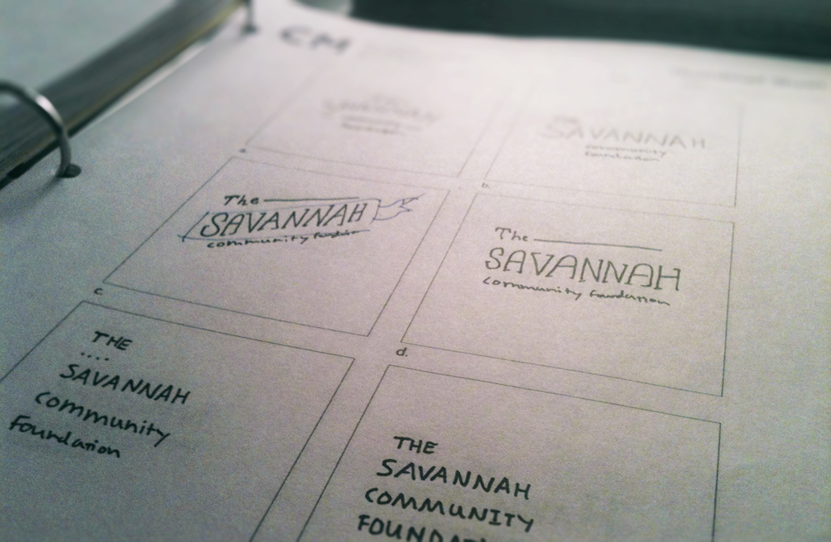
Thumbnails

Thumbnails

Thumbnails

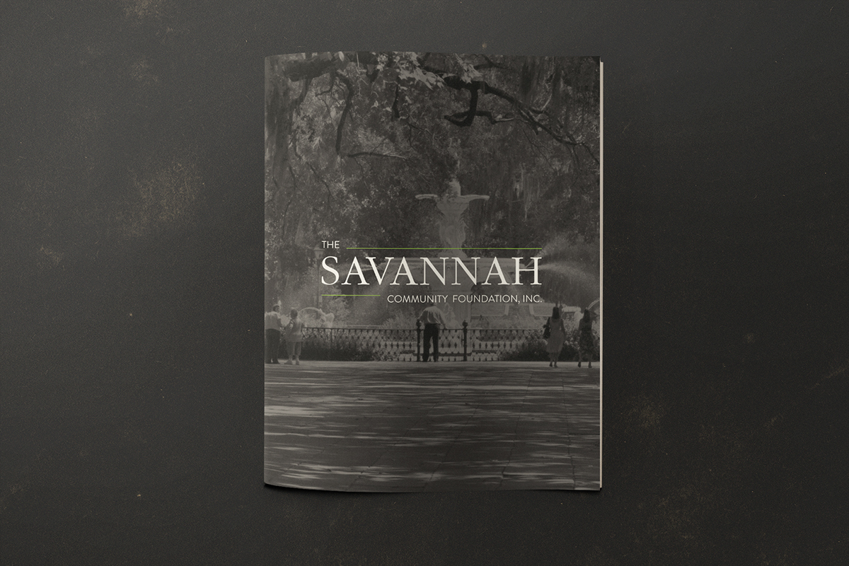
Front Cover

Spreads

Spreads
Spreads
Front and Back