Repositioned for relevance
La Petite Ferme
Background
La Petite Ferme, 'The Little Farm', is an intimate boutique hotel, restaurant and vineyard nestled in the Cape Winelands in Franschhoek. Its history dates back to 1974, started as a family business by John and Carol Dendy-Young predominantly farming plums. In 1984 the restaurant was opened, bringing with it the introduction of the wine. In 1997 the first set of accommodation was built. And in 2015 La Petite Ferme was acquired by The Nest, the current owners.
La Petite Ferme has built its reputation not only through its beautiful vistas and sunsets but also through its award-winning restaurant that offers seasonal menus with local produce. The establishment’s main characteristic is its vineyard, set in a sumptuous landscape that offers a different range of award-winning red and white wines.
Challenge
The luxury traveller has evolved. They are young, active and hungry for unique experiences. To stay relevant, La Petite Ferme needed to define and modernise the brand while staying true to their rich heritage.
With one of the oldest and well-respected restaurants in the area, the brand has a long positive history of success. The authenticity of the brand comes from knowing its strengths, which we needed to bring to life and up to date.
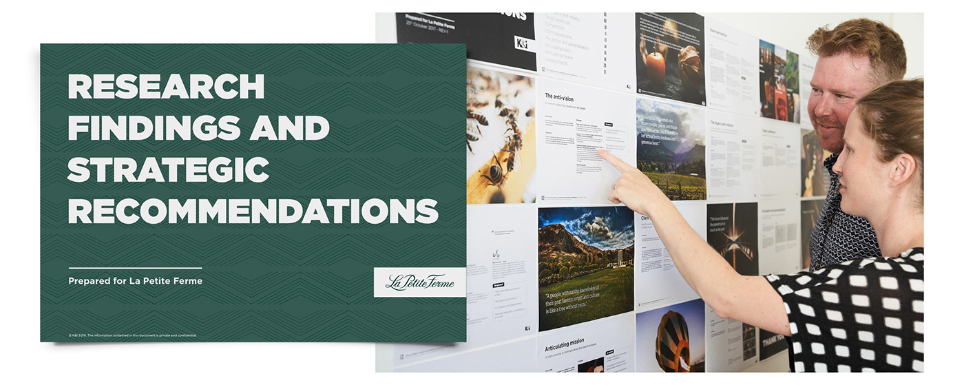
One of the main objectives was to increase brand awareness and determine brand positioning. In order to do so, we needed to define the brand strategy first.
Outcome
We started by looking at the brand strategy, including workshops, one-to-one interviews, and competitor research with site visits to local estates. We found insights into La Petite Ferme’s legacy and perceptions and identified their key differentiators, unique positioning and core values. The outcome was put into a strategic recommendations document.
The brand strategy was developed to honour the heritage of the past and position La Petite Ferme for today. We updated the logo and developed a new visual identity that encompasses their values, is more current, and has the flex to meet their future marketing needs.
The logotype was updated and modernised, keeping the original hand-drawn type as a foundation but minimising the ornate swashes. Several conceptual directions for the brand mark were explored as the previous logo featured a crest that didn’t contribute to their story. The chosen direction focuses on bringing the heritage and history of ‘the little farm’ together in a combination logo that depicts the farm's location as nested in the mountains.
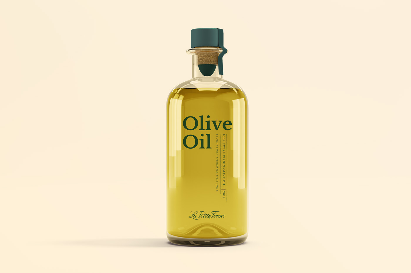
We defined a new colour palette, updated the typography usage, and created a geometric African styled pattern, inspired by the nearby mountain range. The photographic style was developed to convey authenticity, expressing a mystical, romantic, positive and modern style.
The branding was further rolled out into stationery, signage and packaging, including a wine range of 3 reds, 3 whites, a rosé and concept wines. Brand guidelines were established which included positioning statements, values, and visual guidelines.
The La Petite Ferme brand is now positioned to welcome it’s new customers while making sure the loyalist feels right at home with a brand they know and love.