


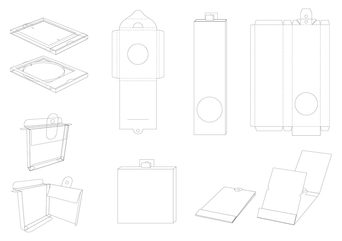
PACKAGING CONSTRUCTION
Re-branding, packaging design and photography for PURELEI
The brief:
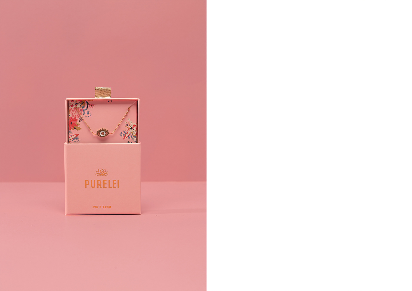
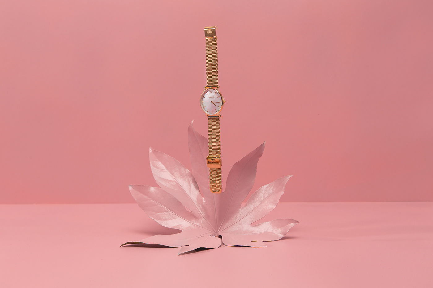
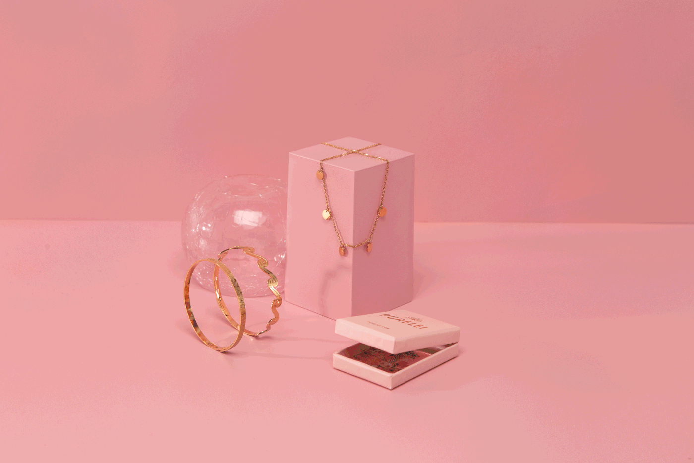
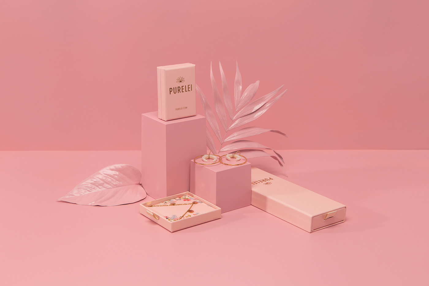
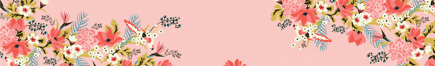
Purelei makes Hawaii-inspired jewelry made in Germany and wants to spread this tropical feeling to their customers all around the world. Being a very young corporation when they first contacted us, their existing visual identity back then had developed out of endless single elements that had been combined over time. They had no constant visual identity. With an existing logo, the goal was to recreate a tropical, elegant and girly world around the brand, to give Purelei a round and complex visual concept.
The solution:
Purelei‘s visual identity is elegant with a tropical touch. Using a soft pink as their main color with golden foil accents, the packaging has a very clean look on the outside. The tropical pattern that one can find on the inside by opening it however creates a surprise moment for the customer. This concept has been applied on all print elements of the design and also on the packaging design and construction. Therefore, some of the packagings are constructed in a way, that makes them unfold similar to an opening blossom.
Elements of design:
15 different packaging designs, business cards, stationery, brand book, social media content, set design.
Art direction and design: Alessia Sistori - Designstudio B.O.B.
Packaging construction: Alessia Sistori - Designstudio B.O.B.
Assistant packaging construction: Garance Poisson - Designstudio B.O.B.
Set design, stop motion animation and photography: Lilly Friedeberg, Marc Oortman, Alessia Sistori - Designstudio B.O.B.