

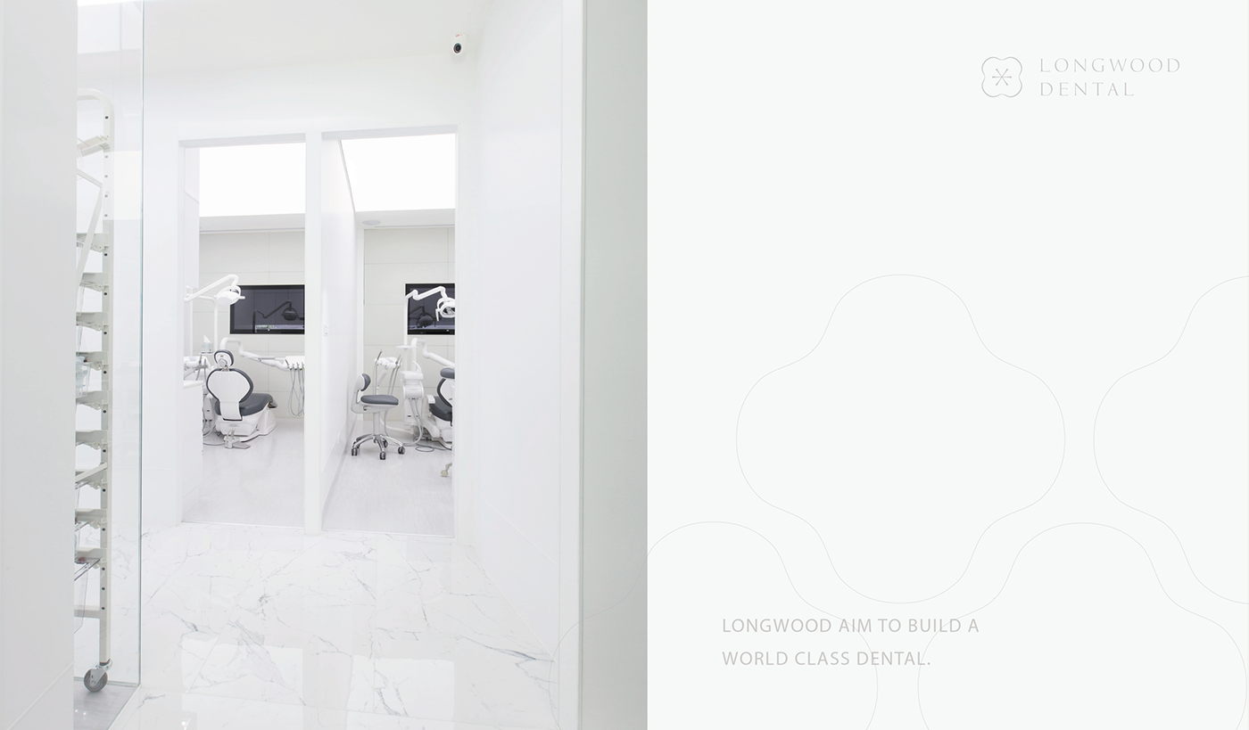
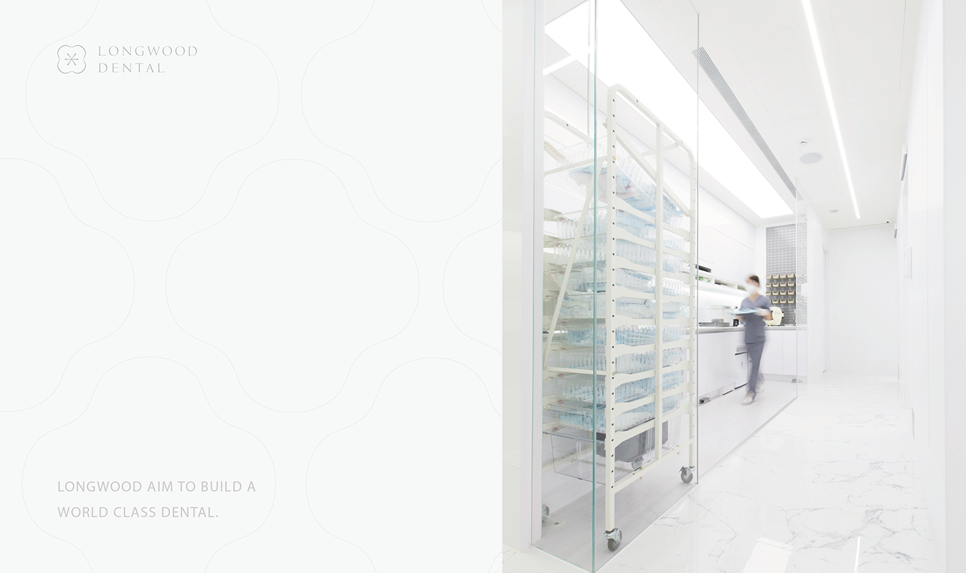


LONGWOOD Dental Branding | 長木牙醫品牌設計專案
Design Agency : StudioPros.work
Art Direciton : Yi-Hsuan Li / 李宜軒
Design Lead : Binsen Wang / 王用賓
Graphic Design : Yi-Hsuan Li / Binsen Wang
Client : Longwood Dental
Printer: Wei-Yang Printing Enterprise Co.,LTD
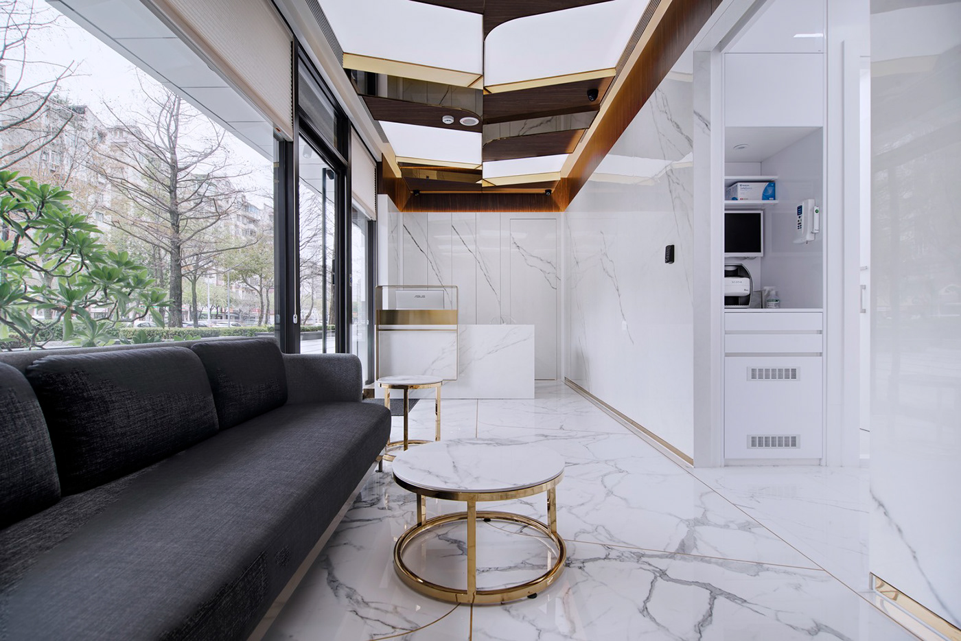
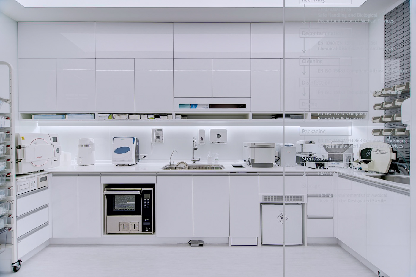
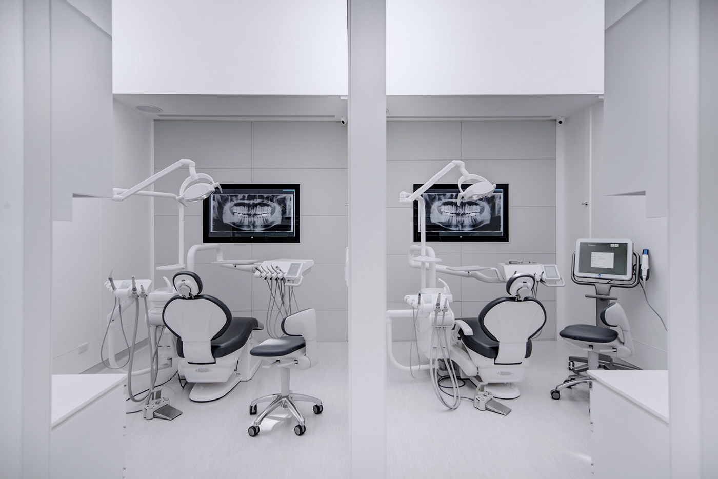
Interior Photography : 朱韻璇
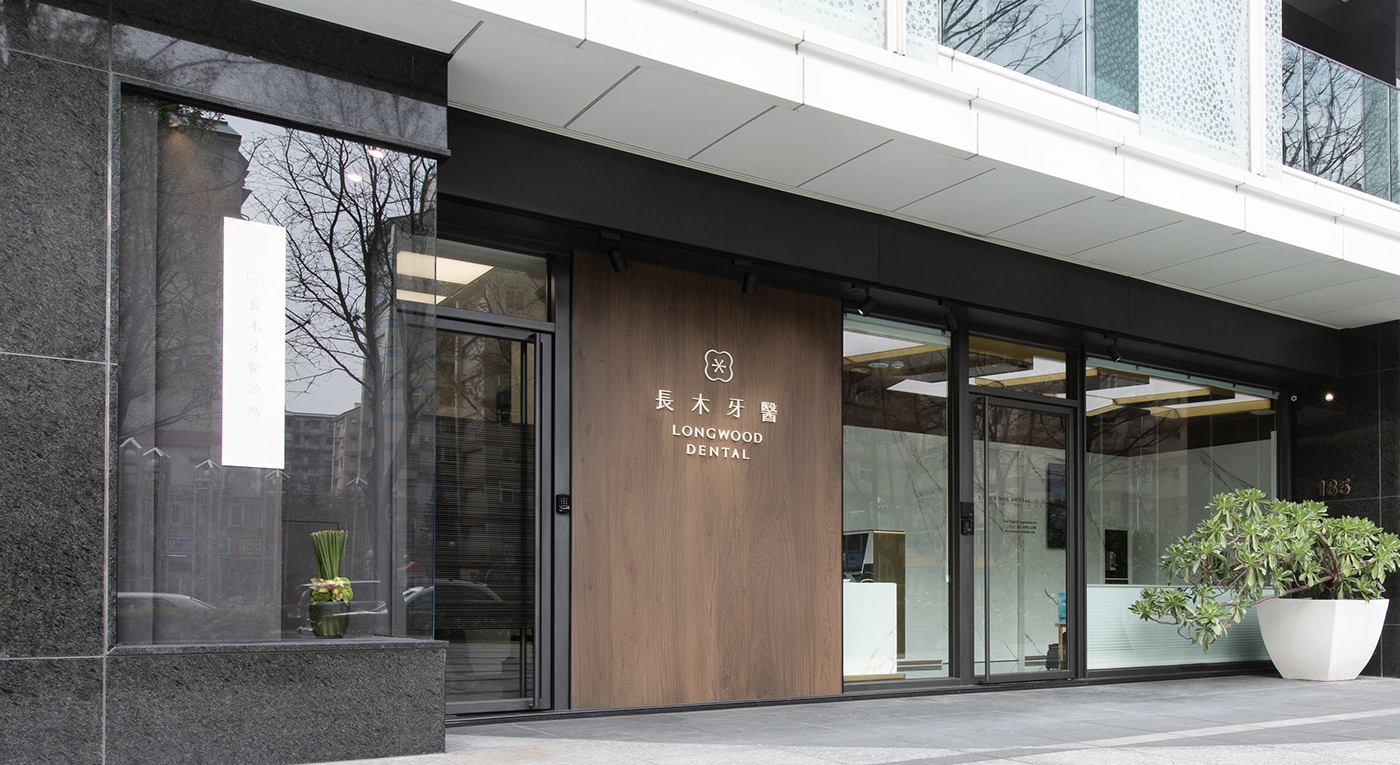
Exterior Photography : Nicophotography
Interior Design Direction : Han Lee 李軍漢
Art Direciton : Yi-Hsuan Li / 李宜軒
Design Lead : Binsen Wang / 王用賓
Graphic Design : Yi-Hsuan Li / Binsen Wang
Client : Longwood Dental
Printer: Wei-Yang Printing Enterprise Co.,LTD
Interior Photography : 朱韻璇
Exterior Photography : Nicophotography
Interior Design Direction : Han Lee 李軍漢
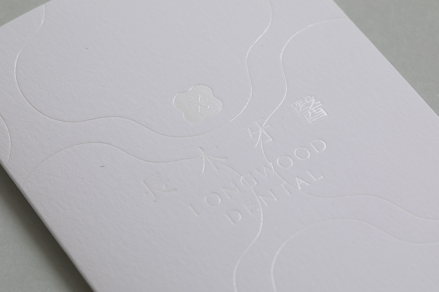
設計概念
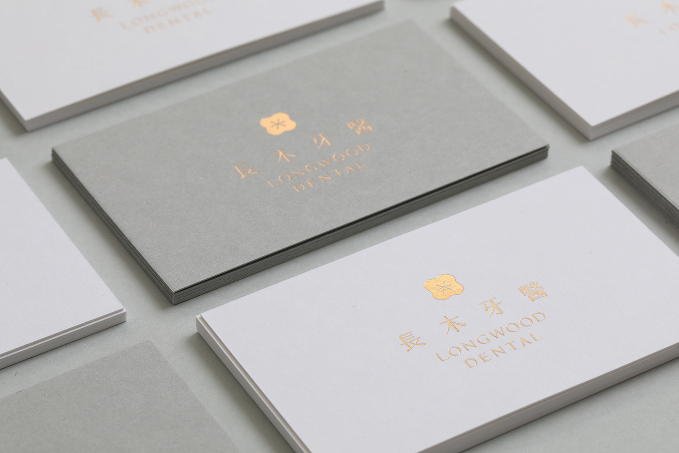
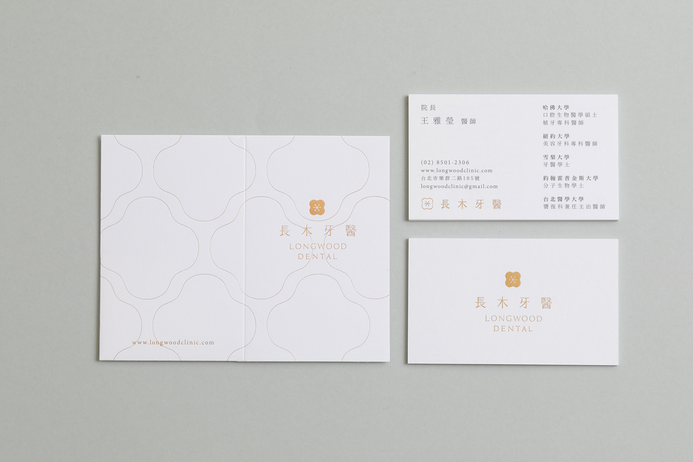
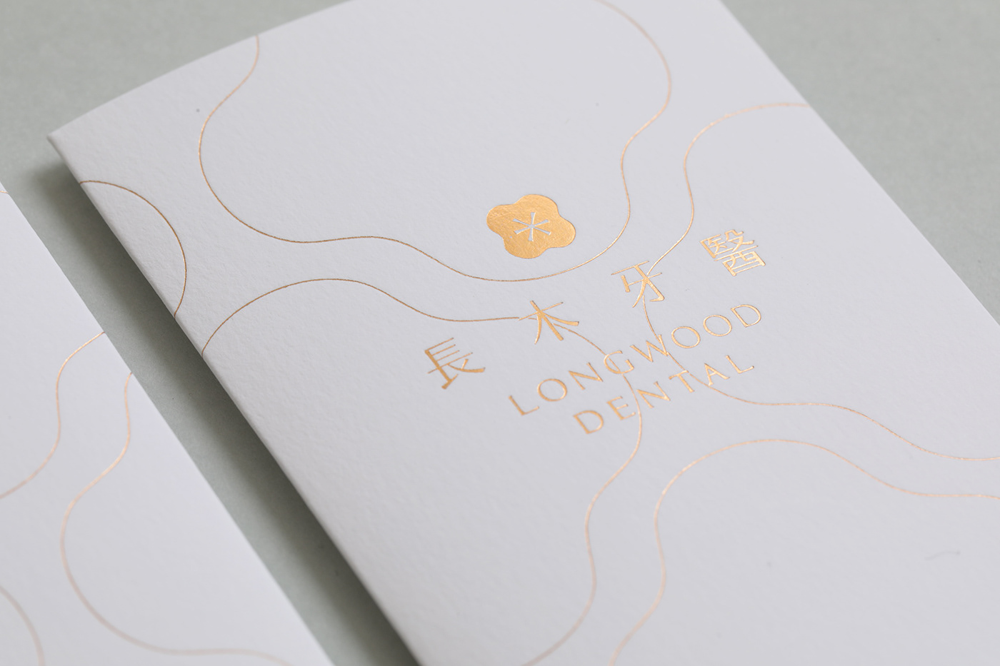
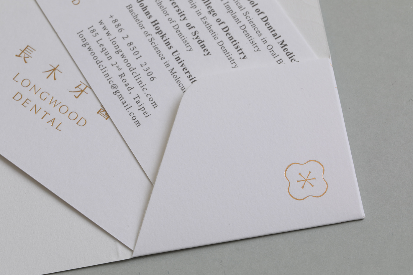
結合臼齒與花朵型態的牙醫品牌設計
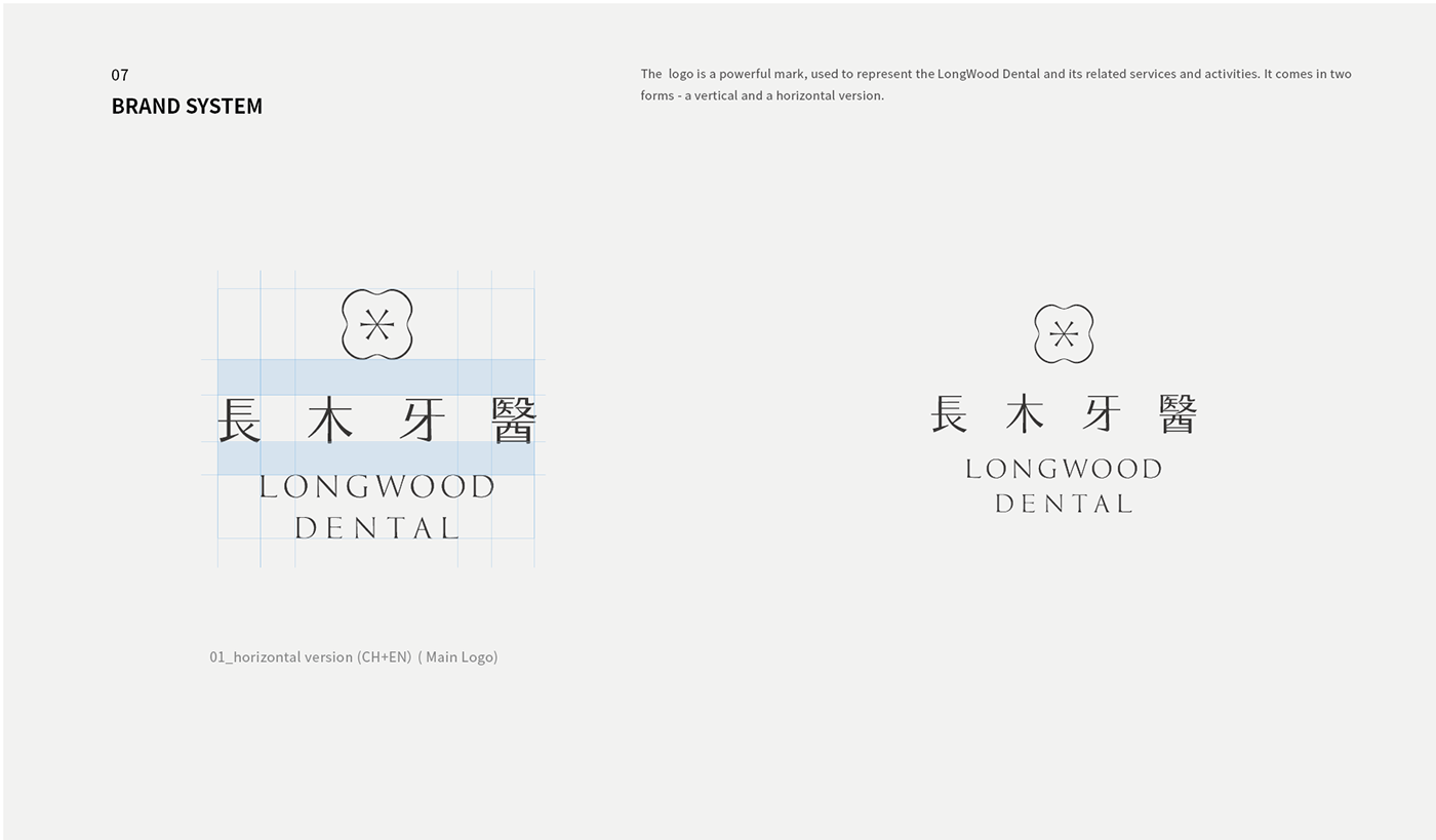
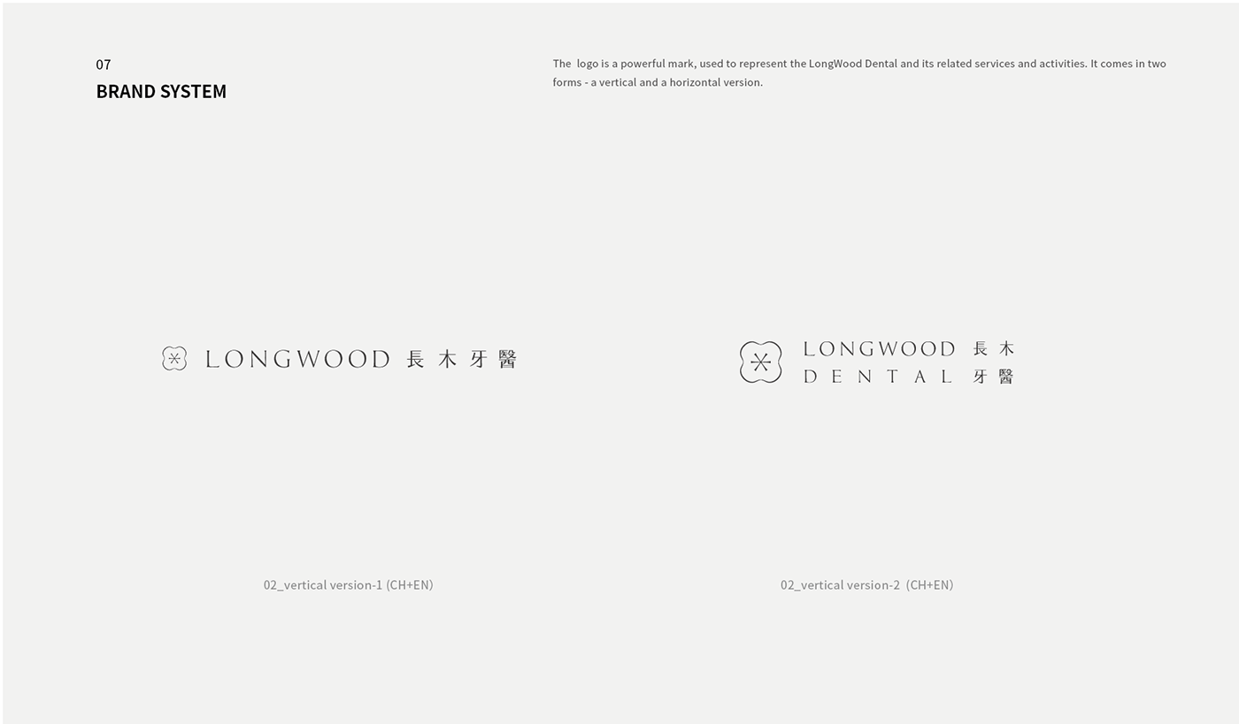
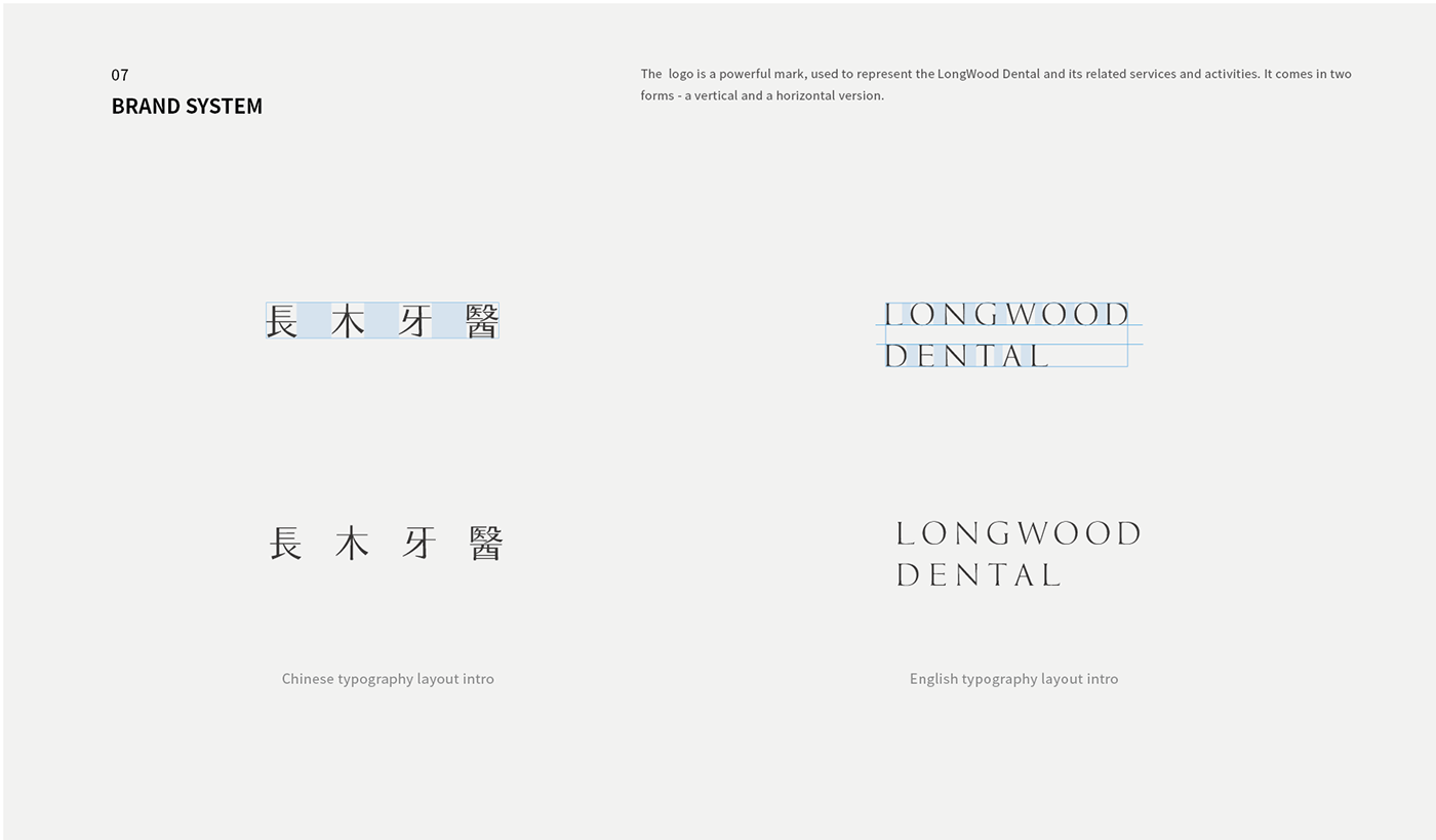
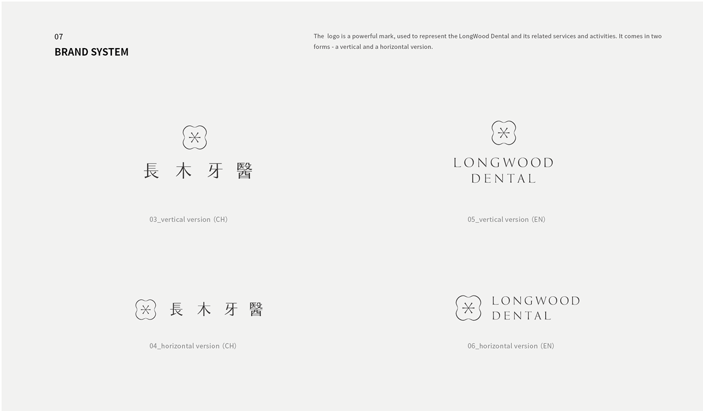
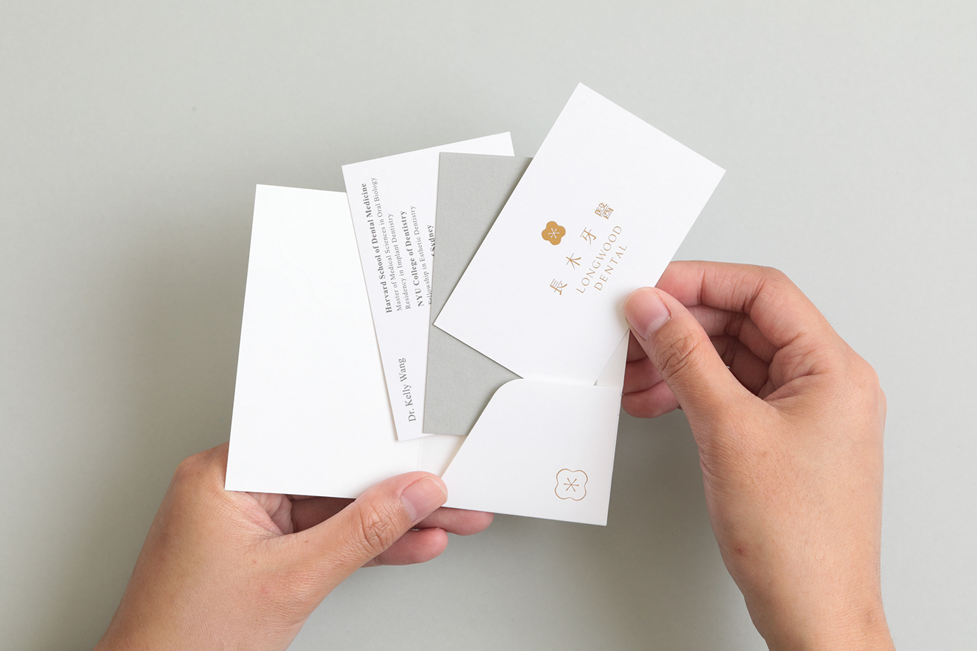
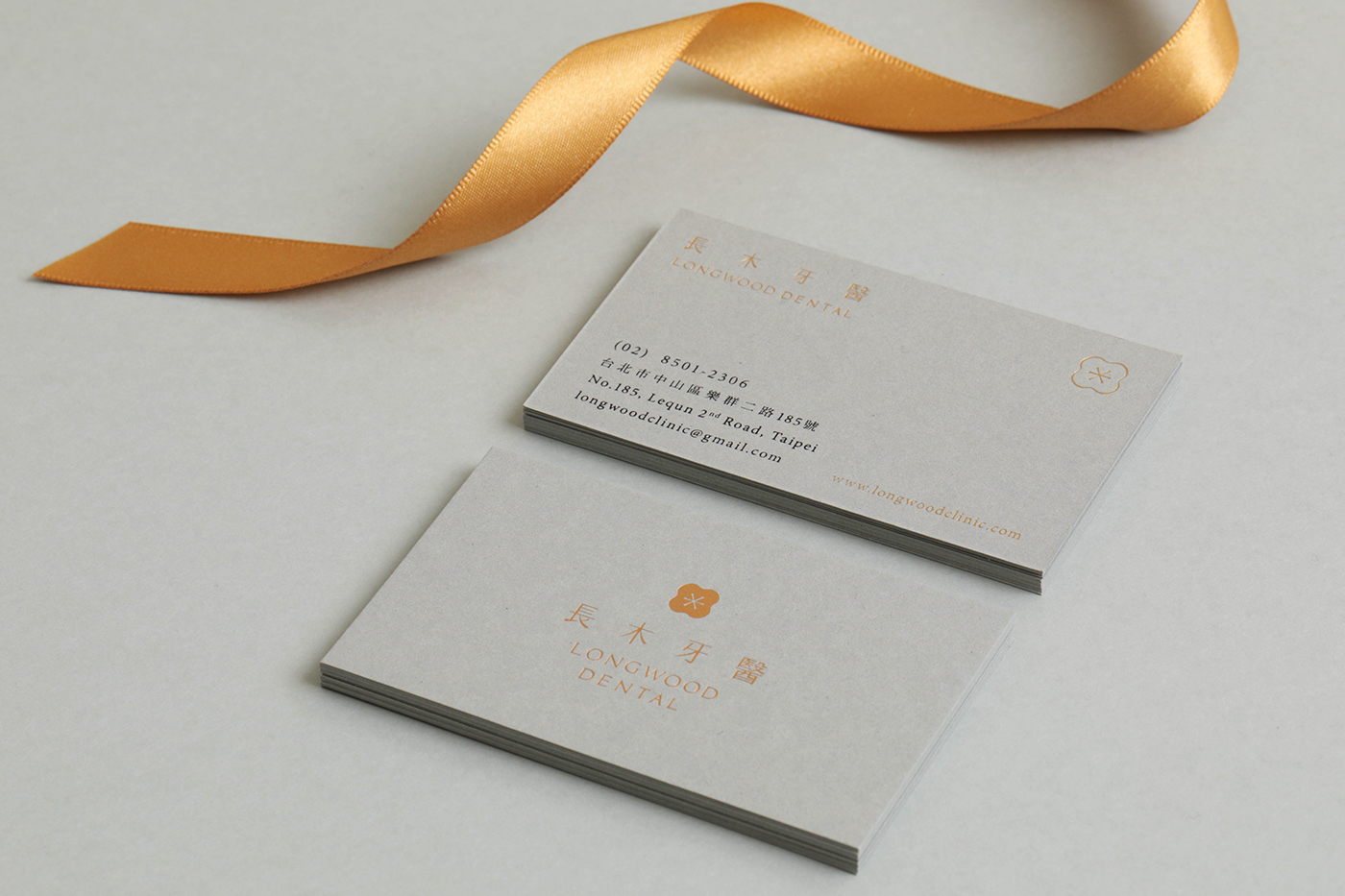
長木牙醫的設計發展上我們以牙齒正視圖形為主軸,將圖形的線條收斂後成形了一個似花也似齒的商標,圖像中細緻柔美的線條也象徵長木牙醫一絲不苟、專業、溫柔的服務理念。
在標準字的設計上,概念提取了「長木」二字的起源 Harvard Longwood Campus 裡滿佈的針葉松樹的樹枝特徵,以粗細有致的細緻質感呈現出字體的結構,而在商標的勾勒上,也融入了此特色讓整體搭配更加一致平衡。
結合臼齒與花朵型態的牙醫品牌設計
長木牙醫的設計發展上我們以牙齒正視圖形為主軸,將圖形的線條收斂後成形了一個似花也似齒的商標,圖像中細緻柔美的線條也象徵長木牙醫一絲不苟、專業、溫柔的服務理念。
在標準字的設計上,概念提取了「長木」二字的起源 Harvard Longwood Campus 裡滿佈的針葉松樹的樹枝特徵,以粗細有致的細緻質感呈現出字體的結構,而在商標的勾勒上,也融入了此特色讓整體搭配更加一致平衡。
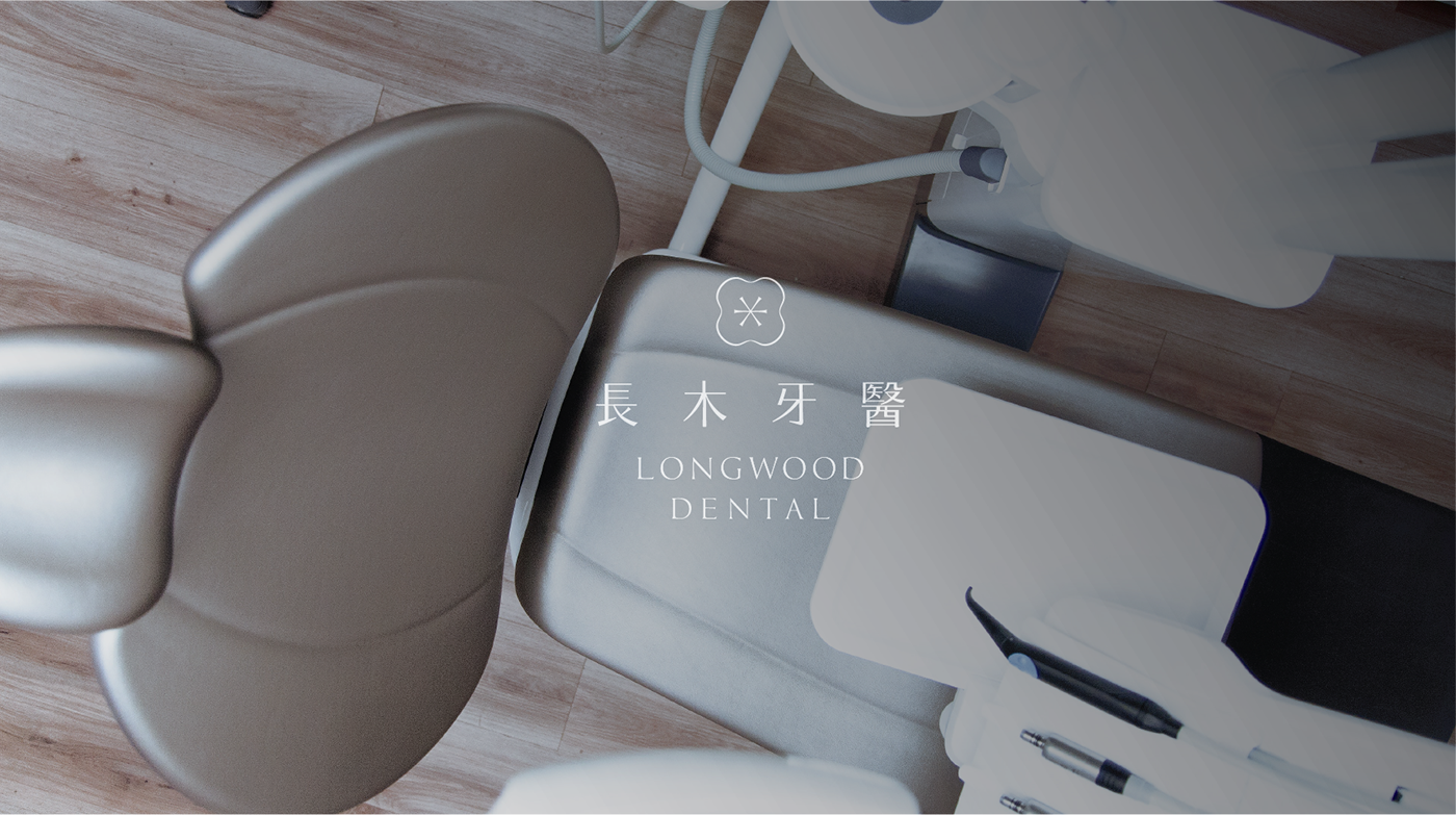
A dental branding design combined with the images of a flower and molar tooth
In the design process, we utilize the top view of a tooth as the main structure; later the lines converge and form a logo that looks like a flower and a tooth. Its graceful lines represent the core service principles of Longwood Dental— be meticulous, professional, and gentle. The brand name “Longwood” derives from Harvard Longwood Campus; thus, we design the characters based on the branch features of the conifers, which form the green canopy of the campus. The strokes are in different degree of thickness to present conifers’ distinctive structure. We also add this feature to the logo, creating an overall consistency and equilibrium.
In the design process, we utilize the top view of a tooth as the main structure; later the lines converge and form a logo that looks like a flower and a tooth. Its graceful lines represent the core service principles of Longwood Dental— be meticulous, professional, and gentle. The brand name “Longwood” derives from Harvard Longwood Campus; thus, we design the characters based on the branch features of the conifers, which form the green canopy of the campus. The strokes are in different degree of thickness to present conifers’ distinctive structure. We also add this feature to the logo, creating an overall consistency and equilibrium.


