
Rebranding
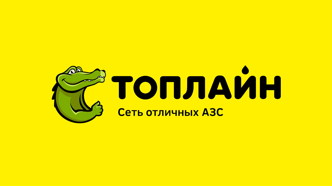
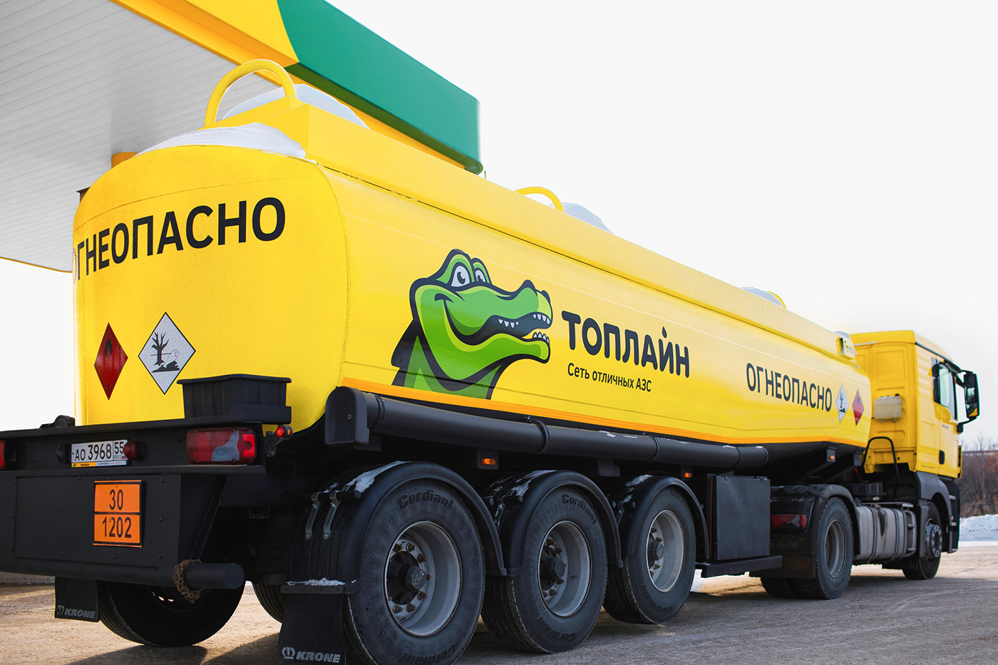
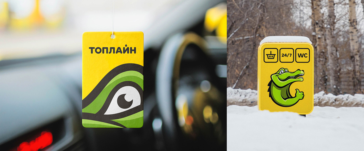
Apart from the brand name, we left the recognizable logo image – a crocodile.
The redesigned logo looks more animated, friendly and vibrant. We suggested a more appropriate font family for the logo sign TT Rounds (TypeType) and fixed it with the positioning statement “The network of excellent Filling Stations”. The typical soft plasticity of the logo sign is transmitted to the graphic elements – stripes, lines, which are used
in a range of scales on promotional products.

Logo Before

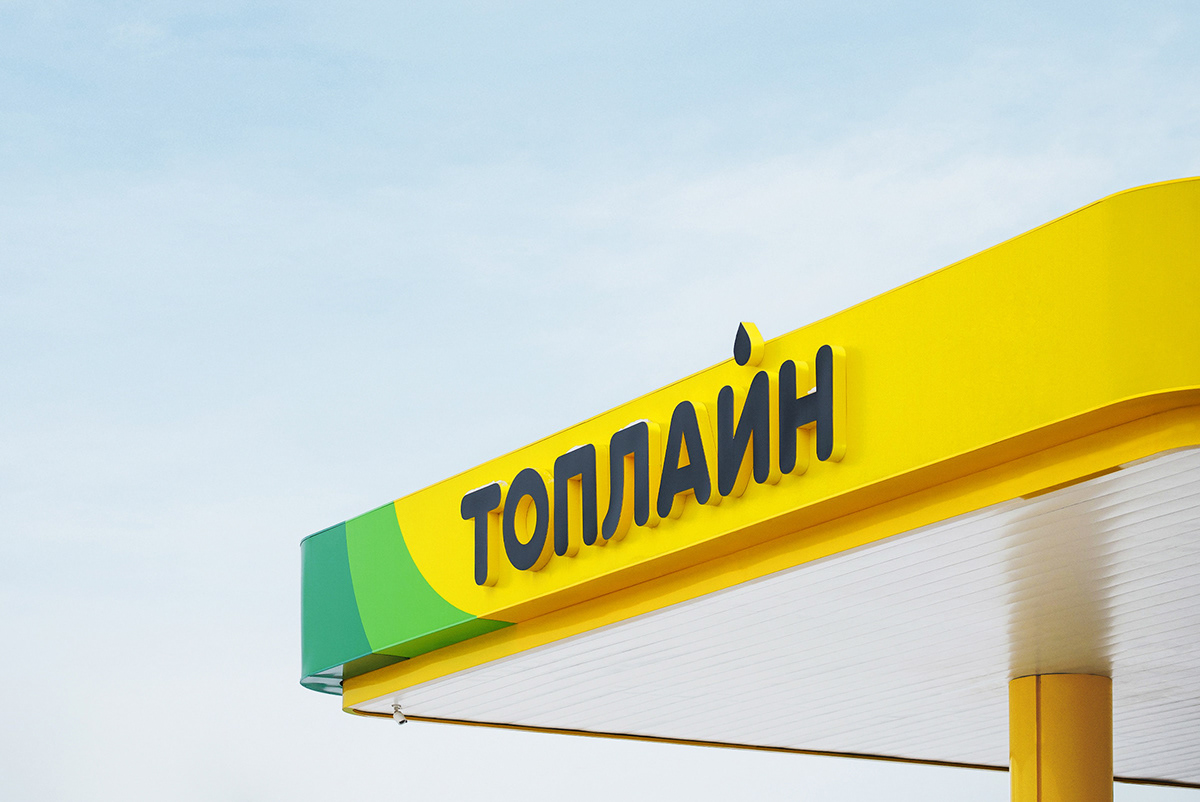
Filling station design
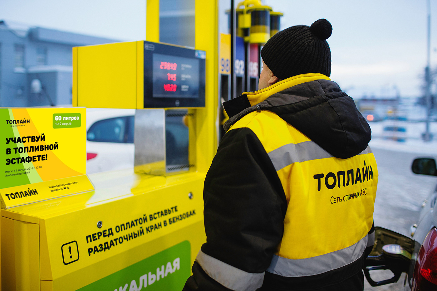
There are 45 filling stations in the network. We developed the design for over 20 of them. The client approached with a task to realize the project within a strictly limited budget, which explains the choice of budget materials for the construction purposes. We had to work with the existing station buildings, so our solutions had to be adapted to their shape. For that reason all filling station has an individual design and for some we have developed purpose-tailored compact solutions. The ongoing work started in 2014.
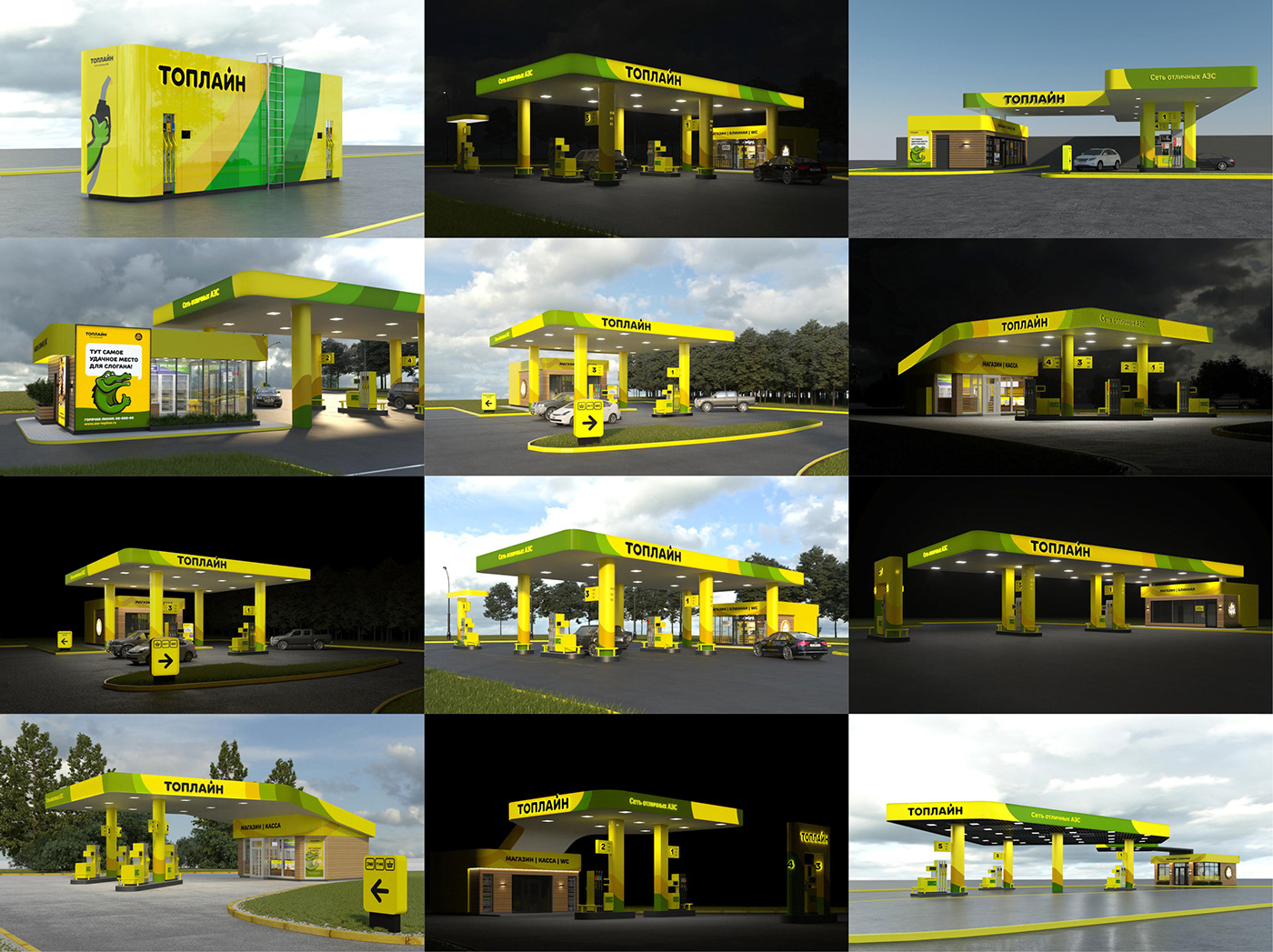


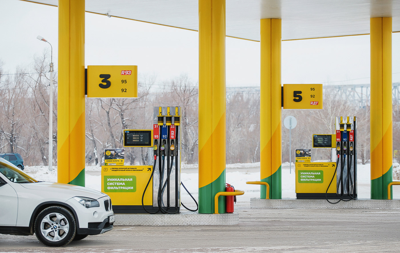

Apart from the fuel stations, we designed stationary, apparel and promotional materials: staff uniform, vehicle design, advertising mediums, POS-materials, navigation system etc.


Creative Directors — Boris Alexandrov & Anna Alexandrova
Account Manager — Daria Svidchenko
Art Director — Anton Storozhev
Graphic Designers — Server Terlekchi, Alexander Osipenko,
Elena Parhisenko, Dmitriy Moga
Illustrator — Alexander Gusarev
Architecture — Sergey Makuhovskiy, Alexander Gusarev, Elena Guryeva,
Liza Kudinova, Irina Shtremel, Plamen Zhuzhunov
Copywriter — Dimitry Panasiuk
Copywriter — Dimitry Panasiuk
Photo — Mikhail Burdel
Follow us

