


Guanabara is the third release of Plau Type Foundry (formerly half of Niramekko). It started from the need of a wayfinding typeface that had personality enough to be the brand typeface for a city. The city of Rio de Janeiro, with its never-ending curves and all year long summer weather provided the constraints and requirements of this typeface.
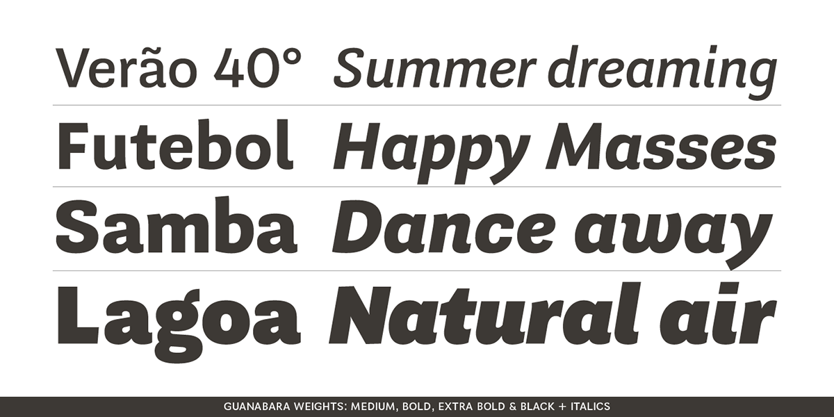
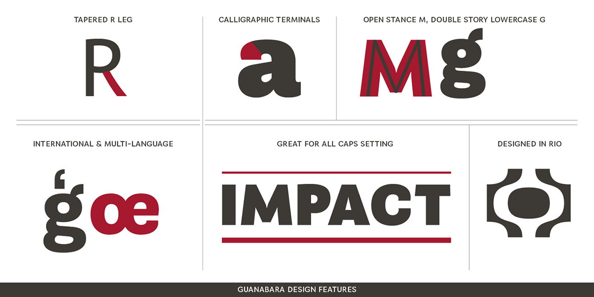
From there, it evolved to be a workhorse, with 8 weights from Thin to Black and matching true italics. It just had to have the features that all us designers have grown to love, such as alternate letters (a, g and r for the romans), tabular and proportional figures in lining and oldstyle set-ups as well as small caps, fractions and all that jazz (I mean, samba).
And it needed to be recognizable and distinct. For that, design features like tapered R legs, capitals with classic proportions and calligraphic finishes on the terminals proved crucial.
And last, but not least, like Rio, it had to welcome many cultures.
We came to think of it as the "Typeface from Ipanema", with a classic, timeless look, swinging elegance and joyful attitude.
Guanabara Sans is available for purchase
and immediate download on these fine distributors:
and immediate download on these fine distributors:
Looking forward to seeing the cool things you make with it!
