Descrevendo de forma abrangente, o Jardin e o Quintal são dois espaços de desconexão que se desenvolvem a partir da união de café e plantas. Localizados no centro de São Paulo, os estabelecimentos têm personalidades próprias, mas seguem o mesmo princípio: serem refúgios urbanos, tendo o verde das plantas como protagonista.
Com o crescimento dos espaços, intensificou-se a necessidade de unificar a identidade e a comunicação dos dois estabelecimentos, surgindo assim o selo Do Centro, como uma marca guarda-chuva que abriga estes e outros potenciais negócios que venham a surgir dentro do mesmo modelo.
Describing it in a wide way, Jardin and Quintal are two spaces of disconnection that emerge from the union of coffee and plants. Located in the downtown of São Paulo, the establishments have their own personalities, but follow the same principle: to be urban refuges, using the the plants as protagonists.
As the spaces grew, the need to unify the identity and communication of the two stores intensified, thus giving rise to the Do Centro seal, a brand house that holds these and other potential businesses that may appear within the same model.
A nova marca deveria se colocar de forma sutil, uma vez que a linguagem dos espaços já estava consolidada de outras formas, como na arquitetura e na essência do atendimento. Sendo assim, o principal desafio seria ler as características existentes e sintetizá-las de forma gráfica.
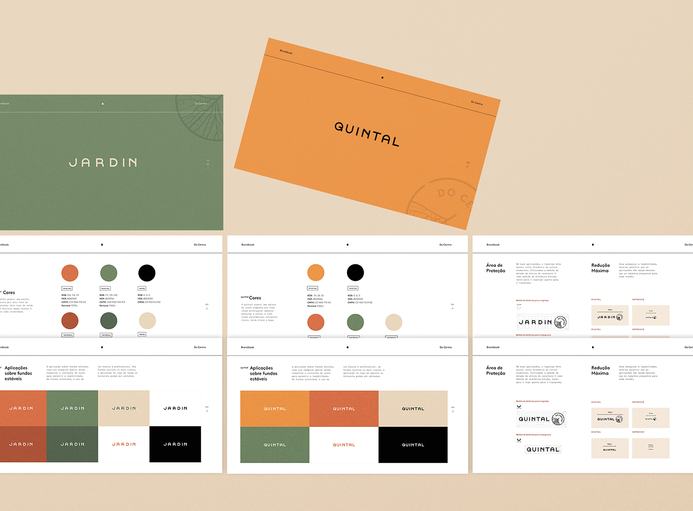
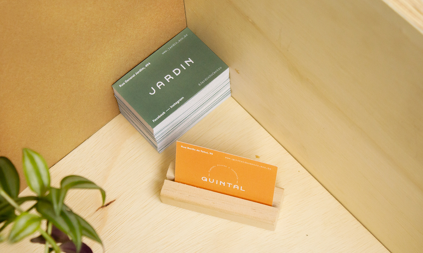
A partir destas leituras, trazemos a terracota dos vasos de argila e o verde das folhas como princípio de uma paleta comum, que se complementa com o amarelo das paredes no Quintal e com o bege da madeira no Jardin, conferindo características distintas a cada estabelecimento.
The new brand should be subtle, since the visual signs of the spaces were already established in other ways, like in the architecture or in the careful service. Therefore, the main challenge would be to read the existing features and synthesize them in a graphic way.
Based on this point of view, we bring the terracotta color of the clay pots and the green of the leaves as a common basic color palette, which is complemented by the yellow of the walls of Quintal and the beige of the wood in the Jardin, giving different characteristics to each establishment.
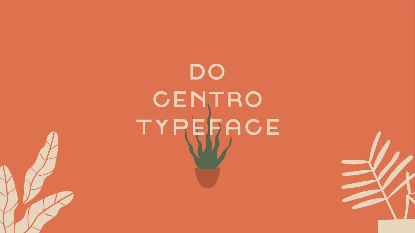
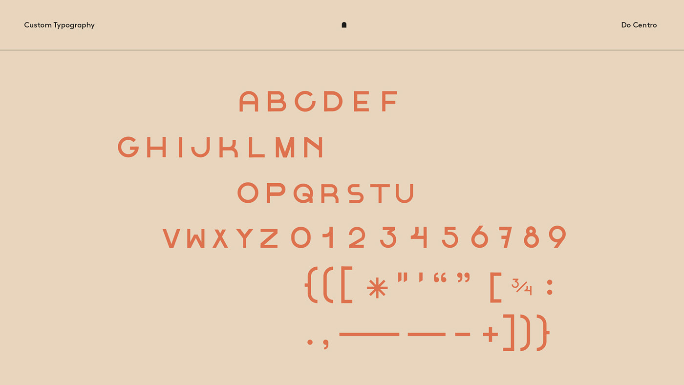
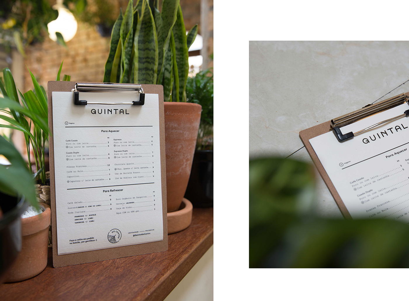
Elemento marcante na arquitetura de ambos os espaços – seja nas portas, janelas ou passagens abertas a cada expansão – os arcos tornam-se o principal ponto na construção das marcas, aparecendo como grafismo na identidade auxiliar e servindo também de inspiração para as curvas da Do Centro Typeface, que se desdobra nos logos das duas casas e traz a clareza e a unicidade visual necessárias, com o cuidado de não descaracterizar os espaços.
A remarkable element in the architecture of both spaces - whether in doors, windows or open passages at each expansion - the arches became the main aspect in the brand's construction, appearing as graphism in the supporting identity and also serving as inspiration for the curves of Do Centro Typeface, which unravels in the logos of both buildings and brings the necessary clarity and visual uniqueness, taking care not to disfigure the spaces.


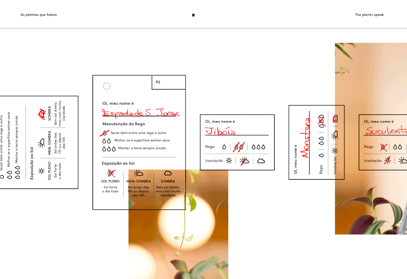
Como forma de melhorar a operação da loja de plantas, as próprias plantas começaram a falar
um pouco sobre si, apresentando-se com nome e pequenas dicas de cuidado como iluminação e rega.
As a way to improve the operation of the plant store, the plants began to talk a little about themselves,
presenting themselves with name and small care tips such as lighting and watering.


Acesso à Sala Semente, o co-working do Jardin do centro. Ticket to access the Coworking space at the cafeteria