

BRAND DESIGN
CPG, HEALTH & WELLNESS
PHARMACEUTICAL CATEGORY
LOS ANGELES, CALIFORNIA
Working in the Pharmaceutical category is incredibly challenging. The industry is heavily regulated and policed by both the FDA and the FTC with strict guidelines regarding information, layout, and typography across all physical and digital channels. Every character is checked by Legal, Regulatory, and Quality departments... And that's after the standard Marketing & Product Team stage-gating. Revisions are endless, pre-press is beyond tedious. Running through the Pharmaceutical redactor to land on-shelf with anything intriguing, relatable, and stylish is design mastery.
The following is the case study of one such undertaking.
Creative Director: Kara Errickson
Lead Design: Jim Slatton
Design: Kailey Staiano
Design: Alex Mathov
Design: Delaney Smith
Design: HR Sweat

About
The DIG team embarked on a lofty mission to re-frame one of the most misunderstood, yet highly significant, stages in a woman's life: Menopause. How can we encourage women to accept it, embrace it, and own it, when the mere mention of that word makes us groan? By creating an experience as alluring as the women it serves!
Tired of watching society push aging women out of relevance, we wanted to show women they have value, support, strength, and that every transitional moment they face is worth celebrating. Ultimately, we hope the Doctor Wise brand is a reflection of the women who inspired it: unique, emotive, and beautiful!

PROCESS
Initially, the client's creative brief requested packaging artwork for a line extension of female-focused medicine for national launch in the USA. Straight-forward, short-turnaround. However, as DIG researchers began to examine the broader cultural context around the project, including the Election of 2016, the Women's March, and the Me Too Movement, it slowly became evident that a tremendous whitespace exists around women's issues. Thanks to a receptive, curious, enlightened client (Thao Le, VP Marketing & Innovation at Hyland's) the project grew into a year-long endeavor that would result in an entirely new brand dedicated to support women through challenging transitions. For those of us embedded, the Doctor Wise project forever changed our perceptions about aging women.
Human-centered design is a widely-adopted problem solving approach that works particularly well as a framework for projects in Health & Wellness. As we began to synthesize the incredible range of personal, touching, sad, and hilarious experiences women shared regarding ageism, sexism, and intimacy, insights emerged that helped shape the brand voice across physical and digital channels.
ARTWORK
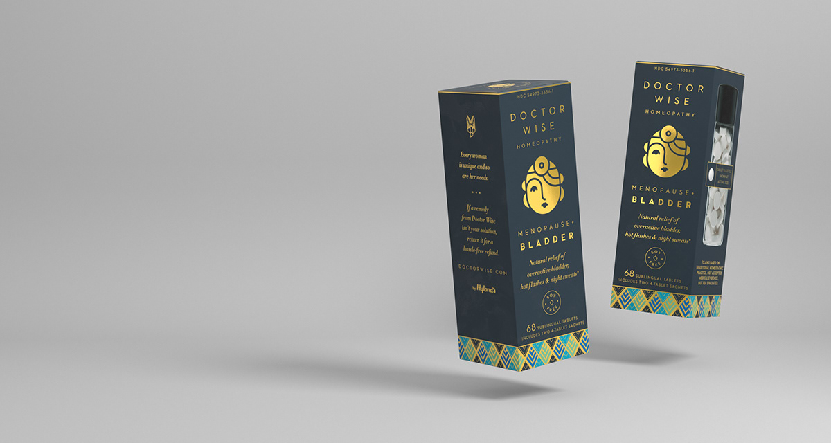
The primary logo mark (designed by Jim Slatton) is a woman's face: rounded, gentle, and knowing, framed by bouncy cropped hair, and wearing a retro doctor's reflector around her forehead. She is emblazoned in gold, the primary focus of every product, an anthropomorphic callout. The slender product cartons are elegant and sophisticated with a bold presence to embody Doctor Wise's position on the subject of women in mid-life: composed, but not constrained. Soft-touch laminate over the deep navy background flood provides a rich sensorial experience. Individual products are differentiated by ornamental Art-Deco bands. The interior of the packages are flooded with soft gold, and upon opening, you are greeted by the wise woman on the top flap.
Partner: Jim Slatton, Slatthouse Creative, slatthouse.com
OUTCOME
Thanks to an incredibly enlightened millennial (!) Fem Care category buyer at one of the largest drug retailers in the USA, the entire line of 5 Doctor Wise products rolled-out nationwide in July 2018.
If there was one thing that kept this ambitious undertaking moving forward, it was passion. We were relentlessly charging forward inside an understandably conservative company to say things unsaid, to help aging women feel validated by acknowledging the truth about menopause, which is anecdotally equivalent to reversing out of puberty. The perception of women in mid-life is dated and stale; their lives are vibrant, expansive, and filled with epic pursuits! These women are not the subdued depictions captured in our culture's collective mind when one hears the word menopause, and we hope for our part, the DIG team has promoted change.


