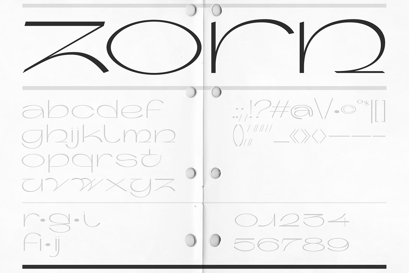
Zorn Typeface
Zorn is based on the directions and energy of small case letters that are extended and quite light with a noticeable contrast. The aim was to create as much tension inside one letter as possible, and also between different letters and numbers, to catch that feeling and overall look of sudden, harsh movements conveyed by sharp forms. To keep this tension and energy, the forms are not always following the contrast consequently. It was important to take the path that lead to the most unified look but also the most interesting shapes.
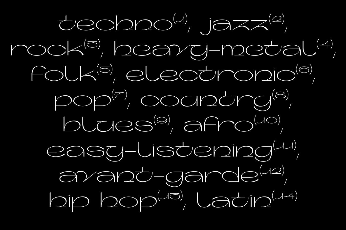
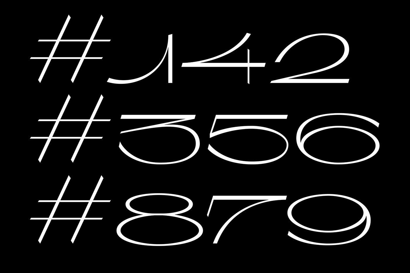
Character set includes small case letters, numbers and punctuation.
OpenType features:
Ligatures – fi
Stylistic Set 1 – i, g, r
Contextual Alternates – ij
Test the whole typeface out on Typelab.fr
Read the article about Zorn on It's Nice That