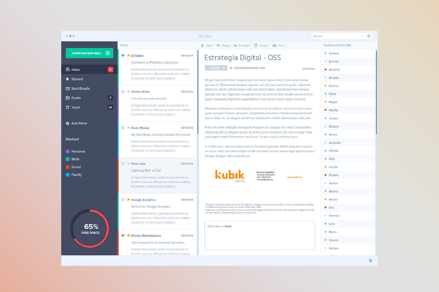
Kubik Digital Agency celebrated its anniversary with a rebranding. After 16 years of helping brands connecting with their audience, the Guadalajara based agency wanted to refresh their logo in a bold way that could give their current and new costumers a sense of innovation and reinvention while reinforcing the values of trust and loyalty with those with whom they have worked so many years.
I wanted the rebrand to cover every aspect of the business: digital savviness, social intelligence, customer service, and audience listening. The first breakthrough element of the new logo was using the letters in lowercase with round corners, thus being more friendly, impactful and audience-oriented.


Kubik's new isotype is represented by the letter K projecting a voxel–the tiniest distinguishable element of a 3D object–to represent innovation and transformation. It will be an ongoing part of the rebranding, used to help represent different services and commercial specialties that the agency offers. Together with a new color palette, and the use of gradients to create ambients and define moods, Kubik's brand would be more vehement, dynamic and powerful than ever.


This proposal was not implemented.
Mockups: Zippy pixels & Graphic Burger


