One may wonder the mysteries that lie behind Wayne Enterprises, and this branding exploration will only peak the interest more for enemies and friends of this company alike. Wayne Enterprises is the face for Bruce Wayne's identity in Gotham City. Through WE, he not only makes business deals but also strategic deals to protect and improve the City of Gotham. Wayne's philosophy is to stay cool, hidden, and above all helpful.
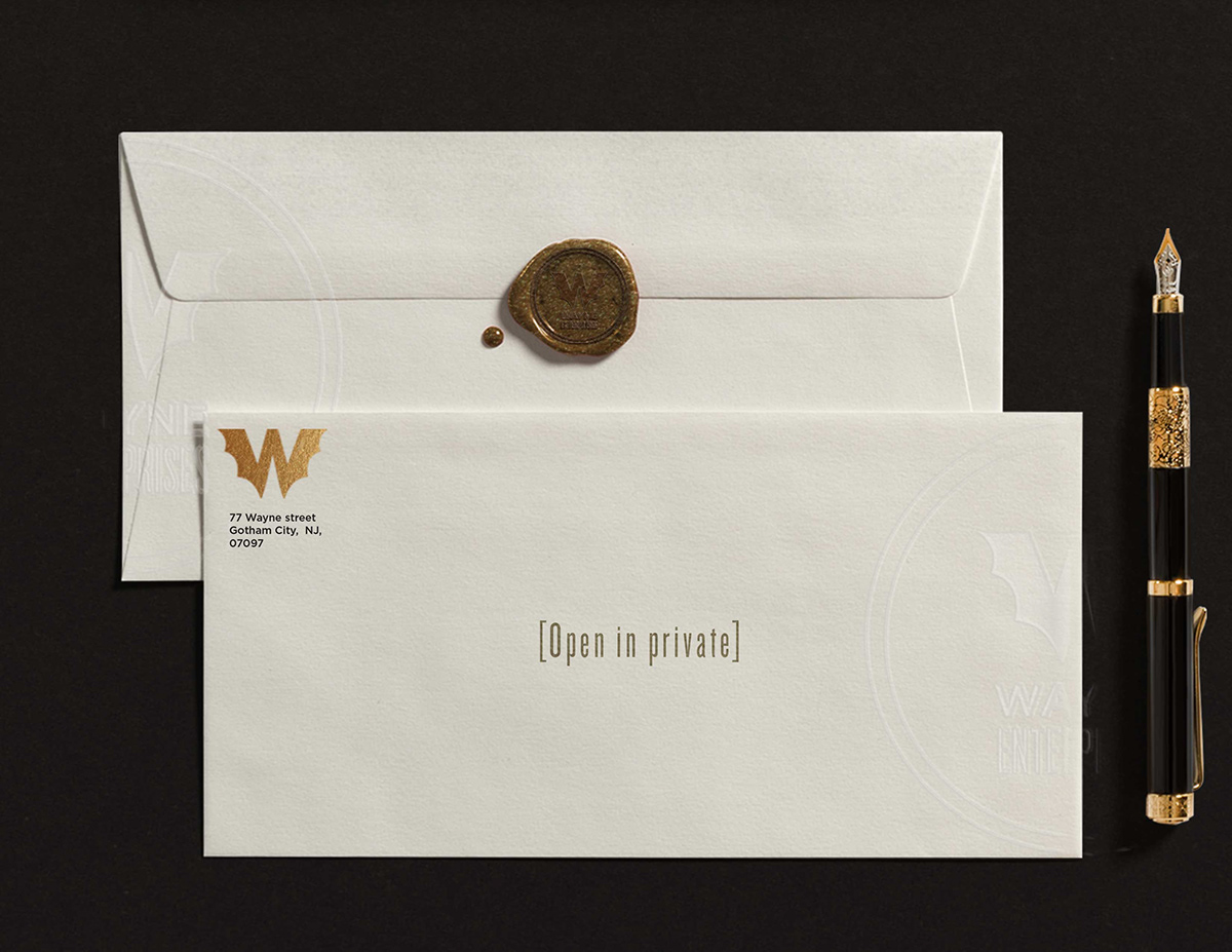
This branding exploration is his philosophy personified. The business cards exemplify a clean and direct way to contact the business services of Wayne Enterprises, but also offer a secret way of contacting Batman by shinning a light through the middle of the di-cut logo. Each paper, even the envelopes, are hand pressed with a security embossment to avoid counterfeit documents. The paper stock is offered on two types, white 24pt paper and also black. When black paper is used, a mix of black ink is used on these document to signify top secret documents. Black on black offers just the right amount of class and secrecy though its look and feel. To, again, avoid counterfeit objects as well stay on philosophy with WE, the edges as well as key elements to the stationary are gold-leafed by hand. You can see this in the business cards, envelopes, letters, and more. As a final element to to this brand, you will see a dynamic crime tracking application, that is authorized for WE staff only. Here you will see not only data and infographics to better your city but also a dynamic logo that tracks the rate of which crime enters the city. Enjoy.


The interactive application is password protected and uses a similar embossed treatment to the type but in a digital format, to hide sensitive information. The app itself is a dashboard that tracks crime in the city of Gotham, while the logo used in the branding becomes a dynamic. Depending on who is attacking, the logo will change color and begin to glow in a radar type of fashion. Depending on the servility of the attack, the logo will change in color density. The logo itself, when in this radar dynamic view, is reminiscent of the logo type when light was shined theough the business cards, as well as bright edges on screen to mirror the gold-leafed inner edges of the logo on the business cards - a sleek way to tie the concept back to its print brother.