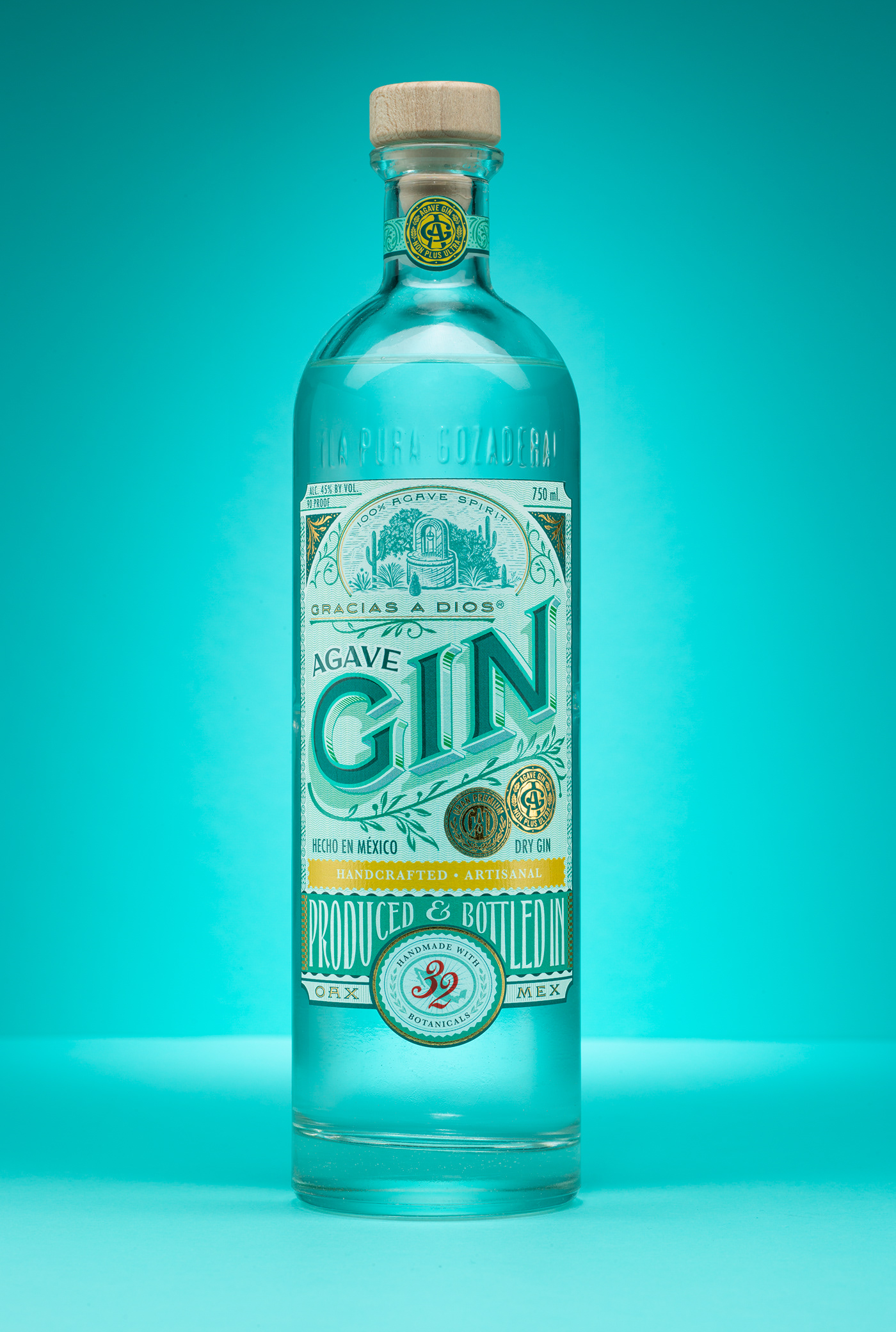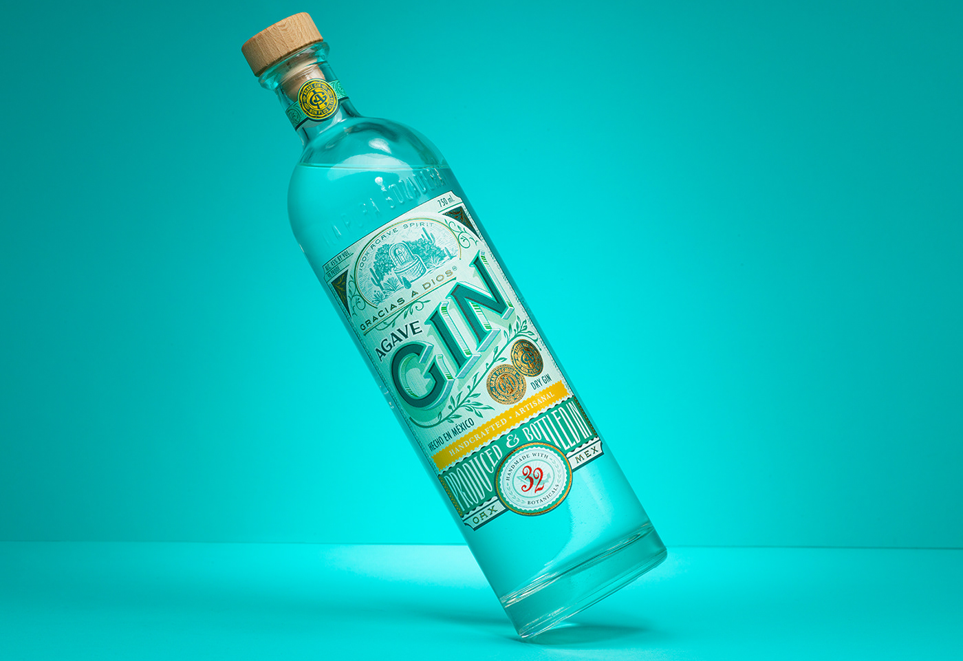
Gracias a Dios Agave Gin
This project represents everything that I love about Mexico; it’s bold colors, intricate detail, and handcrafted tradition. It is inspired by the past but rooted firmly in the present. This also represents the first time I have ever been asked to redesign my own work.
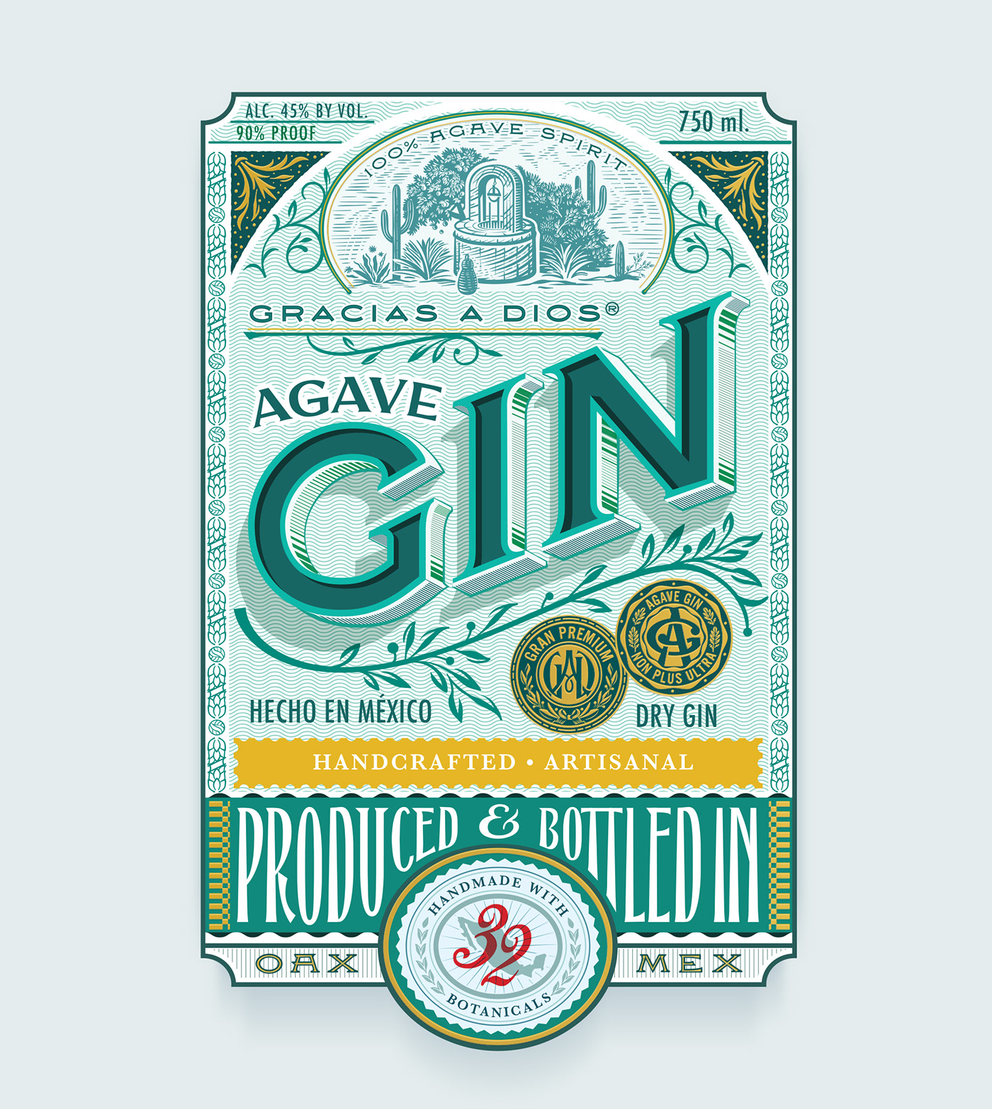
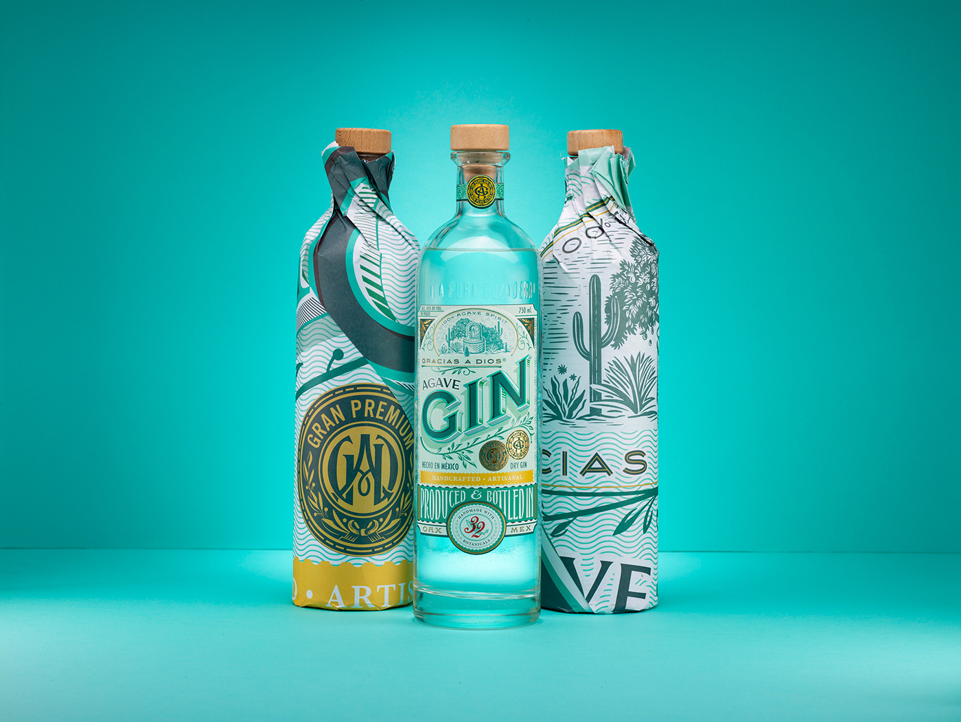
Gracias a Dios commissioned me to redesign their Gin label with two objectives; to create a new brand independent of their mezcal products, and to design for two additional skews that were being introduced into the market alongside their original Gin.

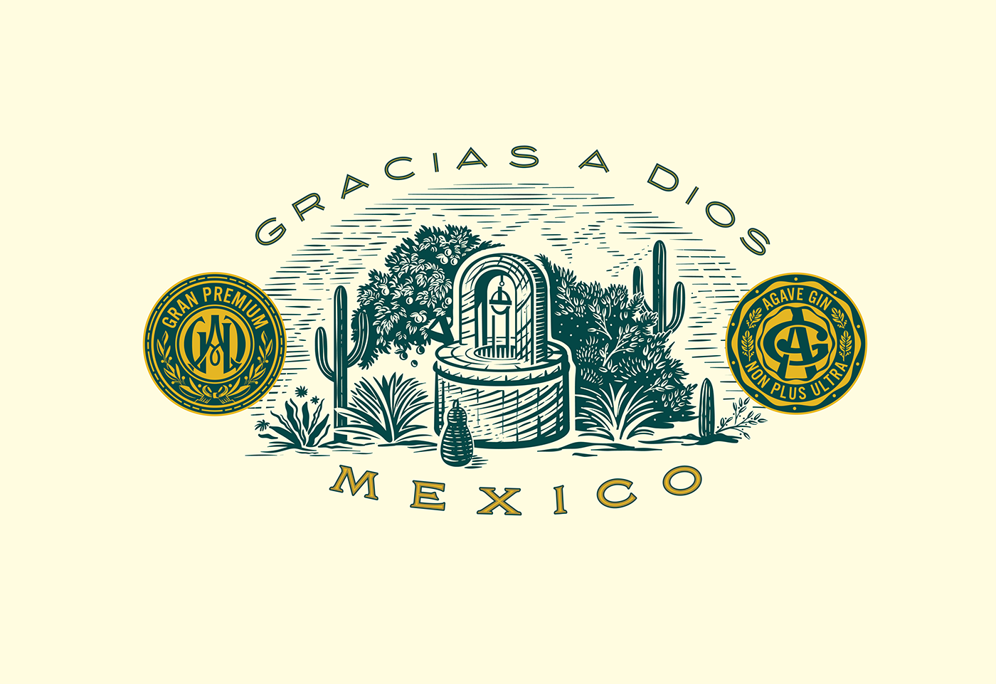
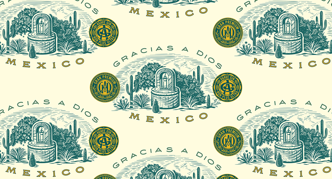
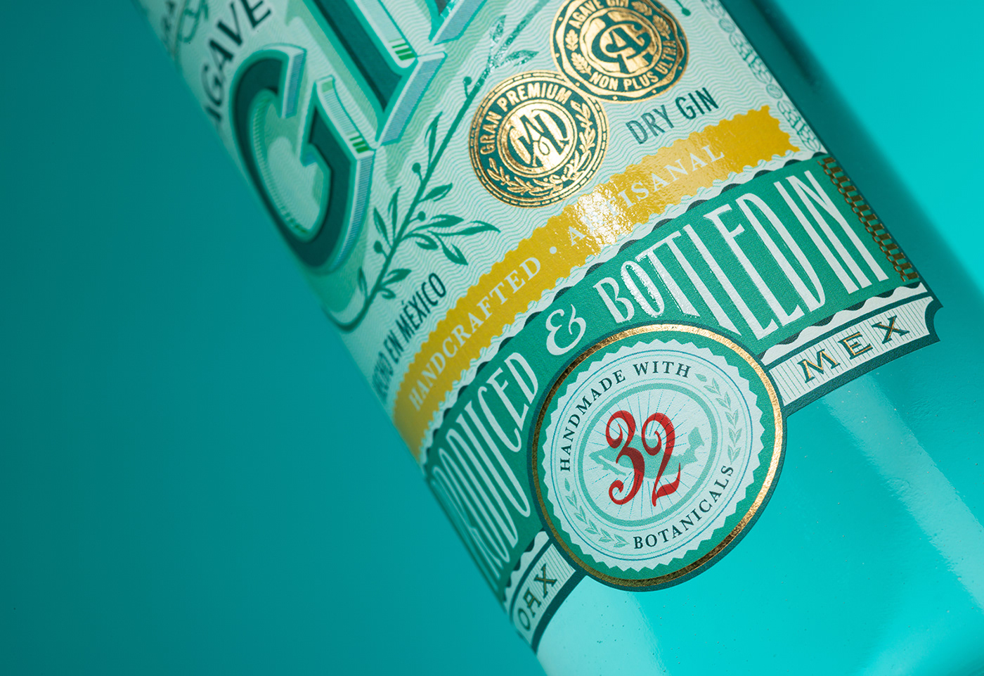
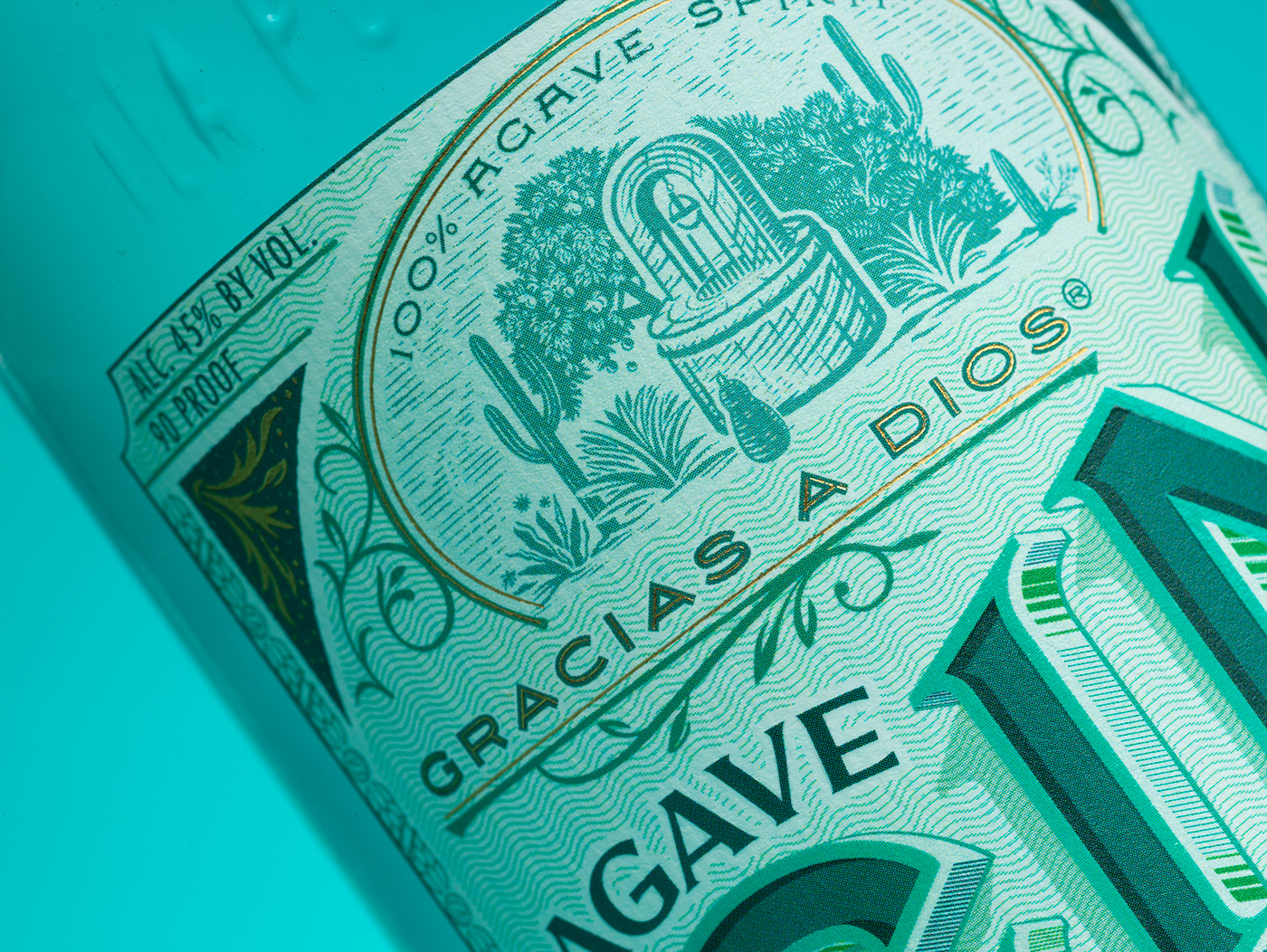
As a starting point, I had to look for solutions for what would replace the current mezcal logo. I wanted to find a way to bring provenance and humility to the forefront. I decided to draw a well in order to communicate the purest ingredient at the heart of the spirit; water. Surrounding the well, is, what I thought it would be a Mexican botanical garden, representing the exotic and fresh ingredients that are the source of the Gin’s unique flavor.