Art direction. Graphic design. Identity system design. Packaging. Print design. Typography. Web design.
—
Client Leah Stuttard, London, GB.
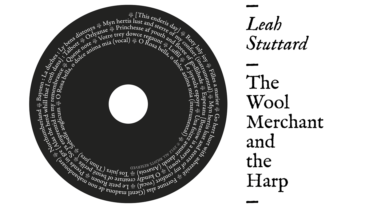
Brief The attention to historical sources and the rigour with which Leah Stuttard plays ballads and original songs from England in the late fifteenth century have inspired our study for this project. The visual concept is based on the artwork specially designed by the artist Sarah Kirby for the cover, while for typography choose the wonderful original character IM FELL Inglese PRO, digitized and processed by Igino Marini on alphabets drawn in England between 1672 and 1692. It is a typeface inspired by the Roman of Nicolas Jenson, used for the first time in 1470 in Venice, and by Ludovico degli Arrighi Italic used for the first time in Rome in 1527.
—


"Buy the CD Here!" website.

Official Leah Stuttard website.
——————————————————————————————————————————————————
The creative pitch.
——————————————————————————————————————————————————


