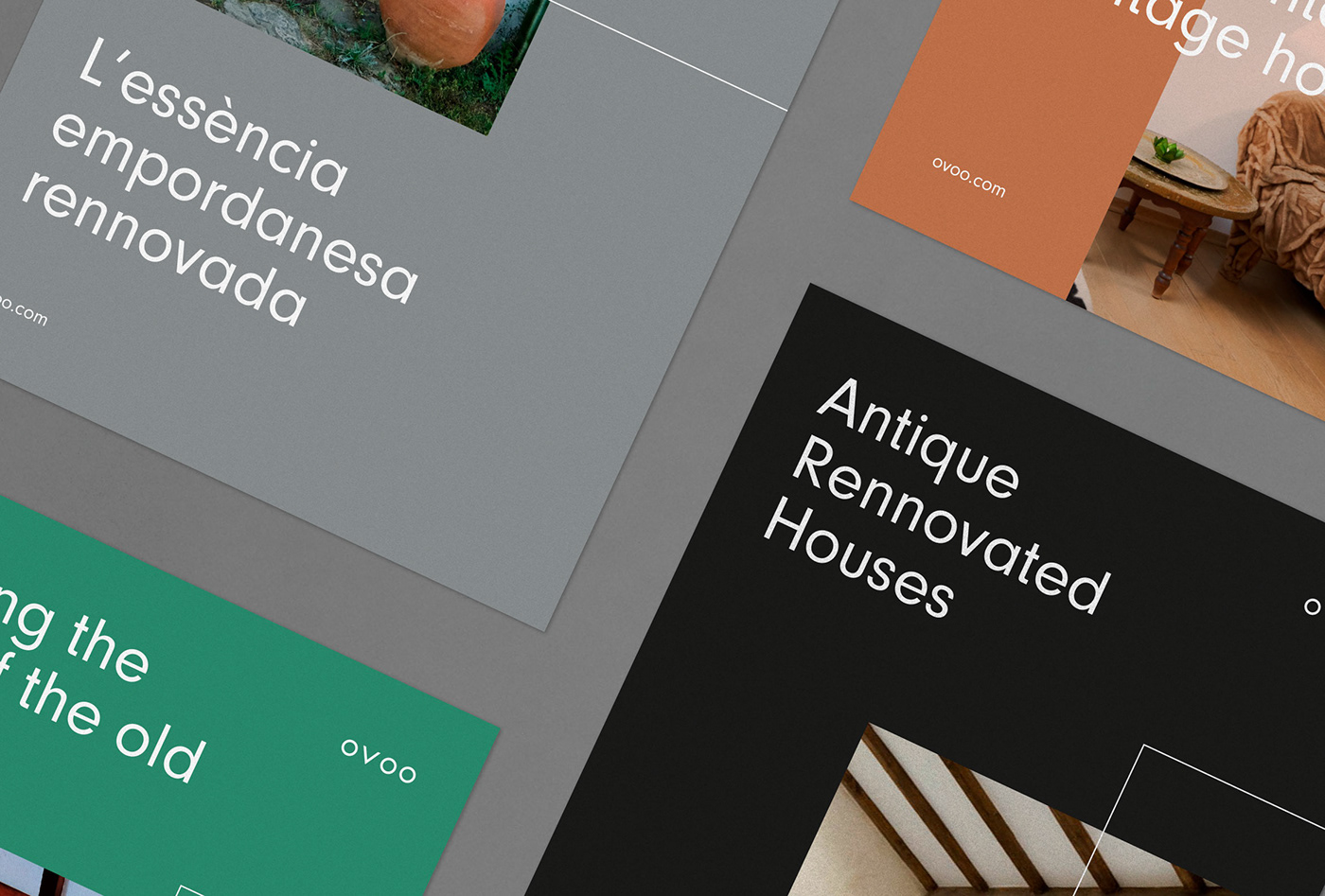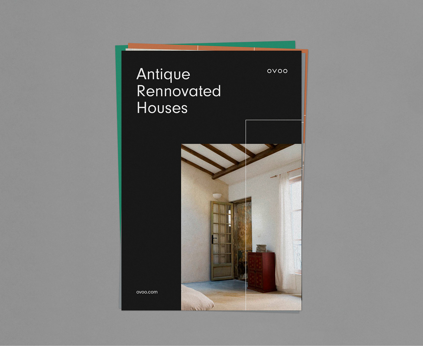
Ovoo, Visual identity
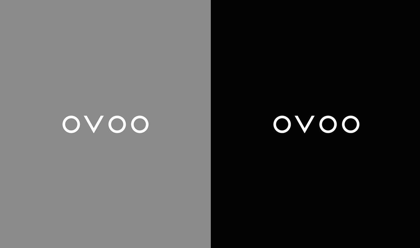
The letters that make up the word Ovoo are very geometric, and we reenforced this geometry through the logotype, that it’s a representation of an essential and minimal graphic solution.
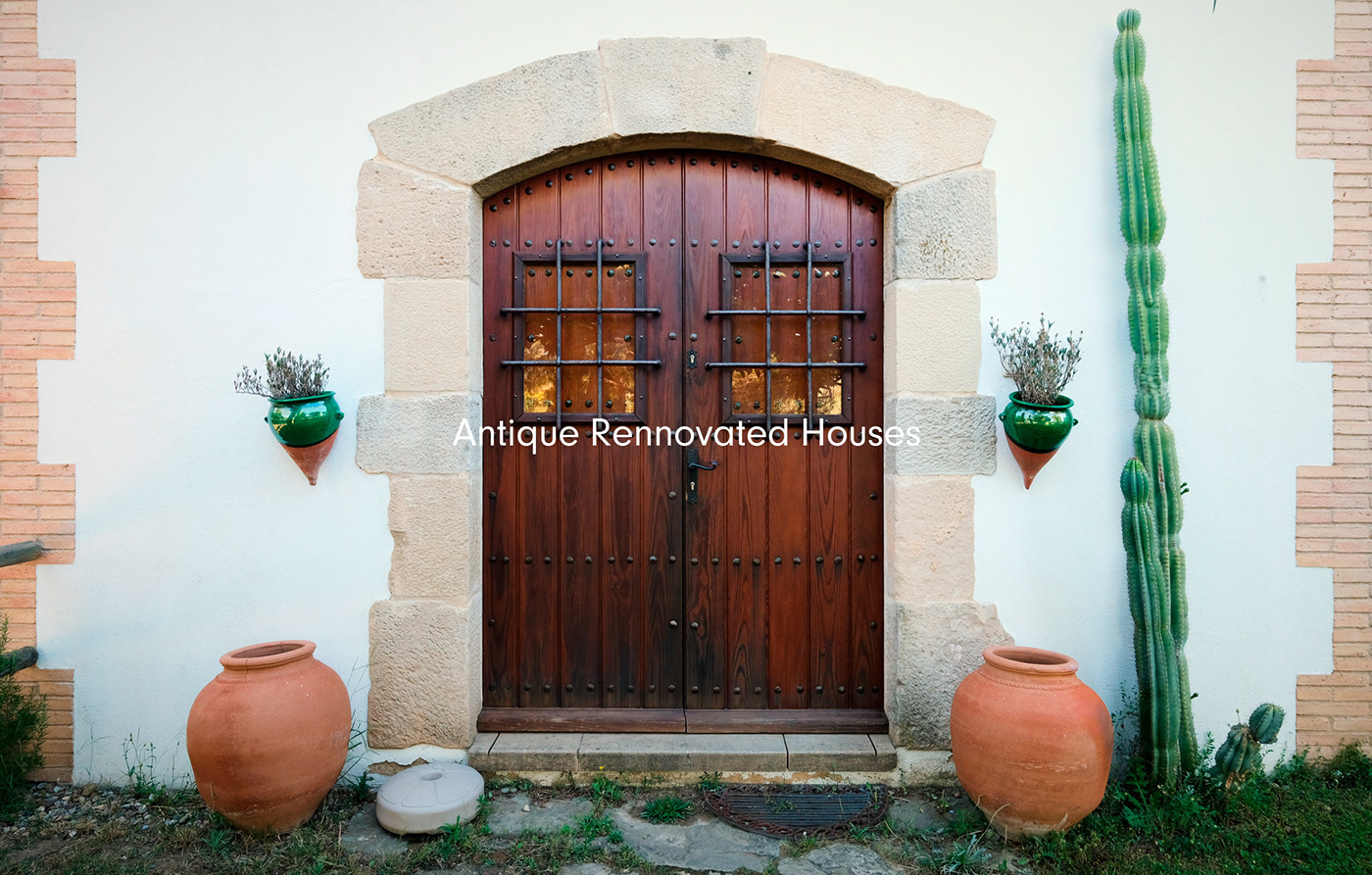
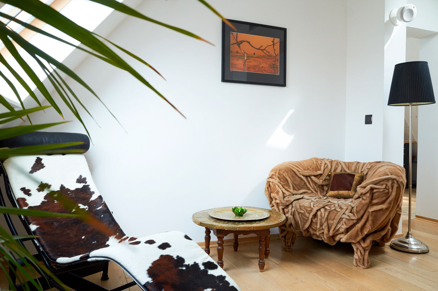
This way, we kept the same approach of Ovoo’s work on the spaces and antique buildings, trying to be the less invasive and respectful with the original ambience.