
A vision to bring NYC soccer off the turf and back to the street. A game for everyone: pro and amateur, any gender, any age, any skill level. STREET FC holds open games across New York City in basketball courts, warehouses, and city parks.
An important part of STREET FC is the relationship between soccer and basketball. Internationally, soccer is seen as a democratic, urban game, played by all on any flat stretch of pavement. In New York, that honor is held by basketball. In their youth outreach, SFC really strives to connect with the same young people who would engage in a game like basketball (but perhaps with better foot-eye than hand-eye coordination).
I spent a lot of my youth in New York City in the 90's, so the inspiration here was a no-brainer: early Air Jordan campaigns, Yo! MTV Raps graphics, and a maximalist approach to typesetting inspired by 90's club posters. I directed and edited the photography to be gritty, giving it an underground feel that enhances the guerilla feel of the games. I took a lot of references from early skateboarding photography, encouraging our photographers to shoot with fisheye lenses and heavy flash. I love how the grainy photos balance out the clean, digital type treatment and graphics.

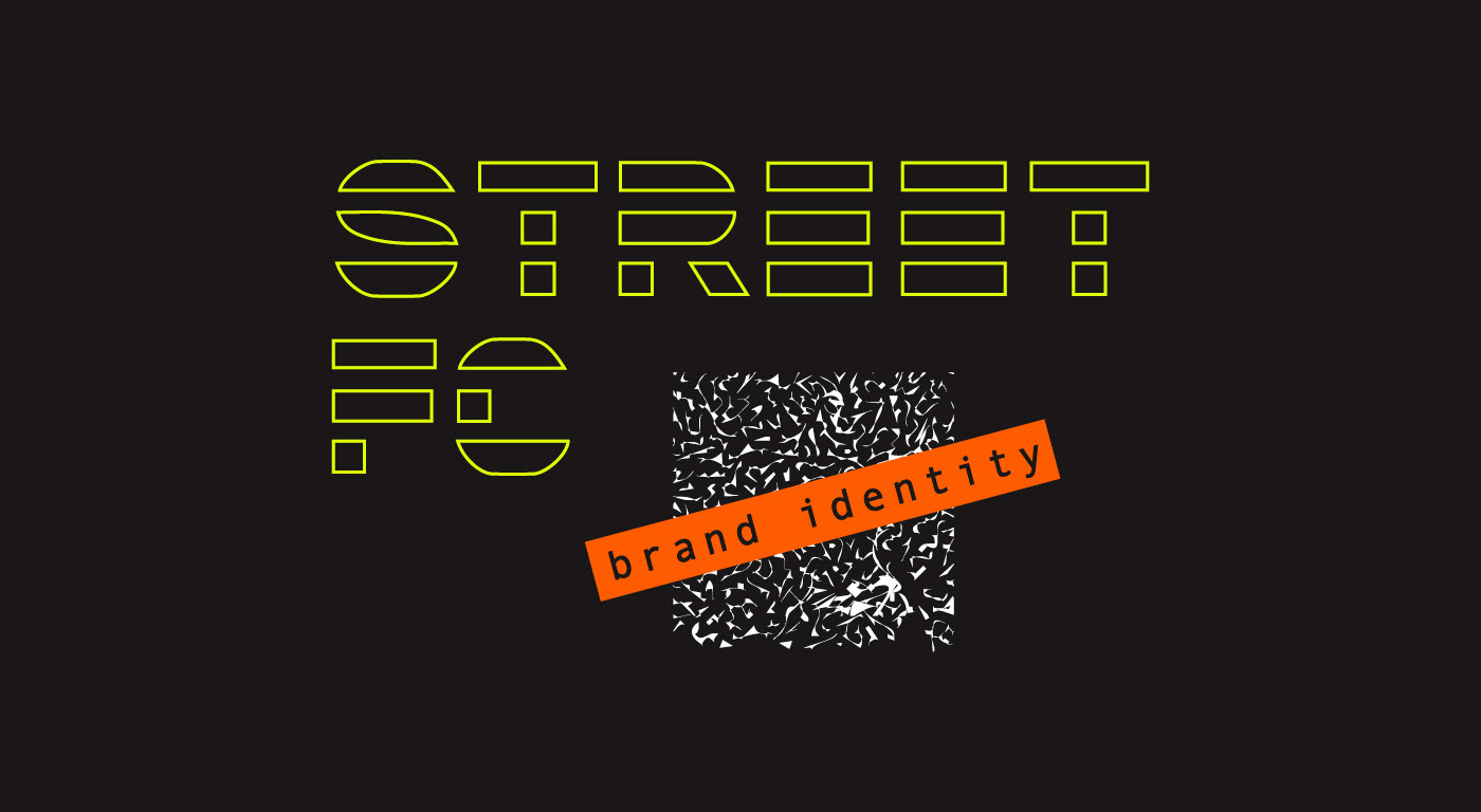
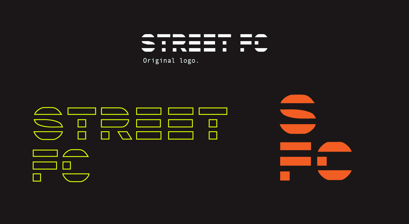
The original logo needed to be modified slightly as the narrow shape made usage quite limiting. SFC also requested a very abbreviated version that could be used for items like team badges.
The color palette was created organically--the highlighter yellow came from the safety yellow of the team pinnies, and the orange came naturally after. I wanted bright neons to compliment the largely black and white photos, and using safety neons felt contextual for the sport and graphically engaging.

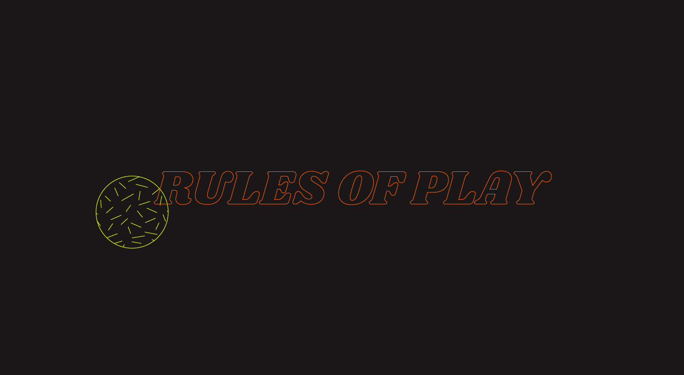
The first campaign I built for SFC was their debut social media blast, Rules of Play. I created a series of Instagram stories and a post grid using animation, photos, and graphics to explain the rules of SFC games.
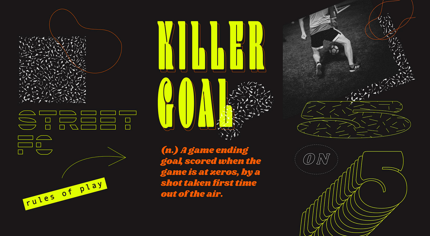
Above: Three slides from the Instagram story.

Left: The grid. Right: The final image of the story and the first presentation of SFCs tagline.

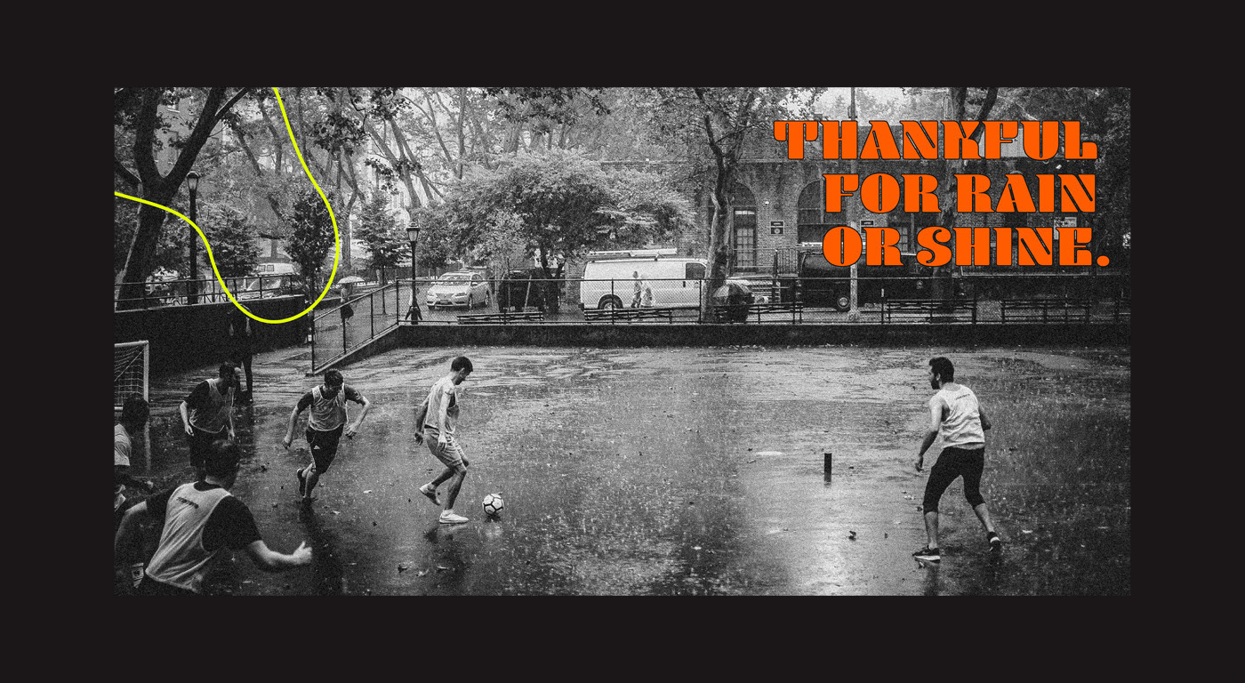
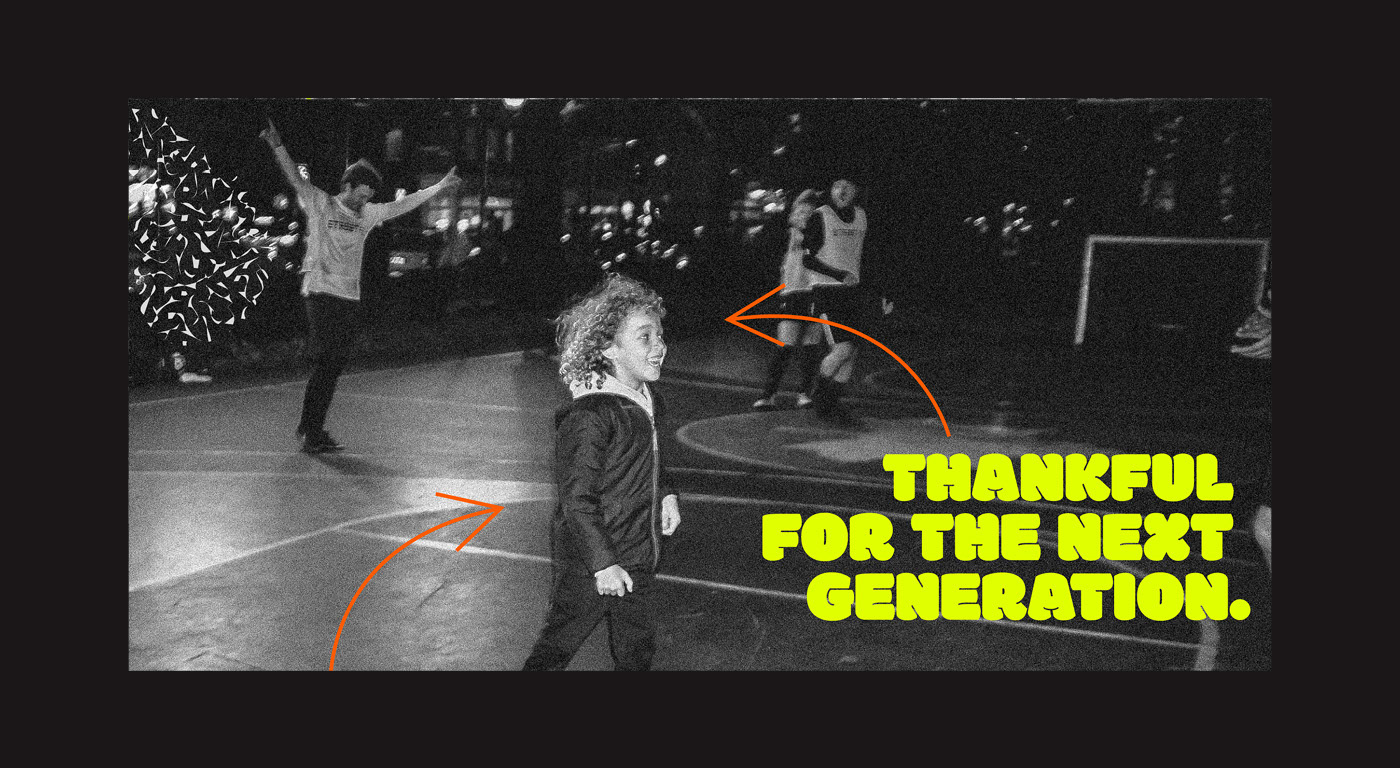
I created, wrote, and designed SFC's Thanksgiving campaign--a series of swipe-through panoramas that spoke to the love of street soccer. It was important that the posts were written in a way that felt relatable and paced in a way that created emotional resonance. I kept the language repetitive ("Thankful for...") and tried to pepper in experiences big and small, immediate and forward looking, while keeping the copy simple and punchy.