City of Toronto (Logo Redesign Proposal)
Whatever you are in Toronto, you can see the CN Tower. It’s the postcard of Toronto. The beautiful sunny day with a contrast of warm and cool colors, and a great nightlife are like postcards of the city.
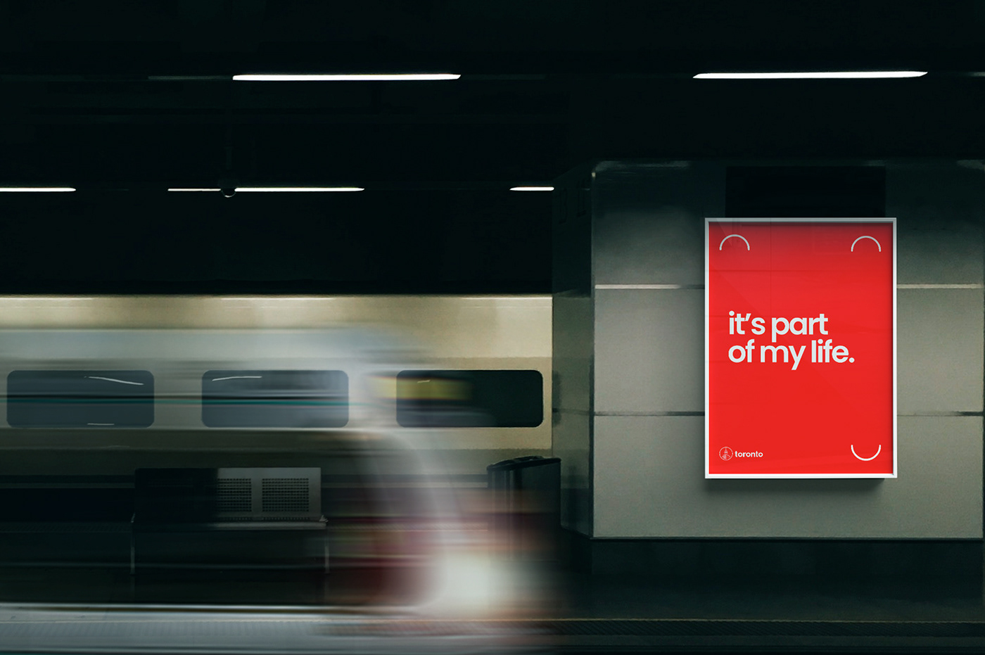
The new logo is formed by a symbol of Toronto's main postcard, the CN Tower. The use of red as a primary color, to exacerbate a city that doesn't stop, day and night and at the same time is an inspiring city that has large green areas and quiet places to connect with our yourself.
Also, the proposal is approachable and easy to read, with an optical kerning, refined weight and a minimal design style, that help to make it as instantly recognizable as possible, just as the CN Tower in Toronto is.
Client: City of Toronto (Experimental Project)
Headquarters: Toronto, CA
Role: Designer
Year: 2018
Headquarters: Toronto, CA
Role: Designer
Year: 2018