


OPENING TITLES
_
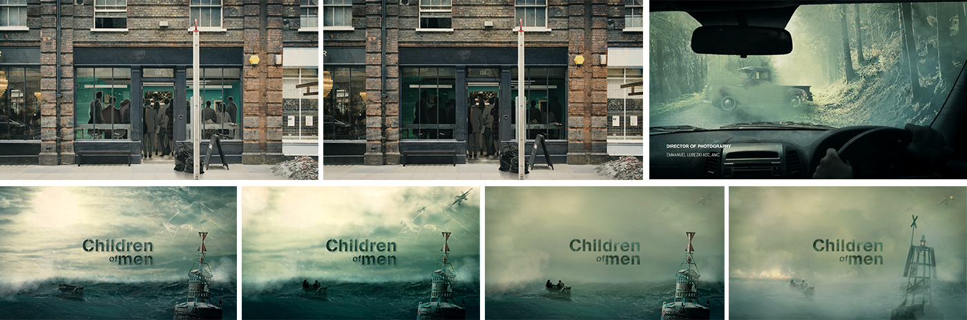
The aim of this project was to design both visuals and in motion pieces from the movie "Children of Men" by Alfonso Cuarón into an opening titles. We decided to recreate the most important scenes into Photoshop to deliver a new way of approaching the film.
Art director: Tiphaine Ruget
Style frames design: Terry Soleilhac
Storyboard: Tiphaine Ruget
Motion designer: Terry Soleilhac
Music: Fragments of Prayer by John Tavener
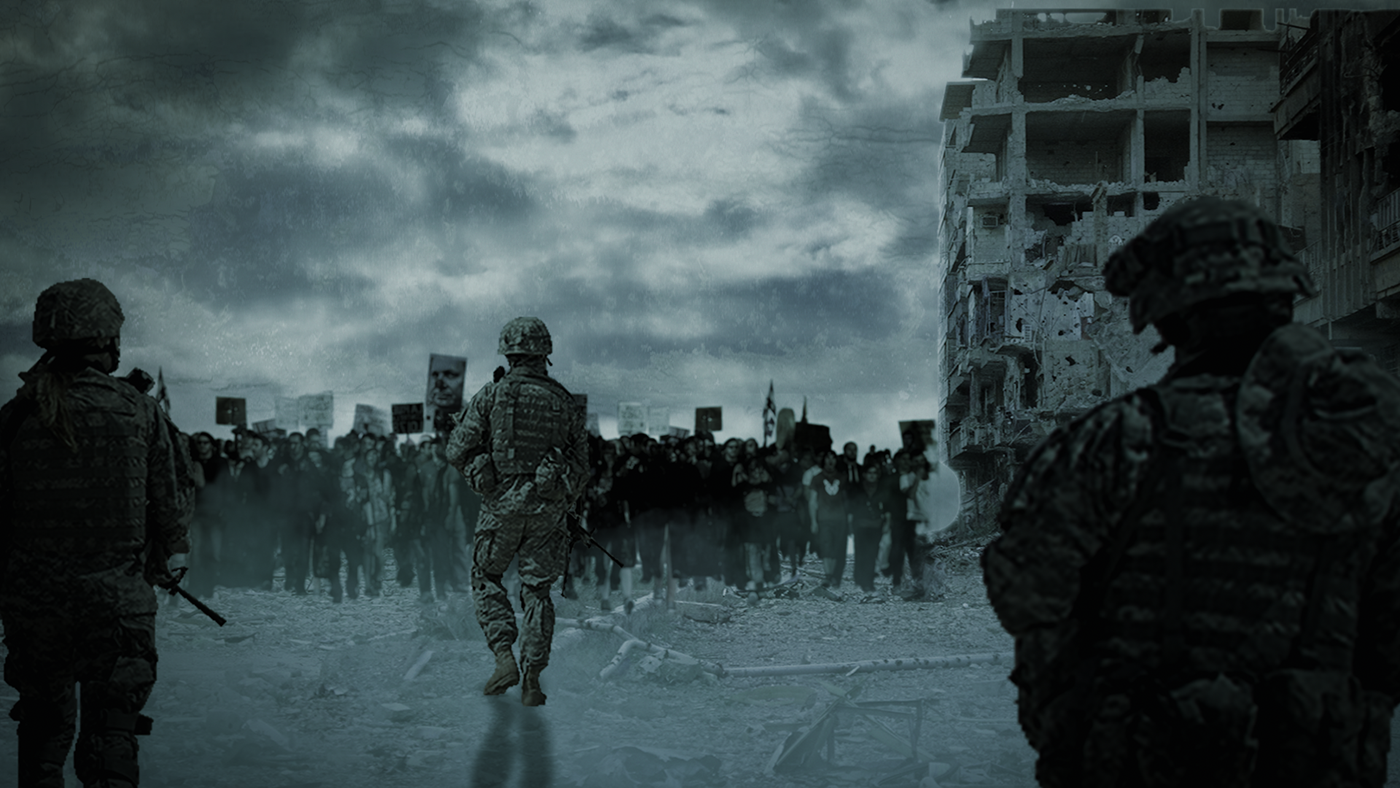
Synopsis: London 2027: The news of Diego's death, 18 years old, is shaking up a world affected by sterility. The youngest human being on the planet has just been murdered for refusing to give an autograph. The world is dying in progressive chaos. Suicide and denunciation are strongly encouraged by the government and war rages... Within this society in perdition, Theo, a disillusioned office worker, comes into contact with the Pisces, a small terrorist group that campaigns for immigrant rights. The latter entrusted him with a mysterious mission....
References
_
Watching what other motion artists did is a great way to get into the topic, and to find some inspiration. We spent a lot of time watching opening titles in a first time to see how they are built, and then, we are looking closer to something we want to design.
Vikings opening titles may be the perfect example because at the end, there is the logo and title reveal over a devastated sea with some fog. It looks nicely to what we try to reach regarding our visual design.
Mood boards
_
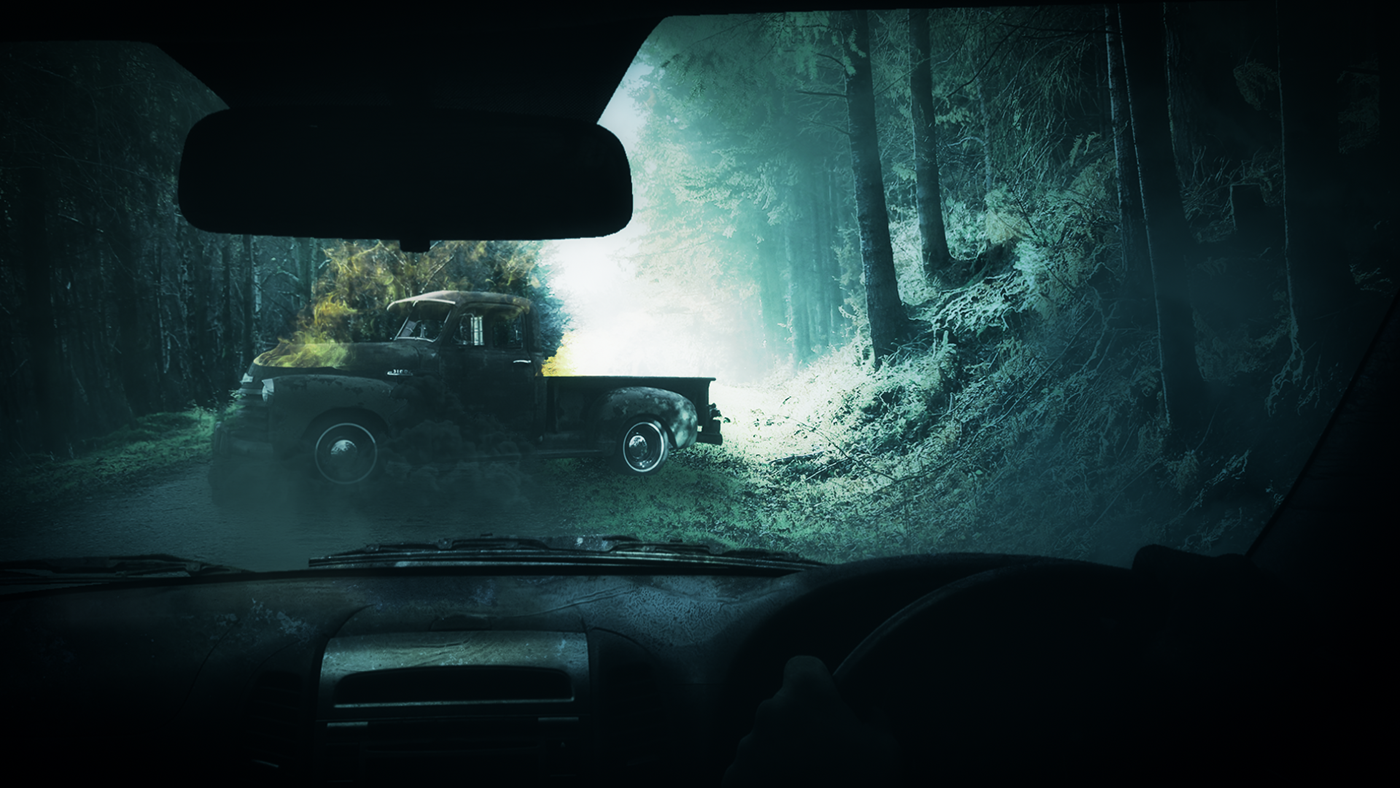
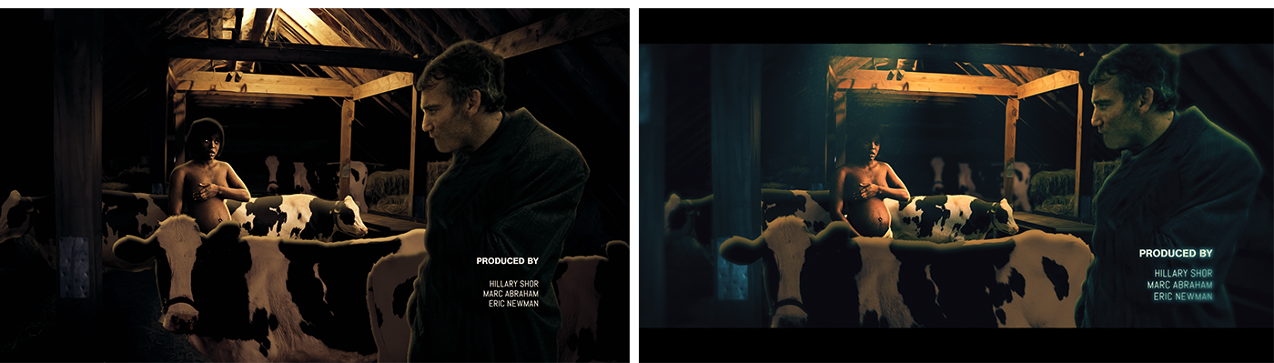
During the research stage, we worked on the idea to transcribe the atmosphere of the film, that is oppressing and suffocating. Then, it was important to us to design some mood boards to enter the atmosphere of the film and orient our design to it.
foggy atmosphere, mist, greenish colorimetry
As for the fog, this allowed us to consider visuals that highlighted certain graphic elements and hidden others at
the same time.


Dark and gloomy sceneries, landscapes, rural places.
Another concept was to make light bring the focus to an element and allow a kind of red thread for the spectators.
That's why to respect the landscapes in the movie, we got to be aware of these dark places where the main
character navigates.


Storyboard
_


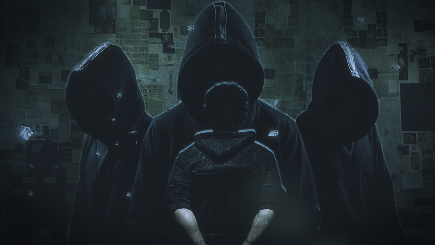
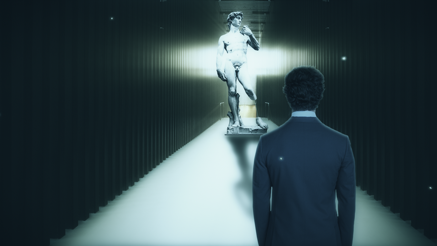
Final styleframe
_
In order to keep a certain level of visual cohesion between frames, we put them into a grid to look after the colorimetric correction, the light/contrast tones. Thus, these are all the style frames we designed before making the animation. We tried to respect the third party rule to make an even more beautiful compositions.


_

_
_
_
_

_

_
Visual development (CC)
_
Typographic casting
_
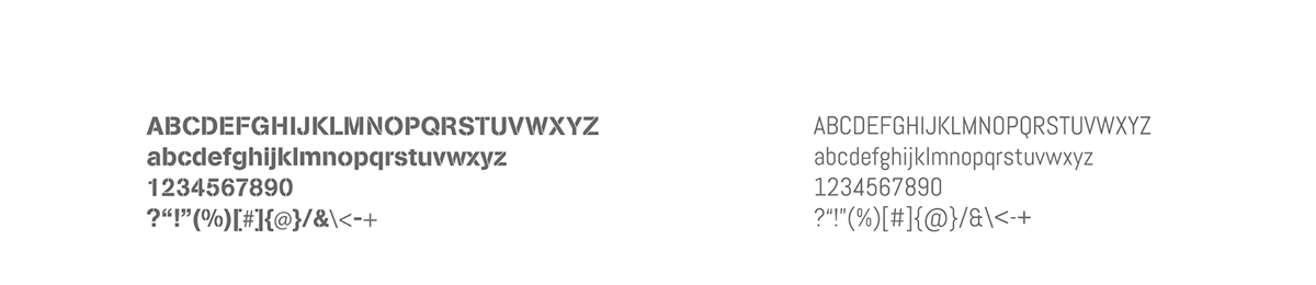
We made these typographical choices because, in a first case, the AG Book Stencil with its glyphs separated into several pieces accentuates this dramatic aspect in which our characters are engulfed.


