


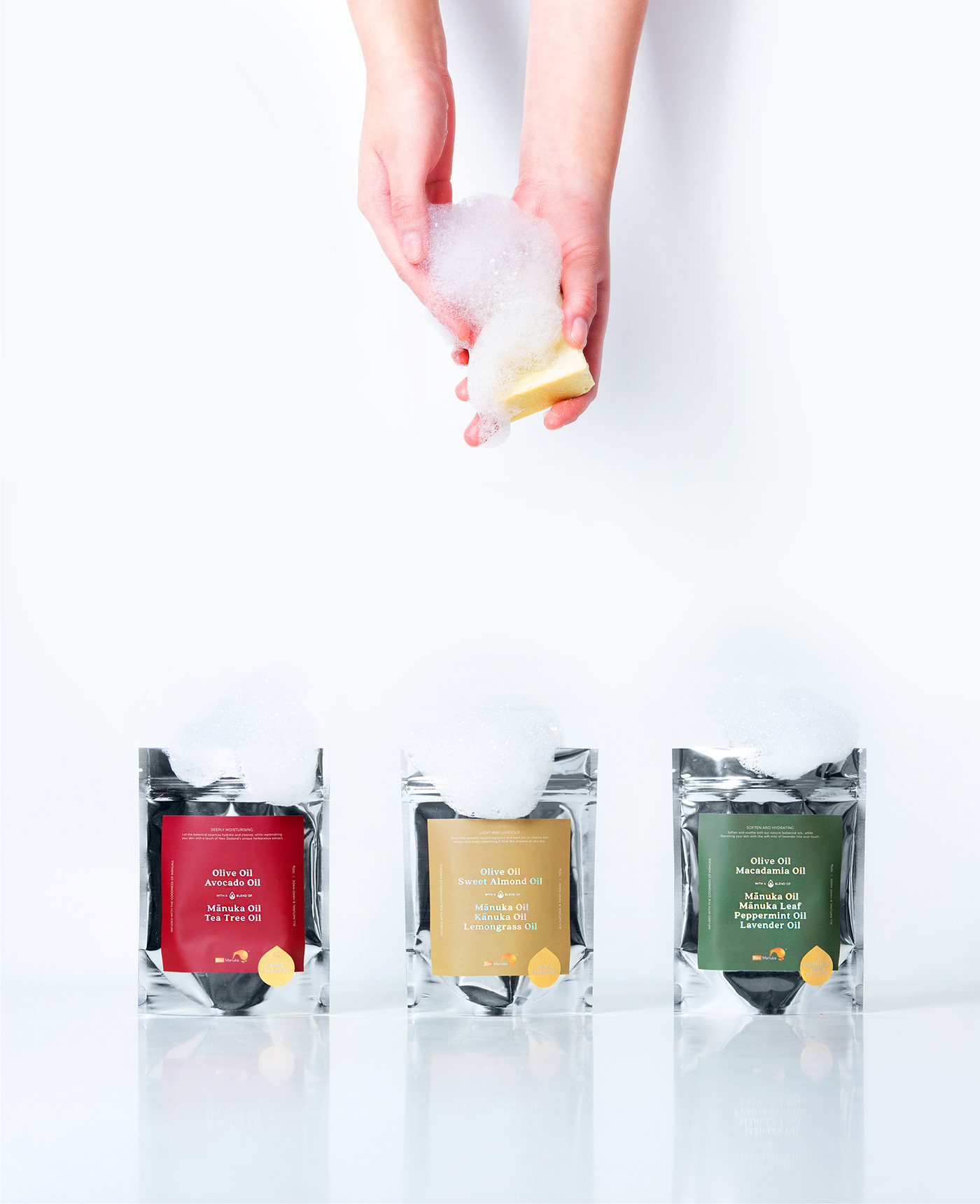
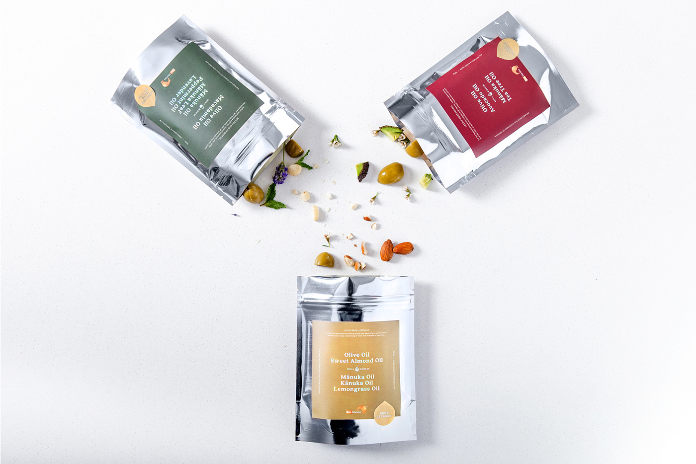
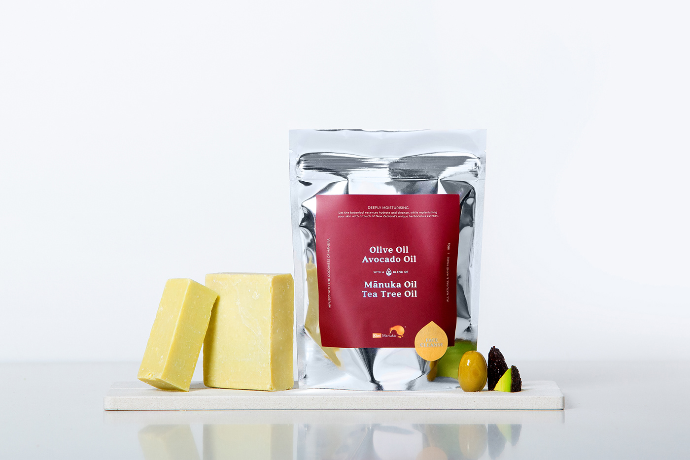
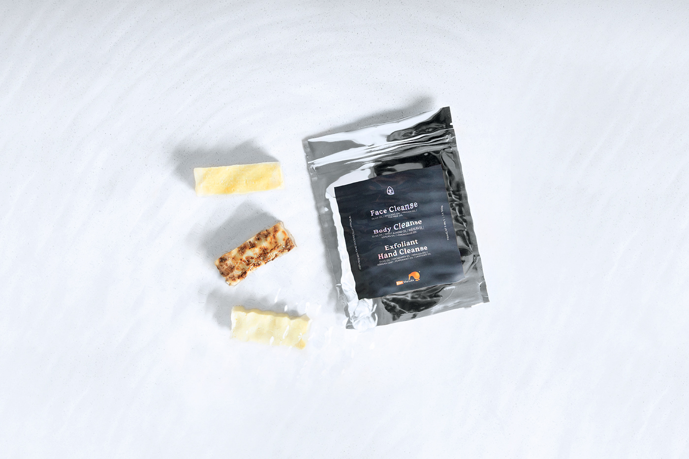
The Kiwi Manuka soap range packaging and product identity was designed aiming to provide a clean yet sophisticated product experience to the user.
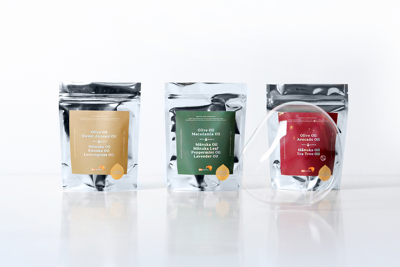
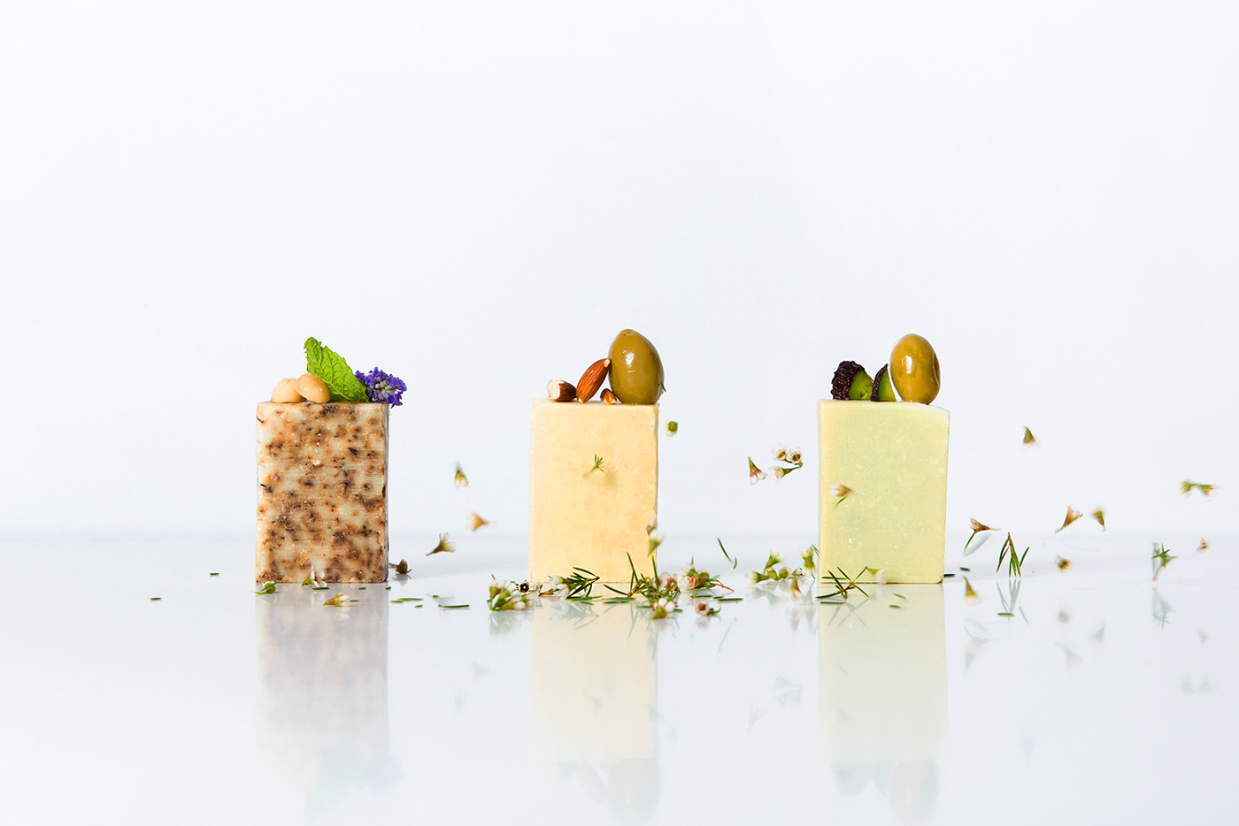
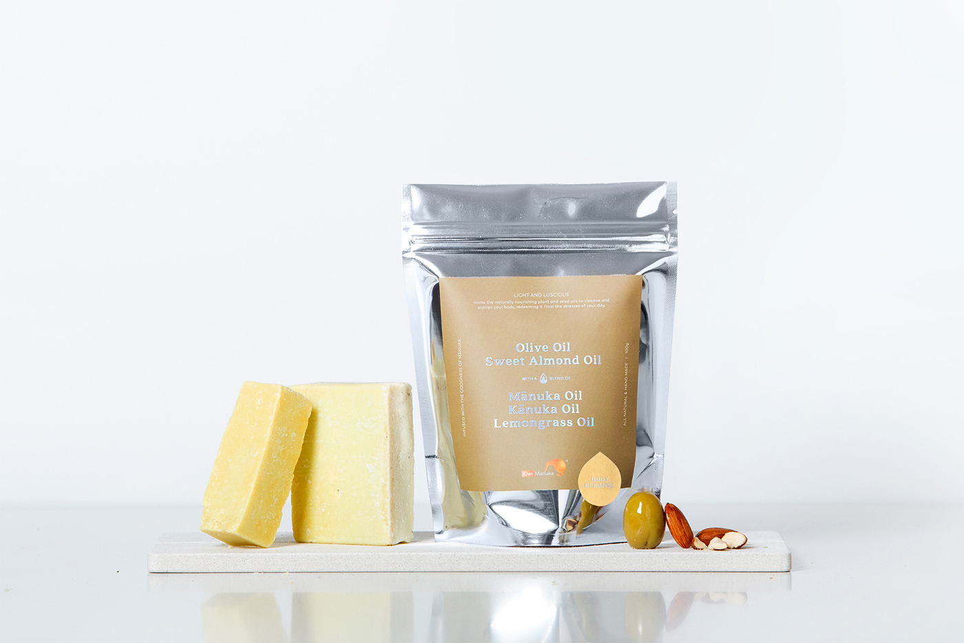
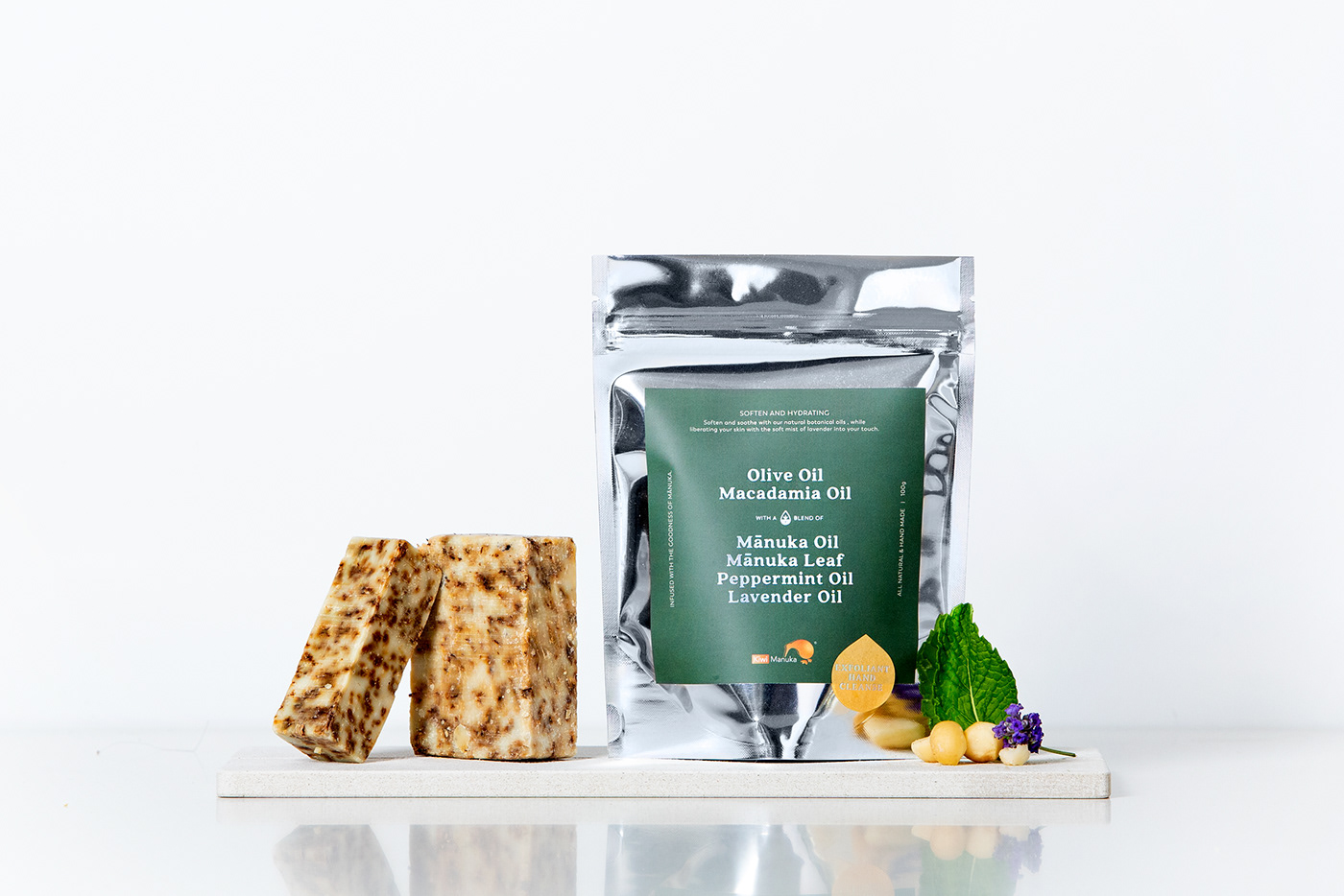
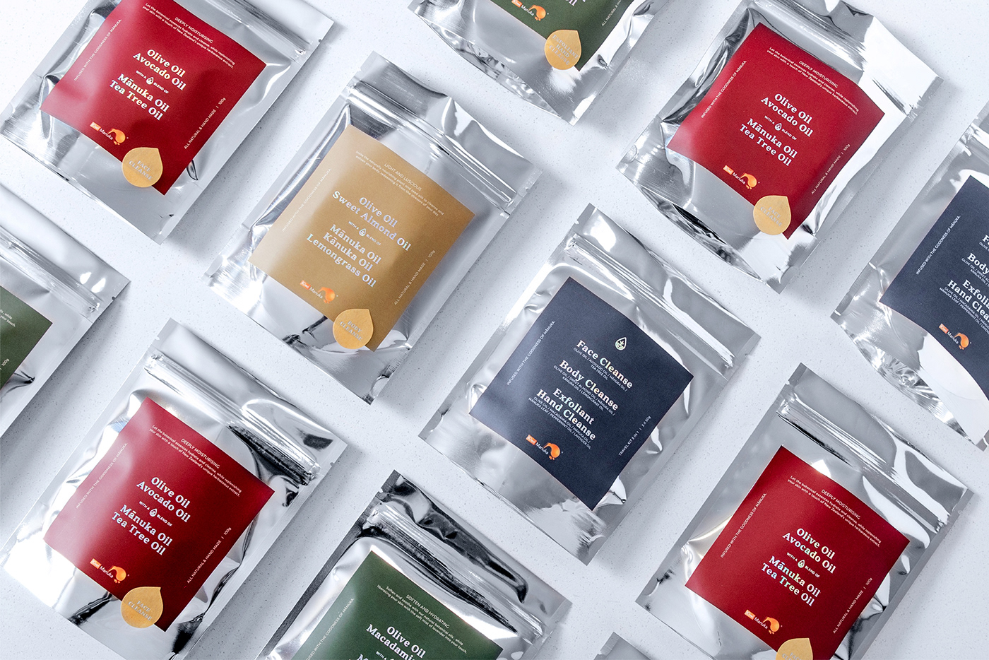
The silver pouches with hologram foil text links with each other presenting a delicate and iconic look. An icon was developed to complement the main ingredient of the soap - the range of herbaceous oil. The colour scheme was selected from the Colourplan chart, each soap is represented by a different colour. The earthy and elegant colour scheme brings out the natural hand made element in the soaps.
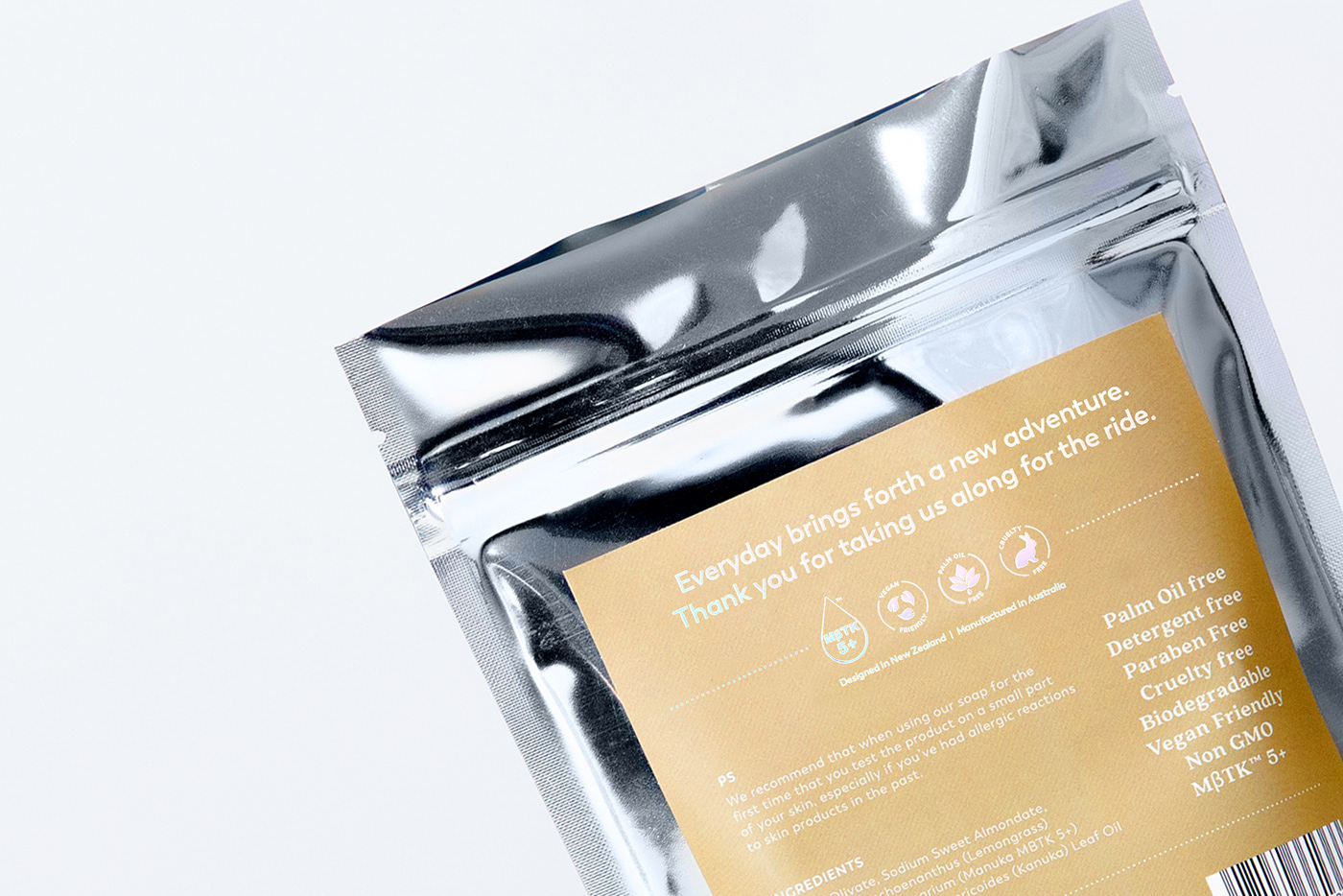
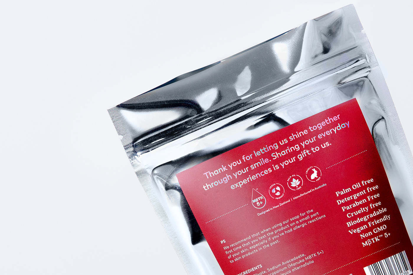
An invitation message is written on the back of the packaging welcoming the users to fully indulge in the cleansing experience. Each soap has a dedicated message for its own purpose and showing gratitude from Kiwi Manuka to their customers.


Client: Kiwi Manuka
AD, CD: Kevin Lam (URFD)
Designer: Charlene Chan, Kevin Lam (URFD)
Photographer: Norris Chau
Styling: Charlene Chan, Kevin Lam (URFD)
-
Thank You!


