AD+D | Rong-Chen, Wei
Project|Practice
Nov, 2018
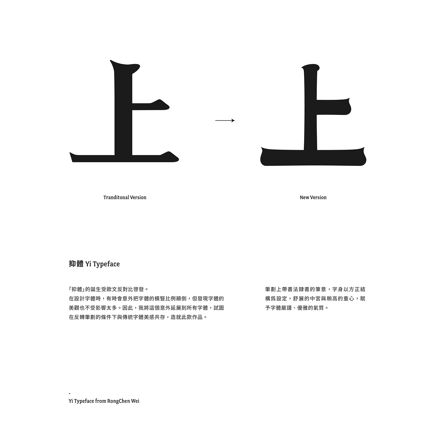
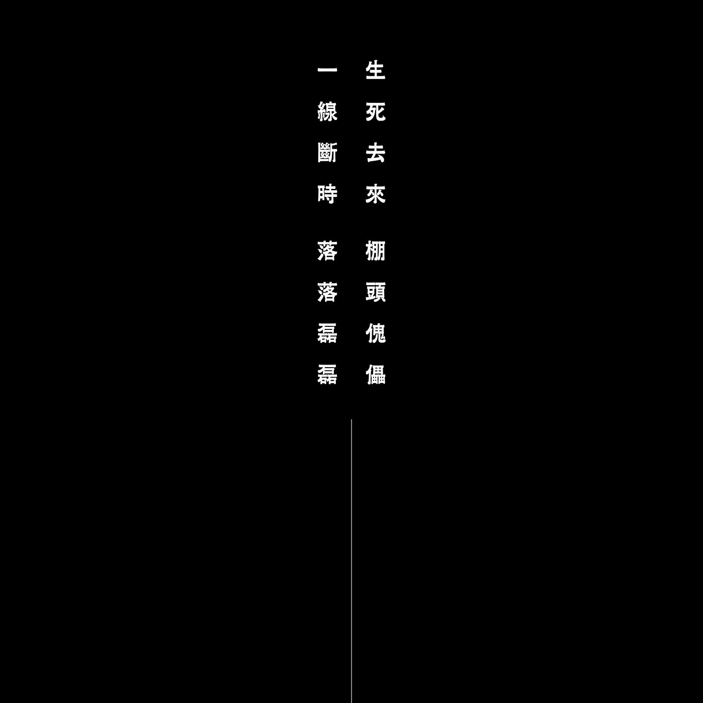
「抑體」的誕生受歐文反對比啟發。在設計字體時,有時會意外把字體的橫豎比例顛倒,但發現字體的美觀也不受影響太多。因此,我將這個意外延展到所有字體,試圖在反轉筆劃的條件下與傳統字體美感共存,造就此款作品。
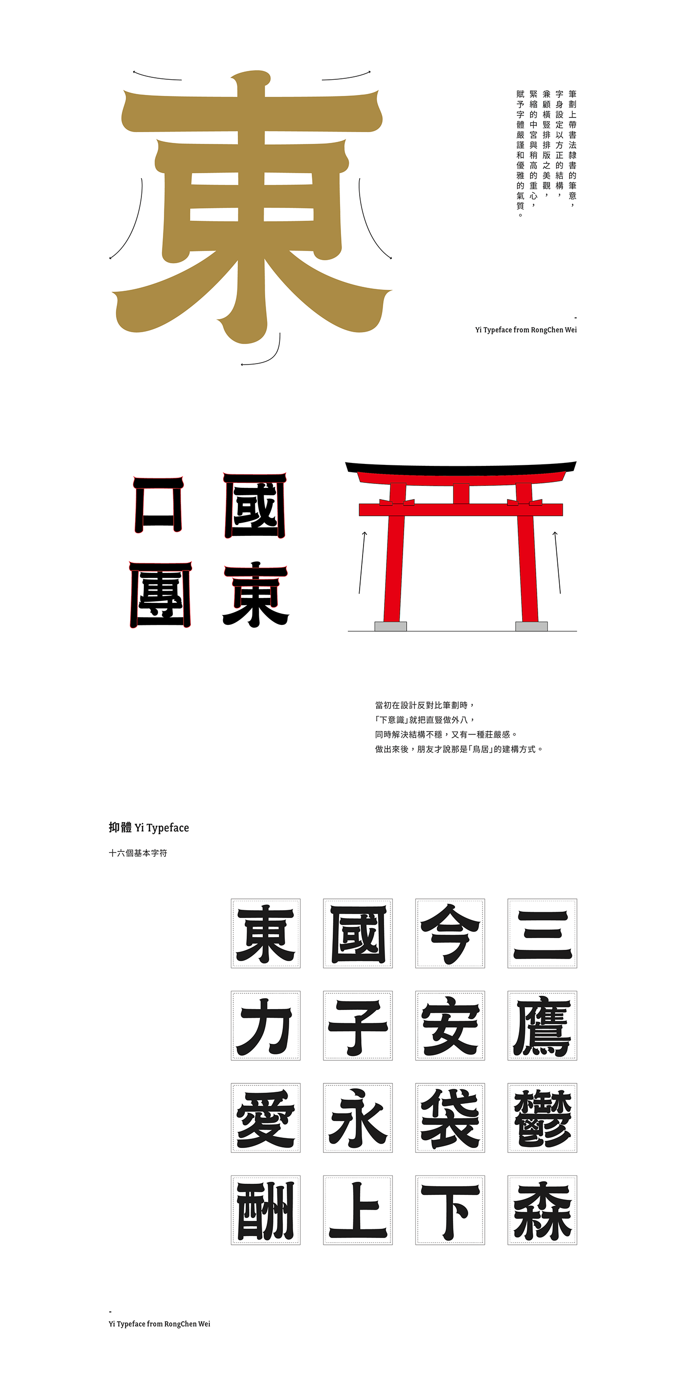
筆劃上帶書法隸書的筆意,字身以方正結構為設定,舒展的中宮與稍高的重心,賦予字體嚴謹、優雅的氣質,適合應用在海報標題、書籍標準字、藝文活動視覺等等。
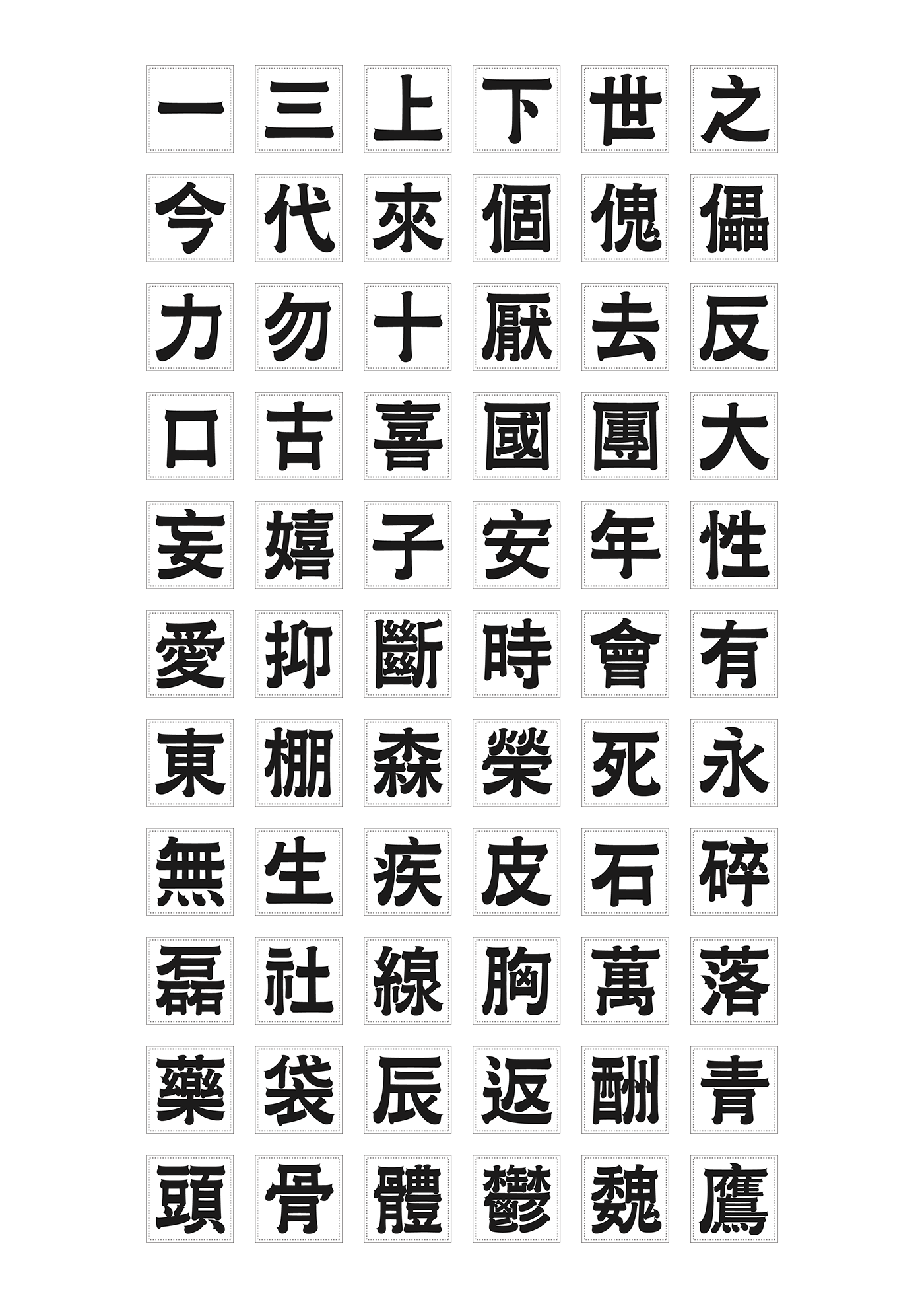
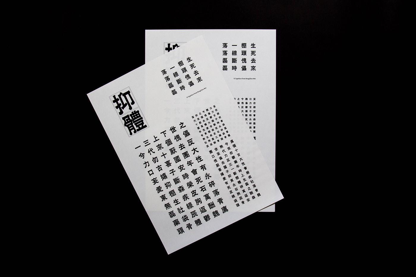
註:抑體為概念性設計,尚未進行字庫發展,目前僅以客製方式製作。
Yi Typeface inspired by reverse-contrast Latin Typeface.. When designing a font, sometimes the font's horizontal and vertical proportions are accidentally reversed, but the aesthetics of the font are not affected too much. Therefore, I extended this accident to all the fonts and tried to coexist with the traditional fonts under the condition of reversed strokes to create this work.
The brush strokes with Clerical script, the body is set with the square structure, the stretched counters and the slightly higher center of gravity, giving the font a solemn and elegant temperament, suitable for the poster title, logotype of books, art activity visual and so on.
In development...