

branding project for
stefano odoardi—
—video maker.
Other proposals ↴
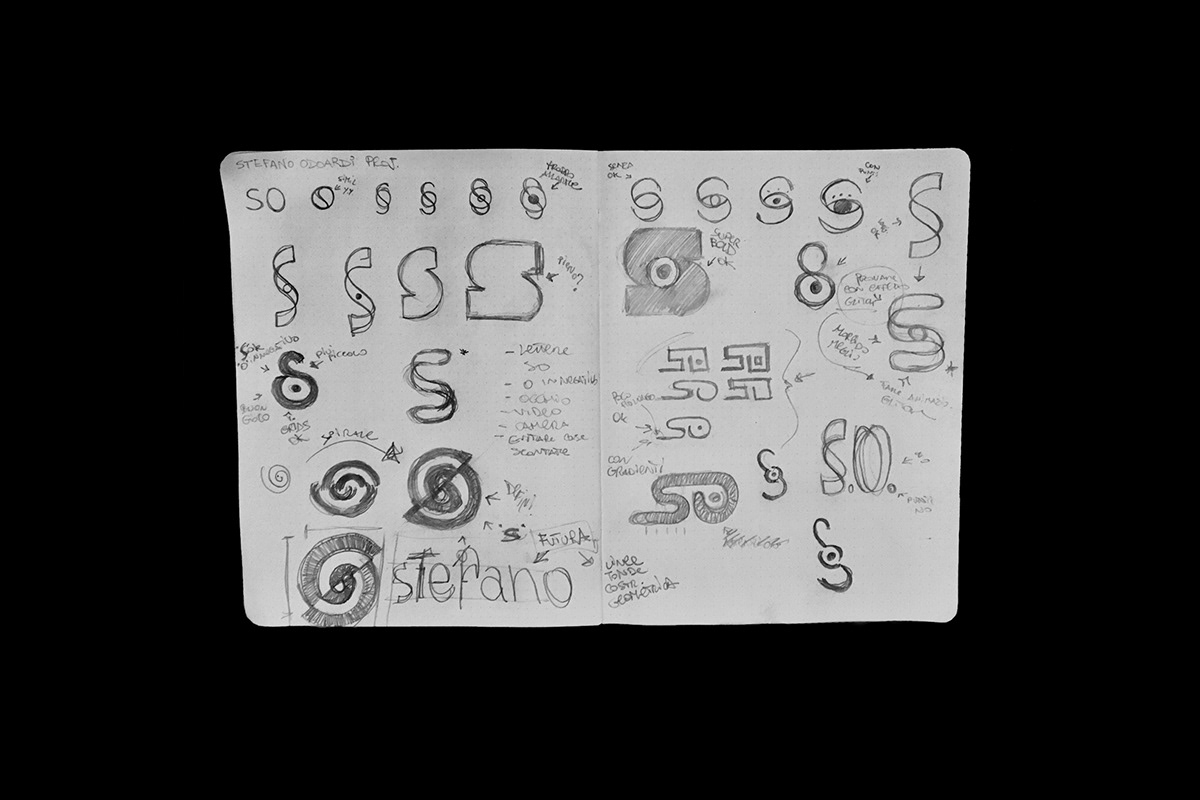
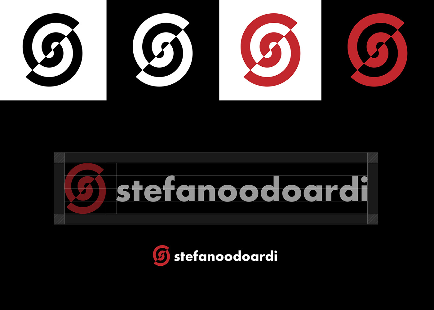
The project from the beginning focused on the idea of the initials.
It was necessary to design a symbol that could also bring to the attention the activity carried out, so as to immediately eliminate the idea of monograms that resume the usual classicisms.
It was necessary to design a symbol that could also bring to the attention the activity carried out, so as to immediately eliminate the idea of monograms that resume the usual classicisms.
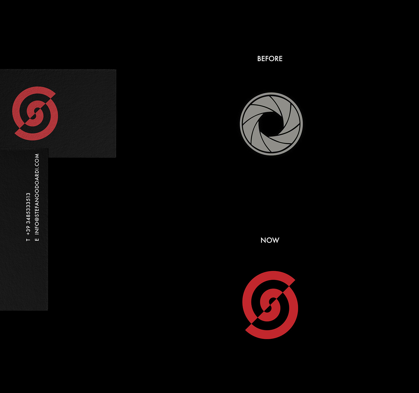
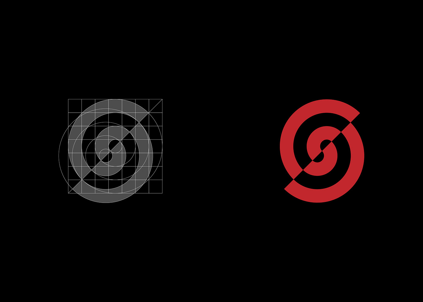
The idea was to use the overlap of the S and the O, adding a point at the center of the O, thus highlighting an eye and the REC key of the camera.

The final logo leaves the idea of the REC button and the eye and points its full force in the movement and in the positive and negative effect that forms a spiral and at the same time the initials "SO". It's in fact an O, divided obliquely that, sliding down following the movement of the cut, creates an S inside.
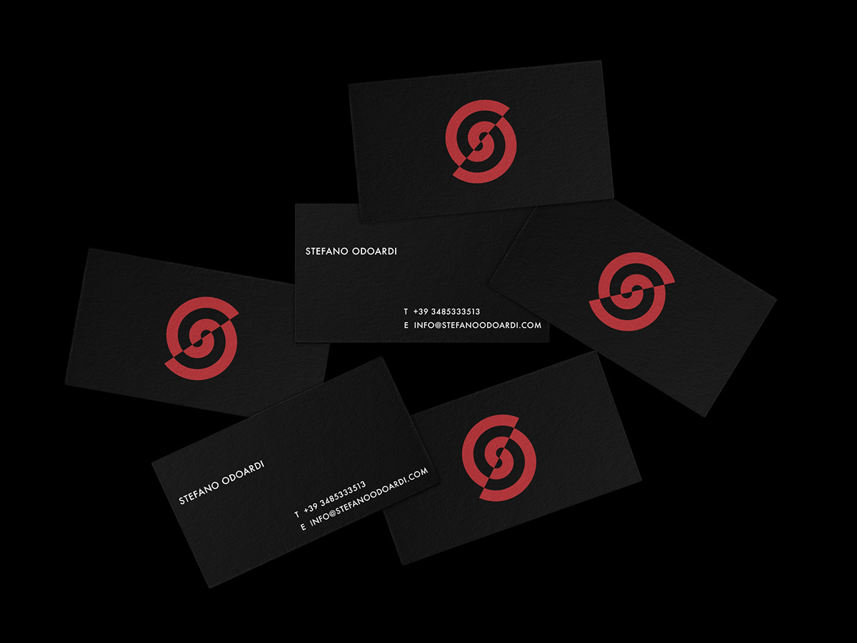
The result is a strong symbol, which together with the red, creates a strong impact and an easy memory of it.


Design by Antonio Calvino.
© All rights reserved.
© All rights reserved.


