


/ CHALLENGE /
THE CORE Create a visual identity and logo for Two Tales, a newly started film production house.
CUSTOMERS The primary customers are other production houses, not clients directly.
THE BRAND Key words for Two Tales are Strong, Bold, Contemporary and Quality.
THE BRAND Key words for Two Tales are Strong, Bold, Contemporary and Quality.
INSPIRATION Two Tales had a wish about using some sort of washed-out retro blue as a key color.
USAGE The identity will be used on business cards, stationary, website, digital presentations, social media, etc.
/ SOLUTION /
/ SOLUTION /
BIG, BOLD & BEAUTIFUL The identity has a strong and bold look. I wanted a living identity that connects to the viewers. After experimenting with different looks for the logo, the chosen direction were a hand-drawn one made with a Pigma MB Sakura Japan brush pen. This solution has a unique driven expression with a clear visible brush texture. Combined with a clean sans serif brand font the identity gets an interesting bold look and a unique expression.
WASHED-OUT COLOR SCALE The colors chosen has vintage vibes but feels overall contemporary when combined together with the other elements of the visual identity.
WASHED-OUT COLOR SCALE The colors chosen has vintage vibes but feels overall contemporary when combined together with the other elements of the visual identity.
FITS IN BUT STANDS OUT I have worked hard to create a identity that you can place branch-wise (i.e. it feels like a company in the creative business) but at the same time signals something new and exciting.
EASY TO USE LOGO The identity is stylish and clean, but at the same time also bold and strong. As every well-crafted logo shall be, the Two Tales logo is easy to recognize and remember, even in cost-effective one color print. Also it works well in the shorter monogram version for social media and other small size places.
EASY TO USE LOGO The identity is stylish and clean, but at the same time also bold and strong. As every well-crafted logo shall be, the Two Tales logo is easy to recognize and remember, even in cost-effective one color print. Also it works well in the shorter monogram version for social media and other small size places.


Above. Inspiration is a important part of every project..

Above. Initial pencil sketches in various style directions.

Above. Practice makes better – repeating certain letters until I find the right shape.

Above. Brush pen sketches.

Above. I love this brush pen, Pigma MB Sakura Japan.

Above. Close-up of brush pen sketch.

Above. Close-up of another brush pen sketch.


Above. Round-up of some hand-drawn sketches that has been digitized.


Above. Final logo for Two Tales. If you compare to the original sketch, this version has been overall thickened, letters has taken on more similar shapes (tail/end of O and S now looks the same, as well as tail/end of swash from T looks as the top ending of S) and A and E has been separated a bit to get better legibility – to mention a few of the small corrections that has been made in order to get a quality logo that works well in both small and large sizes.

Above. Monogram versions of the Two Tales logo.


Above. Brand font is Nobel, a monoline-looking bold sans serif. Main style is Bold italic, which goes well with the cursive hand-drawn logo.

Above. The Two Tales color palette.
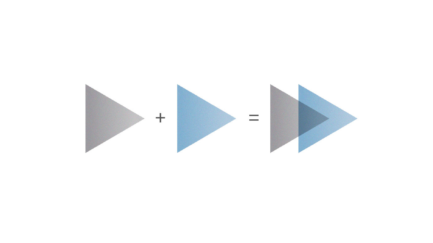
Above. The illustration concept is built around the company name – unique stuff is created from combining the experience back packs (i.e. the tales) from the two founders of Two Tales. Visually this is symbolized through the overlap – which is the unique customer value that Two Tales brings to their clients.
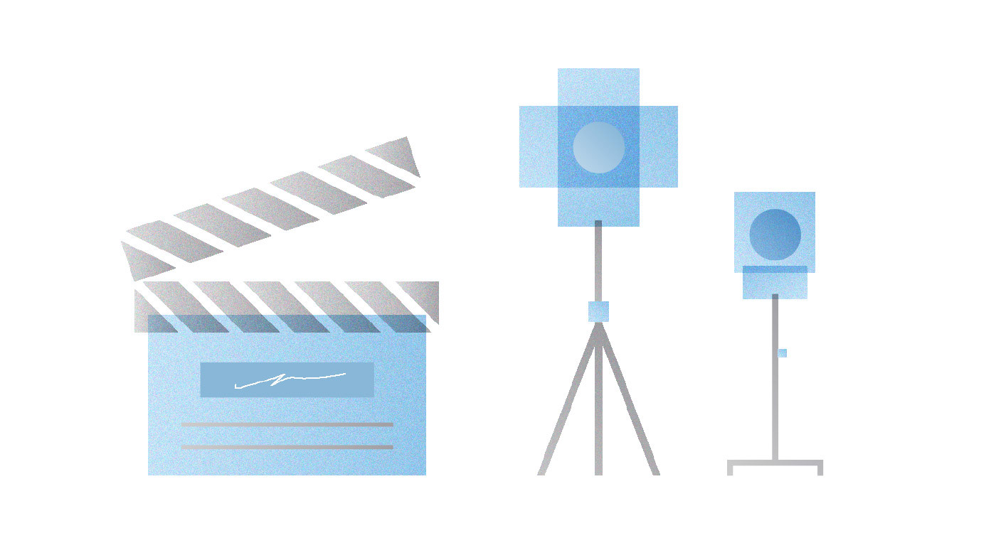
Above. The Two Tales Illustration style in action.

Above The images should go well together with the color palette – that means wash-outed blue tones, different shades of gray etc. For images that don´t fit the color scheme greyscale images is a good choice. Images with a anologue grainy feeling works very well. Use low contrast and low saturation.


Above Examples of two different kind of folder covers – typography based vs image based.

Above Mockup of business cards for Two Tales.

Above Suggestion for introduction view on site or front slide on digital presentations.

Above A view on how identity works on social media – the monogram logo version works well for small spaces.

Above Examples on slides for digital presentations that incorporate hand-drawn headlines and the illustration and photography style.

Thank you for watching!
Do you need help with your branding? Say hello@bjornberglund.com and I will get back to you soon. Visit my website to see my full portfolio and learn more about my design process. You can also follow me on Instagram.
Do you love lettering, logo design and identity/branding work? Please click Follow. If you liked this particular project – hit the appreciate button. Thanks! :-)
Warm wishes,
/Björn
/Björn


