Update the classic visual solution
Challenge
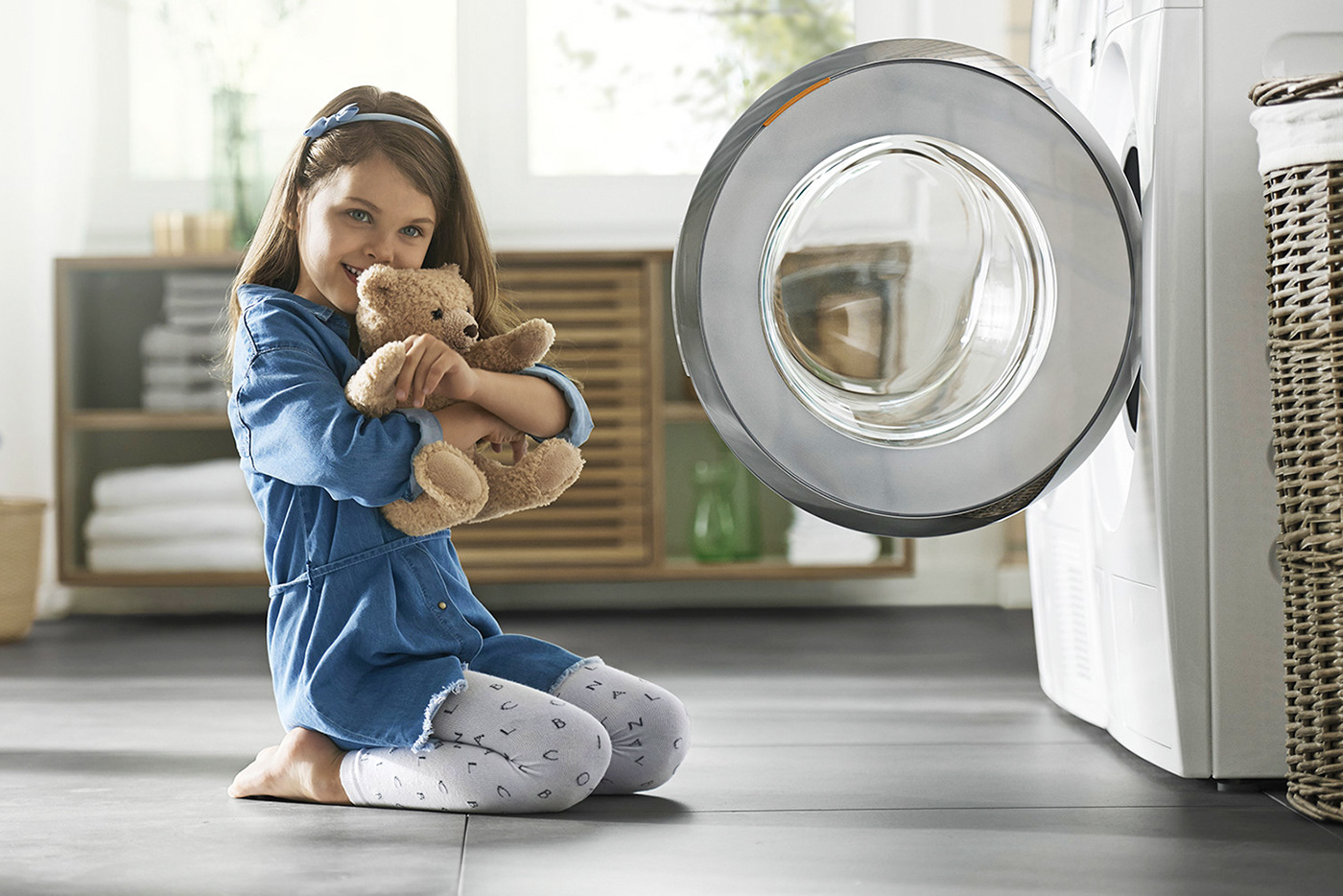
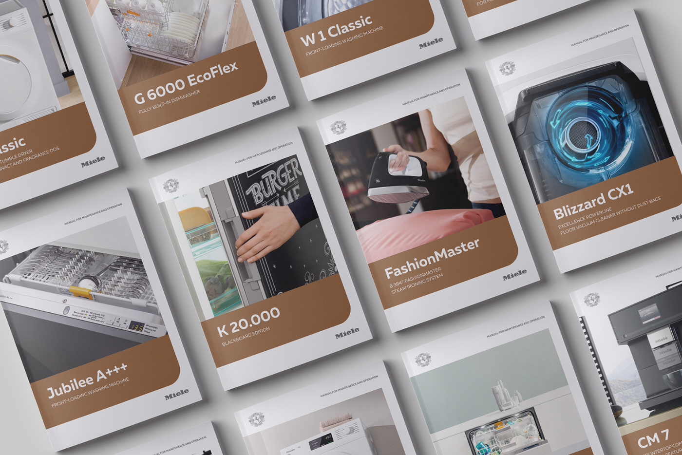
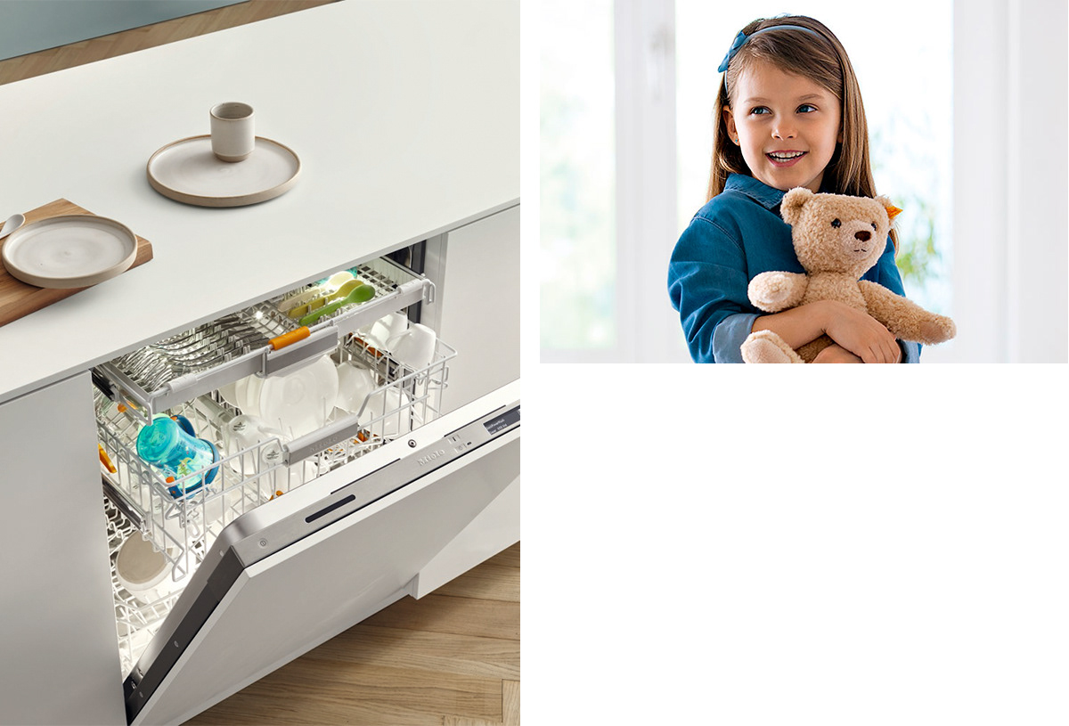
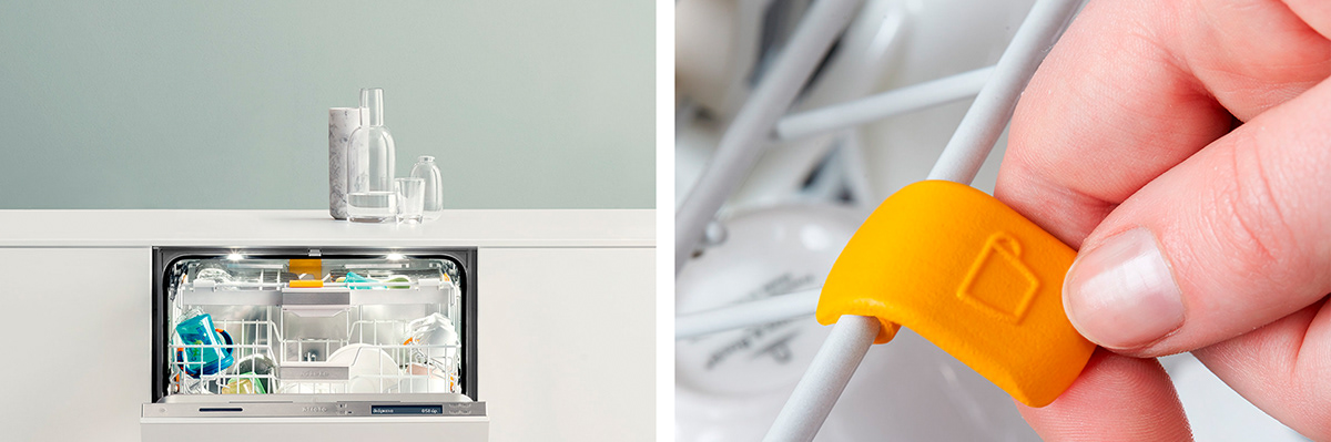
The bright, contrasting colours of the Reds that Miele has been using for a long time have become a characteristic feature of the company's visual identity. Many clients of the company have a number of associative images in relation to the company. The management of the company Miele has set itself the task to modernize the classic visual solution using the relaxed shades, maintaining the minimalist identity of the company and adding pastel colors. The reason for the update was the focus on creating a new emotional image of the company, which carries more home warmth, comfort and convenience. The main condition was to preserve the purity of color, simplicity and memorability of form and a new emotional coloring of the brand not used before.

Solution
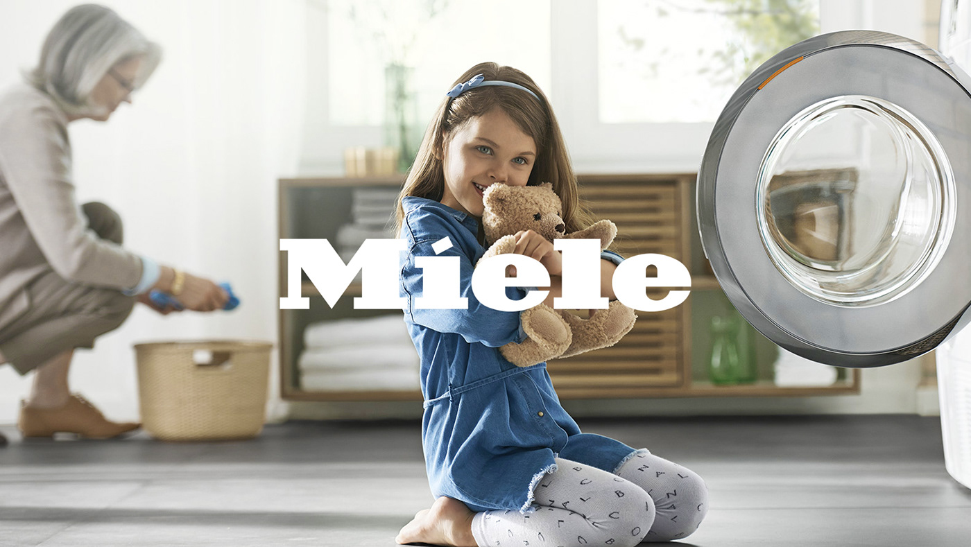
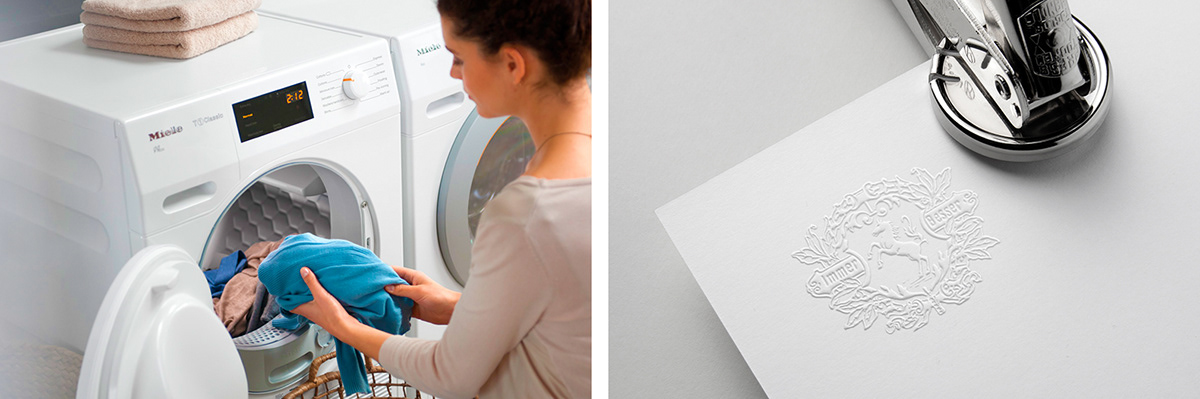
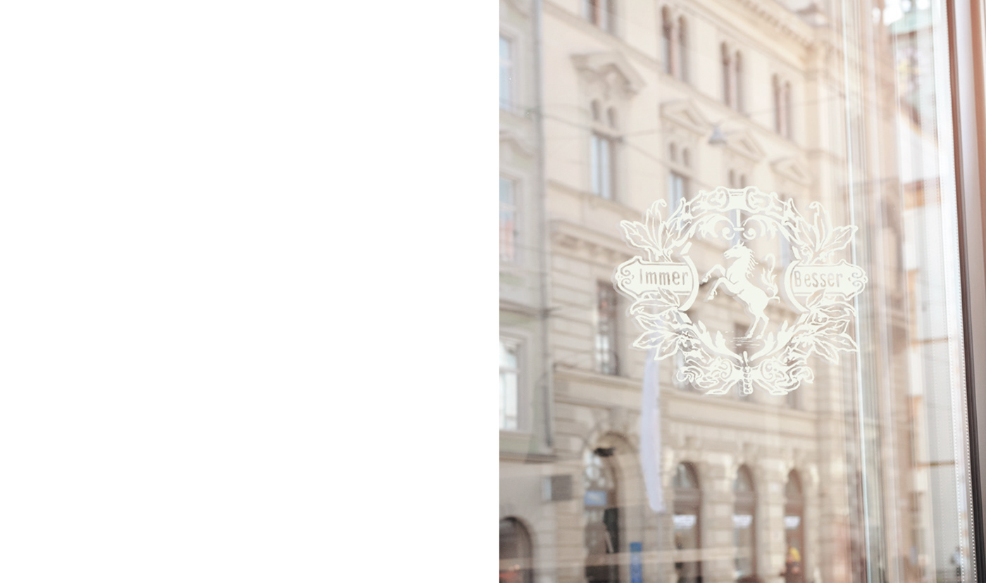
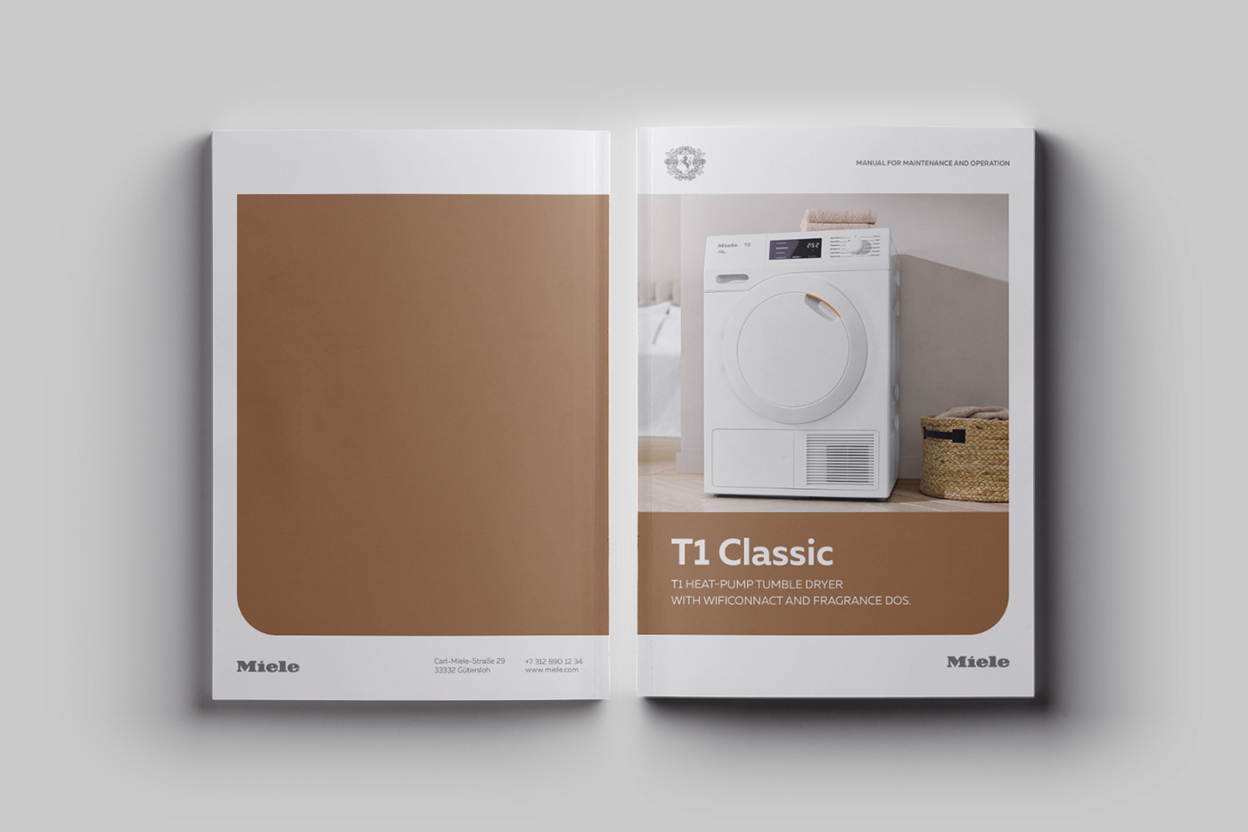
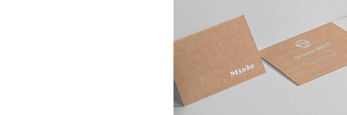
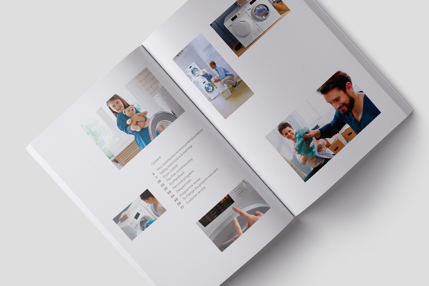
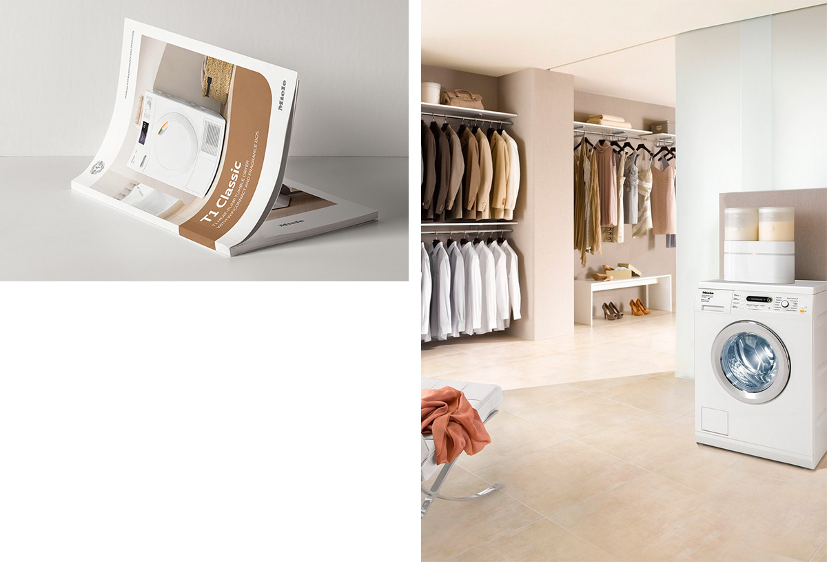
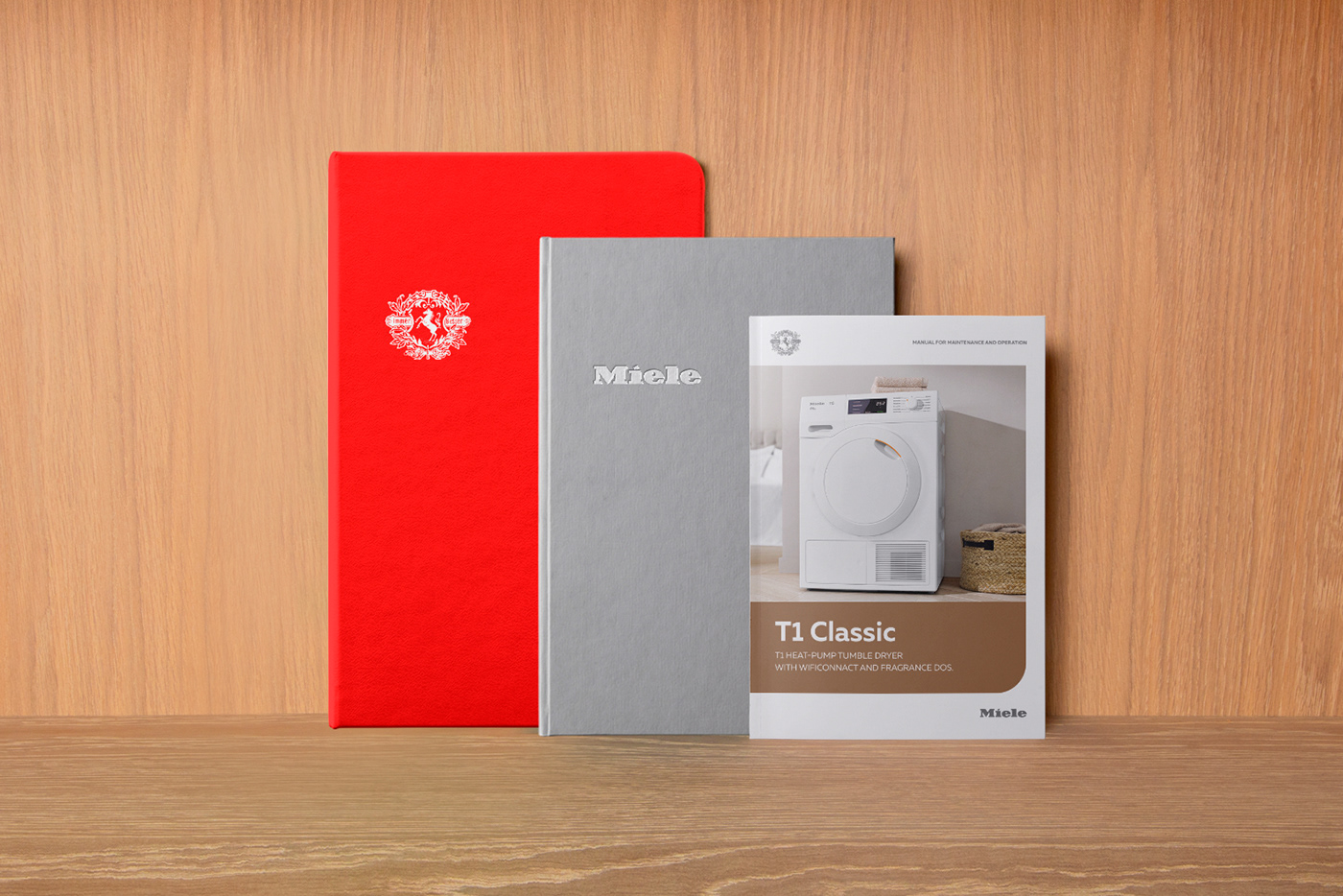
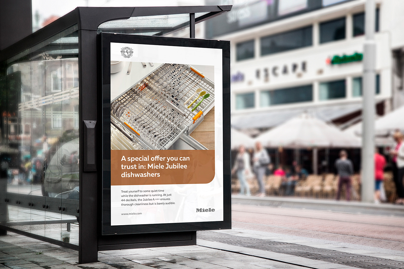
It was important to keep the usual style recognition of the company and at the same time to convey a new emotion to customers. As a new solution, we have focused on the font logo Miele, now it is used in light colors on a contrasting background. Also, the new solution was to pay more attention to the company's coat of arms using the corporate slogan Immer Besser. The use of the company's coat of arms provides a reference to many years of experience and emphasizes the premium of the brand. As a new color scheme, we used pure white, several shades of gray and light bronze to create a warm home atmosphere.

Results
The update of visual identification of the company was successfully accepted among the customers who liked the new emotional message and positioning of the company. Miele company started a new stage of development in communication with customers and integrated positioning in the market, strengthening its pre-eminent status of quality products.