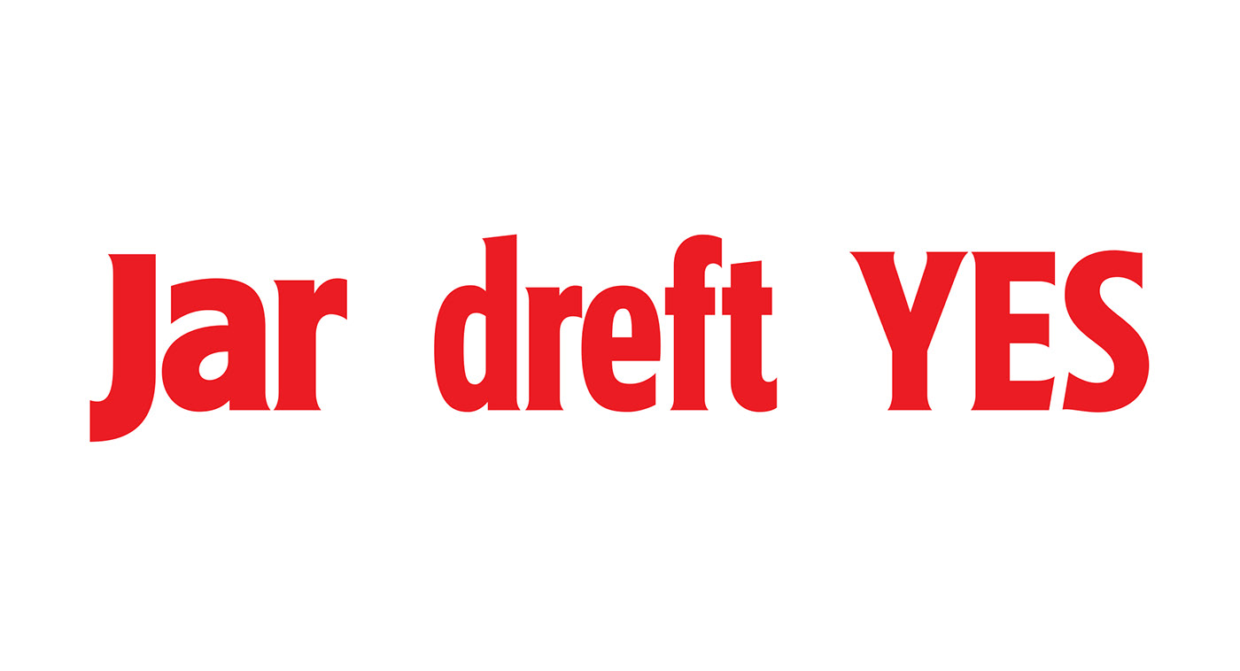
In order to compete with other rival brands Fairy needed to increase its standout on shelf. I worked closely with Elmwood on the development of more impactful typography to enhance ‘the power of the drop‘ concept.


An initial analysis of existing typography was presented followed by a considered amount of development.

The type was redrawn and redrawn and redrawn in order to work at its best within the holding shape.

Alongside the master logo other elements were drawn for use in advertising and for products around the world.


Client: Elmwood


