

Usually when we begin a project for The Soap Factory the slate is totally blank. All we know is the curatorial intent of the exhibition and who’s in the show but we have no idea what it will look like so our design process already rules out showing pictures of the work. When I visited Alexa Horochowski’s studio for the first time I went in ready to learn so that The MVA could respond.
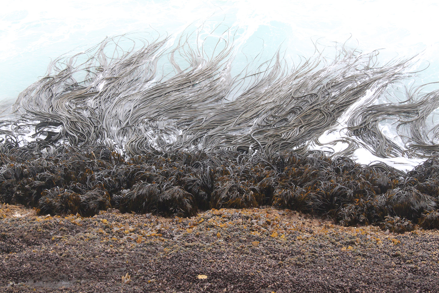
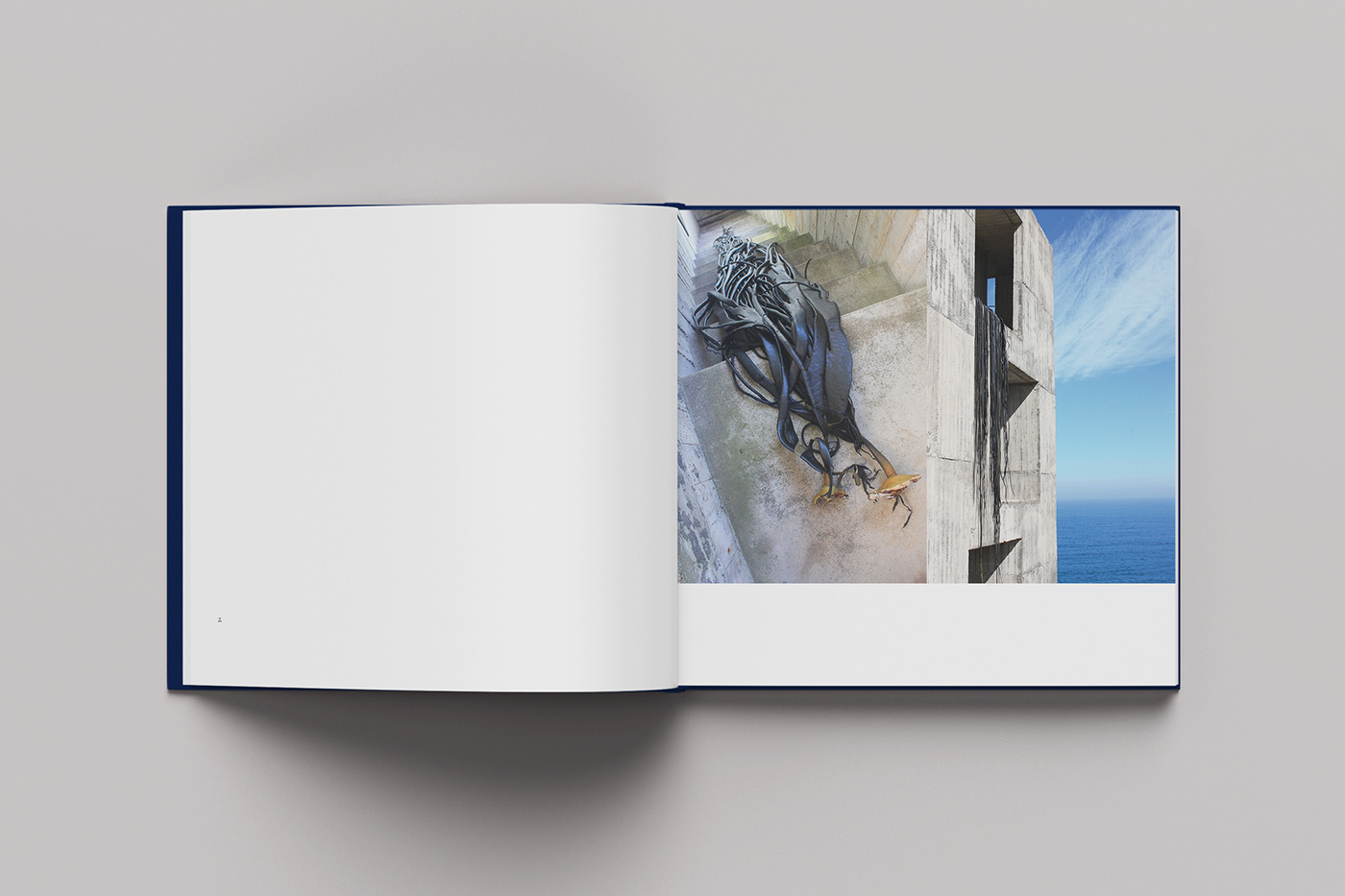
But when I saw this image on her wall and she explained that it was just down the hill from the Casa Poli—a cultural center/residence in rural Chile on the Pacific Ocean—and the giant kelp or cochayuyo was a material that figured heavily in her exhibition I just knew that we had to make a classic exhibition poster.
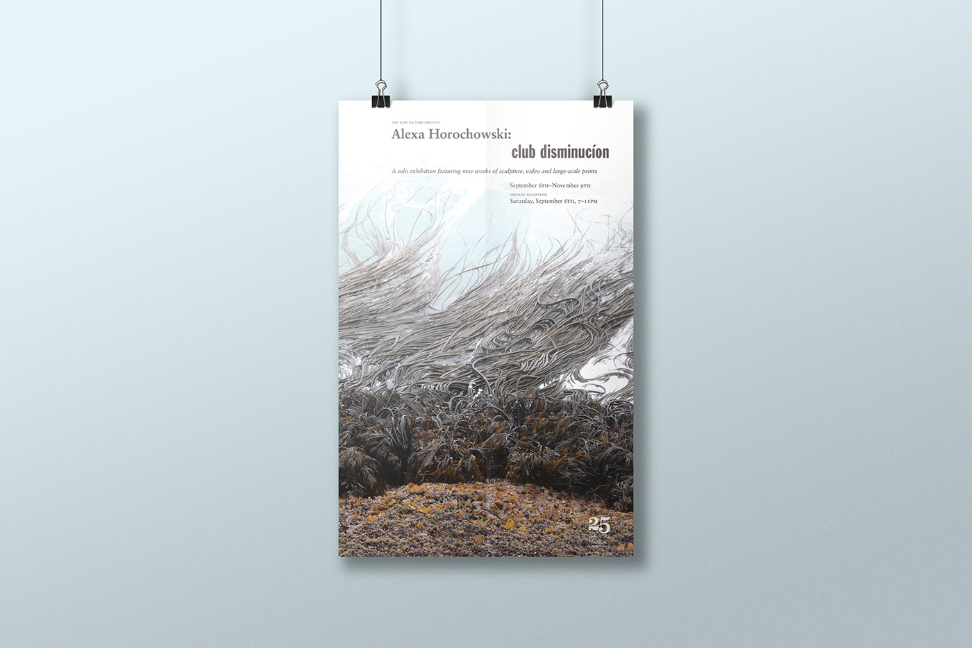
We didn’t interpret the work at all. Instead we viewed it through the lens of “the shock of the new” and promoted the art’s formal qualities by designing in the style of 1950’s MoMA catalogs. We also held the notion of “beautiful art deserves beautiful type”.

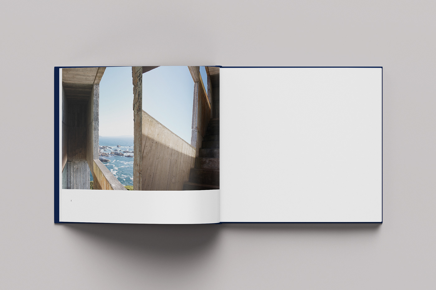
When I met Alexa for the first time she had already laid out the photos in Keynote. I thought it was perfect as is and focused on translating it to print and providing the typographic elements that would book end the photography and connect it to the exhibition identity.
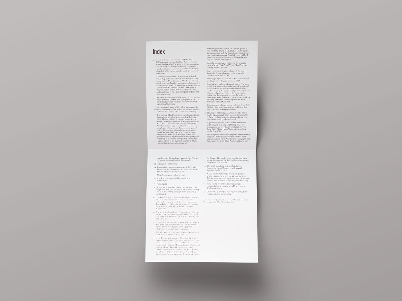
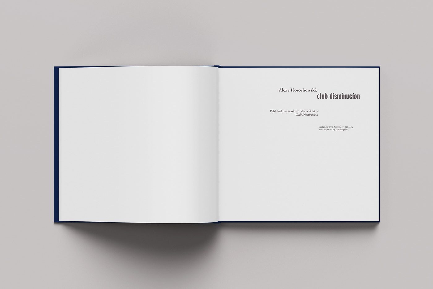
In one of those crap situations that turns out to be a blessing we were waiting on an essay that was going to come into too late to make it in the book so we were going to print it as a separate insert. We decided to include the index as well so that it wouldn’t feel like an insert. While the essay never materialized it the insert caused the book to be almost purely images.

We have a small number of these catalogs for sale at our shop. Each copy includes the 11 x 17" mailer as well.


