


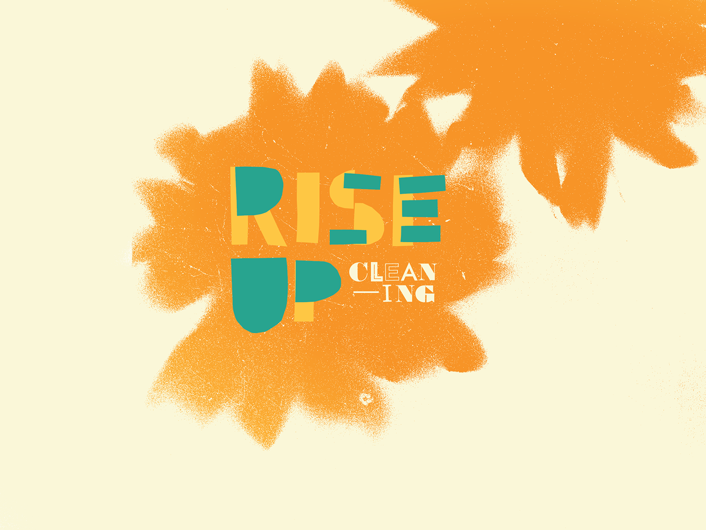
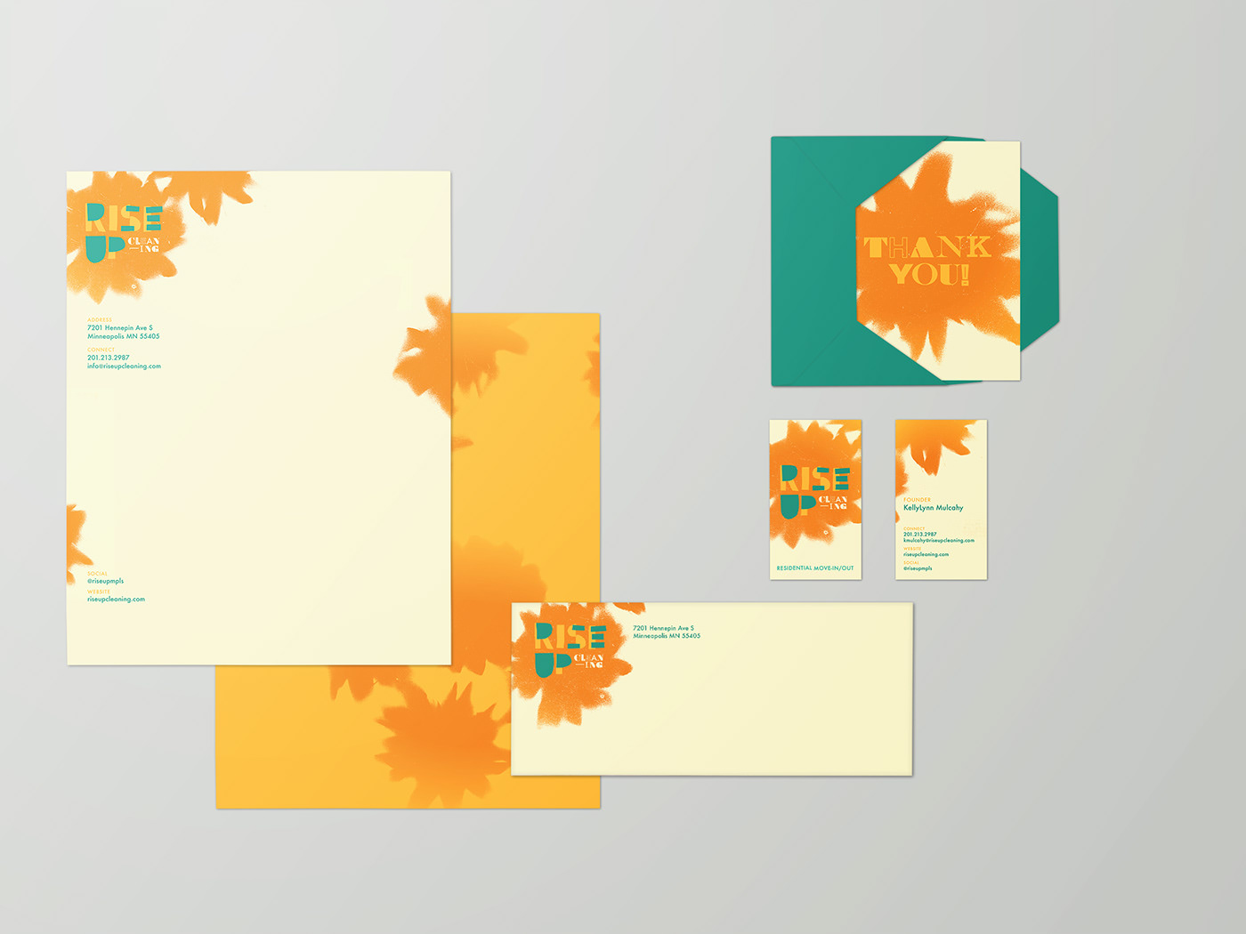
Rise Up Cleaning Identity
Rise Up Cleaning is a startup residential cleaning company striving to bring dignity and fair wages to the industry. Most cleaning companies project an air of clinical sterility in their branding (which makes sense—a sterile room is a clean one). We wanted to go for something different: humanity. Combining DIY methods with a bright color palatte, we gave Rise Up an identity that communicates human touch and joy.
Logo
Though its designed to stand alone, the Rise Up logo is usually situated on a stenciled sunflower. The sunflower was chosen for its exaggerated growth toward light.

Background graphics
The floral backgrounds were created by using actual sunflowers as stencils. The resulting shapes are more about feeling than being a symbol. They come from flowers but evoke stars and fireworks.
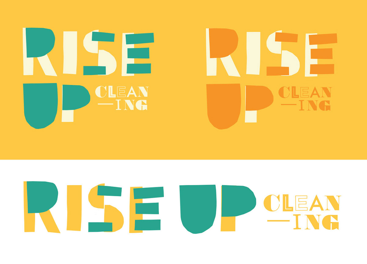
Logo colorways and variations
The RISE UP portion of the logo was created using cut construction recalling everything from children’s creations to the vitality of protest graphics.
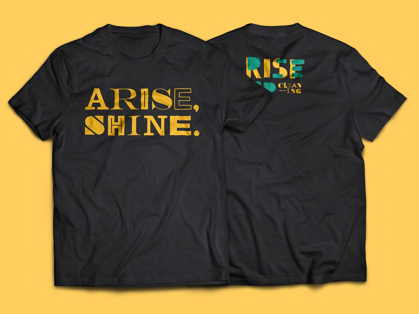
Staff tees
We brought the hand-made energy of the system to other graphics by creating a “ransom note” style that requires every single letter to be fitted just so.


