
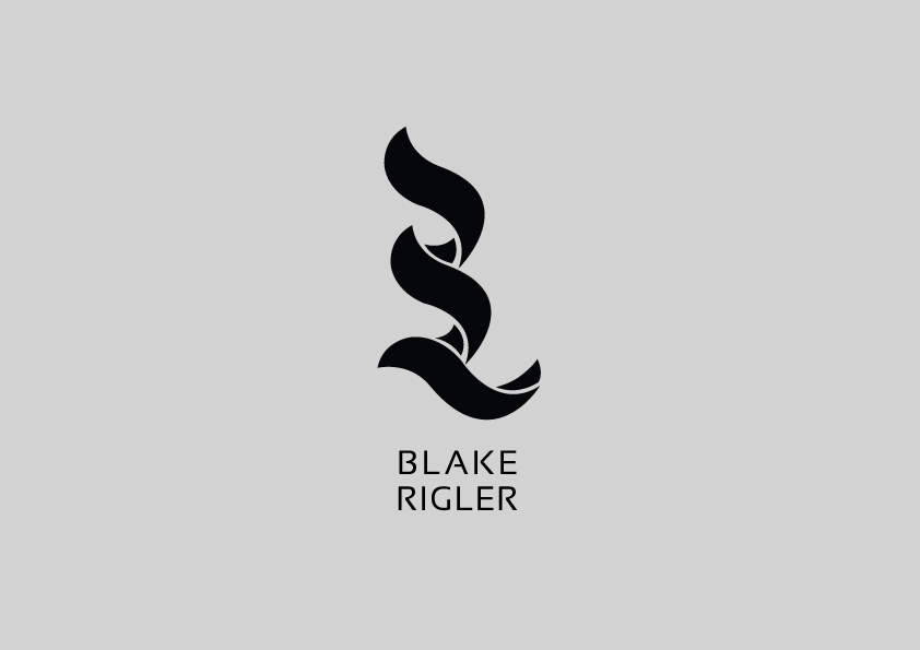
Blake Rigler identity was made for a college project, based on two adjectives previously that define the client, contentious and impulsive are two words that define his character.
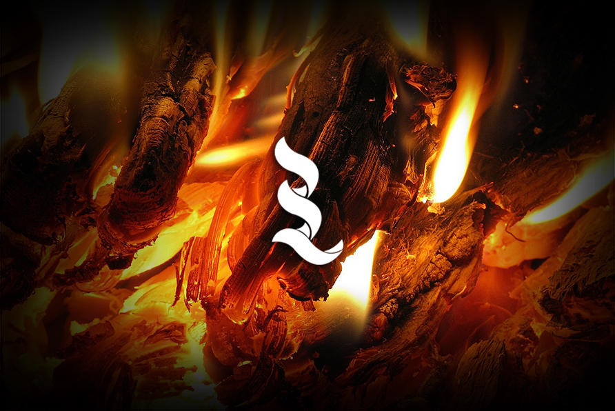
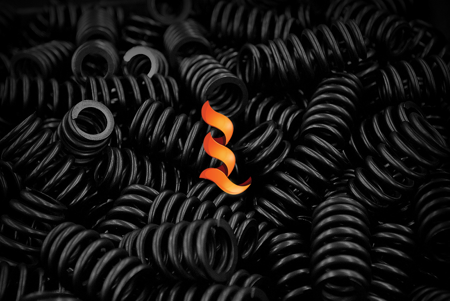
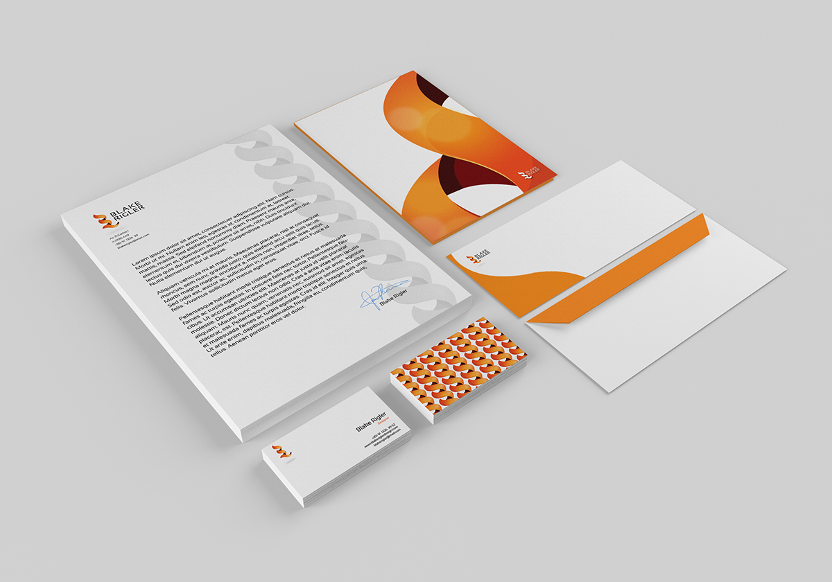
The brand was developed by using two letters ( B & R ) in a vertical alignment and assembling a sort of symbiosis, since the second half of the B is simultaneously the first half of R.
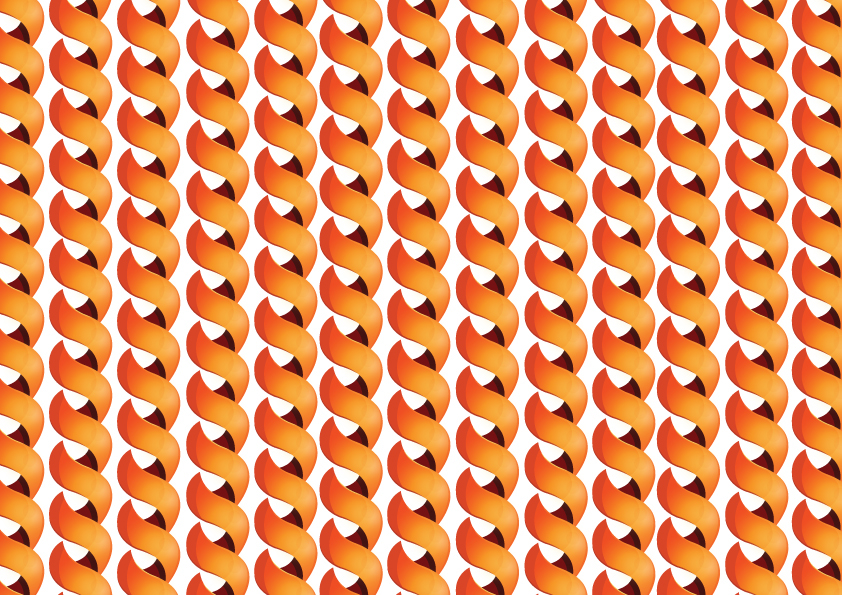
Still concerning the shape, the symbol has a spiral form, which also reminds a spring and therefore the idea of impulse. The propose was also to combine shape and color in the proper way to represent the idea of a flame and portraying both adjectives.
The brand was developed by using two letters ( B & R ) in a vertical alignment and assembling a sort of symbiosis, since the second half of the B is simultaneously the first half of R.
Still concerning the shape, the symbol has a spiral form, which also reminds a spring and therefore the idea of impulse. The propose was also to combine shape and color in the proper way to represent the idea of a flame and portraying both adjectives.
con-ten-tious
- involving or likely to cause contention;
- tending to argue or quarrel;
- causing or characterized by dispute; controversial;
im-pul-sive
- inclined to act on impulse rather than thought;
- characterized by actions based on sudden desires, whims, or inclinations rather than careful thought;
- forceful, inciting, or impeling;


Thank You for viewing

