zippsafe corporate identity and webdesign
We love to work on complex assignments. We provide product design development, branding and digital interface design as professional solutions for our clients to achieve their business goals. We believe that the physical or digital product has to be assistedwith an authentic, uniform brand identity. Company values should be recognisable and taken into account in every form of internal and external communiation to achieve costumer engagement.
In the beginning of 2018, we started our long-term partnership with Zippsafe. We were assigned to redesign the brand identity and help with the product development. During the tasks on the CI, the 1-year-long process covered nearly every single visual platform where a company is able to present itself.
Preparation
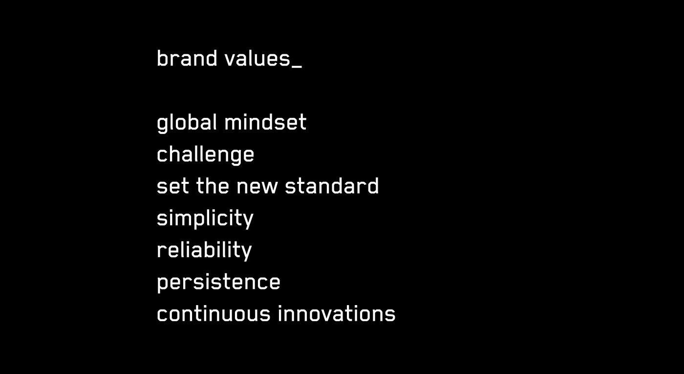
To redesign and improve Zippsafe’s corporate identity, we needed to learn about the company. First, we studied our customer’s brand values and its clients. We traveled to Zurich and spent two days with this inspiring, energetic team. We used our unique challenge mapping workshop methodology to define the basic company values, set our goal for the year and define the creative tasks.
Corporate identity
Logo
In the life of a company, one of the most important visual elements is the logo. For Zippsafe, we decided to refresh the older logo instead of creating an entirely new one. We saw the opportunity in the existing logo and felt, how big emotional bandage it had with the team. With our work, the logo became bold and simple, it communicates the high level creative engineering capacities of the company.

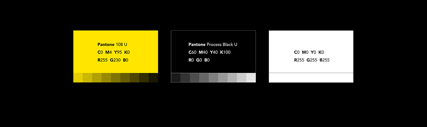
Colours
Primary colours are the most important and most commonly used colours in the Zippsafe brand. We use these ones as often as possible. Out of these three, yellow is the colour that gives depth, style and dynamism to the brand.
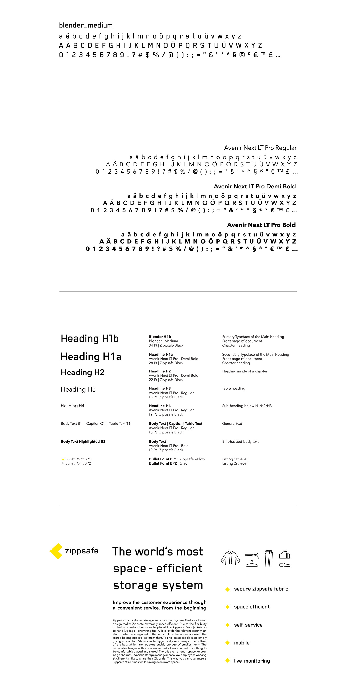
Typefaces
We chose two Swiss typefaces for Zippsafe. Blender is a young, strong, engineering-style font. We use this for headlines and special texts in applications. It introduces a young and dynamic, yet trustworthy visual style to the brand. Avenir is one of the most renown Swiss fonts. Avenir Next is a refined, modernised version. We use this to communicate Swissness, international approach and traditional quality all at the same time.

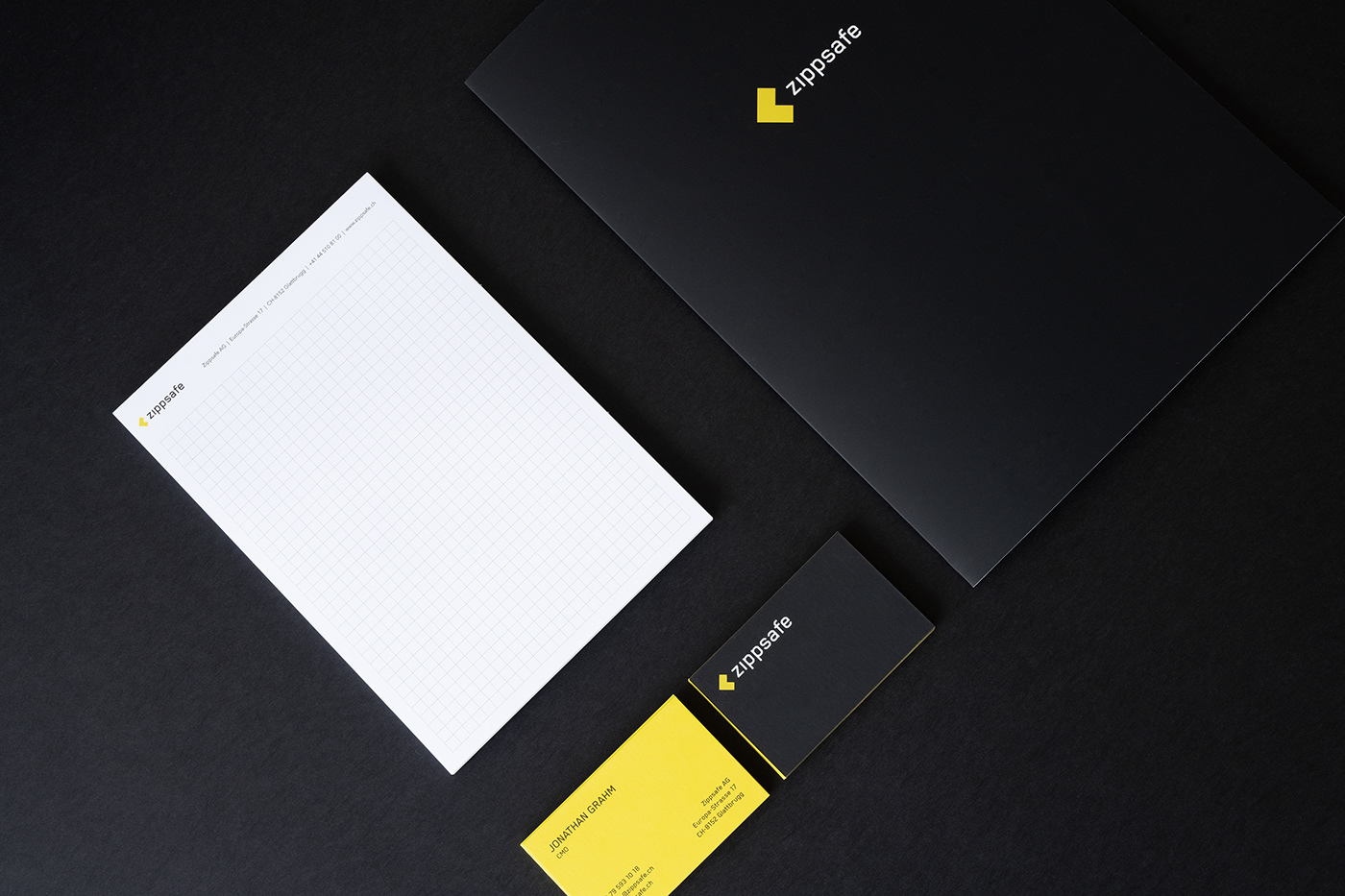
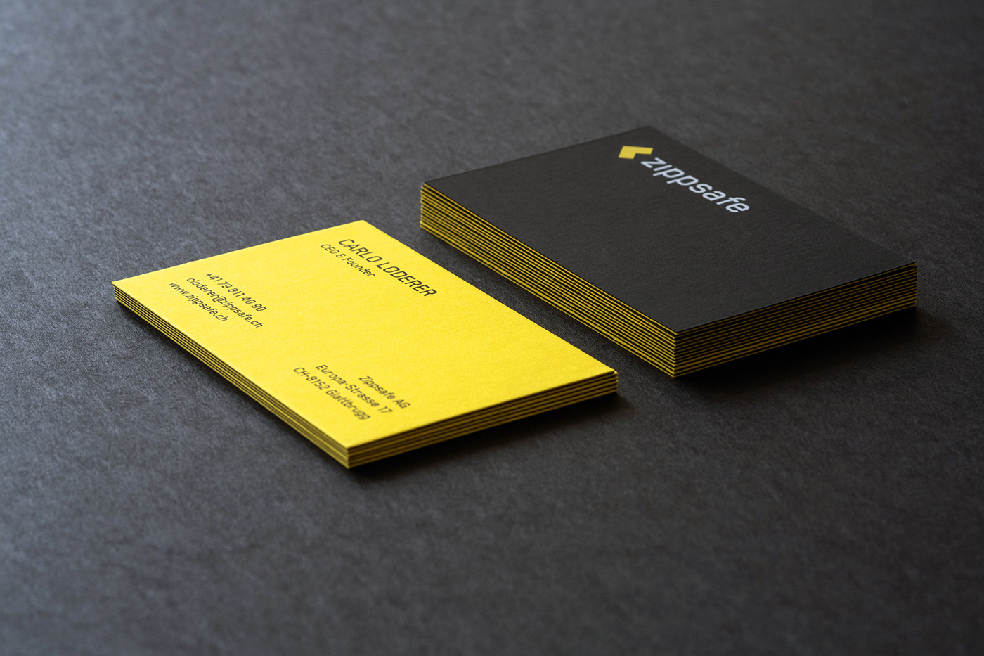
Business cards
Zippsafe business cards are made of double layered matte paper, printed with white and black letters. They communicate quality, reliability and dynamism with a fresh touch on the latest trends. During the design process of the business card, we imagined the moment of giving it to a client. Business cards are the company’s first visual material that we see. It has a huge impact on the impression of the company.
Templates, print materials
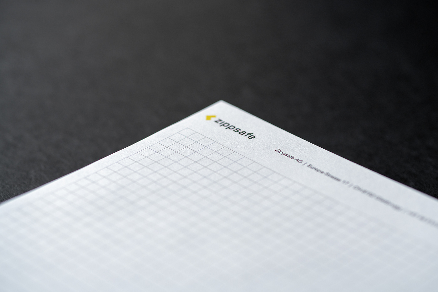
In the brand book, we also focused on everyday office tasks. We made a package of solutions for the documents, e-mail signatures and presentations. With our templates, Zippsafe has it’s unique visual appearance everywhere. Not only the digital presence fits better with the philosophy and goals of Zippsafe, but the physical marketing materials as well. We believe that every small detail has importance, even a folder, envelope or paper block.
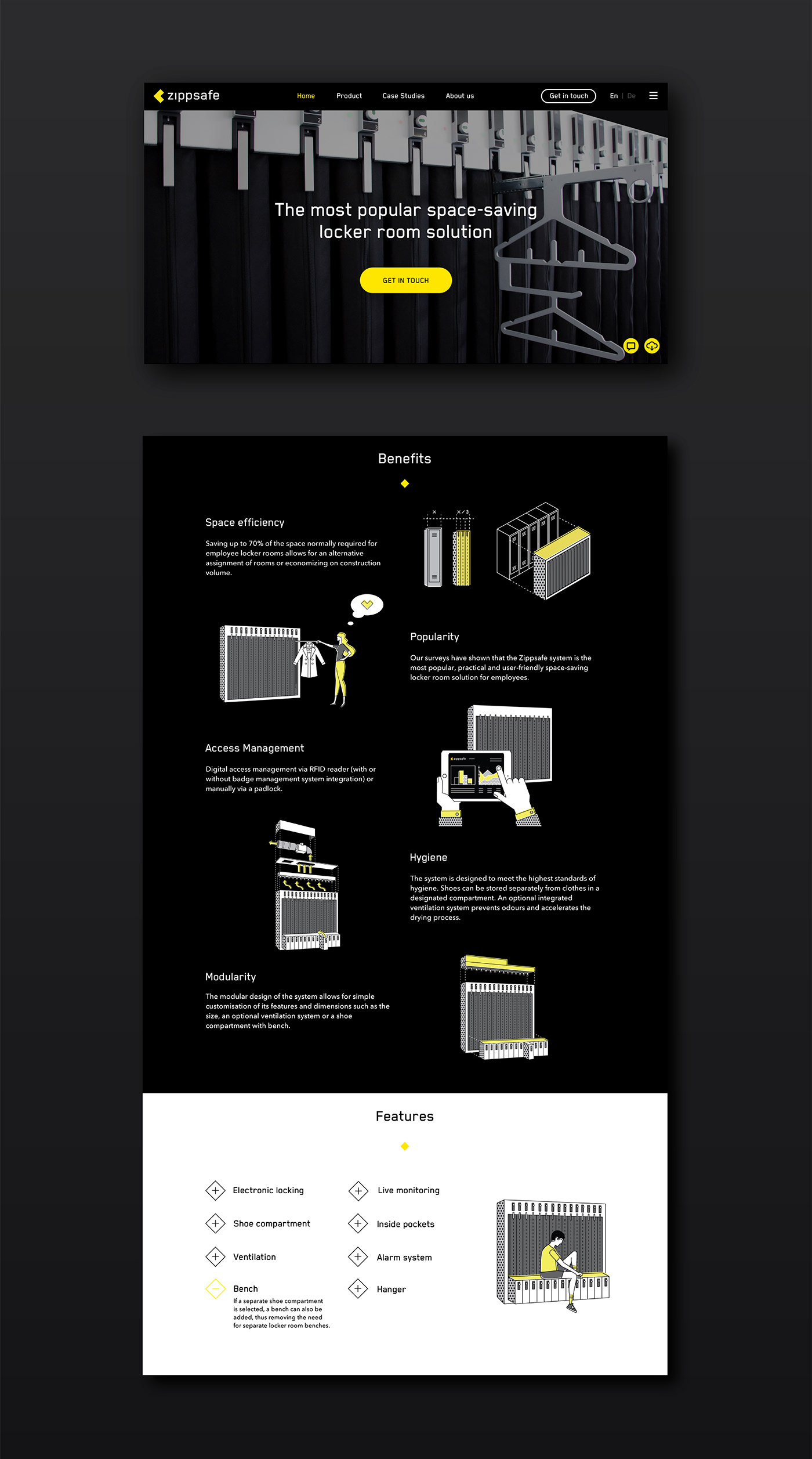
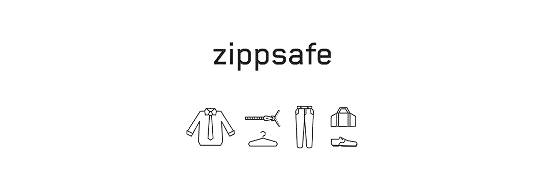
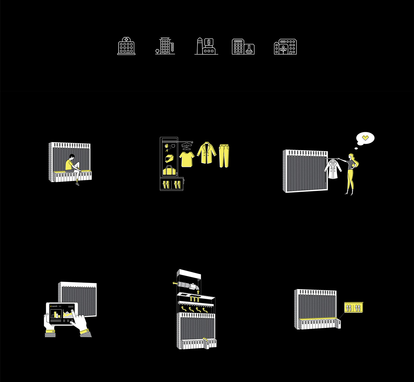
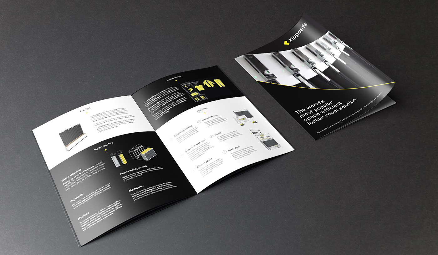
We designed a new, well-organised, informative brochure about the Zippsafe products. We made several illustrations to present the main benefits and the features of the product. We wanted to make a perfect visual system, that’s why we used the geometry of the typeface during the design of the illustrations. Since being consistent is important to us, we used these illustrations with freshly designed icons on the website as well. While designing the print materials, we made sure that the technical implementations and materials reflected the positioning of the brand. We managed the manufacturing and conducted a high quality control on them.
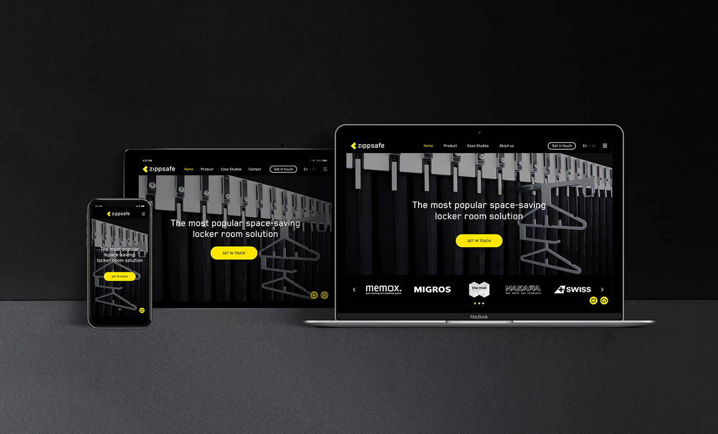
Website design process
The longest contiguous task was designing the website. Zippsafe develops, manufactures and sells a high quality, revolutionary product. For their sales process, it is necessary to have a well designed, user friendly, informative website.
We started this work sprint with another workshop. The aim of the one-day-long meeting was to specify the website visitors’ personas, their user journey and the information they have to receive on the different pages. Afterwards we created the site map. The workshop helped us to start the next step of the website design and create layouts and wireframes.