

AlertaMente - Associação Nacional para a Saúde Mental, is a Portuguese nonprofit mental health NGO. It's main goal is to promote mental health awareness and provide services and support otherwise nonexistent in Portugal. Check them out at www.alertamente.org
A truly grassroots NGO, launched initially with their core member's own means and no institutional help. They kicked off with a simple Wix website and barely any branding in early 2018. Later in summer, I was introduced to it through one of it's core members and my first contribution came to be around late September. I will leave here a small description of the process and different ideas for their logo.
I started off by sketching some concepts. AlertaMente is a compound of "Alerta", Portuguese for alert, and "Mente" meaning mind. As such, images of brains and "other dangers" traffic signs invaded me.

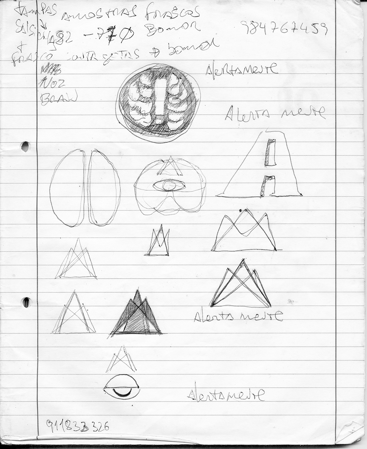
Initial concepts evolved around the idea of a brain where the negative space would draw an exclamation mark. Other ideas involved an exclamation mark drawn by the negative space of a capital letter "A". Or a juxtaposition of the letters "A" and "M", creating an ascending movement. Perhaps to a higher state... There were some other variations like mixing up an Illuminati eye with a brain, which proved extremely cyclopic, and was immediately discarded.
None of the above felt right. So moving on to Adobe's Illustrator, some experiments were done by overlapping heads and playing around with transparencies. Finally, using two mirrored heads, it was possible to draw an exclamation mark from the overlap. The exclamation arises from the dissociation between individuals. What would be considered dissonance, deviation? The loss of common ground. But what is "normal"? How can one define personality in it's full extent versus illness or disorder? Being a true skeptic of the DSM, I'll leave the open question to the real professionals in the field.


Now, time to play around with some color and fonts. And run some tests via social media.

Most normies prefered the "eye" version, however most professionals were clear about the middle "exclamation mark version".
Initial random tests revealed a massive overall preference for the "eye" version. However health professionals and designer's feedback was showing better results with the initial concept of the "!".
After some clean up and tests over light and dark backgrounds, this was the result.
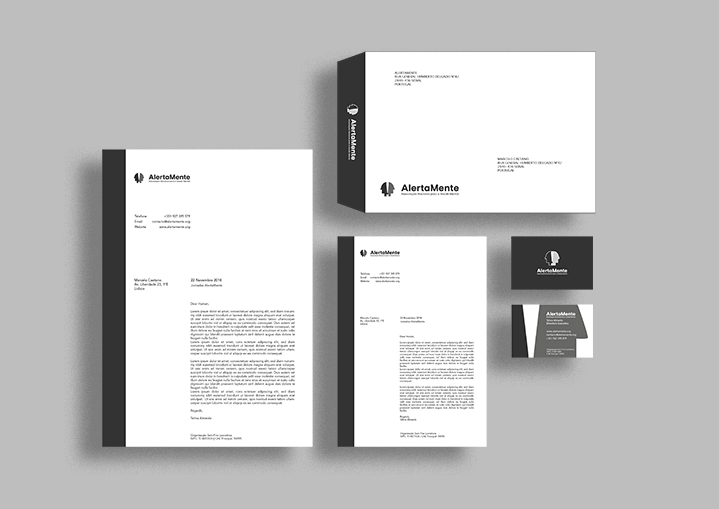
The second biggest priority after the logo was AlertaMente's stationery. The Executive Director started having meetings with national and international sponsors several months before. Everyone was asking for a business card.
Since this ONG is mainly active in Portugal, where mental health is commonly disregarded in the political sphere. It's main goal is to raise awareness precisely at the political level. As such, and following the logo's austerity, the business card remains highly sober. Not a pure black & white, high contrast business card. But still extremely simple and easy to read, in shades of grey over white. And of course, economical, no fancy colors, and no special effects. After all this is a nonprofit.

As for AlertaMente's stationery, the same principles were followed. All elements in grayscale. Both for sobriety and economy's sake. Less aesthetics and more political dimension. A5 and A4 letterheads layouts were designed together with the C5 envelope.
Next up, 10 roll ups for all sort of events and meetings. They apply the official color palette and state AlertaMente's mission. Their design evolved around the logo's simplification over two roll up banners with a gradient as background. A QR code was ended to the bottom corner linking to the official webpage.


