


L o g o c o l l e c t i o n 2 0 1 8
Logos Making Sense. Vol. 3
This is my 3rd collection of Logos that Make Sense. It represents logos and marks which I designed in Summer 2018. To my mind, the main feature of a logo is its' meaning expressed by visual language: shape, color, metaphors, font style or even animation. A logo is a very expressive means of communication, the key element of any branding identity system. At the same time a logo is only a sliver on the full scope which includes a mindful research, deep immersion into a client's business problems and goals. A logo is not just a vector shape. It's how a brand is identified according to its' values and goals.
T r i C o u n t y C a r e

This dynamic logo is designed for an organization that helps people with reduced capabilities to live normal lives. A human and a star symbolizes a person who becomes successful despite of the problems he is facing on his way. A continuous line style in combination with looped animation show interruptable care which company is providing to people.
B i t l l e

Bitlle is a loyalty programme service based on blockchain technology. It allows clients exchange their shopping bonuses within the retailers network or convert them directly to Ethereum. The diamond shape embracing two overlapping arrows that form letter "b" is a perfect metaphor for their logo.
R e l a t e C o n s u l t i n g
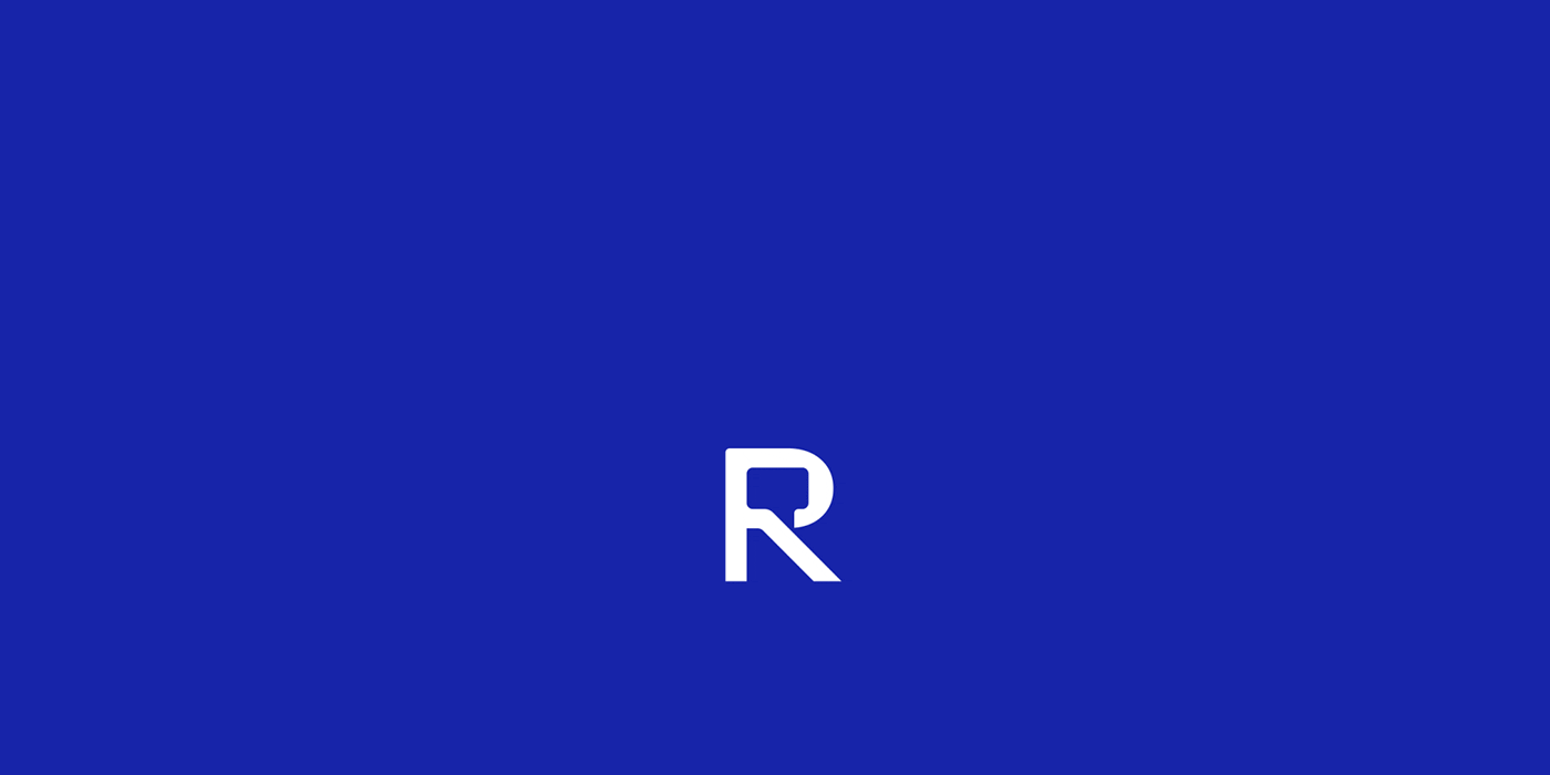

The logo idea is based either on the company name or its' positioning. The "message" pictogram incorporated into the "R" letter symbolizes either relation between people or communication as a marketing goal. The logo simplicity and metaphor clearliness creates the right tone of voice. It tells the clients about the company's reliability and unambiguity.
L u x u r y I n t e r i o r s

Luxury Interiors is a New York based company which specializes on decorationg interiors with wooden materials. Premium qualite, reliability and natural materials are proudly represented with the eye-catching logo symbol. I've managed to combine a bow-tie, a room perspective and timber texture in a single mark.
M i l l e n i x
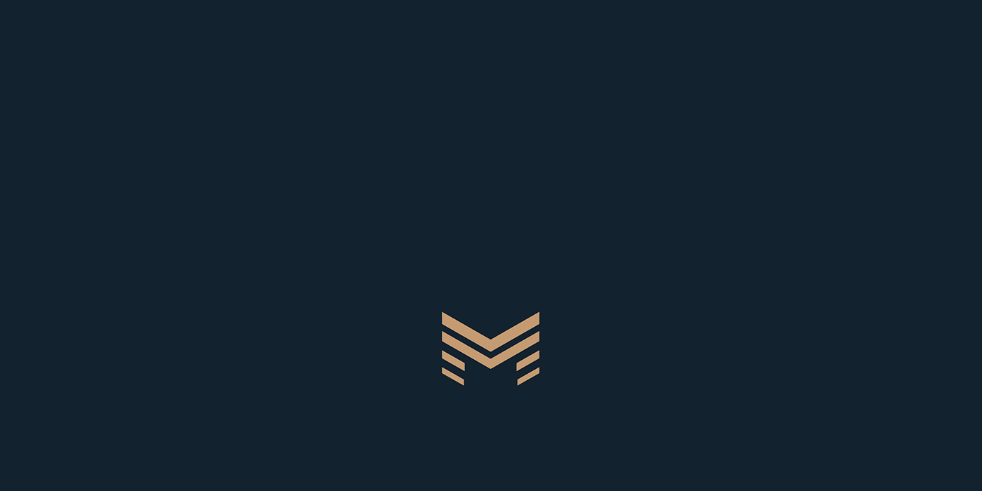

Creating a logo for a group of companies that deals with construction, interior design, real estate and investment was a real challenge. Thanks to thorough research I've developed a name and clear branding strategy which predetermined the logo image. Reliable and flexible, unique and diverse, solid and compound at the same time – this logo has it all.
N e u C a l e n d a r

Logo for an online booking service with calendar functionality. Rather hard to visualize, isn't it? After a deep immersion into the client's business, mindful research and tons of exploration sketches I've decided to combine a flowchart, calendar tabs and letter "N". Transparency grades added a futuristic feeling to the logo understating the brand's innovative personality.
S y n t e c h


This animated logo was born to unused logo concept for a motor oil company. The idea was to combine images of motor gears, lubricant drops and letter "S". Adding rotating motion to the logo made the motor feel even stronger. This concept is available for sale now as an editable animated logo template on Creative Market.
E c o d r e v p l i t

A logo for a plywood and sheet material wholesale supplier. The concept is a result of a close cooperation with the company CEO, say nothing of a competitors research and branding platform definition. Piles of plywood reminding of tree branches hide inside a hexagonal box which ideally stands for the company USP: "Wholesale and delivery of wood sheet materials".
T h a n k s f o r w a t c h i n g


