
MoHappy is a hypothetical museum that brings in the modernly popular pop-up interactive exhibit culture where it would feature various rooms and activities that represents happiness. The concept is to have attendees leave happy and explore the different things that could make people happy. It is a branding project that involves designing its poster, brochure, screen and Instagram advertisements, website and various collaterals. The whole brand represents the idea of different views of happiness through the differences in the type and funky geometric shapes.

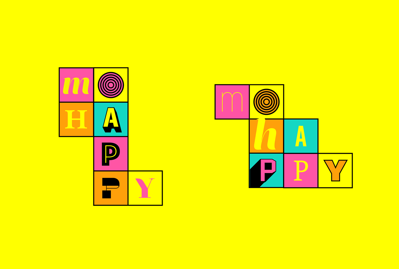
MoHappy’s logo expresses happiness and the fun energy of the museum. With different things representing happiness, I wanted to create sense of excitedness through a simple logo but still embody the varied feel of aliveness and weirdness. The idea is to have a bright and bold logo not just through color but also through the boxes and the funky letters. The final logo is a variable identity where the letter boxes are interchangable and the shape it creates could be rearranged following specific rules.


Before multiple logo iterations and explorations, there were countless sketches and ideas of the direction Mohappy could be headed. These are some of the initial logo designs when MoHappy’s name and acronym were still being played around. A lot of these were starting to embody the fun excitement I was seeking but weren’t quite complete.
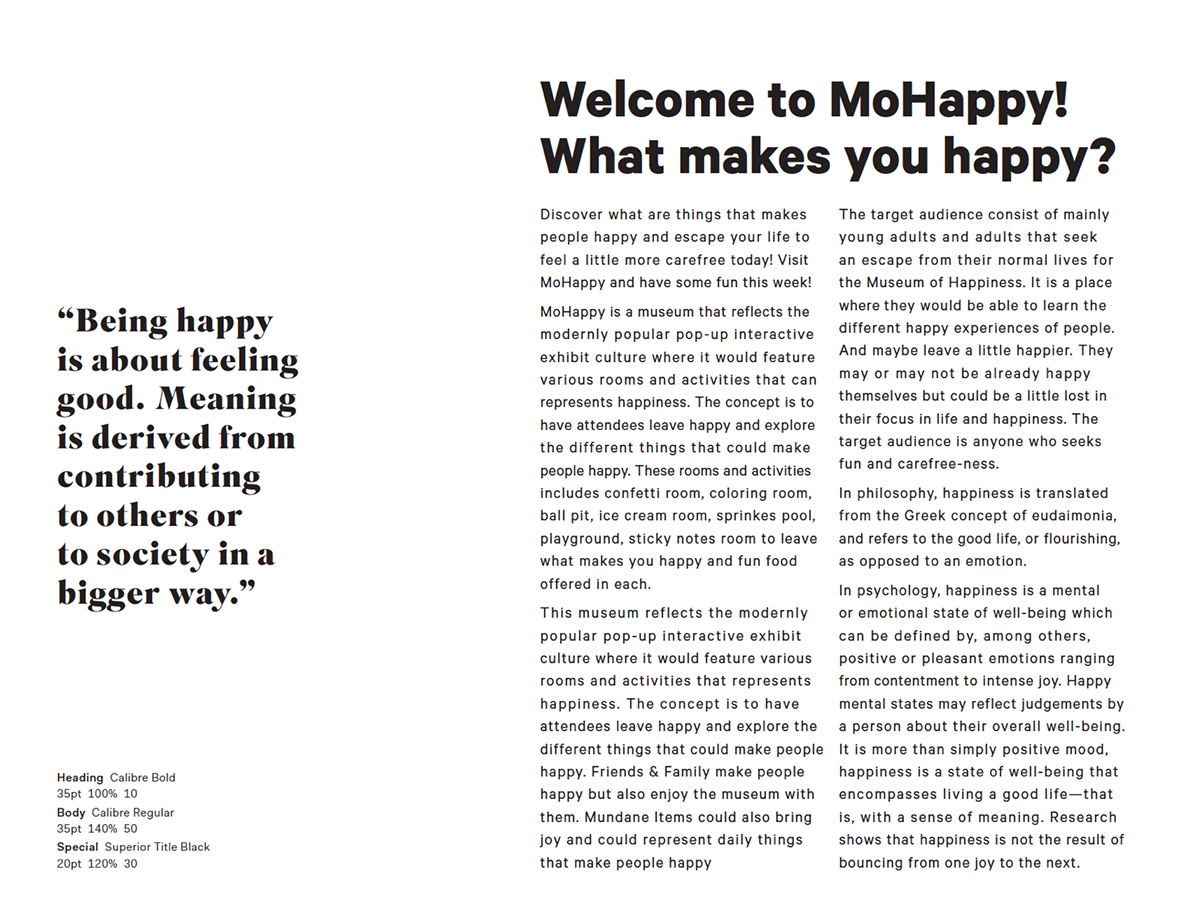
As I finish up with the logos and color decisions, I started to bring in what typefaces would look like with the whole identity. I decided the primary typeface would be a bold and simple sans serif, Calibre, used for both headlines and body text. For the secondary typeface, I wanted a more elaborate and decorative serif typeface, Superior Tile Black, for when there is a special use or a bold and different call out.

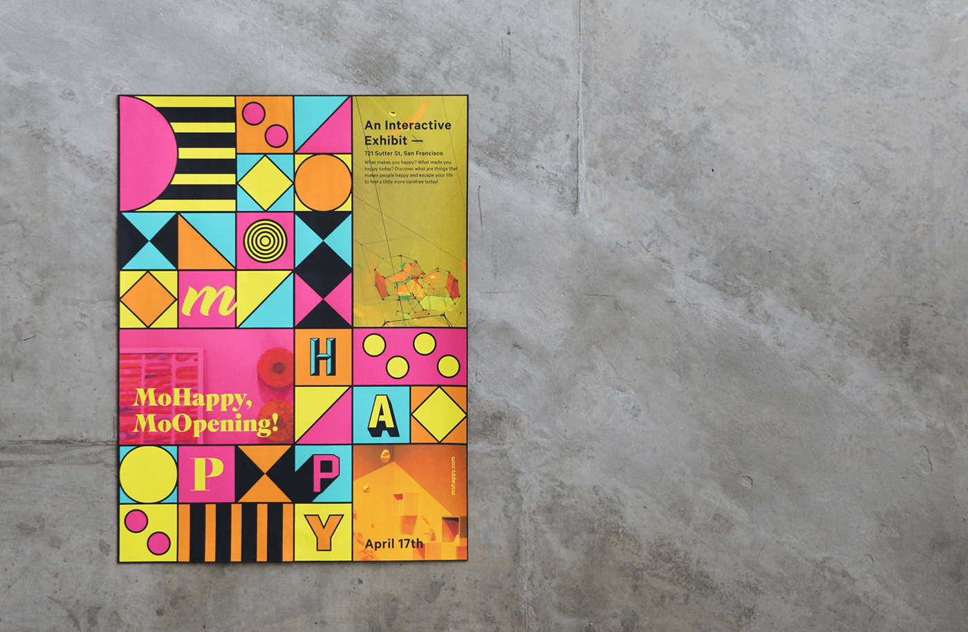
The poster was when I started defining MoHappy’s overall visual identity, extending the logo design to how it could be incorporated with images and patterns and text. I broke the singular box motif and brought in bigger boxes to fit in the grid and implemented different geometric shapes and patterns within the boxes. The seperate boxes combines and becomes an entire pattern and poster language. Titles and museum information could then be placed ontop of overlayed images of the museum, following certain spacing rules and color.
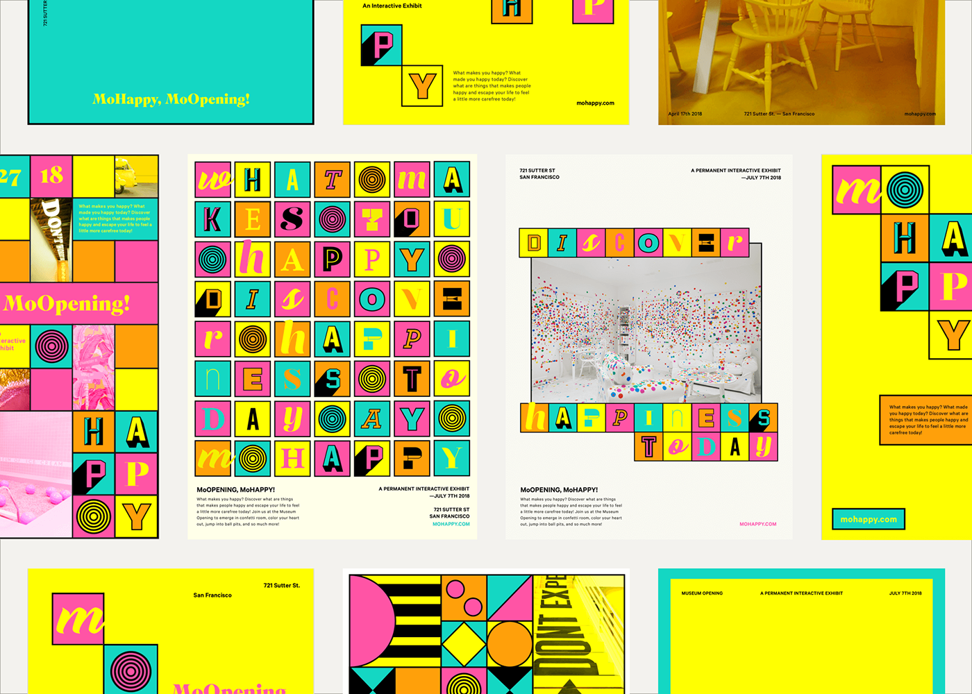
Other explorations of the overall visual identity of MoHappy beyond the logo. Some focusing on one image and some not incorporating images at all, I landed on mix and matching the amount of image, pattern and logo that is used. I had fun exploring creating a MoHappy ‘custom font’ with the letters and its typeface in each box but thought it was too overwhelming as a whole.
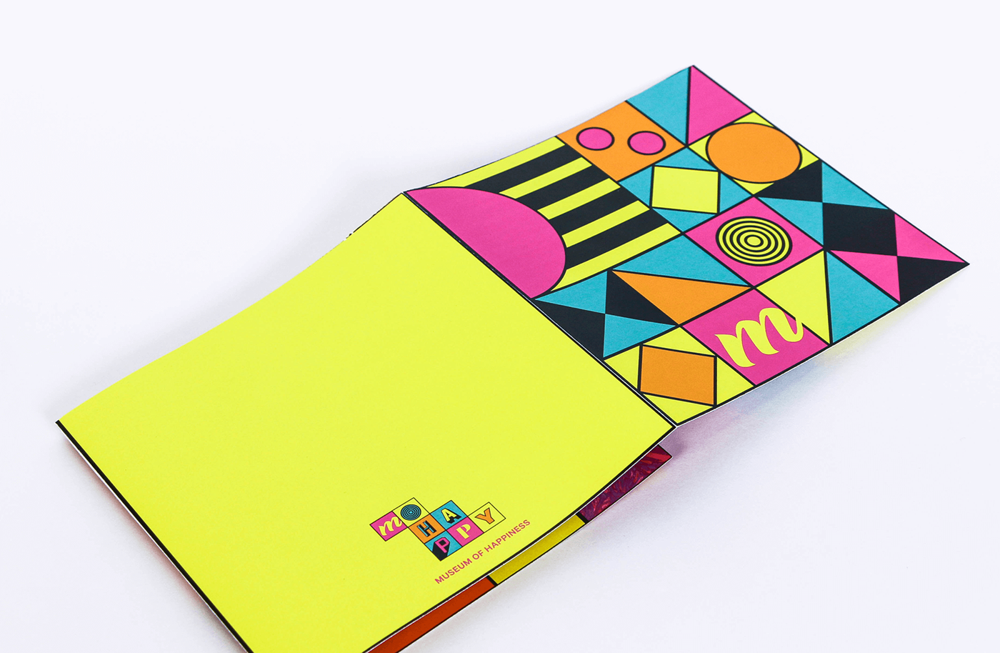
Extending the poster visual to a brochure for the museum allows a fun exploration of the brochure itself being a square and playing around with the folds. The visual works easily as a three-fold brochure where the cover is a form of mysterious branded piece and the back has the whole logo itself. As the user opens the brochure, they are able to experience and change the format and design by flipping the folds around; more information and images of the museum is discovered.


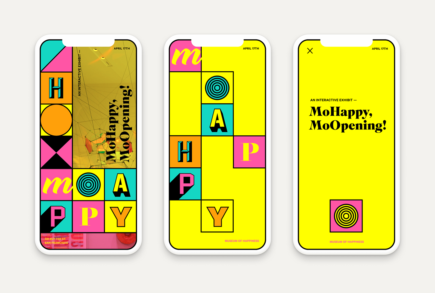
Bringing the visual into the digital world starting with a full screen phone advertisement that could either be Instagram story or a pop-up. The idea was for it to be sequential and move so that more information is being communicated but it could also be used as separate full screen ads.
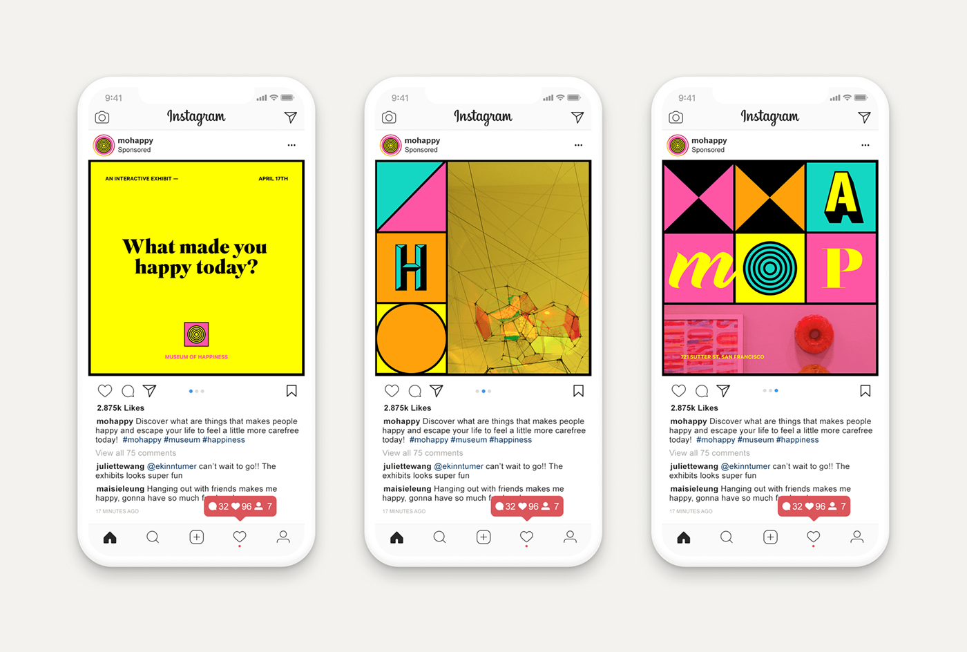
The instagram ad follows a similar concept to the brochure, bringing the three fold idea into a three swipe post. Where these separate square boxes adds up into something bigger but works as a separate entity as well. The swipes reveals more images and brand pattern to give additional information and feel of the museum opening.
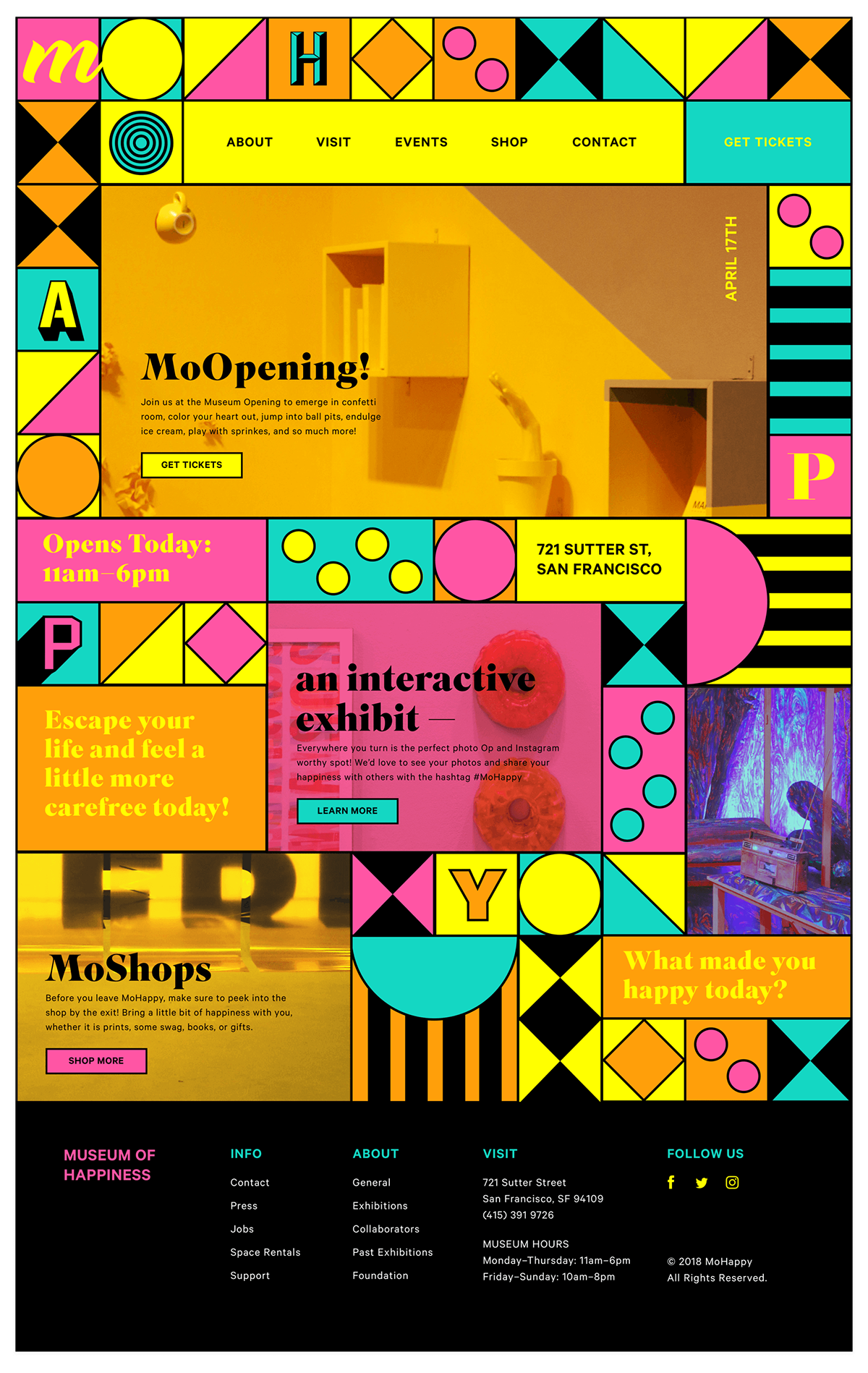
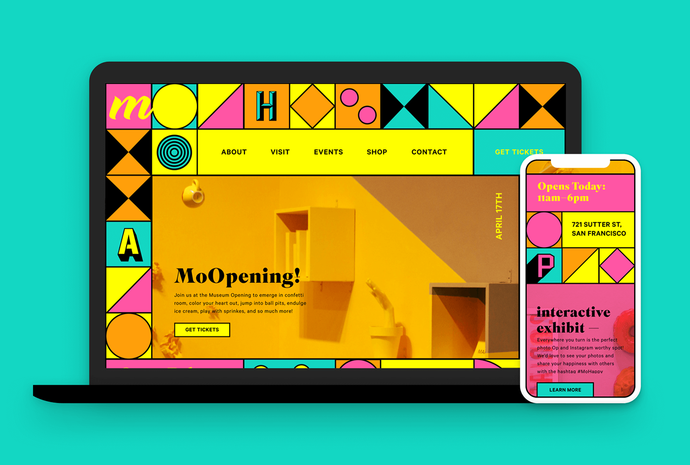
THE WEBSITE
The website brings in the same type of excitement and visual language where the nav bar and contents exists in the same kind of grid system. The buttons follow the same box visual and the type and image treatment is kept the same as the poster. Each of the boxes contain information about the museum and some boxes have additional language that adds to the brand.

MOBILE RESPONSIVE
Although it is an unconventional website design, the box visual allows it to be easily responsive where some patterns could just be omitted and other informational boxes could stack upon each other. It also allows a fun full-screen scrollable experience and the menu translates easily into the hamburger as a bold yellow box.
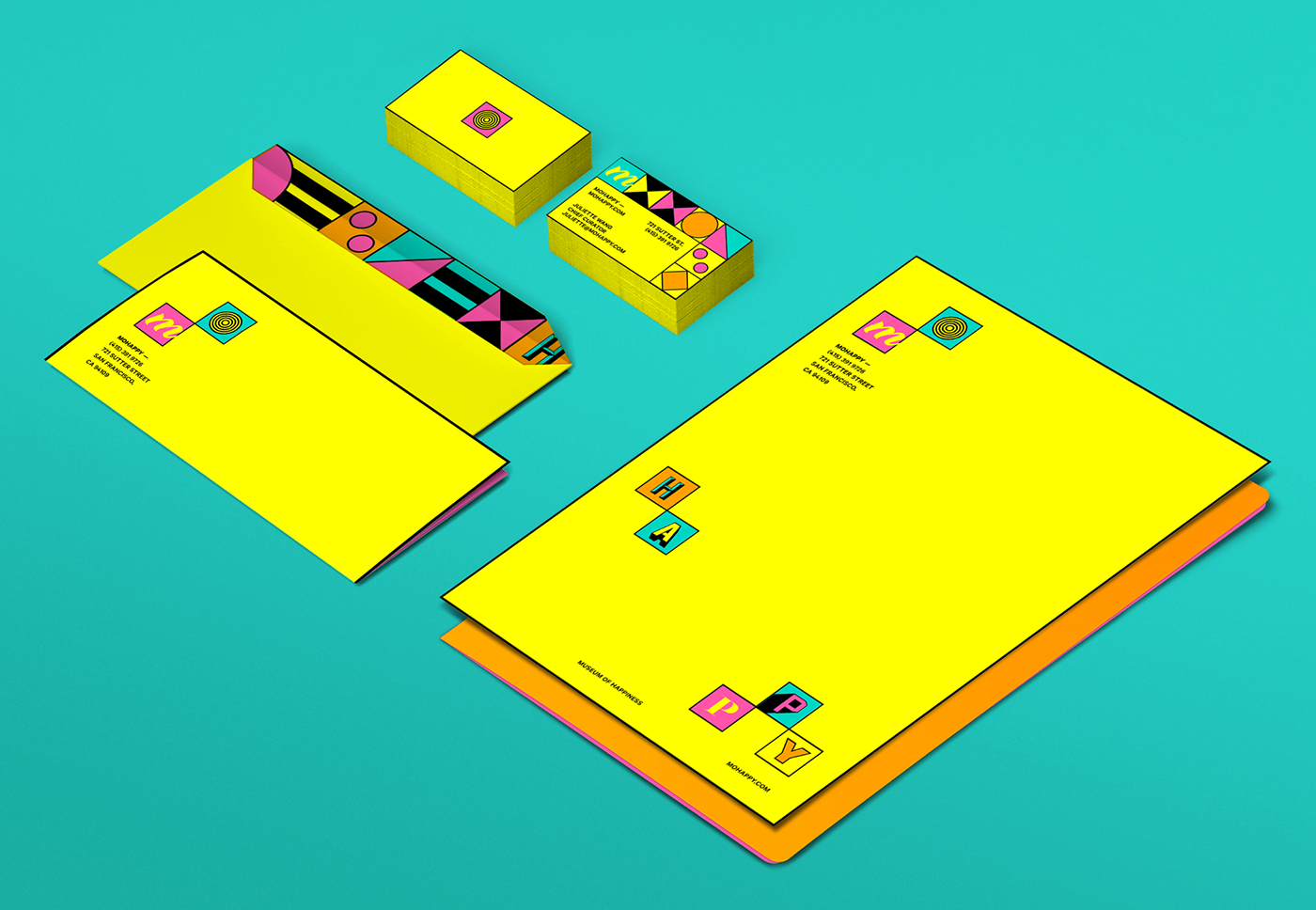
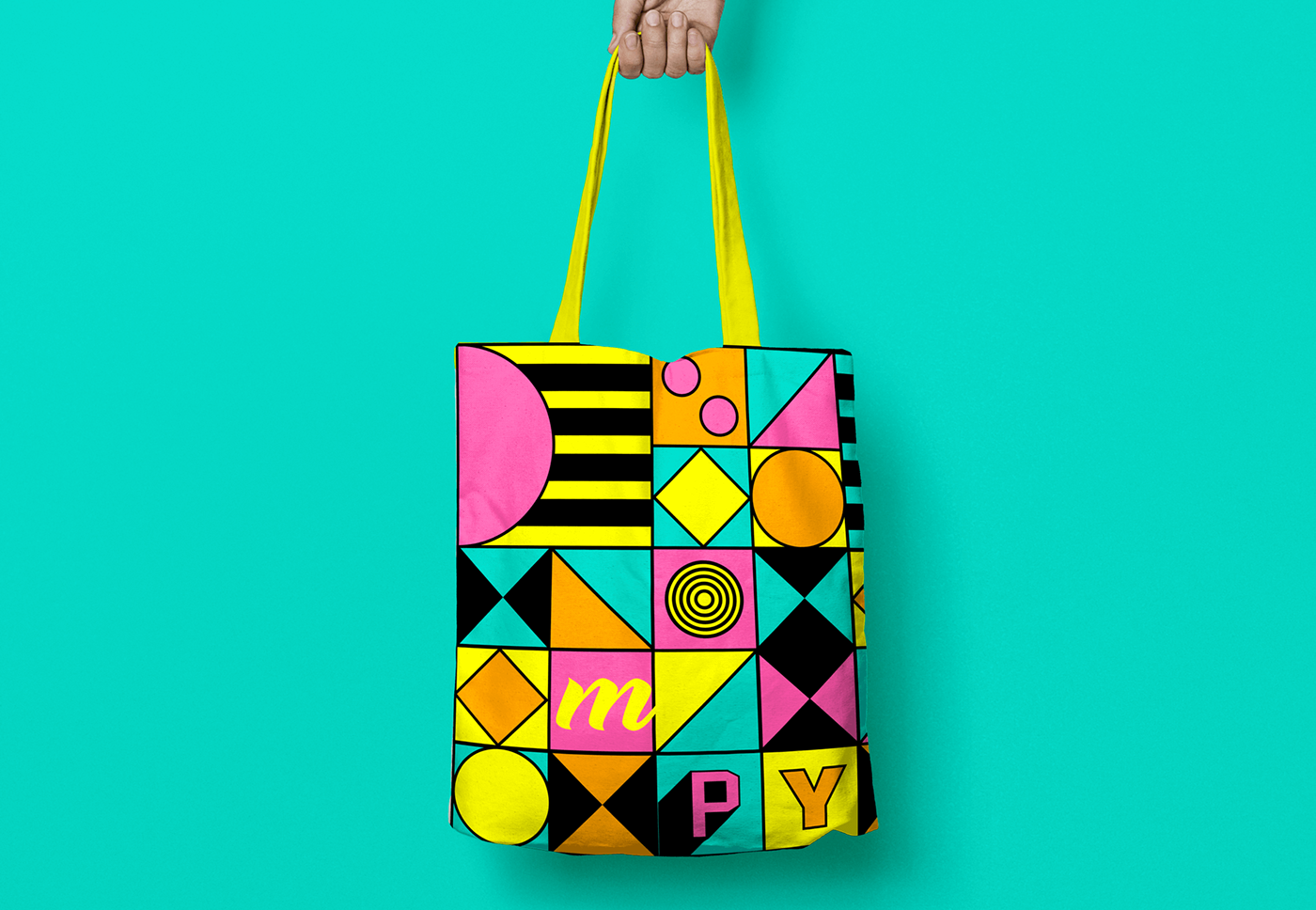
To see the brand as a whole, I then applied the brand elements into some stationery and spacial elements. The letterhead brings in a sense of fun spaced out boxes that keeps the letter simple but yet brings in the visual language. It also helps to see other ways that the logo and grid system could be used, especially on a whole museum wall.


Thank You for Viewing!


